Showing posts with label Principle of Dominance. Show all posts
Tuesday, June 5, 2012
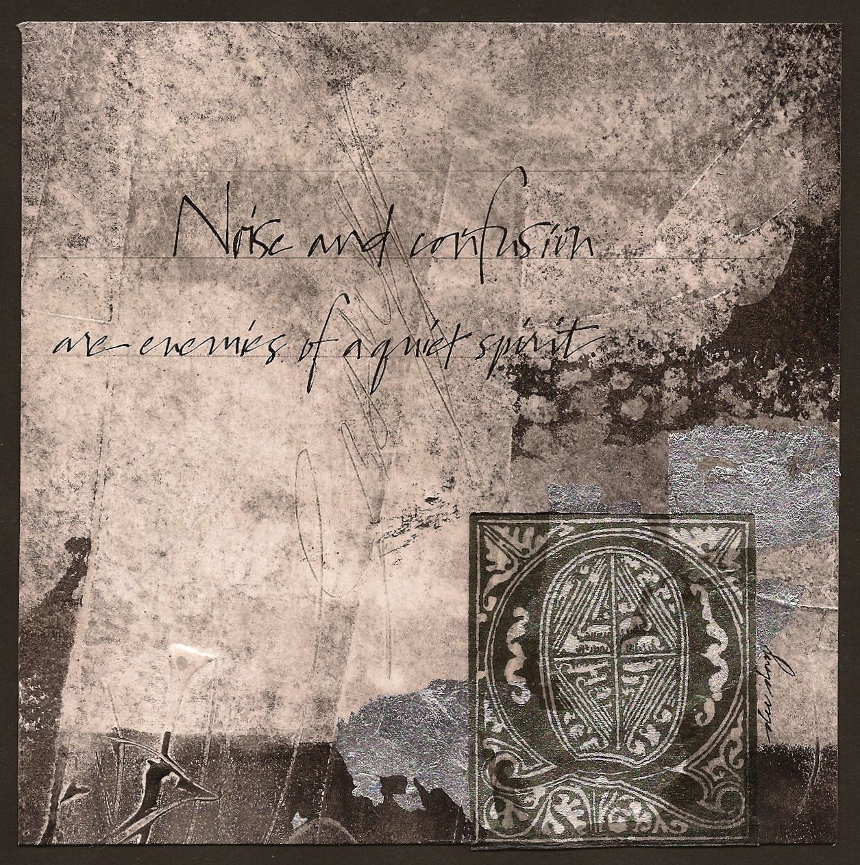
"A Quiet Spirit"
($40.00......6" x 6".....mounted on a 1/8" depth clayboard panel)
"Noise and confusion are enemies of a quiet spirit." Growth in any area of life requires times of quiet and being alone. I can't think of any exceptions.
My experimentations have led me to create more subtle textures and an attempt to completely imbed one layer into another. By toning down my texture in the initial layer of gesso, the erratic lettering in the background underneath the quote becomes a more interesting texture because there is no competing texture in that first layer.
Another decision that makes this a quieter piece is the predominance of the light gray area. Also the fact that the large decorated cap and bits of silver leaf and small black areas take up the least space. So whenever the negative space is dominant, the piece will automatically exhibit a quieter mood. This is a key component in value placement and where the detail is placed.
If the black areas had been dominant with tons of texture, there would have been more tension and more drama. It just depends on the mood of the piece. A wonderful exercise is to look at other paintings and notice whether the positive or negative space is dominant and how that makes you feel while you're viewing the painting. It might give you a new direction on which one of these you want dominating your work. Just a few more things to think about.
Please contact me personally to inquire about this piece.
Friday, September 23, 2011
"Color and Texture" (unavailable)
"Color and texture fit together like pen and ink." This (4" x 6")piece is the first of several in this size created for the "give away" at an Opening Reception one week from tonight. The details for the "Perspectives" Exhibit can be found at (http://www.pactofaustin.com/). There will be well over (100) of these art pieces created by the (40) exhibitors for this "give away". You are cordially invited.
The focal point in this piece is the texture of the pot. It is in direct contrast to the color blocks that have little to no texture. Of course, the perfect location for the pot was inside the area that looks highlighted. It looks that way because of the gesso applied to the paper before the color.
Harmony and contrast create the tension in any piece of art. If there is too much harmony...the piece is boring. If there is too much contrast...there is chaos. The way to achieve harmony is to allow each design element to have a dominating characteristic. For instance, one color needs to occupy the largest percentage of the design space. The line work (which includes obvious lines and edges of shapes) needs to have more horizontal, vertical, or diagonal lines. One of these directions needs to dominate. In today's piece, it's horizontal lines which also includes the horizontal format. And on it goes with the remaining elements.
However, there also needs to be contrast which would be the opposite characteristic found with each design element. Once again, look at the color. There are several contrasts of color. There is a contrast of light and dark, warm and cool, complementary, saturation, and extension. In the design element of line, there are obvious vertical lines and two lines slightly diagonal which are in direct contrast with the dominating horizontal lines.
Some of this may sound confusing, but it is very important to learn how to analyze and define what is happening with these design elements to know how to correct your own work as well as appreciating what is happening in another artist's work. A whole new world will open up to you as you begin observing. After all, the elements and principles of design are the language of design. Just something to think about.
Subscribe to:
Posts (Atom)

