Showing posts with label Design Elements. Show all posts

Thursday, August 15, 2013

"Feather My Soul"


(SOLD.......8" x 8".......on 300 lb. CP Fabriano Paper.....Presented on a 2" depth cradled board)

"Feather my soul with declarations of your love." I have developed visceral feelings about this feather so this is one of three in a series. The quote today came from my own heart and has a spiritual meaning, but it could also be referring to the love of your life.

Today's posting is an (8" x 8"). Squares still hold a special attraction for me because of possibilities of space division. It can have a horizontal or vertical feel depending on the image. This, of course, is an abstracted feather, but not so abstract that it is unidentifiable. The colors and shape are the elements that had me at first glance.

Any natural image from our created world has numerous possibilities for abstraction and playing with shape. By noting the elements of design (line, shape,size, direction, color, value, texture).....and what they are doing, you have the opportunity to abstract the image by altering any of these elements. And how much these elements are altered is totally up to the artist.

Even though I love color with all my heart, neutrals still beckon me frequently to come back and visit them again. These are the kinds of continual "returnings" that give you the most obvious clues in what comprises your art voice. And I seem to have a new found love for watercolor since its characteristics contain some of my longings for transparency contrasted with opacity and especially the luminosity.

So on it goes, the daily listening for the spirit within that originates the longing for particular techniques, moods, and all the other elements that comprise visual communication. And there you have it...just a few more things to think about.

Please contact me personally to inquire about this piece.

Saturday, September 15, 2012

"Motivation"


(unavailable)

"Motivation is energy fueled by ideas." It is amazing how one idea can trigger enormous energy and fuel  the possibilities behind a thought. The secret is to act on the idea before it flies away.

Creating a collage is like putting puzzle pieces together without having the completed picture to guide you. I resolve the problem by starting with a page or segment of text. I adhere it to my black gessoed surface with no thought to exact placement. Although it is good to place it somewhere where there is enough room to place papers around it.

In this piece, the second selection after the text and rice paper overlay was the largest purple section. The black and green at the top were laid down followed by the long vertical green piece. I then added a bit more text in the lower right corner followed by a torn piece of purple.

The last bits of collage printed on silk tissue paper were placed with the idea in mind to join two color blocks together. You might say they act like stitching. Placement was also determined by the lines already there. Again it is important to remember to include torn edges as well as straight edges. And if you include hand lettering, it is important to leave a section where the lettering can be written. It sounds complicated, but it really isn't if you remember the elements of design. Black, and white, plus one or two other colors in different sizes with different edges works every time it's tried. And there you have it...just a few more things to think about.

Thursday, September 13, 2012

"Root Stimulator"


(unavailable)

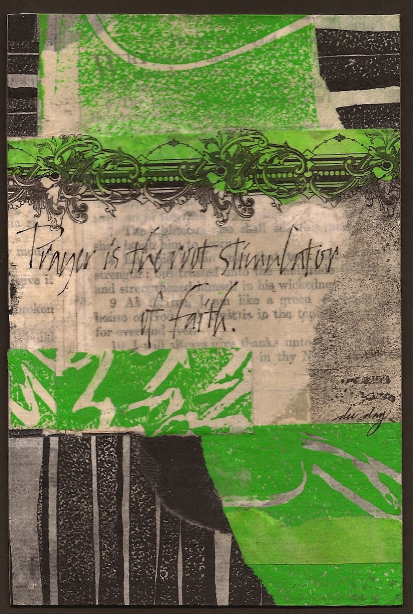
"Prayer is the root stimulator of faith." Ruth Hailey Barton wrote a remarkable book called Sacred Rhythms. I was struck by her statement that the only time she feels truly at peace is when she is praying. In these chaotic times, we can stimulate our faith through prayer and stay in peace.

Collage is a wonderful way to learn a lot of things about design. The difficulty comes in calming the chaos that can develop by placing disparate pieces of paper together on a support.

The same elements and principles of design apply to collage. It is still important to pay attention to the division of space...designing the corners...and having each of the elements of design (line, direction, shape, hue, value, texture, size) have a dominating and contrasting element. For instance, in this piece, the dominating line is straight, but there are also some contrasting curved lines. Lime green is the dominating color, but only by a little bit. The dominating shape is a  rectangle, but there are also some torn papers that bring in a different kind of edge and a few diagonals. The dominating texture is printing on rice paper, but there is also a contrasting texture of text overlaid with plain rice paper as well as a piece of a line engraved collage element.

These are just a few things I think about when putting a collage together and this is only one way. If you want to tame the chaos a bit more...use mostly neutral colors or limit your color choices to one intense color plus black and white such as the piece today. Collage is very exciting and it can work well when it is designed well. And there you have it...just a few more things to think about.

Saturday, August 25, 2012

"Knowing and Doing"


(unavailable)

"Doing comes before knowing." I still find myself and others thinking we can know something before doing it. More often than not, I may not be thinking I am trying something and expecting to know it before doing it, but it seems to sneak up on me. Practicing and doing are mandatory before knowing anything.

It is always a good thing to experiment and see where the experimentation takes you. But even when experimenting with new things, there are stubborn facts that will stop you in your tracks. Those stubborn facts are the elements and principles of design. Things work or don't work for a reason. It can be terribly frustrating and liberating at the same time.

One item in your studio will help you more than any other. That one item is removable tape. If you are in a quandary about where an element of your design should go, tape it in the place that seems the most logical and then look at it from across the room. Then try taping it in several other places and compare. If it doesn't look good anywhere, then it probably doesn't belong on that particular piece.

Save yourself some heart aches and head aches by making a quick decision to exclude that element and move on to what does work. It's the constant indecision that hangs up a lot of artists. I can tell you from experience that placing a time limit on yourself will assist you in making those kind of decisions quickly...i.e....working on your work every day, even when you don't feel like it.

Fear and your internal critic are getting some of you "hamstrung". I know that because I've watched you work through your process in some of my classes. If you go through all of the elements and principles of design as you look at your piece and ask a few questions. you will soon figure out the problem. Let me help you out a bit. Color values are the "sneakiest" of all of the elements of design that you will most likely overlook, so check that out first. Make a black and white c opy of your entire piece or just a portion (if it's too large) and you will know right away if you have a value issue. And there you have it...just a few more things to think about.

Saturday, August 4, 2012

"The Color Red"


(unavailable)


"The color red is reserved for those who love drama." Just think back on any environment.  If the color red is visible, that is exactly where your eye goes. Test it out and look for the color red.  You'll see.

If you have been seduced by pouring medium and wonder if there is any part of your larger sheet that holds out a good possibly for a smaller "cropped" section, let me share my criteria of judging when a "good pour" has taken place.

Strong shapes with a slight bit of marbling is my personal preference. In this piece, I was thrilled that both the black and red color blocks touched three sides of the design space. It might have been slightly better if one of those colors had taken up less space than the other, but because of the marbling which broke up the surface tension in those areas, it proved to be very effective. I also check to make sure my corners are all different with interesting color variations in each one. Also, the light turquoise color has graduated sizes of shapes which I found extremely interesting. There were also small hints of white around the edges which gave me the opportunity to echo that color in the lettering and break up the large color blocks of the black and red.

You will also notice that there was enough space in the blue to add the decorated cap and have an echo of black repeated in a different style and texture creating a wonderful focal point.

What will not make a good pour is one with ill defined shapes and the colors taking up equal amounts of space. Echoes are simply "repeats" of a design element such as color, line, shapes, values, texture, size, and direction. If the "repeats" are not exactly the same, the design will be more sophisticated and create a better "echo". And there you have it...just a few more things to think about.

Saturday, March 17, 2012

"True Calling" (Sold)


(sold)


"The gravitational pull of a deep desire to do one thing above all others reveals your true calling in life." It is a great feeling to know that you're doing what you are "wired" to do. I have noticed that a person may be generally working in the area of their gifting and as they continue on in that general area of focus, it becomes very specific over time.

The colors in this piece are very tropical and genuinely appear happy. That mood completely mirrors the feeling of working in an area that perfectly fits who you are. One of my favorite parts of this piece is the very quiet area in the top right corner where very little is going on. When cropping these pieces, I look for those areas to include...even if I am forced to leave something out that is a favorite part. The reason cannot be overstated. The eye must have a place to rest in a piece of artwork. This is especially true where the majority of the design space is filled with movement and color.

Another thing that is often overlooked is an insatiable desire to place too many elements in a given piece. I often ask myself this question..."Is this element of design contributing to the main thing or is it detracting from the main thing?" If there is any doubt...leave it out.   Just something else to think about.

Sunday, September 25, 2011

"Core Strategy" (unavailable)


"Prayer should be the core strategy of life." A strategy is a plan. Prayer is communication with God. Pairing these two together is a wise thing to do, especially if life has gone off the "rails". (This is another 4" x 6" to be given away at an Opening Reception this coming Friday...for details check out pactofaustin.com/)

This piece is a perfect illustration of how to solve the design issue of all straight lines. If you can imagine the piece without the round image, it would be too harmonious and boring. By introducing a circular image, the piece automatically has a strong contrast which adds drama and interest. Placing the quote in close proximity to the image in a color block of gray unites all three shapes to form a focal point.

It is always a good idea to place the design elements with the greatest detail together. The eye needs a place to rest. If the entire design space has "wall to wall" detail, it can easily become visual overload. It is also good to remember that paintings are made up of shapes. Thinking of shapes from start to finish will keep us all out of the sea of confusion. Not everyone agrees with these design principles, but you can test it for itself as you view other people's artwork. If you cannot view a piece for more than (5) seconds, visual overload is probably the culprit. The viewer's eye is always looking for a place to focus. Just something to think about.

Tuesday, September 20, 2011

"Blending and Moving" ($60.00)


(adjusted price....$60.00....mounted on a 1.50" depth clayboard)

"Blending and moving color is the most stimulating design element." It is a truth in the visual arts and an excellent metaphor in thinking about relationships. When we can be happy for others and even assist them in their hopes and dreams, we are blending and moving in relationship.

This old antique bottle with a hazy patina has been sitting on my drafting table for weeks. I was waiting for the right quote and right background. So this is a perfect illustration of allowing spontaneous processes and materials do their thing and then putting the remainder of the design elements in their places. It is a very exciting and contemplative process.

The basic design elements are present in most works of art. But knowing what they are and how to bring them together is the essence of good design. So in case you have forgotten...line (straight or curved)...direction (horizontal, vertical, or diagonal)...shape (formed by lines and their direction)...size (small or large)...color (actual hue(s) and combinations)...value (light or dark)...texture (simulated or real).

Observing what is happening with each of these elements is the first step in creating well designed work. So put on your exciting glasses today and really observe what is happening in your artwork or in someone else's art. Tomorrow I will list the principles of design...to give you something else to think about.

Please contact me personally to inquire about this piece.