Showing posts with label Shapes. Show all posts

Tuesday, August 6, 2013

"Variegated I" (draft 2)

(image 1)

(image 2)


Today's posting is the second image from yesterday with more layers. More than likely, there will be no more layers added except for the lettering. My quote will be...."Variegated thoughts are running through my mind."

This piece today represents me processing and practicing glazing and layering to create interesting shapes, edges, and maintaining the luminous qualities of watercolor. Like you, I am on a "learning curve" with these techniques since it has been a very long time since I made watercolor a part of my voice.

I am pleased that I did not overwork each layer by going over and over it. My mind was firmly wrapped around the idea of waiting until it was completely dry before adding more layers. Having said that, I really need to practice the ratio of water to paint. There are times when the water in the brush needs to be completely squeezed out before dipping it into more color.

And the value created by how much water is added to the pigment is also a major factor. I did exercise some control by testing my value on a "work off" piece before adding it to the actual piece. And I think this is a good practice tip, even with much experience. And I am also practicing different techniques on a 4" x 4" piece of 140 lb CP in between working on my other work.

My plan is to make notations of what I did on each 4 x 4, punch a hole in the corner, and place them on a binder ring. (They are available at office supply stores.) The reason these kind of exercises are important is to have a ready reference to make it easier in selecting which techniques to use to accomplish a specific goal. You can also cut out visual inspirations and mount them on large shipping tags and also place those on a binder ring. They also make a pretty display in a wood or decorative bowl in your studio.

So you can see in the two images today which colors I layered and in what order.  (My inspiration was the leaf patterns on an "Angel" plant....so you are seeing the top side of the leaf which is green and the underneath side of other leaves which is red.)  Planning out a layering strategy requires thinking ahead through the piece and then plotting your strategy. It's like thinking ahead and thinking backwards at the same time. You can also have no thought at all and simply paint whatever comes to mind. And that does work occasionally, but for long term success, you and I will both be better served by learning the basic techniques, color priniciples, and possible compositions before going crazy.

If you cannot recount to yourself and others what you did to create a particular look, then you can never intentionally repeat it. This means you will be starting at square one every time you paint. It will simply be a roll of the dice. Even artists who work very intuitively are thinking about a few things that are very important and making decisions as they go along. And there you have it...just a few more things to think about.

Sunday, July 28, 2013

"Heart Walls I" (final)


($200.00.....11" x 14"......Mixed Media Wall Series.....Presented on a 2" Cradled Board)

"Let love and faithfulness never leave you; bind them around your neck, write them on the tablet of your heart." (Proverbs 3:3) This is it! The first in this series is done. But I am taking a break from this type for a few days.

This was a very experimental piece for me, and there were a few challenges. I almost threw in the towel the day before I started the lettering. But wisdom prevailed and I decided to wait until the following morning to make the final decision. Once I saw it again with fresh eyes and some sleep, I decided to press on until the lettering was done.

The brush lettering in the top right hand corner stabilized everything for me, along with the decision to do white lettering. So the point in sharing this is to give encouragement to those who love to experiment and feel like they've landed in the weeds. The truth of the matter is that every single piece is like that unless you've worked through the issues with a particular style with all of the techniques and materials.

After all of the struggling, I have made some decisions concerning this series. I will be leaving a portion of all of the pieces completely untouched. In watercolor in particular, that does give the final piece a freshness that cannot be achieved any other way. I have also decided to do white lettering in all three pieces. The same techniques for creating the texture will also remain the same.

So just by making those decisions, I can feel assured that there are enough common denominators to keep the series coherent. And there you have it...just a few more things to think about.

Please contact me personally to inquire about this piece.

Saturday, July 27, 2013

"Heart Walls I" (draft 5)

(draft 5)


"Let love and faithfulness never leave you; bind them around your neck, write them on the tablet of your heart." (Proverbs 3:3...NIV) Not quite there yet, but the lettering is coming along. The process really slows down when it's time to add lettering.

Nothing has changed about the background today, but the informal versals can take a while. And rather than trying to speed up and try to get it all done this morning, I thought it might be instructive to let my lettering friends see a bit more of my process.

I generally begin laying in these types of versals by laying tracing paper over the piece so that I can see the shapes in the background. I then begin to write the letters with pencil first so I can erase and change things as I go along. The beauty of these letters is the fact that there are no descenders or ascenders to deal with and they can be expanded and compressed to fit into any shape.

After feeling satisfied with the spacing and slant, I then transfer the letters to the actual piece by scribbling on a plain sheet of tracing paper with a graphite pencil. I then slip that underneath the tracing paper with the lettering and go over it again with a pencil, checking to make sure it is transferring.

After this step, I go over all of the letters with a pointed pen loaded with the color gouache of the final lettering and simply fill them in with no pressure on the pen. And that is what you see on the part of the quote I still need to finish. I then erase the initial graphite.

And this next step is the most important. I check the slant and spacing one more time. In this case, I did remove several words and rewrite them in white gouache right on the original. Because the surface has been prepared for lettering, I can simply take a brush dipped in water and remove anything I like. After all of the adjustments were made, I began to build up the versals with a pointed pen and Bleedproof White gouache.

I may also need to go back and beef up all of the letters one more time. The best way to do that is to spray the entire surface (2x) with spray acrylic coating and then prepare the surface for lettering again. This keeps the pen from digging into the previous layer of gouache which can be very frustrating. And there you have it...just a few more things to think about.

Friday, July 26, 2013

"Heart Walls I" (draft 4)

(draft 4)


Some lettering has been added today, but there is more to come. The quote you see today is in Spanish and may be hard to see. It is meant to be background lettering. The English translation will be included tomorrow and easily read. It is Proverbs 3:3.

My decision to do all of the lettering in white was to bring calm to the very textured background. No matter what the lettering style, white can do wonders to bring calm to the piece. Of course, it will look strange and not well integrated if there is not white in the background texture.

Lettering or any other visual helps to solidify a piece like this where the texture is actually the main feature. Lettering and walls seem to go together. They appear in all kinds of walls...either in a graffiti style or a printed sign. I particular liked the Spanish word "escribelas" since it means "to write". It is very similar to the word "scribble".

So even though all of the lettering is not visible today, there is enough there to convey the sense of calm and add meaning to the piece. But just as a recap...there are still shapes and a range of values in the wall texture that provide the foundation for the piece. Lettering that is simply written on a solid piece of paper or a background with no shapes is immediately thrust into the category of graphic design. If the piece is to be classified as fine art, it is better to have actual paint, techniques of layering, shapes, values, and color. Not to mention the fact that it is far more interesting.

The medium used for the lettering was Bleedproof White Gouache. The large word was written with a pointed brush and the small script was written with a Leonardt Principle Nib. And there you have it...just a few more things to think about.

Thursday, July 25, 2013

"Heart Walls I" (draft 3)

(draft 3)


The title and direction of this series has changed to quotes from Proverbs having to do with what is written on the heart. The title is not referring to walls as a barrier, but what is being written on our heart and mind.

I decided to wait an extra day....maybe two...to practice my lettering. Today it looks like it will be versals, but that can change. And that's what the art process is all about. To stay locked into a preconceived mold throws the baby out with the bath water (so to speak).

So after viewing this piece most of yesterday, I realized that my darks were not dark enough. This is not just a standard faux finishing technique with an overall texture. The idea is to create a texture revealing all of the erratic shapes and crumbling nature of paint and plaster on an old wall. As usual... the problem was with the values. The darks were not dark enough, so I prepared the surface for a new layer with dilute gel matte medium and then added some soft pastels to darken the edges and some of the central shapes. The range of values from 1 - 10 on the gray scale helps build the foundation for the shapes and consequently the piece.

I am now satisfied and what will bring it all together is the proper placement of the lettering. And this is a lot of staging for the star of the show, but will be worth it in the end. Another option (especially if you're not a lettering artist) is to incorporate a drawing or do some deconstruction with a piece or two of collage so it looks as though it were peeling off.

And that's the process of my first "Wall" series piece. There will be two more to form this "Heart Wall" series and then in the future I could have another type of "Wall" series. Sequels are always good. And there you have it...just a few more things to think about.

Friday, July 19, 2013

"Gracias" (draft 2)

(draft 2)


Last evening I decided on a finished size of 6" x 12" in a vertical format. A few blocks have been completed and laid on the support. Nothing will be adhered until everything has been decided.

What I decided this morning was to have a larger contrast of size, so I will be cropping some of the pieces you see, making new ones, and including a variety of small sizes mixed in with the larger ones.

Contrast of size adds a lot of drama to a composition and brings the viewer in to a particular area, especially if the contrast is quite significant. So my plan is to have some smaller blocks that are less than an inch in size to create a focal point and a lot more repetition of all of the colors. This does take more time, but is well worth the effort.

It is always a good idea to notice the size of shapes in other artists' artwork. By analyzing and comparing how you respond to contrast of size, you will fully comprehend the power of this important contrast. When everything is too much the same size, the piece may be unified, but lack energy. In fact, contrast is the number one most important design principle....especially in a day and age when we are all bombarded by visuals.

So it might be a good idea to analyze as much artwork as possible to take note of all of the contrasts you see. Be looking for contrast of line (including edges and direction), color, texture, shapes (size), and values.

Analyzing a particular piece of artwork is more valuable than simply reading about design and trying to include the principles in your work. If you can see it in a finished piece of art, it will make a lot more sense and be more easily understood. And there you have it...just a few more things to think about.

Friday, July 12, 2013

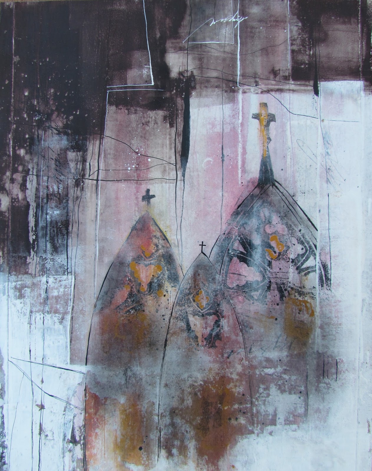
"Cathedrals" (draft 3)


"Cathedrals in all their grandeur cannot compare to the cathedral of the heart." Hearing the sounds of a choir singing upon entering a cathedral is a rare and beautiful moment, but the cathedral of the heart is a place one can visit at any time.

It isn't finished yet, but I am almost there. This piece has now been cropped to an 11" x 14" and all of the edges, lines, and shapes have been adjusted to my satisfaction. It is time to stop this part of the process and move to the lettering. My thought this morning was to bring more of the dark area into the white shapes and vice versa. I did this with line work...removing more paint with alcohol and a brayer...and by adding gold gouache and black charcoal powder.

Holbein manufactures an Acryl Gouache called Gold Orange that has a vintage quality that is perfect for these types of pieces. I applied the gold with a brush in select areas of the cathedrals. It was too even and solid so I used alcohol and a stiff brush to remove and disperse the paint. After drying, I added black charcoal powder right over the gold and other areas of the cathedrals.

You can also compare with the previous posting and tell exactly where I added more line work and a bit more lettering. I am now satisfied that there are definite shapes with a variety of edges and line work that are having a conversation with each other.  Tomorrow, I will add the lettering and post the final.

While this mixed media piece has been in process, I have also been doing some palette knife painting in oils and very pleased to have another creative area to express my voice. It's all very exciting, but if you find it overwhelming to think about too many processes at once, I strongly encourage you to focus on the techniques that can be combined to express your deepest longings in one area.  It's all a win-win and very healing to the soul. And there you have it...just a few more things to think about.
Monday, June 10, 2013

"Orad Sin Cesar" (draft 4)

(draft 4)


Today I have changed the title of the piece. This is just one of the many things that can happen when working.  All of the fragments I have included from my old bible are scriptures about crying out to God. This title just seems to be more appropriate to the piece.

A little over half of the piece is now adhered to the support with gel matte medium. I also laid wax paper, a book, and a large rock on it overnight. This definitely insures that nothing comes up as I move into the final stretch. You can now see how the white toned pieces also create their own shape as well as the yellow at the bottom. I do love the idea of staggering the separate pieces in such a way that everything seems to be interlocking. And it's much more interesting than having each color be in a straight line.

So what I have learned about when to adhere the separate pieces is to get one color section adhered at a time. It is not doable to try to keep pieces where they go and having to constantly put them back in their places. However, it is important to wait until all of the pieces in a particular color range are placed before adhering to the support.

Another point to note is that it is not necessary to lay out a double palette of colors to create this kind of piece. (Even though that is the way to achieve color harmony when creating a painting.) This technique affords you the opportunity to use up some of those odd colors you may have purchased when you didn't know better.

The yellows, for instance, are raw sienna right out of the tube. I then mixed raw sienna with some cad. yellow light. Liquitex Parchment color plus cad yellow light created a nice chartreuse. But you can see that they are interspersed throughout the yellow section to create some interesting echoes. And I am doing the same thing with the blue area. I like mixing cobalt blue with cobalt turquoise and then throwing ultramarine blue in the mix. It makes for a very interesting color arrangement.

So if you want to work larger, you might want to give this approach some serious consideration. It allows you to work section by section to create a very dynamic surface treatment. And there you have it...just a few more things to think about.

Sunday, June 9, 2013

"Orad Sin Cesar" (draft 3)

(draft 3)


Slowly but surely the small and the large piece are coming together. The focus is on portraying Psalm 119: 130 visually and include this verse from The Message.

The collage technique I am using is an exciting way to use color and texture in a different way. Each piece is being prepared separately which can be time consuming, but I have speeded up the process by cutting many different squares and rectangles from 140 lb. HP.

The undercoat is painted on many of them at once and left to dry. I then come back later and apply the top coat with a palette knife. If I want my marks to reveal the undercoat a great deal than I use the corner of a credit card or metal palette knife to make gestural marks in the wet paint which in turn, reveals the color underneath.  If I want sharper and more subtle marks, I dry the paint first and then spray it with rubbing alcohol and brayer over and over.  I can then stop and scratch into the paint with the sharp corner of a palette knife.  On some of the pieces,  I then sprayed with alcohol and brayered over the surface again until satisfied with the texture.  All of this is then dried and sprayed with acrylic coating before placing it on the support.

In a few pieces today, I did use a stamp into the wet topcoat and also stamped half of a handcut "O" with Speedball Printing Ink after the topcoat was dry.   I also plan to create a small arched doorway with a palette knife, painting wet-into-wet for one of the pieces.

This technique offers a glorious opportunity to use fragments of old paintings, try new techniques, add text and rice paper, etc. Where you see large black spaces in today's posting is the support and will eventually be totally covered with my separate pieces. Some of the pieces have been moved around, but nothing has been adhered to the support just yet.

Today, I may adhere the white toned areas since most of them have been decided upon. It is very difficult to keep everything in place when nothing is secure. Part of the experimentation process is learning what works and doesn't work as you go along. If one section of color seems satisfying, then it just makes sense to go ahead and glue that down with gel matte medium to make it easier to fit the other colors in their places.

The key to success in this type of work is having enough common denominators throughout the piece and also having specific shapes by grouping a particular color together to form a larger shape. Having specific shapes helps to ground a collage that might otherwise look like a "hodge podge". And there you have it...just a few more things to think about.

Tuesday, June 4, 2013

"He Heard My Cry" (draft 3)

(draft 3)


Today's image is the third draft of "He Heard My Cry". I have done a considerable amount of adjusting the values with additional rice papers and a lot of pastel work. Today I will be viewing the piece on my iPhone which allows me to see it in a whole new perspective. There is something about viewing your work as a flat image and simply getting away from it physically that will show you what else needs to be done. So if you don't blog, at least take a photo of it and study it during the day.

At this point, everything is adhered to the support except the handmade paper and glass inclusion. Today I will adhere it to the 11" x 14" flat gessobord panel and weight it down to dry. I also will be considering any other adjustments. I have already set the stage for white lettering at the bottom and because I have subdued the background considerably, I will probably opt for gestural writing and white bleedproof white. I am also considering a bit of pencil lettering in that area before the white lettering is written.

Since yesterday, I have cropped the piece to its finished size and then positioned and repositioned the large bible page, handmade paper, and glass inclusion about a million times. I was very careful not to adhere anything until I determined where I needed some more marbled paper and plain rice paper. But even before all of that, I brushed on a lot of soft pastels to create some darker areas and integrate the piece with my frame. The frame has a brownish red and black color with a gold trim around the opening. The gold looks very good with all of the aged yellowish tones in the piece. So when you are creating a piece that will be framed, I strongly encourage you to select your frame before finishing the piece so you can adjust any of the values and colors for a better integration.

My frame also has a historical look to it which lends itself to this type of presentation. (In the past, I have referred to these type of pieces as my library pieces.) And if you think about it, all of the elements give a nod to the book arts and books are found in libraries. As time goes on, books may become obsolete so I definitely want to do my part in preserving the written word.

In this third draft, my entire focus was on shapes, edges, and values. And you do need some kind of focus and a goal as to what you are trying to achieve when creating layers. If you simply place paint or elements wherever you feel like it, you might succeed part of the time, but eventually it is important to have a focus on what you're doing.

One of the most important things I've learned to focus on is the fact that artwork is made up of shapes. All over backgrounds created with sponges and a dab here and there does not create shapes. That is precisely why the "edge to edge " concept is important. The minute you extend a line, shape, or connecting shapes from edge to edge, you have created several shapes by dividing the design space into two or more parts. That's exactly why the cruciform format (vertical and horizontal from edge to edge) is so effective.

In this piece, that thought of extending shapes from edge to edge played a role in deciding where to add my additional marbled papers. The placement of those papers connecting the handmade paper and old bible page to the top and bottom edge keep the focal point from floating in space. It's not that vignettes are wrong....they just cannot compete with the dynamic pieces that have well designed shapes and depth. And there you have it...just a few more things to think about.

Friday, February 22, 2013

"Joy"

(unavailable.....4" x 6".....Mixed Media on 140 lb HP.....mounted on Masonite)

"Joy ripples through the peaceful heart." The predominance of red and the violet ripples created by the pouring medium prompted this quote. I have found it to be true that when I am peaceful, there is joy.

This is a 4" x 6" mixed media piece with the base support created with Liquitex Pouring Medium and Fluid Acrylics on a 140 lb. HP support. In previous postings I placed the text pages in the center, creating a vignette. This time, I decided to touch two edges with the shape of the collage elements. There is much that can be accomplished when thinking in shapes. Going one step further and making sure the space is divided in a pleasing way by allowing the shape to touch at least two or more edges of the design space is another option and a bit more dynamic than placing the shape in the center. 

There is a lot of layers of text pages and rice paper, along with deconstructed elements, to create a raised and complex shape with lots of layers. The slight marbling in the pouring medium is also a good pairing with this type of collage. So if you're inclined to rummage around antique stores and look for old books, this might be a project to consider. And there you have it...just a few more things to think about.

Sunday, January 20, 2013

"A Study"

(unavailable)

"Order holds all things together." Order implies that there is a plan, a pattern, an arrangement, a grouping, etc. In order to have order, there has to be elements to be orderly with. This is a study of shapes with different values that divide the space. Even though it is abstract, there is order in the arrangement, creating depth and a syncopated alternating effect.

There are many things that constitute a piece of art. I've seen a lot of art and no matter who the artist was or the style they chose or even if I liked the piece or not, the one thing that every artwork possessed was an arrangement of shapes. They could be very simple or very complex, but there was always a variety of shapes in particular colors with a variety of values.

It is also called form. In fact, the definition of form is....a shape; an arrangement of parts. This doesn't seem very important until you see a painting that simply has a monochromatic background with splotches of color all over. If those splotches are all very close in value to the base color, that would be a very weak painting, if you could call it that at all. Even colorists have used an analogous color scheme where the colors are extremely blended as they go from one to the other have created form within the painting.

I have this on my mind because it is very good to frequently go back to the basics and figure out these things. So shapes become something that require very careful attention. In addition to having interesting shapes that have contrast of size, it is good to then make sure the edges of those shapes have a variety of soft and hard edges. If there is too much of one or the other, (especially all hard edges), the painting would look very contrived and immature. 

So to walk through a gallery and pay particular attention to shapes and edges is a very instructive thing to do. It will serve as a reminder of what to do or not to do in your own work. It is part of learning to analyze design in order to know how to do it yourself. And there you have it...just a few more things to think about. 

Monday, January 14, 2013

"Safe and Secure"

($50.00...6" x 6".....Water Soluble Oils on Gessobord)

"The secret place of God is safe and secure." This is my own revision of Psalm 91:1. It's one of the most powerful chapters on dealing with God's protection. No better image comes to mind of a secure place than a hugh rock. In this case, there is a small opening in the rock where someone could easily hide.

Learning to see all paintings as broken down into shapes with a color and a value is the essence of painting. I am learning to notice each value as a shape in relationship to the other shapes and to isolate and mix that particular color. By doing that throughout the piece, it eventually turns out to be a painting. There are times when I have my doubts, but it is best to just keep painting until yo get through before making a judgement.

And if you paint often enough, it will become faster and even more abstract. If you prefer to paint more realistically, all you need to do is slow down, blend more, and add more detail. This piece is actually a "study" for a 12" x 12". I will switch to acrylics (with retarder) since I need a fast turn around. The process for painting in acrylics is very much the same with less working time. So it is very useful to try the same painting in a smaller size with oils first just to get the "lay of the land" before going to acrylics.  

My working time has speeded up which shuts down my internal critic and keeps me moving forward. One other tip...wait until you have several paintings done before doing a hard critique of your work. I often think a painting is too abstract and rather "a mess" until I view it for a few days and in context with my other work.  And there you have it...just a few more things to think about.

Please contact me personally to inquire about this piece.

Thursday, December 27, 2012

"Internal Combustion"

(sold)

"The internal combustion of the heart creates heat." This quote can be interpreted several different ways so I will let you decide.

The motivation to paint another snow scene from Flagstaff was inspired by our own weather here in Austin. It is not hard to imagine that we could see snow falling in the midst of temperatures in the 20's.  I will go with the odds. It probably will not snow so I will paint it and pretend. Of course, those who live in it all winter would probably like to trade places with those of us who live in the South.

In this piece, it looks like the snow was falling after a previous snowfall since the foreground has little or no snow. Once again, I am vitally interested in the foreground since it creates depth and interest in landscape painting. The shapes in this particular piece are very fascinating and contrast beautifully with each other. So it is worth repeating that all paintings are made up of shapes. And the more varied and interesting they are...the chances of creating a better painting will increase. 

Finding these kind of photos requires taking a lot of pictures...much more than you will ever need. You will also learn what types of compositions appeal to you personally. That's why it is important to paint from your own photo references or better yet...paint on location. A strategy that I have been using is to have a pocket camera in my purse. That way, you will always be ready to "snap" that special shot. My friend, Sue, actually inspired me to do this. I was always impressed to see her "whip" out her camera at the optimum time.

Beyond all of that, it is simply important to paint or sculpt, or create a mosaic, or mixed media piece, or anything else that you feel compelled to do and do it regularly. And there you have it...just a few more things to think about.


Monday, October 15, 2012

"Hay and Stubble"

($40.00.....6" x 6"......Oils on Gessobord)

"Hay and stubble is contrasted by pumpkins and gourds." All across the "Smokies", there is a prominent display of pumpkins, gourds, hay, and corn stubble. So this is a "Happy Fall" piece.

As those of you know who have followed my blog for a long time, I am trying to hone my techniques and try new things all the time. In this piece, you are at a slight disadvantage because it is overcast here in Gatlinburg and my photograph is not showing the true color of the hay. And even apart from the photography issues, hay is a difficult thing to portray. 

I began with a very dark background so that the dark areas in the hay would show through when the lighter color was applied on top. The quote was written into that area of the painting to add even more texture. I have no doubt it would have been a bit easier with a brush, but I am quite determined to use only a palette knife. Never the less, it looks convincing from across the room. 

So the lesson in this piece is to keep pressing on, even when there are issues. And it always helps to take and break and set the piece on an easel across the room. It is always advisable to stand back from the painting during various points. What I can't see a foot in front of the piece seems to always be seen from across the room. 

One compositional decision I did make early on was to have the pumpkins and gourds form an overlapping shape from edge to edge. This is generally a better option than making them really small and placing them in the middle. And there you have it...just a few more things to think about. 

Please contact me personally to inquire about this piece.

Friday, October 12, 2012

"Nature Poem"

($125.00.....6" x 6"....oils on a gessobord....floated on a linen mat in a custom frame.)

"Turning leaves are a nature poem." This piece is another oil painting created in Boone, N.C. I tried to capture the color of the leaves as well as the fog that hung over the mountain in the background.

It doesn't matter whether or not a collage is being created or an oil painting with a palette...the principle remains that paintings are made up of shapes.   In this piece, the shapes have many soft edges due to the subtle shift of values. Of course, the tree trunks helped create the divisions of space and consequently the shapes.

Normally, I like to work larger and then crop the image, but in this case, I had to work with a predetermined size.  It them becomes necessary to think about all of the elements of the composition in advance. Taking photos will help with this kind of work so I have taken app. 1500 so far. 

Photography is a great practice in your design thinking. And cropping the image on the computer before painting will assist in getting the composition right, especially when the option of cropping for the final painting is not possible.  And there you have it...just a few more things to think about. 

Please contact me personally to inquire about this piece.

Friday, October 5, 2012

"Fragments"

($60.00.....6" x 6"....300 lb HP mounted on a 1.50" depth clayboard)

"Fragments leave traces of the whole." Any quality or characteristic of a thing reveals the source of its origin. In art, collage is an example of this. In life, what we allow to influence our thoughts determines the source.

In this piece, there are definitely many parts of something else. I chose to use the back side of some pieces of mono printed rice papers because of the interesting texture. There is also some deconstructed pieces where the texture was created by adhering a piece to the support and then pulling it up before it dried completely. This leaves a segment of the adhered piece without having the whole piece. It's an exciting way to create spontaneous texture. 

There is also a piece or two colored with walnut ink which gives the deep rich brown colorations. So the combination of adhering papers in the traditional manner and including deconstructed pieces gives a rich "aged" and textural surface that cannot be created any other way.

Another inclusion is the white fluid acrylic drips which were poured onto rice paper and left on wax paper to dry. I then cut around these "drips" before adhering them to create a contrast of texture to what was already there. Texture is a compelling design element so learning techniques that increase the contrast between different types of texture will give you a compelling surface. 

Arranging the textures to form interesting "value shapes" is the other important consideration. Having shapes overlap and go from edge to edge to form a larger block is a good decision to make. And there you have it...just a few more things to think about. 

Please contact me personally to inquire about this piece.

Tuesday, October 2, 2012

"Process"

($60.00....6" x 6"....300 lb HP mounted on a 1.50" depth clayboard)

"Process is all about time management." Time constraints require all of us to carefully consider time management. And just so you know, I still struggle with this myself. Just factor in that it will always take longer than you think to get anything done!

There are several more layers of papers in this piece than some of the previous ones posted. The many overlaps and the exposed edges create more depth and subtle value shifts. Notice that there is very little strong color except for the red in the area of the edge to edge shape going from top to bottom. 

And that bit of red was applied by brushing gel matte medium on the color side of the rice paper and then adhering to the support. Wait a few minutes and then carefully lift it off before it dries and the color transfers in a very erratic pattern. I also did the same thing with some of the text pages from an old book. This is commonly referred to as deconstruction.

Walnut ink created the "smudges" on and around the edges. And it is best to dilute it a bit and dab it on after the rice paper is adhered. Notice also the red line created by the edge of the text page. That is something to look for when buying old books for this type of layering. This surface creates the perfect light background for the inclusion of expressive lettering after it has been prepared for writing by brushing on a mixture of (2) parts water to (1) part gel matte medium. 

And believe it or not, the shapes are quite distinguishable from across the room. And there you have it...just a few more things to think about. 

Please contact me personally to inquire about this piece.

Friday, August 31, 2012

"Change Course"


(unavailable)

"When something is not working...change course." In any area of life, this is a good thing to do. What sense does it make to keep doing things that continue to produce failure?

This piece brings me back to something I've learned in oil painting. Paintings are made up of shapes. This is the best advice I can give anyone who is creating a collage. The key is to make sure there is a conversation between the shapes, colors, patterns, line work, etc. These conversations are called "echoes". The shape and direction of the flowers echoes the gestural lines in the mono printed rice paper. The detail in the vertical patterned collage echoes the flowers and the gestural marks. The colors are echoed throughout the piece.

Edges are another important consideration. There are some very straight lines in this piece, but they are contrasted by the torn edges and the curved lines that appear in the flowers, patterned detail and gestural marks.

A lot of movement can be introduced into a collage with the inclusion of gestural marks created in the printing ink and mono printed onto rice paper. Speedball Printing Ink remains my choice because it creates such a nice print (much better than acrylics) and the use of rice paper will give you the sharpness you are looking for. Rice paper is made for printing and it is thick enough to really absorb the ink. Begin by brayering the color onto a piece of glass until it sounds "squishy" and then make your marks with shaper tools or old credit cards. Lay the rice paper onto this surface and print by running a clean brayer over the rice paper. Lift up and set aside to dry. (Don't forget that this ink is water soluble and you will need to spray with Acrylic Spray Coating before adhering to the support.)

Some of you have encouraged me to do more expressive lettering and move away from Spencerian Script. There is a good reason why I can't always do that. Space is one factor and often a straight line of script has a calming effect on the piece. I promise to mix in some more 6" x 6" pieces so that I can have an opportunity to do different lettering. The 4" x 6" are being created for a "give away" for an upcoming exhibit. And there you have it...just a few more things to think about.

Monday, August 27, 2012

"Verbal Music"


(unavailable)

"Poetry is verbal music for my soul." Words that are arranged to describe an emotion or an image can so change a person's outlook that it is magical. Poetry helps the visual artist as well as the composer to create deeper works. All three are needed...poetry, music, and visual art.

This piece is a great lesson in controlling a very active background of color and composing a piece that will work visually.

Line engravings continue to be one of the best ways to accomplish very definite shapes out of a pool of multitudinous color. An artist could use their own ink drawings, but I think the precision of these engravings makes it more sophisticated unless the artist takes the time and effort to create a very detailed ink drawing with shading. It takes more than a single line drawing. Also, by choosing a line engraving that has a definite repeat of a geometric shape gives the piece rhythm and stability.

The collage fragments of poetry by Ralph Waldo Emerson also bring a light value with no detail that causes it to stand out as the focal point of the piece.

And the last thing is very straight Spencerian Script written from edge to edge in a tinted white gouache that connects with the other light areas and cools down some of the very warm orange color notes. And there you have it...just a few more things to think about.