Showing posts with label Masking Fluid. Show all posts

Monday, September 23, 2013

"A Poetic Collection"


(unavailable....4" x 6".....watercolor on Fabriano 140 lb. CP....mounted on masonite)

"A poetic collection fell to the ground." The fall is a perfect time to see all kinds of poetic collections while taking a walk. The very small leaf in this piece had three seed pods sitting on top so I brought it back to the studio. What was so interesting to me is that these three small pods have not moved from that leaf. It is like a still life found.

Noticing small things in nature and in art is the chief business of the artist. For instance, this piece has a variety of different types of edges. And edges can make or break a piece. The first set of edges were created with masking fluid over the first initial wash and the paper being thoroughly dried. So after all of the glazes were finished, and the masking fluid removed, there is softer and harder edges based on the gradated color in the lettering. So many different effects can be achieved by when you decide to include masking fluid.

The second set of edges were created in the initial wash using "neutral tint". This is actually the name of the color and turns into a beautiful gray on wet paper. After the sheen of the water leaves the paper, these letters were written with a more concentrated amount of pigment and a pointed brush. The edges became softly diffused.

I then created some black erratic lines with pen and FW ink which created a few more shapes and some very hard edges. The seed pods on the leaf were then painted followed by the pencil lettering. The lettering was "beefed up" a bit after initially being written. All done with an extremely sharp pencil (sharpened on a sandpaper block) to create very thin lines. And there you have it...just a few more things to think about.

Saturday, September 21, 2013

"Wait and Listen"


(unavailable...4" x 6"....Watercolor on Fabriano 140 lb. CP....mounted on masonite)

"Wait and listen to go deeper." This is true in many decision making situations, but especially true in spiritual matters. Waiting is a matter of shifting down to first gear and perhaps placing your activity on "pause" until hearing the still small voice of the Holy Spirit. That's when the very best things happen.

This small piece began as a larger mono print. And what a fun and relaxing technique this is to just loosen up and let yourself go with your favorite colors. Of course, black and white plus one other color works every time it's tried. (In case you have trouble making a decision.)

You can tell that the mono printing was created on dry paper because of the hard edges and the stark white of the paper creating smaller shapes. And I cropped this particular section because I love it when a shape touches three sides of the design space.

I also had some neutral tint that was placed on the glass and not completely mixed before the print. That's how the circles were created. There is also some lettering that was written with a bamboo pen while the blue print was still wet. The amount of pressure used to write those words determines the subtlety of the mark.

After the initial print was dried, I used masking fluid to create the lines and gestural writing in the lower corner. I glazed over it with a dilute portion of neutral tint...blotted the upper line with a kleenex....let it dry and removed the masking fluid. 

The quote was inspired by the look of deep water and the lines. And there you have it...just a few more things to think about.

Wednesday, September 18, 2013

"The Details"


(unavailable....4" x 6"....Watercolor on Fabriano 300 lb. CP...mounted on masonite)

"Make sure God is in the details." We have all heard the phrase...."The devil's in the details." I would rather look at the quote from a different perspective.

This posting is a cropped section from a watercolor that didn't work out. I brought it to life by using white bleedproof white gouache to "echo" some of the design elements already existing in the piece. By doing that, I was able to write in white to unify the piece. It is another "give away" for the upcoming Opening Reception.

I have been teased relentlessly for the quote I have used on many occasions...especially when anyone asked me what colors to use. My standard reply is that...."black and white plus one or two other colors works every time it's tried." So when you have a crop like the one I chose today and there is already black and color on the piece, the introduction of white will give the entire piece a much needed "value lift". A very good thing to know and do.

Sometimes, beginning artists may not know where to place additional color and this piece is a very good lesson. I already had an image from the first layer of a bottle that was placed in masking fluid and stamped on the paper. It gave the perfect spot to place a stamped image of the same bottle dipped into bleedproof white gouache. (WN brand) The reason I always say bleedproof white rather than other kinds of white is because bleedproof white (comes in a jar) has more covering power. The white dot happened quite spontaneously so I just left it there. The addition of some more erratic lines and the lettering completes the echo effect.

So the "take away" for today is to pay attention to the design elements that are already there rather than introducing different ones. It creates a more integrated and unified effect. And there you have it...just a few more things to think about.

Monday, September 16, 2013

"Notice" (final)


($125.00.......6" x 12".....Watercolor on 300 lb. Fabriano CP....Mounted on a 2" depth cradled board)

"Noticing, naming, and writing things down makes them visible to the heart." The piece is now finished, but there will probably be more quotes and pieces inspired by One Thousand Gifts by Ann Voskamp. She documents her grateful observations by writing them down and also with a digital camera.

And I will document mine with pieces of art. The idea of painting small observations from our created world in the context of abstraction really appeals to me. Of course, the problem is.....everything seems to appeal to me! It is quite the dilemma, but I am muddling my way through and making every effort to observe and notate that which inspires me more than all of the others. Alas, there are only so many hours in the day and one cannot do everything on this side of eternity.

There really isn't a whole lot to add to what I've already said about the techniques used to create this piece. The lettering is the only new addition, so I will say something about that. Values are important, even when lettering. After preparing this surface for lettering since it had (3) layers of spray acrylic coating, I wrote the quote with a Leonardt Principal nib and Bleeedproof White (WN brand). For the byline and my signature, I added just a bit of black gouache to the white to make a gray. This keeps the viewer focused on the actual quote rather than an extreme white byline and signature.

Too often, artists write their signature in such a contrasting value that it becomes a distraction. It all goes back to hierarchy of script. The most important things should be the most visible in size and value. From there on, any additional writing needs to drop down in size and value. It's just a good tip for all artists, even if you don't do lettering. Most artists have a signature on their work. That signature cannot be the first thing that the viewer notices. Otherwise, the focus of the visual communication has been compromised.

Just as a recap....the key components of this piece include a combination of different shapes and sizes...a full range of values...a full range of edges and erratic lines...transparency and opacity. That hits all of my favorite things. And there you have it...just a few more things to think about.

Please contact me personally to inquire about this piece.

Sunday, September 15, 2013

"Notice" (draft 2)

(draft 2)


Since I explained the quote in the first draft, I will not repeat it again today. The final will be posted tomorrow with the quote written in white to the left of the feather. The values are the biggest change since yesterday.

It is a temptation in watercolor to keep the values on the light side and have that extreme "watercolor" look as in the first posting. However, it is the range of values that brings a piece together. If everything is too much at one end of the gray scale, then the piece falls short of having balanced visual weight. It was a bit scary, but I did (4) separate glazes over the darkest area in this piece...losing one edge with a brush dipped in water.

You can clearly see today that the masking fluid used in the second layer never gets completely lost, even under the darkest areas. In fact, those areas can look luminous after they're glazed with a dark tint. The only area that remained virtually untouched with the exception of one and then another partial glaze is the shape to the right of the feather.

In looking back at some of my earliest work in the first year of blogging, I realized that I habitually like to create shapes using a "plaid" pattern approach. By using different sized brushes and creating bands of color from edge to edge in both directions, many shapes are created...with a range of rectangular shapes.

And this is what it is interesting about every artist. Each one has their own habitual marks that seem to crop up in any style or medium. It might be a fun exercise to look at all of your work together and see what habitual marks keep showing up. It definitely will give you an insight into your own personal voice. And there you have it...just a few more things to think about.

Saturday, September 14, 2013

"Notice" (draft 1)

(draft 1)


"Noticing, naming, and writing things down makes them visible in our heart." This quote is a paraphrase from One Thousand Gifts by Ann Voskamp. This is a book that will create a paradigm shift in your life. It is all about noticing and naming the everyday things in life as an act of gratitude.

This is the second piece created in watercolor and inspired by kiln formed glass. When transparent glass is layered and then fired...a very rich surface is created. It can be all transparent or a combination of transparency and opacity.

Transparent watercolor is another way to achieve a similar look. For all of my glass fusing friends...it is also a way to practice before committing your design to glass. (And a lot cheaper!) This piece began with a monoprint on damp paper. This was allowed to dry naturally so the color could do its thing.

The next step was to lay down some masking fluid. The erratic lines and lettering were created by decanting the masking fluid into a small bottle with a tip. However, the little metal tips that come with those bottles is much too small for the masking fluid to come out of so it is best to just use the bottle without the tip. The quality of the line can be controlled by the speed at which it is applied. After drying the masking fluid with a hair dryer, I applied two glazes...drying in between.

The next part requires more serious thought. I will need to decide how much glazing needs to be done...decide whether to add more words and lines with black ink and a pen...and then decide where to place the actual lettering of the quote. And there you have it...must a few more things to think about.

Monday, September 9, 2013

"Gratitude" (final)


($300.00......11" x 14".....Watercolor on Fabriano 300 lb. CP.....presented on a 2" depth cradled board)

"Seeing and noticing are the heartbeat of a thankful heart. Writing it down makes it visible." (paraphrase from One Thousand Gifts by Ann Voskamp) It's done at last....unless something else comes to mind during the day. You never know. Thanks for hanging in there through the process on this one.

Any artist trying to juggle lettering and fine art and integrating them into one piece has some difficult decisions. For a long time now, I have opted to have my artwork look like a fine art piece from across the room. And the viewer then has the option of coming closer and reading the text, but that would not be absolutely necessary. It could also work the other way around. The lettering could be read from a distance and the background art taking a supporting role. It has been an interesting process and one which leads to endless variations on the theme.

Another point to consider is the color of the text. If I had chosen black text and painted a black feather on the piece, it would have looked completely different. However, I like the ethereal quality of white so that was my first choice. I also chose Spencerian Script because it has a "quieting" effect on dynamic backgrounds. It also has a poetic feel and much of my work trends in that direction.

The piece will now be sprayed with varnish (3x) and then varnish will be brushed on (3x). This varnish (Golden Acrylic Spray Varnish with UV filters) will ensure that the piece can be mounted on a 2" depth cradled board and be impervious to touching or spills.

My next move is to use similar techniques with more vibrant color and see how it goes. And there you have it...just a few more things to think about.

Please contact me personally to inquire about this piece.

Thursday, September 5, 2013

"Gratitude" (draft 3)

(draft 3)


Almost there. The lettering with the quote and final will be posted tomorrow. Layering takes time and it is good to have time to "mull" things over before continuing to the next step.

You may notice that some of the colors are brighter today. That is because I glazed over them one more time after cropping the piece. However, you can still see the luminosity and the sparkle created by masking out some of the erratic lines and lettering before applying any washes. (One...not more than twice over with the glazing.)

The feather took a great deal of time in order to achieve the opacity and different shadings within the feather itself. The spine of the feather is also the same as painting any bone or antler image. It may look white, but it is not. Neutral Tint, Quinacridone Gold (Sennelier) and Bleedproof White Gouache were the colors used to create this feather. It also helped to have a liner brush which helps to lay in the numerous layers required to achieve opacity and depth. So I went back and forth between these colors to create subtlety.

Today, I will study the feather and see if there is anything else that needs to be done. This is the part of the process where the tough questions need to be asked. Is the image convincing? Or does it look contrived? It takes time and space to ascertain these things. I am not yet convinced of the feather, so it will probably receive some additional work after I have been away from it for a few hours. This would be a good time to begin another piece and allow the preliminary washes to dry.

What I am satisfied with is the layered glass look which was my inspiration in the first place. The whites and softly diffused lines from the very first layers are still giving that glass look that I am also working with for another piece.

Even in very representational work, the imagery that is in the distance is not as well defined as the imagery that is in the foreground. So the "take away" from today is to stop working at intervals and take a break when the final details are being decided. The very free "stuff" can be done very intuitively and quickly, but then there is a time to go slow in order to decide the final steps and not to go beyond the finish line.

Going too far is just as bad as not going far enough. And frankly, I've done my fair share of going too far. It's time to slow down. And there you have it...just a few more things to think about.

Wednesday, September 4, 2013

"Gratitude" (draft 2)

(draft 2)


This second draft has three more layers. Two of them are watercolor glazes and one is lettering with a pointed pen and FW Ink.

Before adding the glazes, I laid in some more erratic lines and a few words with masking fluid. You can now see how these additional layers push the first layers way back into the background to create depth.

Even though this is a contemporary watercolor piece, there are still identifiable shapes and a lot of expressive writing and erratic line work. The next step will be the introduction of a focal point by painting in the identifiable shape of a feather followed by the quote.

This type of work requires transparency and the inclusion of many different lines and edges plus the writing. These three elements give the illusion of glass and depth. And even if you're not a lettering artist, creative stamping into wet washes followed by a more identifiable stamping in the following layers will achieve a great deal of imagery.

If using a commercial stamp, try sloshing on some FW Ink and stamping that image several times. You will see only portions of the stamp which will give it a more ethereal and mysterious look. For fine art, it is best not to use a commercial stamp and stamp the entire image. It will look contrived. And if you use Speedball Printing Ink in the final stamping, you can blot portions of the image completely away with a damp paper towel.

There are really so many options with layering. Even though there are numerous techniques, it is best to use a limited palette of techniques and then leave the others for some other piece. It is incredibly easy to get into the "weeds".   And there you have it...just a few more things to think about.

Tuesday, September 3, 2013

"Gratitude" (draft 1)

(draft 1)


This is the beginning of what I hope will be a very exciting and gestural piece. There will eventually be a white feather in the piece....or not. That will depend on what happens in the next layers.

My inspiration, mood, and look for this piece is definitely being informed from my kiln formed glass work. Transparent watercolor is the perfect medium for emulating layers of transparent glass fused in a three layer stack.

Opaque glass will eventually become a part of my watercolor voice as well. I will be able to create that by painting a rather dark value over a portion of the piece first, followed by thin glazes.

In this first draft, I began with a half sheet of Fabriano 300 lb. CP. By pouring some masking fluid in a small bottle with a tip, I was able to write the word gratitude twice and create a few erratic lines and "splotches".

After that layer dried, I wet the sheet of paper on both sides with a sponge and some water. I then mixed up a rather saturated amount of Neutral Tint (Daniel Smith Brand). After removing the excess water with a dry brush, I charged in the neutral tint. This was followed by inscribing lines into the paper with a bamboo pen. As the paper began to dry a bit, I used a more concentrated amount of the neutral tint and created more line work and a few words written with a pointed brush.

Finally, I ended this part by charging in a bit darker neutral tint in the central area where most of the lines cross. "Charging in" with more color can be risky when the paper is already losing its sheen because it could create a bloom. Sometimes that is preferred. In this case, I did get a small bloom which creates a hard and ragged edge. I like the texture of it, so for me, it was a preferred thing.

What I am attempting to do here is create the same depth as I can achieve in glass work. By having soft and diffused edges in the background and even some of the white showing through is also easily achieved in glass by beginning with clear glass...sifting powders on and spraying with water to get a watercolor effect and soft edges. On another piece of glass...powders can be sifted on and then removed by writing gesturally with a shaper tool or corner of a credit card. When these are fired separately and then stacked, they can create a similar look to what I just did in watercolor. And there you have it...just a few more things to think about.

Sunday, August 11, 2013

"Common Denominators" (final)


(unavailable.....4" x 6"......mounted on masonite)

"Common denominators create patterns." Common denominators in art are the same thing as repetitive elements. In this case, it is repetitive lines and color.

Since yesterday, I drew some erratic lines over the watercolor with pencil. I used several different values of graphite. The piece was then sprayed with water on both sides and extra water dabbed off with a sponge.   It is important not to wipe the excess water off since the watercolor has not been fixed with an acrylic spray.

A light glaze of sepia was brushed on with a flat watercolor brush and then I wrote into the wet paper with an empty pointed pen. You can clearly see that effect in the tiles.  The piece was dried with a hair dryer. Diluted white gesso was then applied with a sponge brush and pushed around with a credit card.  

The piece was then dried with a hair dryer and then bleedproof white gouache was applied with sponge brush on damp paper. The beauty of bleedproof white is the ease at which it can be blotted and removed or pushed around with a credit card. The piece was dried again and some of the white gesso removed with a stiff brush dipped into alcohol. After that was dried, I added a bit more yellow and blue watercolor.

Another technique I used througout these last layers was blotting with a kleenex lightly. All of these techniques combined create an "aged" and mysterious looking surface with a lot of depth. And there you have it...just a few more things to think about.

Saturday, August 10, 2013

"Common Denominators" (draft 1)

(draft 1)


The quote has not happened yet, but the title gives me lots of options. Language and key words often provide the imagination with all kinds of images. None of us may realize just how much our eye is on the hunt for common denominators. In a way, it helps us stay sane...like counting telephone poles or automatically seeing the complementary color when looking at a particular color for a length of time.

It is quite fascinating to realize how much common denominators play a part in our lives and in our art. They are found primarily in repetitive design elements. In this piece, the repetitive element is found in the tiles. They will definitely be the focal point, but by tomorrow, this piece will be totally transformed. It will end up being a 4" x 6" which is quite small, but this is a test run for larger works.

This is an experimental piece using watercolor and gesso or bleedproof white gouache to incorporate a portion of the watercolor as the main attraction while the rest of the piece will be various intensities of the white with erratic darker lines in the background which is my very next step. I will also be knocking down the intensity of the tile work with glazing and perhaps a few aging techniques.

This first draft began with drawing in some basic outlines of the shapes of the tile with a pencil. Last night I applied masking fluid (with a dental pick....the wooden kind) to all of the white shapes you see in the tiles.

This morning, I wet the paper front and back and removed the excess water with a sponge. The yellow was then charged in with a mop brush. After that dried, I added more masking fluid over the shapes in the tiles that are yellow. Next came the Delft Blue wash over a completely wet surface. (If I had it to do over again, I would have glazed over the selected areas on dry paper.) That's why this is an experimental piece. I forgot how much the yellow would lift and mix with the blue if it was saturated with water. And that's why practice is so important. Every piece yields a bit more information about technique.

After the second layer was completely dry, I removed the masking fluid with a hard eraser designed for its removal. So today, I will experiment with the gouache and how to incorporate all of this into something cohesive and interesting. And there you have it...just a few more things to think about.

Sunday, July 28, 2013

"Heart Walls I" (final)


($200.00.....11" x 14"......Mixed Media Wall Series.....Presented on a 2" Cradled Board)

"Let love and faithfulness never leave you; bind them around your neck, write them on the tablet of your heart." (Proverbs 3:3) This is it! The first in this series is done. But I am taking a break from this type for a few days.

This was a very experimental piece for me, and there were a few challenges. I almost threw in the towel the day before I started the lettering. But wisdom prevailed and I decided to wait until the following morning to make the final decision. Once I saw it again with fresh eyes and some sleep, I decided to press on until the lettering was done.

The brush lettering in the top right hand corner stabilized everything for me, along with the decision to do white lettering. So the point in sharing this is to give encouragement to those who love to experiment and feel like they've landed in the weeds. The truth of the matter is that every single piece is like that unless you've worked through the issues with a particular style with all of the techniques and materials.

After all of the struggling, I have made some decisions concerning this series. I will be leaving a portion of all of the pieces completely untouched. In watercolor in particular, that does give the final piece a freshness that cannot be achieved any other way. I have also decided to do white lettering in all three pieces. The same techniques for creating the texture will also remain the same.

So just by making those decisions, I can feel assured that there are enough common denominators to keep the series coherent. And there you have it...just a few more things to think about.

Please contact me personally to inquire about this piece.

Saturday, July 27, 2013

"Heart Walls I" (draft 5)

(draft 5)


"Let love and faithfulness never leave you; bind them around your neck, write them on the tablet of your heart." (Proverbs 3:3...NIV) Not quite there yet, but the lettering is coming along. The process really slows down when it's time to add lettering.

Nothing has changed about the background today, but the informal versals can take a while. And rather than trying to speed up and try to get it all done this morning, I thought it might be instructive to let my lettering friends see a bit more of my process.

I generally begin laying in these types of versals by laying tracing paper over the piece so that I can see the shapes in the background. I then begin to write the letters with pencil first so I can erase and change things as I go along. The beauty of these letters is the fact that there are no descenders or ascenders to deal with and they can be expanded and compressed to fit into any shape.

After feeling satisfied with the spacing and slant, I then transfer the letters to the actual piece by scribbling on a plain sheet of tracing paper with a graphite pencil. I then slip that underneath the tracing paper with the lettering and go over it again with a pencil, checking to make sure it is transferring.

After this step, I go over all of the letters with a pointed pen loaded with the color gouache of the final lettering and simply fill them in with no pressure on the pen. And that is what you see on the part of the quote I still need to finish. I then erase the initial graphite.

And this next step is the most important. I check the slant and spacing one more time. In this case, I did remove several words and rewrite them in white gouache right on the original. Because the surface has been prepared for lettering, I can simply take a brush dipped in water and remove anything I like. After all of the adjustments were made, I began to build up the versals with a pointed pen and Bleedproof White gouache.

I may also need to go back and beef up all of the letters one more time. The best way to do that is to spray the entire surface (2x) with spray acrylic coating and then prepare the surface for lettering again. This keeps the pen from digging into the previous layer of gouache which can be very frustrating. And there you have it...just a few more things to think about.

Friday, July 26, 2013

"Heart Walls I" (draft 4)

(draft 4)


Some lettering has been added today, but there is more to come. The quote you see today is in Spanish and may be hard to see. It is meant to be background lettering. The English translation will be included tomorrow and easily read. It is Proverbs 3:3.

My decision to do all of the lettering in white was to bring calm to the very textured background. No matter what the lettering style, white can do wonders to bring calm to the piece. Of course, it will look strange and not well integrated if there is not white in the background texture.

Lettering or any other visual helps to solidify a piece like this where the texture is actually the main feature. Lettering and walls seem to go together. They appear in all kinds of walls...either in a graffiti style or a printed sign. I particular liked the Spanish word "escribelas" since it means "to write". It is very similar to the word "scribble".

So even though all of the lettering is not visible today, there is enough there to convey the sense of calm and add meaning to the piece. But just as a recap...there are still shapes and a range of values in the wall texture that provide the foundation for the piece. Lettering that is simply written on a solid piece of paper or a background with no shapes is immediately thrust into the category of graphic design. If the piece is to be classified as fine art, it is better to have actual paint, techniques of layering, shapes, values, and color. Not to mention the fact that it is far more interesting.

The medium used for the lettering was Bleedproof White Gouache. The large word was written with a pointed brush and the small script was written with a Leonardt Principle Nib. And there you have it...just a few more things to think about.

Thursday, July 25, 2013

"Heart Walls I" (draft 3)

(draft 3)


The title and direction of this series has changed to quotes from Proverbs having to do with what is written on the heart. The title is not referring to walls as a barrier, but what is being written on our heart and mind.

I decided to wait an extra day....maybe two...to practice my lettering. Today it looks like it will be versals, but that can change. And that's what the art process is all about. To stay locked into a preconceived mold throws the baby out with the bath water (so to speak).

So after viewing this piece most of yesterday, I realized that my darks were not dark enough. This is not just a standard faux finishing technique with an overall texture. The idea is to create a texture revealing all of the erratic shapes and crumbling nature of paint and plaster on an old wall. As usual... the problem was with the values. The darks were not dark enough, so I prepared the surface for a new layer with dilute gel matte medium and then added some soft pastels to darken the edges and some of the central shapes. The range of values from 1 - 10 on the gray scale helps build the foundation for the shapes and consequently the piece.

I am now satisfied and what will bring it all together is the proper placement of the lettering. And this is a lot of staging for the star of the show, but will be worth it in the end. Another option (especially if you're not a lettering artist) is to incorporate a drawing or do some deconstruction with a piece or two of collage so it looks as though it were peeling off.

And that's the process of my first "Wall" series piece. There will be two more to form this "Heart Wall" series and then in the future I could have another type of "Wall" series. Sequels are always good. And there you have it...just a few more things to think about.

Wednesday, July 24, 2013

"Walls I" (draft 2)

(draft 2)


Hopefully, you can see the peeling paint effect today. It requires more than just a few layers to create this look. It is an "edgy" look and will not appeal to everyone, but it is something I am compelled to create.

After yesterday's posting, the next step was to add more masking fluid over the original white of the paper, but much less than before, and to also cover some of the first (3) glazes. After allowing the masking fluid to dry overnight, I painted a darker glaze over the entire surface. I added Sepia (Daniel Smith Brand) to the redi/orange mixture from the previous glazes.

After drying this, I removed the masking fluid with a hard eraser designed for this purpose. And to add some more shapes, I applied some watercolor ground in an erratic fashion along the right side and the bottom. The same dark glaze was applied to this area only and painted (3x)....drying in between.

Of course, it wasn't integrated into the piece like I wanted so I used rubbing alcohol, brayer, and Viva paper towels to remove a great portion of what I just laid down. And I'm talking about spraying the paper and brayering and then scrubbing it off with a paper towel for about (30 min.). I then beefed up the values with a dull purple and light violet soft pastel by scraping it on a paper plate and brushing on with a soft brush. All of this was sprayed with spray acrylic coating and that is what you see today.

You might wonder why anyone would bother to paint something and then remove most of it, but I guarantee you cannot get an aged texture without doing that. It will look contrived every single time. If you think about it, this process follows the natural aging process. You paint something, and then it rains, the wind blows, the Texas heat kicks in, and very soon you will see the removal of portions of your paint.

After studying the piece today, I will more than likely adjust the values a bit with either soft pastels or more glazing. I will then add my quote for the final. And there you have it....just a few more things to think about.

Tuesday, July 23, 2013

"Walls I" (draft 1)

(draft 1)


There is no quote yet, but this is the first piece in my "Wall" series. What you are viewing today is the first (4) layers of watercolor. The white paper showing was masked out with masking fluid before painting the glazes.

Whatever makes an artist stop in their tracks visually is worth a bit of photography or note taking. For me, it has always been texture...especially old walls with peeling paint...patches...and scrawled words. I have set about to look through all of my periodicals and compile a journal of wall pics that can serve as a starting point for this series.

There are a variety of textures and colors in my collection. It is much like having an inspiration board. A cork wall or board could also be used to inspire your direction. The main design consideration in the "Wall" series is making sure that I have identifiable shapes. No matter how vague or what size...paintings are made up of shapes.

So the first step in this first piece in the series began by sponging on some masking fluid (WN brand) and also using my "gloved" hand to spread it around. the idea was to make it look erratic and spontaneous. After the masking fluid dried, I painted on a dilute portion of Hansa Yellow over the entire piece. After drying this first layer with a hair dryer, I repeated the process with a layer of Caput Mortuum Violet (WN). The last glaze was Red Med. (WN) plus Hansa Yellow Med. (Daniel Smith) After drying the piece thoroughly, I removed the masking fluid with a hard eraser designed specifically to remove the masking fluid. And that is what you are viewing today.

So to sum it up...I have created shapes as well as preserved some white of the paper. I will add some background lettering before tomorrow as well as more masking fluid and a bit more glazing. This is just one watercolor technique and well worth the effort. And there you have it...just a few more things to think about.

Monday, July 22, 2013

"Old Wall" (experimental piece)


(unavailable....4" x 6"....experimental watercolor work)

"Generosity is a state of mind that is always giving." My main focus today was experimentation rather than a finished piece. However, I felt compelled to include some lettering and an original quote.

Old walls, peeling paint, along with discoloration and patina have long been a passion. I can stand in front of an old wall and have the same passion that I feel in front of an exceptional work of art. So I have some new materials and needed to play around with them and this small 4" x 6" is the result.

It is a watercolor incorporating masking fluid and watercolor ground in between layers. This is my jumping off point for a series of "old wall" pieces that will be shown in an upcoming exhibit called "Poetic Collections".

I began with pale washes of watercolor, but after the first layer (with the paper bone dry), I brushed on a band of masking fluid with a sponge brush. After that dried, I glazed over the entire piece with another dilute wash....dried with hair dryer....removed masking fluid. These steps were repeated several times and then I created a new shape on the right hand side and bottom by brushing on a dilute portion of the watercolor ground, followed by drying and painting again.

Of course, lettering was adding along the way along with some erratic lines. So the creation of this look is similar to the gesso works, but with different materials. I do like the watercolor because it adds a great deal more luminosity than acrylics.  (Better seen in the original)  This piece will stay in my notes and I will continue experimenting until the "old wall" series is completed. And there you have it...just a few more things to think about.

Sunday, May 29, 2011

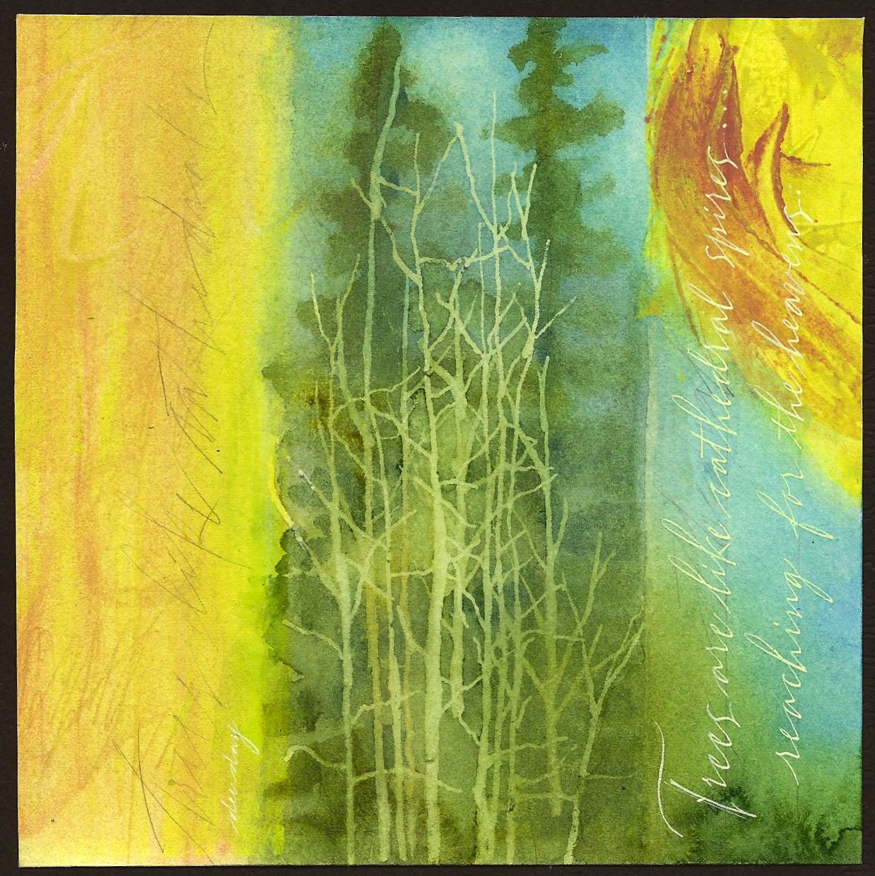
"Trees Like Cathedrals" (sold)


(sold)

The quote reads...."Trees are like cathedral spires reaching for the heavens."

This is the first time since blogging that I've placed the quote in a vertical orientation. It does make it harder to read, but I just had to do it in this case.

The limbs on the barren trees in the foreground and the yellow "sun like" shape in the upper rt. quadrant help to counter balance the predominantly vertical shapes. This is just one of the advantages of working with a square. Since it has no particular horizontal or vertical orientation, you can decide that by dividing up the square in a particular way.

I did paint the trees with transparent watercolors. However, the barren trees were masked out with Pebeo Masking Fluid first. It is easier to achieve a random look by applying the mask with one of the wooden picks used to clean your teeth. (Found with the toothpaste and manuf. by Johnson and Johnson.) Using these will also save your brushes from destruction. Pebeo Masking Fluid can be hard to find. Order from Paper and Ink Arts. It is very useful when trying to preserve portions of previous layers. If you've not used it, give it a try!