Showing posts with label Trees. Show all posts

Wednesday, November 21, 2012

"Close Harmony"

($40.00.....6" x 6"....Water Soluble Oils on Gessobord)

"Close harmony is always pleasing."  And it applies to so many things. Close harmony in music, in relationships, and in art is soothing to the soul.

This piece was inspired by a reference photo taken in North Carolina. We simply do not have too many of these type of brilliant yellow/green trees in Central Texas. I was drawn to it because of the close harmony and so, of course, it is an analogous color scheme (two to four colors adjacent to each other on the color wheel).

I've always loved yellow/green with a deep blue/green. And it is not as visible on your computer screen, but it is a stunning combination. My encouragement today is to make full use of your color wheel and increase in your knowledge of color. There is a lot of information packed onto that wheel which is extremely helpful in identifying the root color of any color you see, remembering that all colors originate from the twelve colors on the color wheel.

You will notice that I did not call the blue/green by its common name which would be turquoise. It is important to begin calling colors by the name that appears on the color wheel because it is a more accurate description of where to start mixing. It also gives you the basic color schemes and the tints and shades of all of the root colors.

There are slight variations in color from brand to brand so it is also useful to mix the colors from the brand you particularly like and use that as a reference for yourself. Nothing will help you more than creating a painting and mixing all of the colors you need from a limited palette. 

The first painting class I ever took, we were required to mix all of our colors from Cad. Yellow Light....Ultramarine Blue, Cad. Red. Medium....and White. There are artists who still work that way. It's a great discipline to get under your belt which is another reason you are seeing so many oil paintings on this blog. And there you have it...just a few more things to think about. 

Please contact me personally to inquire about this piece.

Saturday, January 21, 2012

"Out on a Limb"


($40.00....6" x 6" mounted on a 1/8" depth clayboard panel)


"If you go out on a limb...make sure it will hold you." This quote is all about being prudent. Rather than blindly going into a situation, it is best to look at it from every angle and count the cost before going out on a limb that isn't strong enough to hold you. There are also times when it's prudent to take a risk and have the faith to see it through. Wisdom is knowing the difference.

This is such a simple layout and leads me to ask why I ever took a picture of a tree limb like this. It is not the typical thing that people whip out their camera for. Having said that, I think digital cameras have opened up a treasure trove of inspiration for experimenting with cropping and choosing images that have an abstract or poetic "feel" that can form the core of a piece of artwork. This image could have also been painted entirely.

It is not necessary to set up a still life or paint the traditional landscape. Why not try painting things that are totally unexpected. Today's image would make a great painting, especially if it were done much larger. Many techniques could be used and subtle color changes that would look great as an oil or acrylic painting. So my creative thought patterns keep evolving and wondering how many different ways this composition could be interpreted. If you can zoom in on very ordinary objects and then do some effective cropping, I think some very exciting artwork would emerge. Just something to try or think about.

Please contact me personally to inquire about this piece.

Friday, January 20, 2012

"Astray"


($40.00......6" x 6" mounted on a 1/8" clayboard panel)


"Stray thoughts lead to actions gone astray." There are other words that give a deeper insight to the word "astray".   Such words as wander, drift, sidetracked, and digress are just a few. Taking control of our thought life and staying focused is worth the effort. Who would want go astray and end up in the weeds?

This is the second piece in a small series that could be called "going out on a limb." The line work in this barren bush going off in all directions was a good image for the quote today. In case you missed another time when I talked about the process of coming up with quotes, let me repeat myself. Today is my 316th posting. I have tried every sequence that came to mind such as coming up with the quote first, thinking about it in the middle of the process, or waiting until the image is done. The last way is the easiest and most integrated way for me. If I am passionate about the process and the image, there is always a quote to be written. The image then becomes the metaphor for what I am saying.

You might find the writing of quotes satisfying so I encourage you to give it a try. That way you're using both sides of your brain simultaneously. Just something to think about.

Please contact me personally to inquire about this piece.

Thursday, January 19, 2012

"Lines and Boundaries"


($40.00.....6" x 6" mounted on a 1/8" depth clayboard panel)

"Lines capture visual space much like boundaries protect our goals." No one likes to be excluded so it goes against the grain of most people to set a boundary that protects the time it takes to achieve a goal. It is difficult to negotiate, but boundaries are really the only way things get done. The person who cannot say "no" is the person perpetually frustrated trying to please the whole world.

Before the spring comes and leaves cover the trees once again, try to take note, sketch, or paint some tree limbs. It is a great way to study division of space created by multiple lines. Trees will give you the opportunity to see how they intersect, form diagonals, and even very straight lines. I've been doing a study of them for a long time with my camera, but I also plan to draw some as well. It will also give you practice in how branches jut off from the main branches and how the graduated effect of how they get smaller as they get further away from the trunk. It's quite fascinating.

Even though I have been writing more expressively and experimenting with some gestural forms, this piece was screaming out for one or two lines of script. When a piece has this many diagonals, I don't think it looks good to also introduce more diagonals and freely written letters. The piece needed a couple of straight lines.

I did use a lot of soft pastels and pencil lines to accentuate the image that was already there in the photo. It was a photo taken in Sedona, Az., with rock formations in the background. Not everything can be the focal point so it is very good to edit by choosing what to emphasize. Don't hesitate....but get your camera and get some shots of those trees before the spring. Just a few more things to think about.


Please contact me personally to inquire about this piece.

Saturday, December 31, 2011

"A Way of Seeing"


($40.00....mounted on a 1/8" depth clayboard panel)


"Drawing is a way of seeing that transcends a brief and casual observation." Even if you do not draw, the principle of keen observation is applicable in all areas of life. Awareness must come before change occurs.

Trees, especially when the limbs are exposed, is a fascinating study of line. The diagonals created by the branches with abrupt changes in direction have been a source of inspiration for artists in every medium. By its very nature, the act of drawing or sketching causes the artist to consider every aspect of the shape and form of the object being drawn.

The lettering was written with a pointed pen and more or less drawn rather than using a press / release technique. I decided not to use any guidelines to practice squeezing and stretching the letters as I went along. The "white on white" effect always works especially if writing on a hazy translucent white. In several places I also used a stiff brush dipped in alcohol to remove some of the white gesso. It creates a bit of texture and an aged look along the edges. Just a few more things to try or think about.

Please contact me personally to inquire about this piece.

Tuesday, December 20, 2011

"Star, Bell, and Tree"


($40.00.....mounted on a 1/8" depth clayboard panel)


"A star, a bell, and a tree converged on the landscape with warm greetings." This beautiful photo was taken in Silverado, Colorado. Enjoy all the beautiful images you see as you move through your day. They are everywhere!

There is a beautiful contrast in this piece between organic and manmade shapes. Both shapes extend from edge to edge vertically, making it a great division of space. They are harmonious in the sense that they're both vertical and have an apex at the top, but they also have extreme contrast in texture, color, line, and shape.

The focus on photography this month has made me even more aware of how much can be learned about composition so quickly. If you have young people in your home or life, it can also be a way to ease them into understanding composition and move into the technical aspects of drawing and painting. (It is useful to carry a small camera in your purse or backpack with a zoom lens for those unexpected things you might see while you're out and about.)

For those of you who are into offhand flourishing, note the placement and direction of the flourish. It leads your eye right to the tree, bell, star, and quote. It's almost like an invitation to come into the piece. Just a few more things to try or think about.

Please contact me personally to inquire about this piece.

Thursday, December 15, 2011

"The Fir Tree" (unavailable)


(unavailable)

"The fir tree poses like a living statue and throws its fragrance into the air." This is one of those poetic quotes that is designed to stir up special memories of Christmas trees in the home or the undecorated ones still in their original setting. Have fun thinking about and enjoying the trees in or out of the house.

Today is my 280th posting and it causes me to stop and think more deeply about process and how artwork gets created. I have noticed that most people, including myself, get to a certain level of proficiency and then tend to coast. The artists that truly excel are the ones who keep pushing through to the next level, continuing to notice the little "nuances" that will make their work better.

After blogging day after day, I will admit that there are days when weariness sets in and surrounds me like a fog. But because I'm a determined "little 'cuss", I have ploughed through the fatigue and much to my amazement, it is that process of moving forward in spite of obstacles that causes me to dig deeper. So I guess my point is...to never give up and keep honing your observation skills, keep practicing, keep taking classes, and eventually it all comes together in a way that is satisfying to you and others. Just some words of encouragement to think about.

Sunday, November 27, 2011

"Aspens (4)"


($40.00.....mounted on a 1/8" depth clayboard panel)

"Aspens are like gold coins shimmering in the breeze." This is the last of the aspen series. For me, it was the perfect way to end up November and appreciate what God has created for us to enjoy. Thanksgiving has passed, but hopefully it will be in our hearts every day of the year.

Combining and exploring techniques has been one of the joys of working in mixed media. I truly appreciate and enjoy my friends who work in total realism, but for me, the idea of coming up with totally different looks that include lettering is my true passion. And I tend to want to do something for a few days and even weeks, but then I sense something within telling me to combine the things I know, add something new, and let the images continue to "morph" into something else.

Before going on to explore something else, I do need to say something else about lettering on top of pouring medium which is the top layer on the last six days of photography. I have used the same lettering style for the Aspen series. Moon Palace (diluted a bit) and a Mitchell (6) were the ink and nib used. And even though Moon Palace ink is very black and dense, one pass over this surface was not adequate. I did go over each letter again to make it bold. It does take practice to go over the same letter and place your pen in the exact same place again. It requires your best vision and best lighting arrangement. I have noticed that some of my script students are not always prepared to use a magnifying jeweler's hat or reading glasses even though they have trouble seeing up close. If you truly want to letter, it is imperative to be able to see well up close....especially if you're trying to retrace a letter.

I did use some background pencil lettering and lines in this series and in much of my other work. There is a softness and hand lettered quality to pencil lines....even more so than pen and ink. Pencil lines indicate a human presence even more than ink because it is similar to doing a sketch or a preliminary study. It is so compelling that even non lettering mixed media artists like to include pencil. These are just some things to try or think about.

Please contact me personally to inquire about this piece.

Friday, November 25, 2011

"Aspens (2)"


($40.00....mounted on a 1/8" depth clayboard panel)


"Aspens and evergreens live together in perfect harmony." This is another photo from Hyde Park in Santa Fe. Before Christmas overtakes us all, it is refreshing to the soul to linger a bit in the company of Aspens dressed in yellow. Enjoy.


If you have a desire to learn this "encaustic like" effect over a favorite photograph, refer to "Aspens (1)" for details. There is a tip regarding the lettering that might be useful before you get carried away. This is not like writing on paper. You will not be able to attack this surface with the same energy you do on unprimed paper. It requires an extremely light touch, barely skimming the surface. The energy and form of your lettering must be practiced on paper first with a pencil to get the movement down before writing on your piece. The good news is that the surface preparation allows you to dip a stiff brush in water and remove any mistakes. (I have taken out whole lines of lettering before.)

As for all of you color enthusiasts....it's time to analyze what is going on with the colors in this photo and why we are captivated by this particular arrangement. First of all, yellow and blue are split complements, so by including a portion of the sky, you automatically have a combination that satisfies that need for the eye to find the complement. Second of all, even though you may not see any red, I can assure you that if you tried to mix a "rich" deep green as you see in the evergreens, you would need to use some red. And red and green are the two most powerful direct complements. The conclusion is that a close study of nature will actually help to understand what colors to use together and why. So get out your "trusty" color wheel and mix away! Just something to try or think about.

Please contact me personally to inquire about this piece.

Wednesday, November 23, 2011

"Curtain Call"


($40.00)


"Enjoy the fall before the curtain closes on red, orange, and yellow and opens again to the faithful evergreens." This photo was taken in Hyde Park in Santa Fe. There are a few spots of color here in Central Texas so try to visually drink that in, but also enjoy the vicarious experience of fall in other parts of the country. The curtain is about to close.


Yesterday, I gave a step by step instruction on how to incorporate your photos into a piece of artwork. This hazy look created with Titan Buff (Golden) plus Liquitex Pouring Medium will do this for you in varying degrees of opacity.

Abstraction describes the essence of something real and anything that is altered can be considered an abstract. Just painting red, yellow, and orange on your design space in geometric form or a few organic shapes could be an abstract of a fall landscape even though you would not see actual trees in that kind of presentation. In the case of photography, additional paint and mediums or inclusions can blur the edges between total realism and abstraction so in that sense, I have abstracted the photo. In days to come you will probably see me do it a little more drastically. The point is perfectly summed up in a quote by Pablo Picasso..."There is no abstract art. You must always start with something".

If you are interested in brief dissertations on abstraction as well as other prominent "design" words, I highly recommend a book by Tim McCreight entitled...Design Language. It can be ordered from John Neal Bookseller and will give you many insights into design.

The following direct quote from this book will give you the flavor of its pages. "Some people think abstract art just means something weird-looking; this is incorrect. Weird is easy but abstract work springs from, and must be responsive to a physical reality." So there you are. Just a few things to think about.

Please contact me personally to inquire about this piece.

Tuesday, November 22, 2011

"Aspens (1)" ($40.00)


($40.00)

"Aspens pierced the landscape with yellow brilliance." As Thanksgiving approaches, I wanted to focus on the fall landscape with a new technique using photography. We don't have aspens in Central Texas, but we can certainly enjoy them from a distance. This is the first in a series of four. Enjoy!

The first thing to do if you are interested in trying this technique is to print a favorite photo onto Arches Text Wove. It is a lightweight watercolor paper that will feed through your printer. The only problem is that it is too lightweight to receive product like Pouring Medium. So after you have made the print, spray at least 2-3x with Spray Acrylic Coating (Krylon). Moisture will cause the toner to bleed.

The next step is to mount the photo onto a 1/8" Clayboard panel or 1.50" depth Cradled Clayboard. Use Gel Matte Medium to adhere the print and then cover it with wax paper and place it under a book with a rock or brick on top.

In just an hour or so, you will be able to mix up some Pouring Medium with a bit of acrylic. (Fluid Acrylics are best) In this piece I used Titan Buff (Golden) mixed with the medium and poured it over the piece and spread it with a palette knife. It covers the photo with no transparency at this point until you hold it over a paper plate and spray with water, allowing a lot of the paint mixture to drip off. By spraying in a particular area where you want more visibility you can achieve some interesting effects. After allowing to dry overnight, the surface is ready to be prepared for lettering. (Check previous postings for surface preparation) This is something you might want to try or think about. When all is said and done, the photo has a hard film over it which offers complete protection without glass.

Please contact me personally to inquire about this piece.

Tuesday, August 23, 2011

"The Shade Tree" (sold)


(sold)

If you are blessed to have a large tree either in your yard or surrounding area, then you can appreciate its significance. Perhaps you've noticed how quickly all of the parking places near a tree get "snapped up" as we continue to endure the Texas heat. Trees are good!

The primary appeal of the tree in this piece is the transparent watercolor plus a "wet into wet" application. The soft blurring of color is a great contrast to the hard edges of the tree's outline. The contrast in color was "bumped up" in the lettering and the dark areas of the foliage with the addition of Perylene Violet Gouache (WN). Violet is a split complement of green which gives a more subtle contrast than a direct complement.

Shapes and division of space are always present in my thinking process. By extending the tree from top to bottom and choosing a tree with interesting branching, I was able to mimic the same shapes that were present in the first layer of paste paper. Extending lettering, shapes, and imagery from edge to edge is so much more exciting than placing everything in the center. And that is something to really think about!

Sunday, May 29, 2011

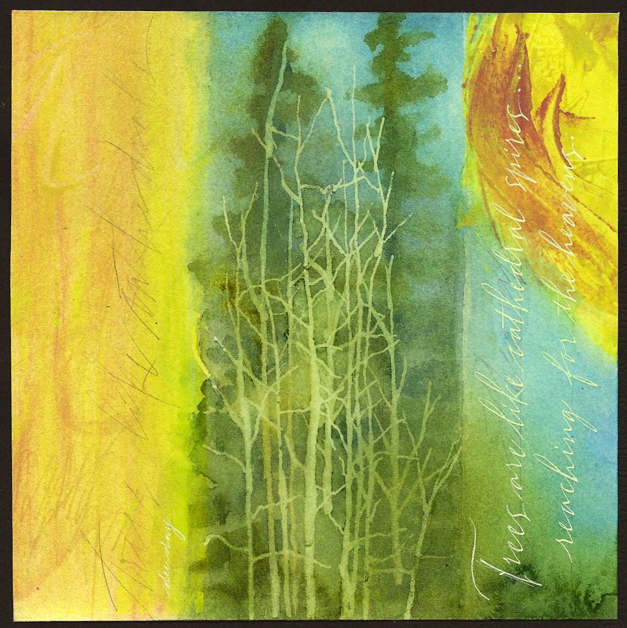
"Trees Like Cathedrals" (sold)


(sold)

The quote reads...."Trees are like cathedral spires reaching for the heavens."

This is the first time since blogging that I've placed the quote in a vertical orientation. It does make it harder to read, but I just had to do it in this case.

The limbs on the barren trees in the foreground and the yellow "sun like" shape in the upper rt. quadrant help to counter balance the predominantly vertical shapes. This is just one of the advantages of working with a square. Since it has no particular horizontal or vertical orientation, you can decide that by dividing up the square in a particular way.

I did paint the trees with transparent watercolors. However, the barren trees were masked out with Pebeo Masking Fluid first. It is easier to achieve a random look by applying the mask with one of the wooden picks used to clean your teeth. (Found with the toothpaste and manuf. by Johnson and Johnson.) Using these will also save your brushes from destruction. Pebeo Masking Fluid can be hard to find. Order from Paper and Ink Arts. It is very useful when trying to preserve portions of previous layers. If you've not used it, give it a try!