Showing posts with label Pencil. Show all posts

Monday, August 5, 2013

"Variegated I" (draft 1)

(image 1)

(image 2)


The word "variegated" has always fascinated me. It reminds me of variegated embroidery thread and some of the work my mother enjoyed stitching onto pillow cases. Of course, I haven't seen an embroidered pillow case in years, but the memory will never fade.

After hosting a  contemporary watercolor workshop this past weekend with Mandy Gregory, I am, of course, now very involved with watercolor. So what you see today is two 8" x 8" pieces with two glazes and a bit of penciled lettering.

I began two pieces just in case one of them doesn't work out. But I also used different techniques with each one. In (image 1) you see the color applied to the wet paper by floating the watercolor on glass and laying the paper in the paint to create a mono print. The first layer in both pieces was a dilute portion of Neutral Tint Watercolor (Daniel Smith Brand)

In the second image, I used a mop brush to apply the dilute color to the paper with only one pass of the brush for each shape. After the first layer dried, I rewet the paper on both sides (lightly with a flat brush) and used a very dilute portion of Alizarin Crimson Watercolor (Daniel Smith Brand).  And after the second layer dried completely (bone dry), I wrote the word "variegated" with pencil on both pieces with a different placement for each.

My inspiration for this piece is coming from an "Angel" plant that has variegated color on the top of the leaf and deep red purple on the underneath side. The most important thing to know about glazing with watercolors is to lay down the color with as few strokes as possible and then leave it to dry naturally (bone dry) before laying down another color. If these two principles are not followed, the luminosity that is the primary characteristic of watercolors will be lost forever.

It is also a good idea to leave some of the white of the paper showing through or at least a very pale wash showing through. The last "take away" is to go from light to dark (most of the time) and build up the values gradually, making sure the paper is completely dry in between glazes.   And there you have it...just a few more things to think about.

Thursday, July 11, 2013

"Cathedrals" (draft 2)

(image 1)

(image 2)


No quote yet, but by tomorrow, I feel sure I will have one. As you can see, there have been many changes since yesterday. I am going for a very ethereal look.

Last evening, after viewing my piece several times during the day, I had the urge to go over the cathedral imagery again with the same colors plus adding some alizarin crimson to the yellow shape. I also laid a kleenex in a place or two to lift part of the color. It was left to dry overnight.

This morning, one of my first questions was how much detail to add....what tool to use....what color and type of pigment. I began with moon palace ink and a pointed nib, but decided to go with something a bit more graphic and found a hand cut stamp of a cathedral that I cut several years ago. Rather than inking the whole stamp, I chose fragments and stamped those on with Speedball Printing Ink applied with a brayer.

After writing a few words and creating different types of line work, I dried the piece...sprayed (3x) with spray acrylic coating. The reason I sprayed that many times was due to the thickness of some of the ink. After drying the piece again, I used a sponge brush and applied dilute gel matte medium 2x. After drying that layer, I laid in the dark shape which was cobalt blue + brt. sienna gouache. The reason I chose that medium is the ability to lift it if I didn't like the result. Because it is an opaque watercolor, it also has a bit of a translucent effect in places. (You do need to brayer it on and then keep brayering until it becomes smooth.)

White gesso was also added (1:1 ratio with water) and dried. Alcohol and a brayer were used alternately over the gesso to create the texture you see in image (2). I also repeated all of these steps....spraying...brushing on med...adding more gesso...etc. until satisfied.

Today I will be studying this image and seeing if I need to do anymore "tweaking" of values and shapes before deciding on the lettering. So far...I have asked and answered (30) questions about this piece. And there you have it...just a few more things to think about.

Thursday, June 6, 2013

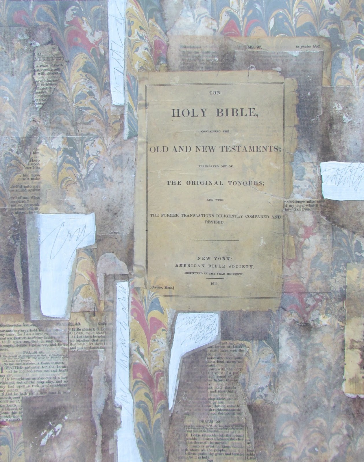
"He Heard My Cry" (final)


($250.00.......11" x 14".....Mixed Media....Kiln Formed Glass...Presented in a Custom Frame)

"I waited patiently for the Lord; he turned to me and heard my cry." (Psalm 40:1....NIV) After (5) drafts, the piece is now done. Hope you have enjoyed watching the process. I will be doing one more psalm and it will be the largest.

The only thing I added to the piece since yesterday was the white lettering. I alternated between ruling pen and a Speedball C-5 using WN Bleedproof White Gouache. I then touched up with a Leonardt Principal Nib. My goal was to create some expressive lettering with a lot of line variation.

Just to recap some of my thought processes...I did keep everything in the realm of the book arts. All of the materials used would be elements that one might see in a book. Even the glass inclusion has some non verbal lettering. What brings it into the realm of fine art is the design, the materials used (all archival) and the presentation. It will be presented in a very historical looking frame, under glass, with a balsa wood spacer in between the glass and artwork. (This creates a shallow shadow box and is a very elegant way of presenting this type of work.)

My total focus in combining all of the elements was to integrate a wide variety of shapes and values, as well as the three focal points of all of my artwork which is opacity, transparency, and translucency. Integration was achieved by having echoes of all of the elements throughout the piece.

As I said earlier in the process, any artist could have stopped just by laying down the marbled paper....followed by the one text page and handmade paper....ending with the glass element. There is nothing inherently wrong with doing that, but it is infinitely more interesting to have many layers of papers. And by choosing what to reveal and conceal, the shapes are arranged in an interlocking fashion with a lot of variation in value which creates depth.

So if you haven't tried this type of layering, you might want to give it a try. Shapes can also be created with paint...followed by the inclusion of papers in select areas. There are some artists who collect old pieces of paper off of the ground for heaven's sake!

The sky is the limit. Just keep the main thing, the main thing and keep it simple. It will get complicated enough with the selection of just (3 or 4) elements. Remember that all I selected in the first draft was a sheet of marbled paper, a fragment of handmade paper, and a piece of kiln fired glass. And there you have it...just a few more things to think about.

Please contact me personally to inquire about this piece.

Wednesday, June 5, 2013

"He Heard My Cry" (draft 4)

(image 1)


(image 2)


The draft from yesterday bothered me a lot so I have spent one more day adjusting values by removing some of the darker values with a stiff brush and rubbing alcohol in addition to adding more rice paper. Today I am satisfied that I can now deal with the lettering. Notice that the shapes are much more identifiable and you can see the range of values from light to dark.

As I expected, looking at draft (3) on my iphone led to an immediate conclusion that the values were still wrong. At first I thought it would just be a matter of removing some of the darker values with rubbing alcohol, but that was not enough.

So this morning I made the decision to add more rice papers to lighten up several of the shapes that connected to the focal point and went to the edge. I also knew that placing rice paper over a semi medium value would not be light enough so I painted those shapes with (2) coats of white gesso. I dried them and then did some writing in pencil over the gesso. That's what you see in (image 1).

The next step was to place some plain rice paper over each of those areas and cut around them with a break off knife right on the piece.  Those areas were slightly smaller than the previous layer so the edge of the underneath layer would show. After adhering the papers and drying them, I sprayed the piece with acrylic spray coating and brushed on (2) coats of dilute gel matte medium.

I integrated those areas into the piece by brushing over them with a light gray. There was one more area on the left edge where I laid down two more pieces of rice paper...followed by drying and brushing with soft pastels again. All of this was then sprayed again with acrylic coating and the handmade paper set into place. I then placed the piece on the floor...added the frame to check the values one last time. 

The new areas were still a bit too dark so I removed some of the color with a stiff brush and rubbing alcohol. The piece was sprayed again followed by preparing the surface for lettering. I did some pointed brush lettering at the bottom, but didn't care for it, so I washed it off with a brush dipped in water followed by blotting. What you see in image (2) is the end of the background.

The lettering will be the final touch. I hope you see how the shapes are much more defined and you can actually see a range of shapes and values now. And there you have it...just a few more things to think about.

Wednesday, May 29, 2013

"Road Tested" (final)

(final)


($250.00.....11" x 14".....Mixed Media and Kiln Formed Glass on a Gesso Panel....Presented in a 4" Width Frame)

"Every God direction is road tested. Everyone who runs to him makes it." (Psalm 18: 30...from The Message) Eugene Peterson did an excellent job of writing the Bible in contemporary English. The words bring a lot of visuals to mind. This is the final and will be presented in a 4" width historical looking frame.

Since yesterday and after going to find a frame...I fully realized that black and white combinations (as wonderful as they are) can also be very cold in visual temperature. So I purchased a frame with some of my favorite molding which has a lot of brown.

When I got home, I decided to check out my stash of kiln formed glass and found a piece with lots of black, but also some yellow which looked like raw sienna. That selection sent the entire piece into a different direction.

I took a leap of faith and brushed on several colors of soft pastels over the rice papers. Of course, when you do that, the edges become prominent and the places where the gel matte medium "oozed" out also became prominent. I used brown, raw sienna, and burnt sienna pastels with touches of charcoal powder.

After securing all of that with spray acrylic coating, I added a few more plain pieces of rice papers. You can tell which ones they are because they are much lighter. After drying the new papers,  I also brushed on a bit of color over these papers but just enough to integrate them into the piece.

As I went along, I kept checking how the piece looked in the frame and when I was fully satisfied, I sprayed the entire piece (2x) with spray acrylic coating and let it dry overnight.

This morning I prepared the surface for lettering...practiced for at least 1.50 hours and then wrote the verse on the final. I feel completely at home with this look and since the Psalms make us feel comforted, I especially am pleased to have added lots of warmth to the piece.

The kind of depth in layering is also reminiscent of some of my old work so it all feels good to me. The most important thing I took away from working on this piece was not to be afraid to let the piece "morph" in a different direction. I also learned that soft pastels are a very happy companion to rice paper and add a layer of depth and ethereal qualities that are quite compelling. And there you have it...just a few more things to think about.

Saturday, May 26, 2012

"Breath"


($40.00.....6" x 6".....mounted on a 1/8" depth clayboard panel)


"Process is the breath of creativity." It is absolutely true that process is the name of the game in the art world. Without process, nothing happens. Whether the art work is accomplished is directly related to the quality of the process.

This is an unusual piece and not the type I typically create. I began by applying gesso over a sheet of Arches Text Wove and adding texture with drips, blobs, and gestural marks. This was left overnight to dry. (You can drive yourself crazy trying to dry those thicker areas of gesso with a hairdryer.  It's worse than watching paint dry!))

This morning as I was looking through my writing pad, I noticed the orange circles that a container of gouache had made on my practice sheet. All of a sudden I had the brilliant idea of printing this bit on silk tissue paper. I then searched for several other bits of practice with all kinds of scratching, brush marks, testing my pen, etc. After printing them on tissue paper, I overlaid them one by one and adhered them with gel matte medium right out of the jar. And the paper is so thin that you can see everything underneath each layer. The obvious selection for a quote was to write one about process.

I was actually surprised at how well it turned out. It's very graphic and very contemporary looking from across the room. There was no need to color the gesso so I left it in its original state with just a touch of soft pastel at the bottom. I guess the moral of this posting is not to throw away any of your scribbles and bits as you work. They could become your next piece of art work. Just a few more things to think about.


Please contact me personally to inquire about this piece.

Friday, May 25, 2012

"Limes"


($40.00.....6" x 6".....created on a 1/8" depth clayboard panel)


"Limes are a refreshing summer fruit." Friday is a good day to be lighthearted. Enjoy something as simple as fresh fruit with all of its color.

Today's piece is actually a collaboration. Sue Costa applied the molding paste and the stamped imagery of what became the limes. She also applied a bit of color. It was then my job to finish the piece and get it posted.

Apart from the limes, the shapes are soft and defined by color alone with no hard lines. However, when there is this much texture applied in this way, there are many smaller shapes created. After determining that her circular stamped shapes were going to be limes, I applied some newsprint with a lime green followed by some pencil lines. I then prepared the surface to receive pastels by brushing on some Liquitex Clear Gesso. The aqua and lime green pastels then formed a block of color running down the right and bottom edge. The placement of lettering was then easy to locate. It needed to be at the center of interest and connect the fruit shapes.

Working on a collaboration with another artist is a wonderful design exercise and will teach you how to give up control. I had to build this piece based on someone else's choices. Now it is my time to return the favor and begin a piece for Sue to finish and post on her blog. We'll see how that goes. Chances are it will be exciting and fantastic. So there you have it. A few thoughts about collaboration and what you can learn from this process.

Please contact me personally to inquire about this piece.

Wednesday, May 23, 2012

"Destination" (sold)


"Choices determine destination." This can be an exhilarating and terrifying thought at the same time. It is true that we all make choices that take us down a particular path. We need to make sure it's the right one.

This piece marks a return to a gesso layering technique that creates a mysterious "veiled" effect. It is very satisfying to do and requires a reaction to what is going on as you work far more than other techniques. It is important to continue realizing that paintings are made up of shapes.  The shapes in this piece were created with many layers, alternating between gesso and washes of gouache and lettering.  (I also sprayed the paper and prepared it to receive the next layer with diluted gel matte medium three separate times.)

I deliberately kept the color subdued, but also paid attention to the values which led to the olive green connecting to the edge from top to bottom in an erratic sort of line. Edge to edge creates a division of the entire design space right off the bat and is a very important part of having a good foundation to the painting. And it doesn't need to even be as prominent as I made it in this piece, but there needs to be a division created by color, line, or different shapes.

Another design decision that goes well with gesso is all of the pencil lines. All of the lettering in this piece was written with a normal .05 mechanical pencil sharpened on a sandpaper block. It is also good to hold the pencil vertically. If you are holding it at a slant, you are not writing with the sharpest point of the pencil. Just a few more things to think about.

Sunday, May 20, 2012

"Unique" (sold)


(sold)


"Patterns of creativity are fascinating, God given, and unique as fingerprints." After teaching a class, I am always amazed at how many different ways the same technique gets interpreted. That thought prompted the quote today. It is a reminder that all of us are unique and need to value our own creative voice.

This piece is all about drama and contrast. Notice that there is a thin ribbon of black in the pouring medium and also in the butterfly. It is wise to be very prudent when using black unless you are creating a black and white piece with variations of gray. In this technique, where the color still feels like it's moving even after it's dry, black can overpower the piece and scare you half to death. I'm not kidding! That actually happened to me and I immediately threw the piece in the trash.

The pencil lines in the first layer and the word fascinating written and going underneath the butterfly plus the quote offer a wonderful contrast to the intense color and very abstract piece of artwork. Pencil and charcoal lines show the human gesture and individuality of the artist. It seems to say....a human being touched this art piece. It was not created by a machine. It is very important to show your unique marks in your art.

Even in the act of pouring color on the paper, each person approaches it with a certain kind of movement unique to them. It is quite fascinating and I hope this gives you a few more things to think about.

Wednesday, April 25, 2012

"Forward Thinking"


($40.00.....6" x 6"....mounted on a 1'8" depth clayboard panel)


"Forward thinking is a combination of past experiences plus one new thing." It is so easy to stay in our comfort zones and never include new ideas into our thinking. We can all be forward thinking by thinking and doing new things.

This is a very graphic piece because of the presence of straight forward blocks of color and lettering with very hard edges. Fortunately, the burnt sienna with its diffused edges occupies almost half of the design space. It's a great contrast and considering edges is a hugh part of a successful piece.

The pouring medium in this piece was left to dry after pouring onto very wet paper. (under the faucet kind of wet) By not blending the color externally in any way, you can retain a few sharp edges to your color. The burnt sienna has more diffused edges because it was the outside color and probably a bit more wet. The black is held in place by a dense application of titan buff on one side and the burnt sienna on the other. So where you place your color is very important.

The pencil lettering and erratic lines take on a more prominent role in this piece which gives it a very real human touch. We can often reproduce elements on the computer for inclusion, but pencil marks, especially when they are gestural in quality, give the viewer a sense of the human touch in the work. Just a few more things to think about.


Please contact me personally to inquire about this piece.

Sunday, November 27, 2011

"Aspens (4)"


($40.00.....mounted on a 1/8" depth clayboard panel)

"Aspens are like gold coins shimmering in the breeze." This is the last of the aspen series. For me, it was the perfect way to end up November and appreciate what God has created for us to enjoy. Thanksgiving has passed, but hopefully it will be in our hearts every day of the year.

Combining and exploring techniques has been one of the joys of working in mixed media. I truly appreciate and enjoy my friends who work in total realism, but for me, the idea of coming up with totally different looks that include lettering is my true passion. And I tend to want to do something for a few days and even weeks, but then I sense something within telling me to combine the things I know, add something new, and let the images continue to "morph" into something else.

Before going on to explore something else, I do need to say something else about lettering on top of pouring medium which is the top layer on the last six days of photography. I have used the same lettering style for the Aspen series. Moon Palace (diluted a bit) and a Mitchell (6) were the ink and nib used. And even though Moon Palace ink is very black and dense, one pass over this surface was not adequate. I did go over each letter again to make it bold. It does take practice to go over the same letter and place your pen in the exact same place again. It requires your best vision and best lighting arrangement. I have noticed that some of my script students are not always prepared to use a magnifying jeweler's hat or reading glasses even though they have trouble seeing up close. If you truly want to letter, it is imperative to be able to see well up close....especially if you're trying to retrace a letter.

I did use some background pencil lettering and lines in this series and in much of my other work. There is a softness and hand lettered quality to pencil lines....even more so than pen and ink. Pencil lines indicate a human presence even more than ink because it is similar to doing a sketch or a preliminary study. It is so compelling that even non lettering mixed media artists like to include pencil. These are just some things to try or think about.

Please contact me personally to inquire about this piece.

Monday, September 5, 2011

"The Fragrance of Nostalgia" (sold)


(sold)


"Lavender fills my senses with the fragrance of nostalgia." It's one of those fragrances that never seems to go out of fashion. I even have spray starch that smells like lavender! Yes, it 's nostalgia that perfectly describes this scent.

In this piece I began with a very dilute yellow and alternated that with Transparent Raw Umber (Liquitex) and dilute applications of gesso. Throughout this process, I made sure my one dominant window of darks remained that way.

Everyone that's taking a script class from me knows I have a love affair with pencil. Most of the time, I use a Bic mechanical pencil (.5mm) and sharpen it on a sandpaper block. Graphite and gesso go together well, so it's a great choice in those types of pieces.

There are several reasons to develop the pencil habit. First of all, it's extremely portable. It can also be used to write in any direction with no resistance. It enables you to practice and develop muscle memory without having to think about pen and ink at the same time.

Here is a hint or two. If you do decide to pick up a pencil, turn the pencil in your hand after every letter or two in order to be writing with the sharpest part of the point. Hold it vertically to make sure you're writing on the sharpest part. After every few letters, twirl on the sandpaper block again. Just something to do or think about.

Saturday, June 18, 2011

"Rio Grande" (unavailable)


(unavailable.....in the permanent collection of dee day)

This quote is so appropriate since there are two rivers that form our western and northern boundary lines. Besides, I just like to say and write "Rio Grande". There is something about it that has a tremendous amount of grandeur and presence.

This piece was created with overlapping forms and a progression of built up texture. The first layer of color was applied wet into wet to form diffused and gradated edges of color with minimal texture such as the vertical gestural marks on the right. In the second layer, white gesso was added in upper left and lower right hand corners with expressive marks written in the gesso followed by additional color added to those areas only. The third layer was created with overlapping forms such as the stamped image of Rio and the pencil drawing of the state of Texas. Finally, the quote was added.

This posting was designed for my class in Houston. They will be creating a (6" x 6") tomorrow using geometric forms.

Please visit my ebay listing to bid on original art from Dee Day Art Journal Painting a Day.
Dee Day ebay

Wednesday, June 8, 2011

"The Two Step" ($30.00)


(adjusted price....$30.00)

Growth is often difficult, especially when any of us feels like we're taking two steps forward and one step backward. Just remember that two minus one equals one. Even in these instances, one step of progress was achieved.

This piece has a lot of lines running through it because I took a stylus and made erratic lines by impressing them into the paper before applying color. It's a wonderful way to add more divisions of space and energy. If there are intersecting lines, it can give you a window to place lettering or an image such as the words...."two step". This technique can be addictive so beware of that when you give it a try. It also helps to close your eyes and make some lines going from edge to edge. They will be more spontaneous that way. The idea is not to make them look contrived.

Please contact me personally to inquire about this piece.