Showing posts with label Handmade Paper. Show all posts
Thursday, June 6, 2013
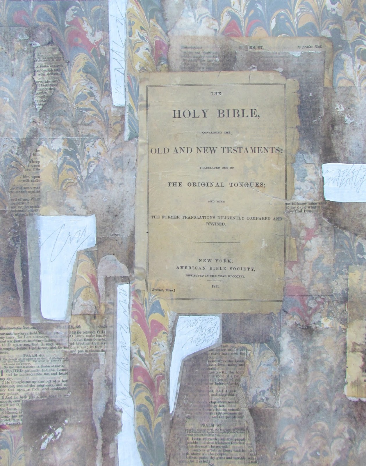
"He Heard My Cry" (final)
($250.00.......11" x 14".....Mixed Media....Kiln Formed Glass...Presented in a Custom Frame)
"I waited patiently for the Lord; he turned to me and heard my cry." (Psalm 40:1....NIV) After (5) drafts, the piece is now done. Hope you have enjoyed watching the process. I will be doing one more psalm and it will be the largest.
The only thing I added to the piece since yesterday was the white lettering. I alternated between ruling pen and a Speedball C-5 using WN Bleedproof White Gouache. I then touched up with a Leonardt Principal Nib. My goal was to create some expressive lettering with a lot of line variation.
Just to recap some of my thought processes...I did keep everything in the realm of the book arts. All of the materials used would be elements that one might see in a book. Even the glass inclusion has some non verbal lettering. What brings it into the realm of fine art is the design, the materials used (all archival) and the presentation. It will be presented in a very historical looking frame, under glass, with a balsa wood spacer in between the glass and artwork. (This creates a shallow shadow box and is a very elegant way of presenting this type of work.)
My total focus in combining all of the elements was to integrate a wide variety of shapes and values, as well as the three focal points of all of my artwork which is opacity, transparency, and translucency. Integration was achieved by having echoes of all of the elements throughout the piece.
As I said earlier in the process, any artist could have stopped just by laying down the marbled paper....followed by the one text page and handmade paper....ending with the glass element. There is nothing inherently wrong with doing that, but it is infinitely more interesting to have many layers of papers. And by choosing what to reveal and conceal, the shapes are arranged in an interlocking fashion with a lot of variation in value which creates depth.
So if you haven't tried this type of layering, you might want to give it a try. Shapes can also be created with paint...followed by the inclusion of papers in select areas. There are some artists who collect old pieces of paper off of the ground for heaven's sake!
The sky is the limit. Just keep the main thing, the main thing and keep it simple. It will get complicated enough with the selection of just (3 or 4) elements. Remember that all I selected in the first draft was a sheet of marbled paper, a fragment of handmade paper, and a piece of kiln fired glass. And there you have it...just a few more things to think about.
Please contact me personally to inquire about this piece.
Wednesday, June 5, 2013
"He Heard My Cry" (draft 4)
![]() |
| (image 1) |
![]() |
| (image 2) |
The draft from yesterday bothered me a lot so I have spent one more day adjusting values by removing some of the darker values with a stiff brush and rubbing alcohol in addition to adding more rice paper. Today I am satisfied that I can now deal with the lettering. Notice that the shapes are much more identifiable and you can see the range of values from light to dark.
As I expected, looking at draft (3) on my iphone led to an immediate conclusion that the values were still wrong. At first I thought it would just be a matter of removing some of the darker values with rubbing alcohol, but that was not enough.
So this morning I made the decision to add more rice papers to lighten up several of the shapes that connected to the focal point and went to the edge. I also knew that placing rice paper over a semi medium value would not be light enough so I painted those shapes with (2) coats of white gesso. I dried them and then did some writing in pencil over the gesso. That's what you see in (image 1).
The next step was to place some plain rice paper over each of those areas and cut around them with a break off knife right on the piece. Those areas were slightly smaller than the previous layer so the edge of the underneath layer would show. After adhering the papers and drying them, I sprayed the piece with acrylic spray coating and brushed on (2) coats of dilute gel matte medium.
I integrated those areas into the piece by brushing over them with a light gray. There was one more area on the left edge where I laid down two more pieces of rice paper...followed by drying and brushing with soft pastels again. All of this was then sprayed again with acrylic coating and the handmade paper set into place. I then placed the piece on the floor...added the frame to check the values one last time.
The new areas were still a bit too dark so I removed some of the color with a stiff brush and rubbing alcohol. The piece was sprayed again followed by preparing the surface for lettering. I did some pointed brush lettering at the bottom, but didn't care for it, so I washed it off with a brush dipped in water followed by blotting. What you see in image (2) is the end of the background.
The lettering will be the final touch. I hope you see how the shapes are much more defined and you can actually see a range of shapes and values now. And there you have it...just a few more things to think about.
Monday, June 3, 2013
"He Heard My Cry" (draft 2)
![]() |
| (image 1) |
![]() |
| (image 2) |
The title of my piece is now settled. It comes from Psalm 40: 1 . I have yet to decide on the translation so I will post the verse in the final. There will be one more draft before the final, but you can see that I have added some old bible pages and plain rice paper. The handmade paper and old introductory page (1911) are simply laying on the top and their placement will be decided today.
If you like this process of laying down one sheet of marbled paper and then laying down text and rice paper overlays, be sure to have extra of this paper for some final touches. Fortunately, I bought (5) sheets of this particular pattern and colors. I may be adding some pieces of that on top of some of the rice papers at the end.
So what I am trying to do with this process is create an interesting pattern with the text, rice papers, and marbled paper. And just a side note about marbled papers...even when they are mass produced, each one is different and has to be hand pulled from the floating colors in the vat. So they are essentially handmade and created on archival papers which makes them a superior paper to use unless you want to use your own handmade mono prints or other papers.
This particular pattern and colors integrates extremely well with old text pages and handmade papers. I will be adjusting the values of the plain rice papers today by brushing on some soft pastels. This will create the darks that are needed and also reveal more of the overlapping edges.
Since yesterday, I adhered the full sheet of marbled paper to 300 lb. HP. I did this so that I have cropping options. You can adhere things directly to a gessobord, but you will live with your beginning layout. I then added one layer of text pages and plain rice papers....some of them overlapping. I then took a photograph before spraying with acrylic coating so you could see how opaque those rice papers are before they are sprayed. That's what you see in (image 1).
The next step was to add more rice papers...overlapping some of the first ones, but always revealing the edge of the first one laid down. I then found the introductory page to my bible and want to include it with my handmade paper, but they are not adhered yet. I want to add my soft pastels first and adjust some of the values.
So I have more decisions to make today (including cropping the image to an 11" x 14"). I am confident it will be a well designed piece because of my initial choices of materials. It will dramatically change before tomorrow. And there you have it...just a few more things to think about.
Sunday, June 2, 2013
"Untitled" (draft 1)
![]() |
| (draft 1) |
A new day and the beginning of a new piece. It really isn't necessary to use all of your techniques in one piece. Visual overload is generally caused by including too much and not having the design elements well integrated. So stay tuned and watch the selection of (3) elements and how they will "morph" and change over the next few days.
All I am showing you today is the selection of three materials that please me, but more importantly, they all have common denominators and yet they contrast with each other texturally. The most common denominator in selecting materials to use in a piece is the design element of color. My first thought as I was considering a new piece was to do one more that included handmade papers, but do it in such as way that artists who might still be struggling with laying down colors and textures would find "user friendly".
So after deciding on a piece of handmade paper, I looked through my "stash" of marbled papers and found this beautiful antique paper which has a lot of white (common denominator with the handmade paper), but also has some beautiful passages of grays and a tint of red/orange.
I also like to keep true to my vision of having transparency in my work so I looked through my "stash" of kiln formed glass pieces and found some with a darker value of the red/orange, plus a bit of black. So I have contained in the glass elements some darker values of the same colors in the marbled paper. And even though I will not use all three pieces of glass...I at least have some size and shape options by pulling out all three.
And so it goes in deciding the elements to combine in creating a mixed media piece. There will be more inclusions of other elements such as some possible old text pages, as well as some plain rice papers and perhaps some pastels.
Today, I will decided whether or not to leave the marbled paper as a whole sheet cropped to fit a particular size gessobord panel or to tear it in strips and alternate between text pages and rice paper. Alternating horizontal bands of papers might give a more integrated look and also introduces the design elements of alternation and repetition which create rhythm in a piece of artwork.
The other option is to leave it in tact and cover up portions of the marbled paper with rice papers which will create different sized shapes, edges, and values which can also be adjusted with soft pastels. In either case, the next step will determine the support upon which the handmade paper will lay upon.
What I hope you can see through this commentary is that I am avoiding the most obvious choice which would be to adhere the marbled paper to the panel...followed by the handmade paper on top of that and then adhering the glass to the handmade paper.
There is nothing inherently wrong with this choice, but the piece can be infinitely more integrated and interesting by considering other choices. Keep reminding yourself that paintings and all types of artwork are make up of shapes. The way the space is divided to create those shapes is an eternal and exciting exploration and is part of the reason we do what we do. And there you have it...just a few more things to think about.
Saturday, June 1, 2013
"En Mi Corazon" (final)
($125.00)....8" x 8"....Mixed Media Mounted on a Gessobord Panel....Presented in a Custom Frame)
"I have hidden your word in my heart that I might not sin against you." (Psalm 119: 11...NIV) So here is the final of this 8" x 8" piece presented under glass in a frame with a balsa wood spacer between glass and art. It is a spectacular way to present this kind of work rather than using a shadow box with a 2" depth.
If you like ethereal and aged looks, you will love this way of layering. In essence, it is alternating layers of white gesso over color which was dried and sprayed with spray acrylic coating and prepared for lettering. Brush lettering was added followed by soft pastels. It was then sprayed again and prepared for the next layer and another layer of white gesso (diluted) was applied with a credit card and then brayered. But the next step will give you some nice texture. You end up by spraying alcohol onto the surface and then brayering in all directions and many times...spraying again with alcohol....brayering....etc. until you're satisfied.
The final lettering was done with a Leonardt Principal nib and Winsor Newton Bleedproof White gouache. The only caution I would give in creating this type of collage / assemblage is to keep the main thing the main thing and don't add anything that is "cutesy craftsy" and don't add too many things. Simplicity is the hallmark of elegance and subtlety.
Hopefully, you have seen another way to create a piece with handmade paper inclusions. One last pointer...papers are a definite part of the book arts. So think of inclusions that go along with that category. You could include a small antique book...part of a book cover...marbled paper...wax seals...an old pen...text pages...etc. Keep it simple and get ideas for dividing your space by observing well done pieces that are elegant. If handmade papers are treated as an elegant inclusion, more than likely, it will be "gallery worthy". And there you have it...just a few more things to think about.
Please contact me personally to inquire about this piece.
Friday, May 31, 2013
"En Mi Corazon" (draft 2)
![]() |
| (image 1) |
![]() |
| (image 2) |
"I have hidden your word in my heart that I might not sin against you." (Psalm 119: 11) The title of the piece in English is...."In My Heart". Of course I love to write it in Spanish and you can actually see it vaguely written with a pointed brush at the bottom of the piece. You can also see that I have now cropped the piece to an 8" x 8".
It will be presented in a frame with a balsa wood spacer to allow room for the dimensional inclusion of rolled up papers. In fact, all pieces that include handmade papers will look better if there is a spacer in the frame. It is a much better plan than picking out a shadow box that has a 2" depth. This type of presentation is very subtle and allows for a piece that is in between mixed media, collage, and an assemblage.
Since yesterday, I have added in this order....the brush lettering...a thin layer of white gesso...brayering after alcohol was sprayed on the surface....and then an application of dark purple pastel, brown pastel, and black charcoal powder. I also placed the frame around the piece to make sure I had enough brown tones that would also be picked up in the frame.
All of this was then sprayed with spray acrylic coating (2x). I then rolled up some text from the Psalms taken from a very small bible. I then found a piece of interesting yarn in an ecru color and wrapped that around the rolled up text pages. The papers are held in place with a liberal amount of gel matte medium.
The next steps are important so as not to paint yourself into a corner. The handmade paper has not been adhered to the support or the whole piece to a gessobord panel. So today I will be removing the handmade paper and adhering the piece to my panel and weighting it down with wax paper, book, and a rock for the remainder of the day.
I will then prepare the piece to receive lettering and after writing the text, I will spray it again with spray acrylic coating (3x)....drying thoroughly in between. I will finish with one coat of Golden Spray Varnish...dry thoroughly and then attach the handmade paper and allow it to dry overnight. It will then be ready to go in the frame. And there you have it...just a few more things to think about.
Wednesday, May 29, 2013
"Road Tested" (final)
![]() |
| (final) |
($250.00.....11" x 14".....Mixed Media and Kiln Formed Glass on a Gesso Panel....Presented in a 4" Width Frame)
"Every God direction is road tested. Everyone who runs to him makes it." (Psalm 18: 30...from The Message) Eugene Peterson did an excellent job of writing the Bible in contemporary English. The words bring a lot of visuals to mind. This is the final and will be presented in a 4" width historical looking frame.
Since yesterday and after going to find a frame...I fully realized that black and white combinations (as wonderful as they are) can also be very cold in visual temperature. So I purchased a frame with some of my favorite molding which has a lot of brown.
When I got home, I decided to check out my stash of kiln formed glass and found a piece with lots of black, but also some yellow which looked like raw sienna. That selection sent the entire piece into a different direction.
I took a leap of faith and brushed on several colors of soft pastels over the rice papers. Of course, when you do that, the edges become prominent and the places where the gel matte medium "oozed" out also became prominent. I used brown, raw sienna, and burnt sienna pastels with touches of charcoal powder.
After securing all of that with spray acrylic coating, I added a few more plain pieces of rice papers. You can tell which ones they are because they are much lighter. After drying the new papers, I also brushed on a bit of color over these papers but just enough to integrate them into the piece.
As I went along, I kept checking how the piece looked in the frame and when I was fully satisfied, I sprayed the entire piece (2x) with spray acrylic coating and let it dry overnight.
This morning I prepared the surface for lettering...practiced for at least 1.50 hours and then wrote the verse on the final. I feel completely at home with this look and since the Psalms make us feel comforted, I especially am pleased to have added lots of warmth to the piece.
The kind of depth in layering is also reminiscent of some of my old work so it all feels good to me. The most important thing I took away from working on this piece was not to be afraid to let the piece "morph" in a different direction. I also learned that soft pastels are a very happy companion to rice paper and add a layer of depth and ethereal qualities that are quite compelling. And there you have it...just a few more things to think about.
Tuesday, May 28, 2013
"Road Tested" (draft 2)
![]() |
| (draft 2....11" x 14") |
In this second draft of "Road Tested", you can see the addition of hand made paper, silver leaf, and a raised inclusion overlaying the silver leaf. The only thing left to do is the lettering.
I created a piece of handmade paper that was dried by laying the wet paper on a texture plate laid on top of a folded towel with a book and a rock on top. It took (2) days to dry. What you are seeing today is a portion of that piece painted with black gesso. I painted it by dabbing it with a sponge brush so as not to tear the paper.
I also cropped the piece to fit an 11" x 14" gessobord panel. At first I had decided to use a glass inclusion, but felt like the silver leaf added a bit of bling and works nicely on top of this "waffle" texture. I sponged on a bit of gel matte medium (straight out of the jar) on select areas and then pressed the silver leaf into the medium. The silver leaf is showing up better on this texture than it would on a flat surface so it is a good technique to use with molded papers.
My inclusion was simply a "cut off" portion from my cropping. I used the rectangular shape as a pattern to cut a piece of 3/8" depth balsa wood. It was cut with a small hack saw and then sanded on the edges. I then painted it with black gesso followed by spray acrylic coating. The mono printed rice paper was then adhered to the balsa wood.
The writing is the only thing left to do. I will write gesturally with a Speedball C-5 nib and Moon Palace Ink, but only after the surface has been sprayed a couple of times with spray acrylic coating and then prepared to receive lettering.
This is a very simple and straight forward approach to using handmade paper as a focal point. There could be many variations on the background. If you want to keep your white or lightly colored paper as is, then you could paint the support black with a few mono printed papers as a support for your handmade paper. And there you have it...just a few more things to think about.
Subscribe to:
Posts (Atom)


.jpg)
.jpg)
.jpg)


.jpg)
.jpg)