Showing posts with label Analyzing. Show all posts

Tuesday, February 12, 2013

"On The Wayside"

($125.00.......6" x 6"......Water Soluble Oils on Gessobord.....Presented in a Custom Frame)

"Beauty is often found on the wayside." The wayside refers to the land immediately adjacent to a road, highway, path, etc. The reference for this painting came from the wayside near Santa Fe. This type of brush with the pretty yellow flowers is everywhere and the color of it is quite lovely. Don't always look in the obvious places for beauty, but check out the wayside.

There is nothing like painting trees and weeds to give you an experience with lines and their direction. Yesterday's posting was abstract, but the reference of marble with all of its lines was simply a different type of line work. There are actually several types of lines. There are long and short lines...thick and thin...solid and broken...straight and curved...uniform and irregular...vertical and horizontal.

When analyzing the type of line work you see in other artist's work or even in your own, it is good to accurately describe what you're seeing in your analysis. If you can describe it in any of these ways, you will more likely be able to incorporate it in your own work. Learning to analyze what you see is a skill that will help you learn design more than any other way besides doing it over and over again. The problem is that you need to know what you're doing because accidentally creating a well designed piece is not a very efficient strategy.

As you hone your own analytical skills, you will soon discover that many of those design things you observed will be cropping up in your own work. It is really quite fun to dissect a piece of artwork by taking each element of design (line, color, shape, value, direction, texture, size) and describe in detail how each is used in a particular work. 

Frankly, it is a shortcut to learning design because you are observing something that's already done rather than trying to incorporate things you don't understand in your own work. Why not "cut to the chase" and see it in someone else's piece first. For instance, if I tell you that one of the color contrasts that is the most effective is the use of a direct complementary scheme....will you understand it better by reading what it is or will you understand it better by seeing it in a particular work? And there you have it...just a few more things to think about. 

Please contact me personally to inquire about this piece.

Friday, November 30, 2012

"Meditation"

(%40.00.....6" x 6"....Water Soluble Oils on Gessobord)

"Meditation is a meeting with God." Busyness along with too many distractions can completely wipe out time alone with God. It takes an intentional act to put first things first and it is well worth the effort. 

Every creative act is very exciting when it's brand new. The problems begin to arise when it becomes the same old thing. My experience has been that when I begin to feel that way, it is time to "kick it up a notch" with a higher goal or a slight change in direction. We almost need to trick ourselves into getting to the studio with a fresh idea. 

This is not just true of artists, but every person who has a job or specific areas of responsibility will face this challenge. That is why the quote today means so much to me. It harkens back to a very familiar Bible verse..."Seek first the Kingdom of God and His righteousness, and then all of these other things will be added unto you." We were all made to find our ultimate satisfaction in God, so by putting Him first, the other things we aspire to do will be accomplished. 

The practical things that I do when I come up against "mundaneness" is to do an analysis of my work. Line up your pieces and take a good hard look and make sure you are going in the right direction. Is your color palette pleasing to you? (Spend some time just mixing color with a limited palette.) Does your work look good from across the room? (Check values if it is not because that's is generally the number one culprit.) Does your work contain any diagonals? (They always add energy to the work.) Does your work contain enough interesting shapes or maybe too many? (Make sure your shapes are different sizes and unequally dividing your design space.) 

These are just a few questions that might cause you to go in a slightly different direction. Keeping things simple is also a good idea because design issues can get very complicated and off into the weeds if you begin with too many ideas. And there you have it...just a few more things to think about. 

Please contact me personally to inquire about this piece.

Saturday, February 25, 2012

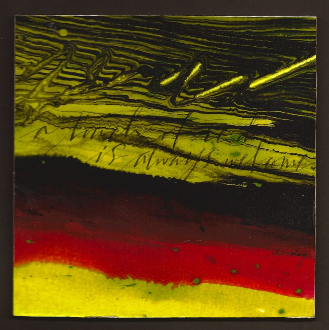
"A Touch of Red" (unavailable)


(unavailable)


"A touch of red is always welcome." So many of my quotes have been on the deeper side of life lately. Here is one that is light hearted with a powerful color punch. Enjoy!

Horizontal bands are always a "win-win". It could be horizontal bands of different sizes, complementary colors, neutral colors, same color...different texture, stacked lettering in different weights, or lines with slight diagonals with different widths.

This piece has bands of complentary colors plus black, lines with varying widths, same color but different textures, plus a slight diagonal direction. It all sounds very obvious, but until the artist can stop and analyze what is actually making something dynamic....the chances of being able to apply that dynamic to another piece is remote. It's not just about technique, but the ability to dissect the design. Just a few more things to think about.

Friday, January 6, 2012

"A New Baby"


(unavailable)


"There's a new baby in the house." I am referring to a new baby grand piano. But I know I had you going there for a minute! It's lovely and the tone is exquisite. This was my way of sharing my good news with all of you.

An image of a piano is always an eye catcher. There's a reason for that. First of all, the black and white represent the opposite ends of the value scale. There is also the tiniest bit of red in the felt behind the keys. There is also the principle of alternation with the black and white keys as well as the lines created by their shape. This particular photo shows the reflection of the keys creating an "echo" of the actual keys.

This leads me to another obsession I have....analyzing. Any artist who is able to analyze and understand the reasons why certain things work or don't work in a piece of art, will be able to repeat the successful things and avoid those that don't work. That's why I like to talk about process in every posting. It helps me clarify my own thoughts and perhaps give you something to think about as well. So there it is....just a few more things to think about.