Showing posts with label Horizontal Bands. Show all posts

Friday, September 13, 2013

"Essential Ingredients" (final)


($420.00.....cropped portion of ...18" x 24".......Mixed Media on Canvas with a 2"00 depth)

"Essential ingredients create growth." The key word in this quote is "essential". There are essential steps or ingredients that must be present to have growth. This was a piece created for the 30th Anniversary of Capital City Scribes. This organization has definitely been an essential ingredient for my growth in the lettering arts.

I don't often create a piece with quite this much texture, but this particular design element was my passion for this piece. What you saw in the previous posting was burlap fabric primed with gesso. It's hard to capture the richness of the texture in a photo or the richness of the color. My inspiration was a picture of an interior room with a view of the forest outside. The colors in the piece represent most of the color notes in the photograph.

One of the problems of creating a piece with horizontal (or vertical) bands is the straight and hard edges. For that reason, I took the bands of color that have "splotches" of paint outside and sanded between layers and ended up slinging paint onto these strips and adding water to some of the edges to give some vertical and erratic lines with some diffused edges. The dark green in the burlap carried over into this slinging process also creates an "echo" of that color.

Even though I like vertical and horizontal bands, I am now ready to do a piece where the fabric is placed very randomly and without a precise shape or pattern. By the time I finished this piece, I was feeling a bit confined. Never the less, I am glad I followed my vision because it will definitely inform the next piece I create with fabric collage on canvas.

The last element added was the kiln formed glass elements in the openings of the burlap. It does add a lot of reflective quality to the piece and I am glad I tried it, but today, my inner creative voice is screaming for asymmetrical. And so shall it be.....in the very next piece. And there you have it...just a few more things to think about.

Wednesday, September 11, 2013

"Essential Ingredients" (draft 1)

(draft 1)


This is the beginning of a highly textured piece. Today's draft is only one part of a horizontal band of fibers adhered to canvas. The entire piece is created with bands of texture and color. The white you see today ends up becoming a very dark green with the bright green showing through.

The particular fiber you see today is a very loose weave of burlap with some of the threads removed and coated with gesso on both sides. A format of horizontal bands is an excellent way to showcase color and texture. It is best, of course, to have the bands in different widths and different textures and colors. This automatically opens the door to alternating the bands.

In addition to three different bands of this particular fiber, I am also including duck cloth which has also been coated with gesso on both sides. It is risky to add fiber to a canvas without it first being washed and dried or coated with gesso first. Adhering it before taking these steps can leave some puckering. This is unlikely to happen on a cradled board, but I have not tried that, but other artists have with success.

Basically, anything can be gessoed and adhered to a support to create texture. It is probably a good idea to keep the main thing, the main thing rather than adhering anything and everything in a haphazard fashion. Another option is to adhere fibers on select areas of the canvas to create some texture with a majority of the design space left free of too much detail. It's all a process. Look at rugs and quilt designs for inspiration images.

Going in this direction clearly places the artist in the "colorist" camp which can be a great place to land since color is the most emotional of the design elements. I believe texture is a close second. And there you have it...just a few more things to think about.

Tuesday, April 30, 2013

"Fearfully and Wonderfully Made" (Draft 2)

(image 1)
(image 2)


The quote associated with this piece is Psalm 139: 14. You will see it in the final. Today you are viewing the second draft which has two layers as shown above. Artists who have not had experience in layering are amazed at how many layers can be involved in a piece. And that is why I am posting each layer so that you can see what each layer looks like. So often, an artist will get discouraged when everything doesn't look finished in the first layer. Don't despair. You simply need to keep going.

In the second layer (actually it's the third since I posted the first two layers yesterday.), I decided to add color. It's a burnt sienna color, but you will not find burnt sienna in Speedball Printing Ink unless you special order it. Just squeeze out a 1/2 tsp (app) of orange....add a touch of blue...and then add white a bit at a time until you have the value you want.  Mix it thoroughly on your printing plate with a palette knife before brayering.  Burnt Sienna is simply a "grayed down" orange.

Of course, I printed this color some time ago and had it stored in one of my gallon size baggies.  And that is the best strategy.  Printing the rice papers and designing the piece need to be separate events.  My design decision was to emphasize the horizontal bands in the lower half of the piece and add a bit of it in the top portion to create an echo. One edge of the rice papers has a straight cut and the other side was torn. I also flipped them...with the torn edge up in some places and the straight edge up in others. This creates more interesting edges and shapes throughout the piece.

After I cut and laid them where I wanted...I began to adhere each one to the support. I then lifted up an edge on each one and deconstructed by pulling the print up. This technique left a residue of the paper while revealing some of the previous layer. It creates a very integrated and ethereal look.  I also dipped by "gloved" finger into water and smudged a bit of the color around.  (Even though I sprayed it once,  thicker areas may still lift and so you will see the staining of some of the surrounding areas with that color.  I then dried all of that with a hair dryer and sprayed with Krylon Spray Acrylic Coating and dried it again. (Spray outside)  After all of that, I took a photo and that is what you see in (image 1).

My next move was to bring some more dark values in the bottom portion and add to the complexity by introducing a pattern (created with a commercial texture stamp and stamped into the ink after brayering on the printing plate.) Again I wanted to emphasize and reinforce the horizontal bands in the bottom half of the piece.

You can see that the straight edge and torn edge helped to create an interesting interplay with what was already there. I also added some plain rice paper strips to conceal and tone down some of the middle values created by the text in the first layer. I again dried the piece thoroughly....sprayed with acrylic coating and took a photo. That is what you see in (image 2)

You will notice that I've been very careful not to conceal the dynamic shapes in the upper half of the piece...while creating a very textured and woven look in the bottom half. And that's what you will want to do when designing your piece. Choose carefully the parts that you want to preserve and leave them alone.

This piece will now have all day to dry before adding additional elements. And that is the ideal way to create mixed media. It insures that each phase is "bone dry" before going to the next step. It also gives you a chance to pray about the next step and study the image. And there you have it...just a few more things to think about.

Thursday, April 25, 2013

"The Quiet"

(unavailable....6" x 6".....mixed media on a 1/8" depth clayboard panel)

"I feel the quiet in the presence of my books." Invariably, my art and quotes emerge from whatever is going on in my life. And as it happens, I have transformed my upstairs studio in the house to a library. I feel quite pleased and very peaceful surrounded by my books. (All my work is now done in the Buck Hill Studio.)

Today's piece is a compilation of techniques that I have been demonstrating over the past few days. This is a finished piece (6"x 6") using those techniques. 

The text went down first on a black gesso board. I then added papers that including a stamped image over mono printed rice paper. The black and white papers were scraps from the demo posted on Monday. The black and white papers with various lines going from edge to edge set the stage for a horizontal bands type of format.

You can see that rhythm in the piece, but I also broke it up by including papers of both types in the opposite areas...creating a conversation between the two types of papers and also some very interesting shapes.

The ecclesiastical looking stamp works well and established the tone and feel of a "library" piece. The collaged text areas are from a bit of prose by Elizabeth Barrett Browning. My quote emerged from the mood of the piece and the content from "The Wandering Traveler".

So often students will ask how do you know where to place all of those bits of paper. Besides experience and lots of failures...it really, really helps to begin with some type of format (division of space). Just by virtue of the fact that I had decided on horizontal bands really helped to lay papers in a way to emphasize that point. I also paid attention to the lines that were already there and tried to line up additional papers to look like a continuation of the lines already there.  And there you have it...just a few more things to think about.

Friday, March 15, 2013

"Rest vs. Unbelief"

($60.00......6" x 6"....Mixed Media on 140 HP.....Mounted on a 1.50" depth Clayboard)

"Rest is the opposite of unbelief." This is the essence of the message from Hebrews 4. As you have noticed, I am rather stuck on this particular passage for an upcoming exhibit. It goes to the heart of what it means to be "Fully Alive" as a Christ follower, so bear with me as I complete my work. I am now ready for the larger works.

The challenge of this piece was enormous and why I am so late posting today. The background of pouring medium was very dark, but did have the association of looking like marbled paper so I decided to go with it, in spite of the complexity of making it look integrated with the text pages. 

In this case, I needed the text pages, otherwise the lettering would not have been easy to read. So by dividing the space into contrasting sizes of horizontal bands and by including another bit of text in the largest band, I was able to give significant weight to both types of bands.

It also helped to bring some mono printed rice paper into the bottom section, which gives the illusion that a portion of the large colored band was peeking through. This is otherwise referred to as an "echo" which is one of the keys to good integration. I also did some deconstruction to create erratic edges, a sense of timelessness, and providing more echoes of the text where the area was a bit static.

If you like this type of mixed media work and you are not a lettering artist, you might want to introduce some erratic marks / lines with a pencil or charcoal pencil. Pencil, of course, will be a lot more subtle. The important thing is not to introduce elements in the work that don't appear to go together. Text pages go with this type of background because of the association historically of marbled papers and books.

Also notice how other mixed media artists combine different elements. Being able to analyze and figure that out will go a long way in understanding design. And there you have it...just a few more things to think about.

Please contact me personally to inquire about this piece.

Saturday, March 2, 2013

"A Gift"

($150.00....12" x 12" Experimental Piece....Water Soluble Oils on 300 lb. HP ...Mounted on a 1.50" depth Clayboard)


"Every day is a gift." It's short, it's sweet, and it's true. Enjoy each day and count it a blessing!

This is another gestural landscape, but this one is based on a reference photo taken from the second story porch of our house. Since I have been painting these types of landscapes, I have been noticing the sky a lot...like every day and even pulling off of the road to take pictures. It is utterly amazing how quickly the sky changes and how it reminds us of the expansiveness of the universe.

It is also a very natural and obvious way of learning how to divide your space. You can have the sky taking up most of the space or flip it and have the land taking up the space. Either way and all the ways in between are good lessons in space division. 

There are other ways to divide your space that every artist should be familiar with...especially if you're working in mixed media. The cruciform is the most versatile. It is nothing more than dividing the space into four quadrants. It amounts to touching the edges vertically and horizontally and unequally. In other words, you could have the vertical division line to the far left or far right and the horizontal division either very low or very high. Playing around with this format will give you all kinds of possibilities.

Whenever you find yourself in a confused and unorganized design space, thinking in terms of a particular format will go a long way in helping you out of your confusion. So just think about it. You could paint four unequal quadrants a different color if working with a cruciform format or you could have unequal horizontal bands (as in a landscape.) These are just two exciting formats that will give you a lot of mileage. And there you have it...just a few more things to think about.

Saturday, January 12, 2013

"Abstraction"

(unavailable)

"The evolution of an image equals abstraction." When an image is altered, it is abstracted. Today's piece is 100% abstracted from the painting posted yesterday. It is part of my experimentation with different ways to abstract an image.

In this piece, I emphasized the horizontal bands from yesterday's painting. I used the painting as my reference point rather than the original photo reference which is somewhat like "morphing" the image into something completely different. The color palette was identical from yesterday, but the blending and application of paint is different. The "sgraffito lines revealing the first layer are reminiscent of the obvious weeds in yesterday's work. I even included the snow, but the cactus image is gone except for the color. And the lettering became more prominent and really is readable in the original although you might not be able to see it on your computer screen.

The whole point of explaining this is to throw out different ways of arriving at abstract work. Since letters are abstract, this is a subject of paramount importance to me. However, even without the lettering it could stand alone as an abstract piece of artwork.  If this is too much abstraction for you, another option is to pick and choose which image to be recognizable and which ones to abstract completely. I could have done this piece and made the cactus recognizable and even a few weeds surrounding the cactus. That would also be a very interesting experiment. 

As you can see, this is where my passion is presently, and perhaps you, too, will be inspired to think about your process in a totally different way. Don't ever dismiss those fleeting insights that come to mind for they could be the impetus to a completely different way of working. And there you have it...just a few more things to think about.

Friday, January 11, 2013

"A Visual Proverb"

(unavailable)

"A visual proverb is seen in cactus with snow." A proverb is a pithy saying that often includes an unlikely comparison. One such example is found in Proverbs 26:1...."Like snow in summer or rain in harvest, honor is not fitting for a fool." And it is very unlikely to see snow where prickly pear cactus is growing. (These was painted from a photo reference taken during a very rare snow storm here in Austin, Texas.)

Horizontal bands are often found in the landscape. It is an exceptionally easy format and works best if the bands have sufficient contrast in color and width. By taking this same photo reference, using the same colors, but creating more of a contrast in the band widths and including no image....only color and texture...or just color a completely abstract piece could be created.  

By looking at your reference photos from a different perspective, you probably have tons of inspiration sitting in your iphoto files. There really is no better inspiration than the created world we live in. For instance, yesterday morning was a great time to take photos of the sky after all of that rain. The size and shape of the clouds was stunning. So be on the "look out" for those special moments when the light is just right for capturing a good "shot".

There are plenty of artists out there who also take several photos and include fragments of them in the same piece by arranging them in horizontal bands or simple cutting them up...mixing and matching to create a whole new piece...very much like a puzzle.  This new reference could then be used as an inspiration for a painting or mixed media piece.  Of course, in these types of work it is good to select photos with several common denominators....such as color, theme, texture, etc.

It would probably take an eternity to complete all of the concepts that come to mind, but there is great satisfaction in experimenting with many techniques that fit into your own particular artistic voice. These are just a few. And there you have it...just a few more things to think about.


Sunday, October 7, 2012

"Sacraments"

($125.00.......6" x 6" ....300 lb HP floated on a linen mat in a custom frame)

"Our lives are sacraments to the grace of God." And really...nothing more needs to be said.

Moving away from a grid format, this piece has overall texture with two horizontal bands. The bottom shape is comprised of several overlapping segments of mono printed rice paper with the reverse side of the mono print showing and several pieces of deconstruction where the papers were adhered to the support and then removed before completely drying.

Even when using a montage of collage elements, the harmony in the piece is achieved by having strong value arrangements, keeping the main thing the main thing, and keeping the color palette simple. This piece is basically a black, white, and gold orange metallic color scheme. The inclusion of walnut ink to some of the papers also adds a bit of warmth and a textural contrast to the black and white.

Design does not need to be complicated, but the technique of layering is what makes it interesting and also a bit "edgy". This will not appeal to everyone, but it sets the stage perfectly for the expressive writing which forms another horizontal band. Try laying down some papers on a black support and see what happens. The black will allow your edges to show up and lend an ethereal look to the piece. And there you have it...just a few more things to think about. 

Please contact me personally to inquire about this piece.

Monday, September 3, 2012

"In Living Color"


(unavailable)

"Bring it on in living color." Color is always a good thing, but especially good on Monday mornings and holidays!

Horizontal bands are one of the best stabilizers in any composition. After working with moving color for many, many postings, I have come to some conclusions that might help you, especially if you are adding any kind of collage element to the piece.

If you have a very nice directional flow of color in your pour, it is best not to interrupt that flow by placing a collage element in any area that interrupts that flow, especially if it has a lot of interest.

The best way to calm down all of that moving color and bring good design and stability to the piece is to make use of horizontal bands...especially at the bottom of the piece. That will weight it visually at the bottom, which is always a good move.

However, it will have more power if the collage element is a strong grounding color...like black. Black is a fabulous counterpoint in a pouring medium piece as long as you don't let it overtake the piece. So you need to be very careful when doing the pour to keep the black occupying less space than the other colors. It is also a great idea to keep a bit of white pouring medium from the first layer showing, like you see at the bottom of this piece.

Another thing to consider is open line work such as the lettering and flourishing you see here be the horizontal band. It still allows the viewer to enjoy all of the nuances of color in the pour.

By stamping (with acrylic paint) on the blank 140 lb HP before the pour, you are also creating more depth and a bit of mystery. And there you have it...just a few more things to think about.

Tuesday, May 1, 2012

"Fascination"


($40.00....6" x 6"....mounted on a 1/8" depth clayboard panel)


"Creativity is a gift wrapped up in fascination." To be totally absorbed in something is to be fascinated. Most creative things do not get created unless there is a high degree of fascination in the process of getting it done. It essentially means to be held captive. Now that's fascination!

Whatever technique or process any of us choose to do to communicate visually, we had better be totally captured by the process. And some processes can be very intimidating and even daunting to tackle. However, the sooner we have the realization of what it takes to obtain that particular skill, and we can stay fascinated with it, the more likely we can overcome any obstacles along the way.

In this piece, I was intent on using Green Gold (Golden Fluid Acrylic) and Anthraquinone Blue (Fluid Acrylic). I also threw in some metallic white. When these colors merged together, the darker, warmer green was created. That's why fascination with the Pouring Medium process has been ongoing. No matter what is done to manipulate the process, there is always a spontaneous result. It seems to take on a life of its own.

In this cropped section, I ended up with a very contemporary take on an old format called horizontal bands. They do work every time they're tried, but the edges of these bands of color are far more interesting than they would have been had I simply ruled off three bands and painted the color in. Most artists I know work hard to hone their skills so that the work never looks contrived which is the exact opposite of spontaneous. If any artwork looks controlled and contrived, it will stop the viewer from connecting with your piece instantly. Just a few more things to think about.

Please contact me personally to inquire about this piece.

Wednesday, March 28, 2012

"The Ultimate Luxury"


($40.00....6" x 6".....mounted on a 1/8" depth clayboard panel)


"Chocolate is the ultimate in affordable luxury." Some of the most ornate packaging with highly embossed gold lettering is seen on packaged chocolate. It is a delectable treat that most people can afford from time to time. Enjoy a piece today!

One of the most easily understood formats that works every time it's tried is horizontal bands. In the case of my piece today, they are slightly in motion which is even better. If you have had the foresight to work on a larger sheet of paper, effective cropping will automatically give you four well designed corners. The varying widths of the bands will also give contrast and sometimes alternation such as the pink and brown color in this piece.

This pouring medium piece had very little external manipulation which would have caused the color to blend more. As for the edges, there is a contrast between the hard edges and the soft diffused edges. All in all, it's a win / win to choose this type of format and technique. You could probably do the same type of thing with watercolor or oil paints. Colors would need to be very fluid and support would need to be very wet. Water soluble oils would probably work better than traditional oils but I have not tried either so it would definitely be an experiment. There are very simple things that can make or break a piece of artwork. Each artist must be willing to embrace the "tried and true" before insisting on creating some preconceived idea and sticking with that idea so stubbornly that all is lost in the end. Just something else to think about.

Please contact me personally to inquire about this piece.

Wednesday, February 29, 2012

"Stay Calm"


($40.00.....6" x 6"...mounted on a 1/8" clayboard panel)


"Stay calm with quiet simplicity." The operative words here are "quiet simplicity". In some work places, the employees must have all clutter and unfiled things removed from their desk and floor before going home. It sounds harsh, but it really does help everyone be more productive. The same thing is true for any environment. Keep it simple. Keep things quiet. That's the way to stay in a calm state of mind.

This is such a simple piece, but I decided that it was perfect for this quote. The horizontal bands of color with no hard edges and lots of water in the pouring medium helped to achieve all of that softness. There are a few hard edges in the lower left hand corner springing upward, but they are close in value with variation from hard to soft. It is good to have these kinds of pieces as well as the more dynamic and colorful ones. Once you've gotten through the whirlwind of life, then you can return to more dynamic things. It's like reading the Bible. Everyone likes to read the Psalms during stressful times, then when life calms down, other passages can be explored. I like to call it the rhythm of life and art.

No fussy capitals...no flourishing....just lower case white letters that disappear when viewed from across the room add to the tranquility. Just a few more things to think about.


Please contact me personally to inquire about this piece.

Saturday, February 25, 2012

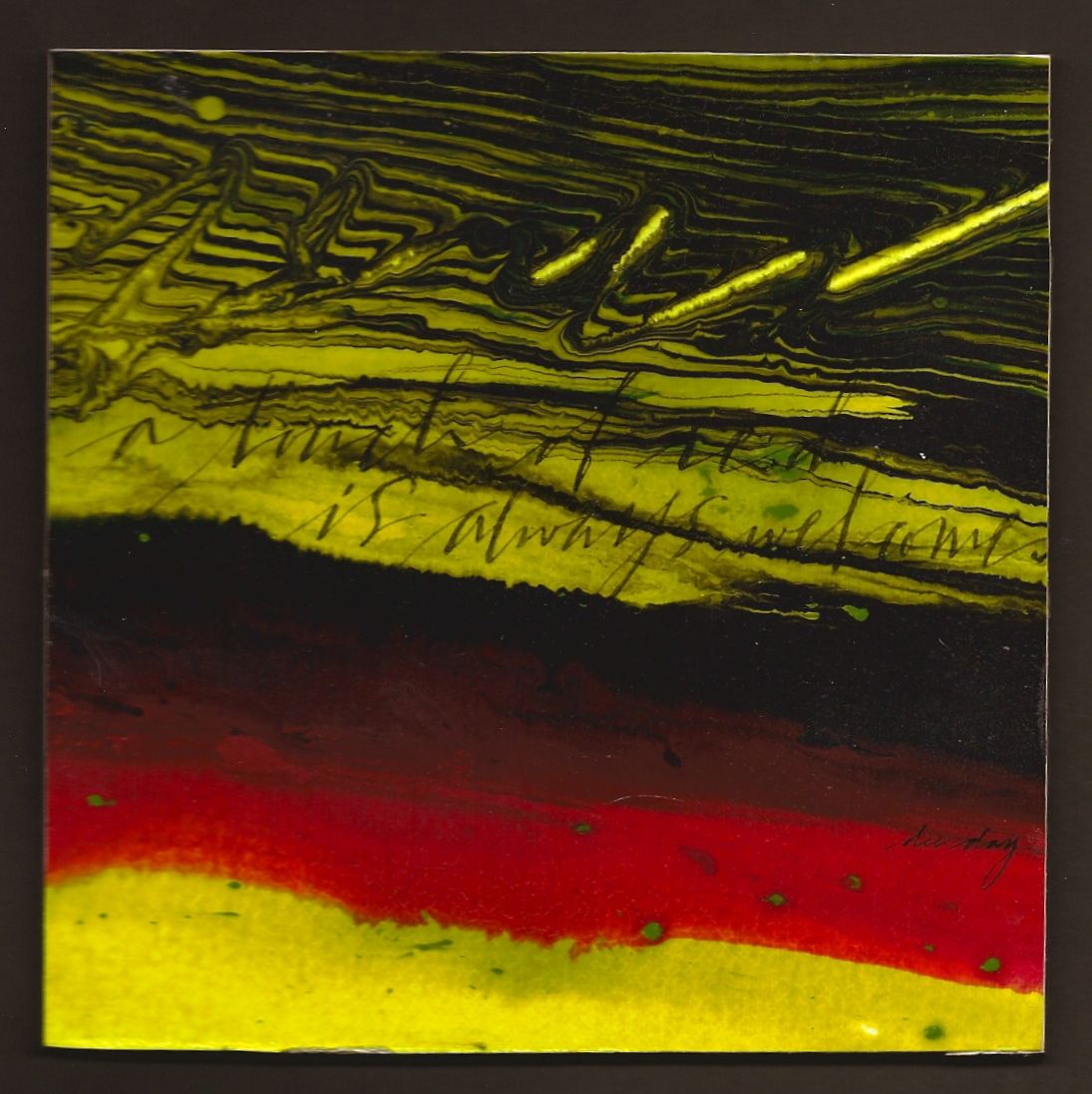
"A Touch of Red" (unavailable)


(unavailable)


"A touch of red is always welcome." So many of my quotes have been on the deeper side of life lately. Here is one that is light hearted with a powerful color punch. Enjoy!

Horizontal bands are always a "win-win". It could be horizontal bands of different sizes, complementary colors, neutral colors, same color...different texture, stacked lettering in different weights, or lines with slight diagonals with different widths.

This piece has bands of complentary colors plus black, lines with varying widths, same color but different textures, plus a slight diagonal direction. It all sounds very obvious, but until the artist can stop and analyze what is actually making something dynamic....the chances of being able to apply that dynamic to another piece is remote. It's not just about technique, but the ability to dissect the design. Just a few more things to think about.