Showing posts with label Complementary Color. Show all posts

Tuesday, May 7, 2013

"Blessed" (draft 1)

(draft 1)


Today's piece is the beginning of Psalm 1. The text will appear in its entirety in the final. This is a new technique woven together with other techniques to hopefully create a very dynamic piece.

This is a quarter sheet of 140 lb. HP (Arches). It has not been cropped, so I will have many options today as I decide on placement of more papers (or not). The entire text of Psalm I will be written in Spencerian Script and some brush lettering in the background.

The color selection was two complementary colors plus mono printed black papers. The delivery of paint to the paper was done first with a brayer (1.50" and 2.00") This technique can be achieved with most water soluble paints.

In this case I chose Speedball Printing Inks. The challenge was to mix the two complementary colors of blue and orange + white to create a range of grayish colors. The first mixture was equal parts of both colors + white and mixed with a palette knife on a glass printing surface. I also sprayed a lot of water in the mixture. Extreme dilution of most colors will yield a measure of transparency which was the goal here. If I had chosen transparent watercolors, there would have been a much more ethereal and transparent look. Gouache and Fluid Acrylics are also options.

The key is to have the paint very "soupy". The brayer was rolled through this mixture and rolled from edge to edge on dry paper. I created several stripes with my first mixture and then added a bit more blue and more water and did more stripes, followed by adding more of the orange + white and water and doing it again. So it is a very spontaneous process and you can see the shapes that are created and various windows (or openings) created when the paint crosses over previous stripes.

After drying and spraying this sheet of brayered stripes with spray acrylic coating, I began to select some mono printed rice papers to fill up some of the shapes. It is very important to cut these papers on the actual painted stripes and doing it with a clear grid ruler (available at Hobby Lobby) to make sure the papers look as though they are a continuation of the lines already there.

I also wrote into sections of the wet paint with a stylus to create some softly diffused letters and then when all was dry, I did some gestural writing with a pencil. All of this will make a nice backdrop to the final lettering which will be written in black.

And if you're not a lettering artist, simply allow your piece to be totally abstract and perhaps include some old text pages or line engravings, drawings, etc. A small drawing or a fragment of watercoloring would also be nice. And there you have it...just a few more things to think about.

Tuesday, October 23, 2012

"Memory Connections"


($40.00.....6" x 6"....Oils on Gessobord)

"Memory connections often come in the form of a structure." There are reasons why certain places and structures conjure up memories. They often remind us of special events or fond memories.

One of the most important things for me in landscape painting is looking for lines that are dynamic. Keeping in mind that all edges create lines, I gravitated to this particular viewpoint because the barn was sitting on a hill which created a diagonal as well as the roof line of the barn. And of course, trees are always compelling because the tree limbs have repeated line work going in all directions.

Another consideration is the possibility of becoming a colorist and taking expressive license to make the most use of powerful complementary colors. In this piece, I obviously have used a wide range of greens which have red mixed into them, but I also used a dark, "grayed down" red in the barn to create a dynamic with all of those greens. There were also some trees turning yellow in the background so I used a light and "grayed down" purple in the barn to create another complementary dynamic.

It is important to be able to mix up the colors that are seen in the landscape, but the most expressive landscapes are created when the "colorist" side of the artist comes into play. And there you have it...just a few more things to think about. 

Please contact me personally to inquire about this piece.

Friday, September 21, 2012

"Bendice A Jehova"

($250.00......10" x 22".....mounted on a 1.50" depth clayboard)

"With all my heart I will praise His holy name." The scripture verse is from Psalm 103 in the New Living Translation. It was created for an exhibit at Hill Country Bible Church with a theme of "Visual Rhapsody". You are all invited to the Opening Reception tonight from 7:00 to 9:00. Check out the invitation at our website...pactofaustin.com

All of the many collages you have been seeing formed the basis of most of my larger works for this exhibit. In the piece today you can see how it looks in a larger more expanded version. You can have a chance at receiving one of those 4 x 6's tonight. We have well over a 100 of them (created by myself and some of the other participating artists.)  Be there early and you can be part of the drawing.

The striking part of this piece is the color selection. There are two sets of complementary colors...the turquoise and orange...as well as the magenta and green.By placing these two sets of complementary colors right next to each other and in several combinations, the color rhythm of the piece was established. I used expressive writing for the main quote. The expanded part of the same verse and a different translation were written in Spencerian script in both English and Spanish. And there you have it...just a few more things to think about. Please contact me personally to inquire about this piece.

Tuesday, March 20, 2012

"Lofty Goals"


($40.00.....6" x 6"....mounted on a 1/8" depth clayboard panel)


"Lofty goals are attainable after letting go of past failures and negative mindsets." I have a brother who has a favorite phrase he uses when reminding himself to let something go....or reminding me! It's called "lig it"...and stands for let it go. Some things need to go and past failures and negative mindsets are two of them.

This cropped section from a pouring medium piece has an interesting selection of diagonals as though they're flowing off of the page. It is a visual metaphor of letting something go...hence the quote.

To quote myself..."Black and white plus one or two other colors works every time it's tried." I particularly like the raspberry color with turquoise. It's a softer version of the powerful red and green complementary colors. Throw in some yellow and you have another set of complementaries between the yellow and turquoise.

The only thing I wish I had done before doing the pouring medium is create my pencil lines and non verbal text. The spontaneity does not quite ring true when they're added after the fact. It goes back to the idea that if you want a spontaneous result you must use a spontaneous process. It is far better to make these erratic marks on a larger sheet, create the pouring medium and then crop the piece. It will look random and never contrived when following that process. Lesson learned. Just a few more things to think about.


Please contact me personally to inquire about this piece.

Saturday, February 25, 2012

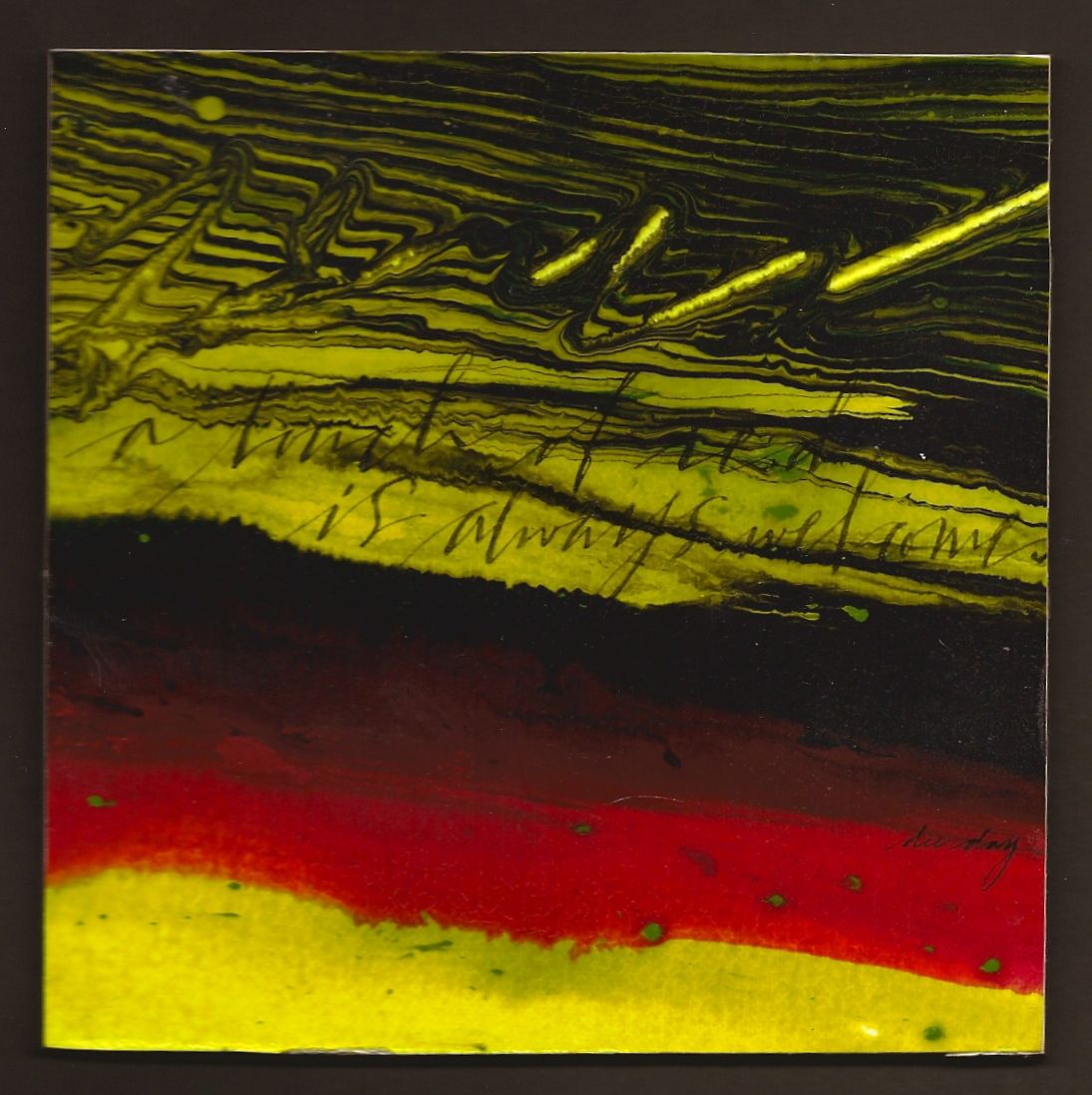
"A Touch of Red" (unavailable)


(unavailable)


"A touch of red is always welcome." So many of my quotes have been on the deeper side of life lately. Here is one that is light hearted with a powerful color punch. Enjoy!

Horizontal bands are always a "win-win". It could be horizontal bands of different sizes, complementary colors, neutral colors, same color...different texture, stacked lettering in different weights, or lines with slight diagonals with different widths.

This piece has bands of complentary colors plus black, lines with varying widths, same color but different textures, plus a slight diagonal direction. It all sounds very obvious, but until the artist can stop and analyze what is actually making something dynamic....the chances of being able to apply that dynamic to another piece is remote. It's not just about technique, but the ability to dissect the design. Just a few more things to think about.
Monday, December 19, 2011

"Poinsettias"


(unavailable....in the permanent collection of dee day)

"Poinsettias say Merry Christmas by their presence alone." This piece could have been dedicated to my mother if she were still alive. On second thought, I think I will go ahead and dedicate it to her anyway. She loved poinsettias at Christmas and they did extremely well in the tropical climate of South Texas. Enjoy looking at these beautiful flowers for a few more days. I am sure you will see some, even at the grocery store.

This piece is a classic example of the two most powerful complementary colors placed in a neutral colored pot. Notice that there is only a small bit of green. In fact, when using direct complements, it is best not to allow each color to take up equal percentages of space. It is much more powerful to let one of the two complements dominant.

Another point about using white lettering if there is no white in the image. In this case, I mixed titanium white (out of the tube) with Liquitex Pouring Medium. Some of the specks of white will stay suspended in the medium which gives you a random placement of white specks to tie in with the lettering. The flourish in the upper right hand corner also unifies the color scheme. The white lettering would not have been nearly as effective if these connections were not established.

Another point, also, about cropping. I originally wanted to include the entire container in my piece. It didn't have the "wow" factor and the insignia on the pot wasn't showcased so the entire problem was resolved by zooming in and cropping the image up close. The "rule of thumb" is to allow the focal point to take up the largest percentage of your design space. Just something to think about.

Thursday, December 1, 2011

"Red and Green"


($40.00....mounted on a 1/8" depth clayboard panel)

"Red and green fuel the warm association of pleasant memories." Every year about this time, I have this urge to go buy a berry bush of some sort. Of course they promptly die when the Texas heat arrives, but they cause me to be in the Christmas spirit. You might want to try this experiment. Go anywhere where there are decorated Christmas trees, close your eyes, and then open them and see which color combination takes your breath away. It will most likely be red and green.

Direct complements deserve careful attention because they are so powerful. With red and green, it is important to pay attention to the percentage of each color used. Berry bushes are so eye catching because they have a hugh percentage of green sprinkled with bits of red. It is not as pleasing to have this reversed. And if the percentage is 50/50...it can be disturbing to view. It is fun to look through decorator magazines and pay attention to the percentages of the colors used and then try to duplicate those percentages in a piece of art.

Another thing I am trying to do in this piece is continue to practice with a Speedball C-4 nib. Yves Leterme thinks it is prudent to become proficient with this nib so I have been picking it up more frequently, but it is way out of my comfort zone. But to quote myself..."The learning curve is easier after realizing that all things are difficult before they are easy." My goal for next year is to include more expressive and gestural writing. (We'll see how that works out.) But for December, I would like to "kick it up a notch" with the pointed pen. It may be procrastination on my part, but what would Christmas be without all of that flourishing! Just something to think about.

Monday, October 31, 2011

"Orange Steals the Show" ($40.00)


(adjusted price....$40.00)

"Orange steals the show in any landscape." One of the reasons I like fall is because of the pumpkins and gourds that are displayed everywhere. My favorite way to see them is in their original setting in the landscape. Enjoy them today in whatever setting you see them in. The chances are good that everyone will see a pumpkin today.

This piece may look like a monochromatic piece with only one color used in all of its tints and shades. But actually it's a complementary color scheme using orange and blue. The blue is well disguised as a gray, but its presence draws you in like a magnet.

Sometimes complementary color schemes are very obvious and create quite a "stir". But if you want a "quieter", more subdued feeling, mix them together with one of the complements dominating. The reason the pumpkin looks illuminated is the surrounding neutrals created by the "mixed complementary colors". The color of orange was kept more intense for the pumpkin which gives it the "glowing" look.

The importance of complementary colors and being able to take advantage of their power in any kind of artwork cannot be overstated. The orange in this piece would not have been powerful by using black to "gray" it down. Nothing dilutes a color and turns it into a neutral like the complement. Just something to think about.


Please contact me personally to inquire about this piece.

Saturday, October 29, 2011

"Energy" (unavailable)


(unavailable)

"Energy is activated by color, passion, and movement." In order to truly understand the power of color, we would need to be in a black and white world momentarily. It is color that acts as a spark plug in our visual world. Add passion and movement to ignite a new level of energy in your daily life.

Green and orange are very powerful split complements. Set them in motion with ribbons of color in a setting of neutral purplish gray to enjoy a delightful arrangement. The technique of playing around with suspended color in Pouring Medium also provides some interesting texture that simply cannot be achieved any other way.

The lettering took on a more active role in this piece, but it was neutralized a bit by mixing the viridian green and orange together plus white. If the background is very intense with a lot of movement, it is best to knock down the intensity of the lettering. It could have been made a bit more satisfying by bringing a bit more of the intense color up into the lettering. However, it never quite works to go back into a piece where pouring medium was the vehicle to try and add something more. It will look contrived and spontaneity goes out the window. So it is what it is and of course, there's always a next time. Just something to think about.

Wednesday, October 26, 2011

"Variety and Repetition" ($40.00)


(adjusted price.....$40.00)

"Leaves are a never ending visual of variety and repetition." Trees are everywhere and it seems they provide more variety than any other thing in our created world. Most of us can walk out the front door and see an endless variety and repetition of leaves, especially this time of the year. It is good to enjoy them and be thankful for this never ending visual.

Several weekends ago the first layer of this piece was created in a color workshop with gesso, lines, and lettering. By accentuating some of the shapes with additional color and Liquitex Pouring Medium in the second layer, the form of the piece began to take shape.

The color provided the inspiration to end up with leaf shapes. The only problem with using one color in several tints and saturations is the lack of variety or too much harmony. By adding just one green leaf with the edges beginning to turn, the necessary contrast balanced out the warm red tones.

Complementary colors not only satisfy the eye's search for the complementary, but it also gives the contrast between warm and cool. Remember that the eye is always searching for the complement of any color...even when it is not present. So there is an unsettled feeling that something is missing unless it is included.  It does not always need to be this obvious, but simply mixing a bit of the complement to "gray down" a color will also be pleasing to the viewer. Just something to think about.


Please contact me personally to inquire about this piece.

Monday, October 17, 2011

"A Silver Lining" ($40.00)


(adjusted price....$40.00)

"Behind every dark spot is a silver lining and a bright color." This is a "take off" on a very familiar quote with a contemporary twist. Life can throw a few curve balls at us, but keeping a positive faith and attitude is the way to see the silver lining and bright color in every situation.

There are always reasons why some pieces work and others don't. That is a true statement even taking into consideration that some people like contemporary art work and others prefer super realism. The same design principles are at work in either case.

The principles of design can be boiled down to two very key factors. One is harmony and the other is contrast. In order to show harmony with all of your design elements, there must be one characteristic of each element dominating. For instance, in this piece, there is a dominance of curved lines. That one fact alone determined my decision to make the lettering straight rather than follow the curve of the color. In doing that, a contrast was created with the element of line. The same is true for the purplish gray color that also bleeds into the white areas. It takes up more space than the green color, creating harmony. But the green is also a split complement of the purple, creating a contrast. And on it goes.

However simplistic this may sound, I still see and even experience in my own artwork, times when I can't seem to think of all these things at once. Sometimes, it's intuitive, but not always. It's in the "not always" times that it is prudent to actually analyze what's going on with each design element. Just a few minor changes will help to make the piece go from "ho hum" to "wow".

Design language is the vocabulary of the visual artist. It is definitely something that needs careful attention. Just something to think about.

Please contact me personally to inquire about this piece.

Tuesday, October 11, 2011

"Diluted Color" ($30.00)


(adjusted price....$30.00)

"Diluted color transforms tension into calmness." I would guess that most viewers would look at this piece and assume I've lost my mind since the color does not appear to be diluted.  The idea is to draw attention to the fact that color has a hugh impact on our environment. Take time to notice the colors in your life today.

Complementary colors are directly opposite each other on the color wheel. They can be mixed together to the point where gray is achieved. That can be seen in this piece. Each of these two colors can knock down the intensity and fully satisfy the eye that always searches for the complementary color.

The Phthalo Blue (Red Shade) in this piece is very intense. It is a bright, intense blue that's very dark when used thickly. Used as a thin glaze it's very transparent. Mixed with white it's an opaque, beautiful sky blue.

This piece was created with Liquitex Pouring Medium and pigment, but on this occasion, I diluted the mixture a bit more with water which created more blending of the colors together rather than being suspended in the medium. There are many different ways to create with Pouring Medium. Just something else to think about.

Please contact me personally to inquire about this piece.