Thursday, June 28, 2012
"Antiquities"
(unavailable)
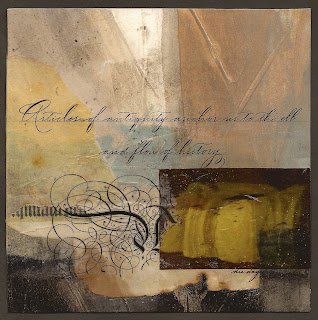
"Articles of antiquity anchor us to the ebb and flow of history." There are a lot of us out here who like to rummage through old things with interesting patinas and shapes. After thinking about it for a long time, I have concluded that the ongoing interest in antiques anchors us into history and securely places us in the timeline. It makes us feel secure...that all is well.
A few days ago I talked about creating a series. This piece is the third in a series created from the same parent sheet of paper. Alas, this is the last for it is all gone.
The background colors are very conducive to all environments, but this one could be categorized as a library piece. It has a look of history and much of that is because of the colors. This robin egg's blue (Cobalt Turquoise + Raw Umber+ White) is a favorite to use with umbers and other earth colors such as raw sienna. If you like this palette, I strongly encourage you to give it a try and experiment with the percentage of space that each color occupies...vary that...and do a series. It's quite instructive and yields a great study in neutrals.
The collage elements, of course, are the focal point with a contrast of translucent, transparent, and opaque pieces. The dark collage piece at the bottom right was positioned over three different surfaces to create different values and shapes from the one image. The same is true for the ornate letter with all of the flourishes. And that's the charm of transparency and the depth that can be achieved.
It is not necessary to include collage over the whole piece, but rather to keep it in one area and going from edge to edge is a good idea. Also make sure to include contrasts between straight and erratic edges as well as transparent and opaque sections. Both types of contrasts are needed to achieve this kind of look. And there you have it...just a few more things to think about.
Please contact me personally to inquire about this piece.
Subscribe to:
Post Comments (Atom)

I do love the color palette, beautiful work!
ReplyDelete