Saturday, November 16, 2013

"Paz" (draft 4)

(draft 4)


"The Lord will give unyielding and impenetrable strength to His people; The Lord will bless His people with peace." (Psalm 29:11..Amplified) As you can see, I am still working on lettering. I thought about waiting until I was completely done, but decided it might be instructive to see the white charcoal pencil layout before it was all inked in.

Because of the value of the background, I chose white bleedproof gouache for the lettering. It echoes the value of the silver leaf and provides a readable, ethereal look to the text.

In order to write with a charcoal pencil on this type of surface, it is necessary to sharpen frequently...sharpen even more on a sandpaper block...and hold the pencil completely vertical. The nice thing about charcoal is the fact that it is easy to erase after all is finished.

The process has slowed down tremendously with the lettering so it will probably take me another day or two. It always pay off in the end because the scripture that speaks to the scribe will more than likely speak to many others.

I am actually writing the First Century Versals with a pointed pen (in case my lettering friends want to know) and then I plan to write the verse in Spanish and Spencerian Script. And there you have it, just a few more things to think about.

Wednesday, November 13, 2013

"Paz" (draft 3)

(draft 3)


Almost there. The script and Spanish Round Gothic is to come. The lettering you see today is "paz" (peace) written with black enamel paint from a bottle with a tip.

I must say that I am quite in love with enamel paint now. When it dries, it is very shiny and smooth. Of course, now I am anxious to add white to my repertoire. It is a wonderful counterpoint to the lettering written with gouache or Fluid Acrylics. The surface was prepared for lettering with (1) part gel matte medium to (2) parts water mixed together with a palette knife and applied to the surface with a chip brush.

You can also see that I altered the edges of the fiber and adhered the silver leaf to the canvas. Edges are very important in any piece and the edges you see today are far more interesting than having the same amount of silver leaf coming down the entire length of an equally straight piece of fiber. By removing some of the fiber on both sides, I created some interesting shapes with the silver leaf peeking out rather randomly. And random is a word that is closely aligned with spontaneous. To quote myself...."It takes a spontaneous technique to create a spontaneous result."

The edges created by the chevron stamp are also important. By sanding part of the stamped image, I have created lost and found edges and a gradation with the color of the fiber with a "fading in" and "fading out" effect. The other random technique used was painting black gesso on the back side of this fiber. The sanding produced a deconstruction of part of the fiber and that black gesso then seeps through to the top side. This is much more effective than trying splatter specks in a random fashion.

So the "take away" for today is a study of edges. Try looking at lots of other artwork and see how different artists deal with their edges. It can truly make or break a piece. And there you have it...just a few more things to think about.
Tuesday, November 12, 2013

"Paz" (draft 2)

(draft 2)


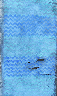
You are viewing the deconstructed fiber piece laid over the support which is a 16" x 20" canvas. There is also some silver leaf behind the fiber peeking through. The final will contain the text from Psalm 29: 11.

Today, I will set this piece on an easel where I can see it from across the room. It also looks good in a horizontal format and viewing it from a distance will determine that decision. There is also silver leaf that has yet to be adhered, and my decision now is whether to tear the fiber a bit more and have some silver showing around the edges as well.

Since yesterday, I applied Super Heavy Gesso with a palette knife. The same chevron stamp was used, but I applied a thin layer of the gesso so you don't see a solid imprint of the stamp. Another little trick about stamping into this type of "gooey" texture is to spray the stamp with cooking oil with each stamping. This keeps it from pulling the gesso up and creating an ugly texture. Once it's dry, alcohol will remove the cooking oil and then you can proceed to paint. This also works if you want to imbed a texture like a "key" just to get the imprint into the medium. Once the medium is dry, the key or other object can be removed. Clean the surface and paint.

Another tip if you want the first layer of black gesso to show when lightly sanding the final top layer of paint is to mix the black gesso into the Super Heavy Gesso before applying to the support. You will then see nothing but black when sanding the top layer to reveal some of the texture.

Again, I made a sample of this fiber with the color mixtures to go into my journal.  The color vibration is particularly appealing to me and I know I will need to jog my memory by looking over my notes should I ever want to do this in a different format.  And there you have it...just a few more things to think about.

Monday, November 11, 2013

"Paz" (draft 1)

(draft 1)


The Spanish word for peace is "paz". The quote you will see in the final is from Psalm 29:11. There is nothing quite like soothing blue colors to capture the spirit of "peace".

The previous couple of postings with a tighter weave (muslim) did not yield great results. That piece of fiber is now in the garbage and I returned to my lightweight linen type fiber with a looser weave. And for those who say..."You could have saved it; why did you throw it in the trash?"....that is not always true.

To create these very textural kinds of looks by deconstructing fiber, it is very important to have a fiber that is deconstructable. Otherwise, you can "beat a dead horse", but it will not be revived. It's dead!

So I began this piece with black gesso on one side and allowed it to dry thoroughly over the weekend. This morning I sanded it, and the deconstruction yielded some nice frayed areas and a few holes. And that is excellent, because I plan to adhere silver leaf to the area of the support where this will be placed and that silver will come shining through.

The next step was to spray the fiber with Palette Wetting Spray (Liquitex). The spray is different than simply spraying water because it consists of a polymer emulsion that is designed to keep the acrylic paint wet for a longer period of time, but it also helps blending and moving the paint around. (I have found that "chip brushes" are the very best brush for applying fluid acrylics to fiber.)

The mixture used for this base color was Cobalt Blue, a bit of Raw Umber, and a lot of White. (Fluid Acrylics) This dilute color causes a color vibration with the more intense colors stamped over this background. Cobalt Blue (straight from the bottle) and Cobalt Turquoise + White are the colors of the chevron pattern. (Color was brushed onto the stamped with a chip brush.)

And just in case you haven't noticed, chevron patterns are the rage right now. So let me take this opportunity to give a "shout out" for my daughter Alice, who is creating some fabulous wrist bags and tote bags, and also makes custom t-shirt quilts.

Check out her products at http://www.etsy.com/shop/ChevronBagsUnlimited. And there you have it...just a few more things to think about.

Friday, November 8, 2013

"Fiber Preparation" (draft 2)

(image 1)

(image 2)


Deconstructing fiber is a process of painting and then sanding. Even though this is simply a "process piece" for my journal, the word deconstruction is very descriptive of some of life's processes. It generally involves deconstruction followed by building on the newly deconstructed surface. The artist has the image of the finished piece. God has the image of our finished life as the deconstruction takes place.

If you think a sander is just for deconstructing fiber...think again. It is possible to do the same thing with quality water receptive papers. I have actually sanded paper until the edge was razor thin. It is a beautiful look and I do have plans to teach that this coming year. There are many possibilities.

So yes, you can go ahead and ask Santa for an electric and variable speed palm sander for Christmas. And should you have any reluctance at all about how aggressive to be with your new tool, just come to my studio and I can show you how to have some real fun!

As you can see, there are two images today so that you can see the applied paint before the sanding. I did paint the entire piece with Titan Buff Fluid Acrylic; allowed it to dry; followed by sanding before applying the colors you see. Notice that the chevron pattern always comes back to some degree during the sanding process. So whatever texture is imprinted into that Super Heavy Gesso during the first layer remains throughout the process.

The last thing I did was practice laying in lettering with enamel paint and a mop brush. What I wanted to notice was the comparison between how this type of fiber receives this paint as opposed to the looser weave of the other fiber I've been using. This one definitely receives it better because of the tight weave and that's without preparing the surface with Gel Matte Medium. Although, I did paint the back side with black gesso in the beginning.

And these kind of details are important to notate when placing the "process piece" in your journal. Why start at square one every time you do something? I guarantee you will not remember what you did six months from now. So it makes sense to have this notated for easy reference.

So now I will be ready to select my colors for the 16" x 20" or they may remain the same as what you see today. It does help to see how they work together in this piece. One thing that will make a difference is allowing the red/purple or blue/green dominate the piece by taking up more space. And there you have it...just a few more things to think about.

Thursday, November 7, 2013

"Fiber Preparation" (draft 1)


Today's posting is a "process piece" in preparation for a 16" x 20" canvas. I know from my own experience that it is instructive to see some of the very first steps in a process. It doesn't look like much today, but by tomorrow it will have full blown color. Never despise small beginnings...just keep going. 

My desire at this point is to move away from too much uniformity with horizontal bands. So in this piece I am shaking it up a bit by having random patterning and color. This is also a tight weave and lightweight muslim. I brushed black gesso on one side followed by drying it with a hair dryer and then sanding. To give it more stability, I repeated the process on the back side.

And then I began to ask the "What if..." question which led me to swiping some Super Heavy Gesso on a portion of the fiber. If you look closely, you will see a chevron pattern stamped into the gesso. The gesso is receiving the stamping in different ways depending on the thickness of the gesso. By tomorrow morning all of this will be "bone dry" and ready to paint. There will be a marked contrast in the way the fiber without the gesso and the fiber with the gesso receives the paint. 

In the meantime, I am continuing work on two other large works. It takes many days for layers of paint to dry and prepare the fiber. And that is the beauty of working on more than one piece at once. While one thing is drying, you simply go to one of the other pieces. 

My large journal will now have another addition (with notes) after I finish the piece of fiber you see today. And then I will switch to the actual piece, select the text, allow for drying time, and post the process as it goes along. And there you have it...just a few more things to think about.

Wednesday, November 6, 2013

"Fuego de Colores"


($125.00.......8" x 10".....Water Soluble OIls on 2" Depth Cradled Gessobord)

Today you are looking at "Fire of Color" (translated from the Spanish title). It is a palette knife oil painting using lots of paint. It's designed to represent my South Texas roots and inspire you with bright color.

All of my abstract palette knife paintings have gestural writing included, but actual, readable text is no longer a consideration for these types of works. I am reserving my lettering to canvases, watercolor or other mixed media works.

Design considerations are still a factor here. The orange is taking up just a bit more space than the blue, but the orange being such an intense color is definitely taking center stage. And even though all of these colors appear very intense, they are all diluted to some degree. Color is diluted by adding black, white, gray, or some of the complementary color. The darkest color is actually a very dark green created by mixing Phtalo Blue (Red Shade), Ult. Blue, Alizarin Crimson, Cad. Yellow Light. Yellow appears in all of the colors represented and this limited palette is why they all work together.

There is also a vast range of edges and line work going from totally blended to slightly blended and to a sharp edge. The writing also creates movement and energy along with some of the color shapes at slight diagonals.

The title was inspired by the flame looking shapes coming out of the orange. Integration was helped by allowing some of the base color (dark green) to be peeking through the entire piece. And there you have it...just a few more things to think about.

Please contact me personally to inquire about this piece.

Tuesday, November 5, 2013

"South Of The Border"


($60.00......6" x 6".....Water Soluble Oils on a 2" Depth Gessobord)

No quote today, but the title surely fits the colors in this piece. It is an abstract created with oils and palette knife. You can see hints of lettering that were also deconstructed by swiping out portions of the letters.

Most of the colors that were laid down first were the very intense ones. What brought it all together was going over portions of those colors with a swipe of black (mixed, not out of a tube). Depending on the pressure exerted with the palette knife determines the "skipping" over some of the first layer to create very interesting shapes.

This might be a good time to talk about canvas vs. gessobords. I do not use canvases at all for palette knife. My preferred surface is something very smooth. The palette knife seems to work better on all of the Ampersand Gessobord Panels and Cradled Boards. I also like working on Hot Press Watercolor Paper for the same reasons. Paper is nice since you don't need to commit to mounting or framing it. Gessobords are more expensive than paper. The difference is that the paper tends to absorb a lot of the paint. I haven't tried to use gesso first on the paper, but that might be a great option.

Besides experimenting with new materials and techniques, the skill that needs to be honed to perfection is the art of noticing what is happening while you work. Ask lots of questions, pray, take a walk, call a friend, and then go back in with fresh eyes. It's all part of the process. And there you have it...just a few more things to think about.

Please contact me personally to inquire about this piece.

Monday, November 4, 2013

"Work It Out" (3) (Process Piece)


It is quite amazing how much preliminary work has to happen in order to create a large piece. Today's piece is my color selection for a 30" x 40" which will eventually have this type of fiber treatment included. Text will be from the Bible, but I haven't made the final decision.

Today's process piece tells me several things. Do I want to paint the back of it with black gesso and take a chance of too much of that black color seeping through the fiber? Probably not, so I will need to be selective in where the black gesso is placed or do it before the exposed portion is completed.

Another important thing I was wanting to test was lettering done with fluid acrylic and an #6 Automatic Pen. It holds a lot of pigment and the writing is done on the corner much like a ruling pen. I did find out that the fiber has to be sealed on the back and prepared for lettering on the front.

The other techniques on this piece were created by writing into the dull brown color with a mop brush dipped into the yellow green color. I then cook a commercial stamp and dipped one end of it into the paint and stamped onto the background. These are textures that are now recorded and will go into my large journal as a reference.

My hope is that I've convinced others who like to do experimental work the efficiency of making notes. Another favorite way of notating "work off" pieces is to cut up some watercolor paper into a small size (i.e. 4" x 4")...glue the sample on the paper....punch a hole in the corner and place on a binder ring. It takes up very little space and provides a ready reference for all of your future pieces. And there you have it...just a few more things to think about.

Sunday, November 3, 2013

"Work It Out (2)" (Process Piece)


Today's posting is another "process piece" that will continue to inform my decisions about larger works on canvas. Experimenting, making notes, and keeping "process" journals is part of the journey in creating a piece of art.

Yesterday afternoon, I tore off a good size section of fiber and covered it with black gesso. (I laid it on wax paper to keep it from sticking to a surface.)  It took a while to dry, but by evening I applied some Fluid Acrylic in a dull brown color with a "chip brush". (They are the best kind for applying paint to this type of surface.)

While the paint was still wet, I dipped a large "mop brush" into a raw sienna mixture of Fluid Acrylic and lettered directly into the wet paint. Brush lettering '"wet into wet creates a more subtle edge. I then dropped down to the bottom area and wrote with the same brush on dry and primed fiber.

You can also see an area in the middle of a stripe painted with the same brush. While the paint was still wet, I stamped into it with a commercial stamp for a bit more texture. You can see the difference in the stamping by how much paint was on the fiber in different areas.

The last thing I did was write with Bleedproof White Gouache with a pointed brush (WN Sceptre Series) followed by a few words with a pointed pen. It will obviously need to go much larger, but I am leaning towards the pen which gives a crisper finish.

I now have two fabric swatches to add to my large journal book. This will become a ready reference for techniques on fiber. It is wise to make notes on your swatches or cut them down and glue them into a journal and make notes on the journal page. "Process is the breath of creativity." And there you have it...just a few more things to think about.

Saturday, November 2, 2013

"Work It Out" (Process Piece)


The text for a large piece I'm working on is from Proverbs. The particular verses have not been decided yet, but today's posting is a "work off" piece created on the same fiber as in the larger work. You're just getting a glimpse at how I work things out. It's similar to rehearsing for a performance.

My goal in creating several "work off" pieces is to see how different instruments of writing and mediums respond to the surface on a 24" x 30" canvas that is ready for lettering. There were several others, but the one you see today is the one that informs me as to how the surface must be prepared to receive gouache and a new medium I'm experimenting with....enamel paint.  (Rust-Oleum from Home Depot)

So the first bit of information that I gleaned from this morning's work is that the back of the fiber must be painted with black gesso. The fiber side where the lettering goes must be prepared with at least (2) coats of (2 parts water to 1 part gel matte medium). If these steps are not taken the gouache bleeds a bit and the enamel paint bleeds a lot. The enamel paint (in black) that you see today was written by dipping a mop brush into the paint and writing by allowing it to drip. It is the perfect medium for this surface to create some expressive lettering.

I also used a ruling pen (the white larger lettering in Spanish) with limited success. On the next "work off" piece, I will be doing some brush lettering loaded with gouache. I also know from yesterday's posting that the Speedball C series works very well on this surface.

And this is the way pieces are put together...especially when they're experimental. The studio then becomes a laboratory to see what works and what doesn't. And there you have it...just a few more things to think about.

Friday, November 1, 2013

"Bienvenidos" (final)


($125.00....6" x 12".....Mixed Media on a 2" Depth Cradled Gessobord)

"Cowhide is the welcome mat of Texas." And all of the native Texans out there said...."Amen!"

I hope this process has shown the contrasts that are available by using very shiny acrylic and very textured fiber pieces. If you would like to experiment with fiber, I would suggest a lightweight muslim or something with a slight open weave in neutral/solid color. I have tried heavier fabrics and they are not as easy to manipulate and sand as the lighter weight. I personally gravitate towards a thin muslin fiber. Once the paint gets applied, it becomes stiff, but is very easy to deconstruct using a palm sander.

Another thought about Fluid Acrylics. It is expensive, but it is highly pigmented and brushes on in a thin, but even coat. And even though it takes (3-4) coats, it is quite smooth. This smoother look is very difficult to achieve by thinning down Heavy Body Acrylics. So the combination I have found to be really cool is to texturize Super Heavy Gesso by spreading it on with a palette knife and then laying different textures into it or scribbling into it with a bamboo pen. The Fluid Acrylic adheres to the gesso quite nicely, creating a very glossy and textured surface that is created in the gesso.

Experimentation is very important, even if it does not yield a successful piece. What it does yield is information on mark making, materials, process, and how to develop a strategy for a larger work. So the piece you see today has helped me work out the "kinks" for something that will be a 30" x 40" size. Doing it small first saves me a lot of time. And there you have it...just a few more things to think about.

Please contact me personally to inquire about this piece.