Tuesday, May 31, 2011

"A Place Called Peace" (sold)


(sold)

It is often a good idea to sit quietly and pray and allow your cares and worries be transmitted to God so that He can transport you to a place called peace.

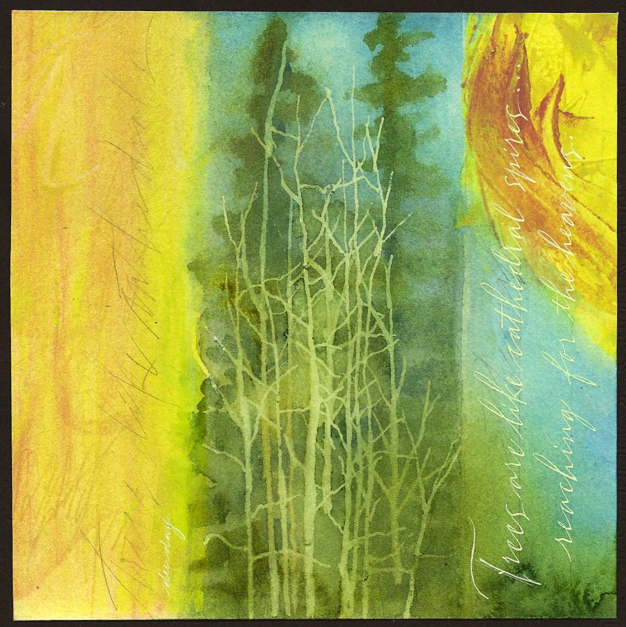
Slight angles and gently framing out the center of interest with gradated color blocks and pencil lines creates a soft dynamic. Soft is the key word to describe the mood of this piece. Actually, every piece has a mood. The mood is set by color choices, color intensity, values, subject matter, and soft or hard edges. I always think about and plan the mood of the piece before all else. For instance, I know that blue and burnt sienna create a softer mood because thaey are split complements rather than direct. I also used values to frame out the shape where the chair sits. Having said all of that, I have concluded that creating a piece of artwork is more instructive than a dozen workshops because it forces you to make decisions that will fine tune your design and technical skills. Just something to think about.

Monday, May 30, 2011

"Journals" (sold)


(sold)

Journals come in all shapes and sizes and deal with a broad range of subject matter. This band of color represents thoughts streaming through the mind in categories much like they might appear in a journal...or a blog!

This piece could easily fit in the category of "colorist". There are artists who do amazing work with color. A "colorist" uses color as the subject matter rather than a particular image. Texture and gradation also become supporting roles in this type of production.

The entire piece was created with paste paper and shaper tools. After creating the textured bands of color, I used a 1.50" shaper tool to scrape off the paste to create soft areas of color with a smooth texture. Having the contrast between rough and smooth textures is the heart of this piece. I personally know a "colorist" who does amazing work with color in oils. Her name is Rebecca Bennett. Check out her website.

Sunday, May 29, 2011

"Trees Like Cathedrals" (sold)


(sold)

The quote reads...."Trees are like cathedral spires reaching for the heavens."

This is the first time since blogging that I've placed the quote in a vertical orientation. It does make it harder to read, but I just had to do it in this case.

The limbs on the barren trees in the foreground and the yellow "sun like" shape in the upper rt. quadrant help to counter balance the predominantly vertical shapes. This is just one of the advantages of working with a square. Since it has no particular horizontal or vertical orientation, you can decide that by dividing up the square in a particular way.

I did paint the trees with transparent watercolors. However, the barren trees were masked out with Pebeo Masking Fluid first. It is easier to achieve a random look by applying the mask with one of the wooden picks used to clean your teeth. (Found with the toothpaste and manuf. by Johnson and Johnson.) Using these will also save your brushes from destruction. Pebeo Masking Fluid can be hard to find. Order from Paper and Ink Arts. It is very useful when trying to preserve portions of previous layers. If you've not used it, give it a try!

Saturday, May 28, 2011

"A Shell" (sold)


(sold)

We probably all have memories of going to the beach. The very sound of waves crashing onto the shore has a rhythmic way of quieting the inner spirit. I spent many of my years growing up and living thirty miles from South Padre...before the high rises. Isn't it wonderful how memories can transport us to other places without ever leaving home?

Rectangular color blocks offer a perfect "niche" to paint an image like this shell. The softer edges of the color blocks can only be achieved by working wet into wet. The results look much more contrived if applying straight acrylic paint which is precisely why paste paper is such a happy choice. The paste also dilutes the color a bit and makes it easier to manipulate. One more technique in achieving transparent and ethereal looks. You might want to give it a try!

Friday, May 27, 2011

"Creative Thought" (sold)


(sold)


This quote is like a commission to all creative people to open up the window of their minds, pay no attention to the internal critic, and let creative thought blow in.

The dominance of vertical lines in this piece is offset by the expressive brown marks running vertically and the use of white glazed diagonally over the window. The horizontal and expressive script also help. As you may have noticed, I do trend towards ethereal looks. Soft pastels, blurring of edges, and the use of white are great tools in achieving that look. If you like that look, it is always instructive to notice how other artists create that mood.

Thursday, May 26, 2011

"Books" ($30.00)


(adjusted price.....$30.00)

There is hardly a subject in the world that hasn't been written about. In fact, if you can read and have enough intelligence and determination, you could learn how to do almost anything. I love books. Do you?

It is also true that there is not a subject in the world that hasn't ended up in a painting somewhere. Subject matter, whether it is realistic or abstract is an important part of every artist's decision making. The wonderful thing about lettering art is the opportunity to offer a connection on two different levels. Even artists who don't actually do hand lettering often include a word or line of lettering in their work for interest. Most people still have a curiosity about what something says or appears to say. How the lettering is packaged then becomes the mission. Something to think about.

Please visit my ebay listing to bid on original art from Dee Day Art Journal Painting a Day.
Dee Day ebay

Wednesday, May 25, 2011

"If The Shoe Fits" ($60.00)


(adjusted price.....$60.00....mounted on a 1.50" depth clayboard)
This is a familiar quote used to point out negative behavior in a somewhat humorous way. I decided to add three words at the end to make it even funnier.  It's not meant to be serious at all and a woman's shoe is such a great contemporary icon!

Color selection is always important but there are several colors available in gouache and acrylic paints that give a glow. In acrylics, one of those colors is light violet. The equivalent to that in gouache is winsor violet (WN) plus white. These colors combined with burnt sienna ("grayed down" orange) are a split complement which gives the visual punch. Another great color (used with burnt sienna in the dark values of the shoe) is perylene violet. It is more of a red violet.

One of the best quotes I've ever heard about color came from Kevin MacPherson (prominent oil and "plein air" painter.) He teaches his students..."If the color note is right, the value will be right." That's a good thing to remember if you have difficulty discerning the values of an object or person.

Please visit my ebay listing to bid on original art from Dee Day Art Journal Painting a Day.
Dee Day ebay

Tuesday, May 24, 2011

"Tyranny of the Urgent" (sold)


(sold)

This quote is a reminder of what we all face every day. The tyranny of the urgent can cause us all to forget the most important priorities. The problem can only be resolved by deleting our schedules or reorganizing in such a way to allow for the important things.

The energy in this piece was the perfect backdrop for this quote. Fortunately there was a horizontal band to help quiet things down a bit. It is a visual of what we often need to do in our lives...create a horizontal band of rest and quiet. This is probably the most simple and effective way to divide a space. And it can also go vertically for a different layout. The piece still remains very dynamic with the large expressive marks and different things happening in every corner. Soft pastels come to the rescue and give additional color and still allow the previous layer to show through. Scrape the soft pastel off onto a disposable plate and apply with a hake brush.

Please visit my ebay listing to bid on original art from Dee Day Art Journal Painting a Day.
Dee Day ebay

Monday, May 23, 2011

"Surprise Elements" (sold)


(sold)

Wild Yucca plants with their white blooms are all along the roadside in the Texas Hill Country. It was an unexpected surprise last week to see them blooming so I knew I wanted to post one of them. In this case the image came first, followed by the quote.

Line is a design element that generally forms a shape in most artwork. When lines are formed by making erratic or expressive marks, they don't always make a shape but create interesting texture. Most of the time, I try to create expressive line work that goes from edge to edge or very close to the edge. By doing this, another division of space is created. It is this type of division created in layers with previous layers showing through that creates depth and interest in abstract art. Just something to think about.

Sunday, May 22, 2011

"Direct Link" ($60.00)


(adjusted price.....$60.00.....mounted on a 1.50" clayboard)

No explanation is really needed here. We've all clicked onto those underlined and high lighted links on our computer that immediately connect us to a particular site. The comparison of prayer to a direct link is perfect.

Erratic lines came to the forefront, big time, in this background. The criss crossing of lines in the paste paper yielded several crosses so I capitalized on what was there and painted in the belfry tower. I did like the "echoes" of crosses throughout the piece in all different sizes and configurations. There was no black in the first layer, but after painting the belfry tower, I noticed a perfect spot on the right hand side to "echo" the shadow in the bell tower.

Echoes of different elements whether it be color, texture, lines, or shapes will add a dynamic rhythm to any piece. Whether they happen spontaneously or intentionally, they are worth careful attention.

Please visit my ebay listing to bid on original art from Dee Day Art Journal Painting a Day.
Dee Day ebay

Saturday, May 21, 2011

"Always Open" (sold)


(sold)

You are a truly blessed person if you have even one friend whose door is always open to you. These special people are God's hand to help us deal with life. Let us all keep the door open to our friends.

Spontaneous is defined in the dictionary as something occurring without external cause...natural and unconstrained...involuntary; not due to conscious volition....instinctive...etc.  If you've ever tried to achieve something that looks spontaneous in your artwork, then you know full well how difficult this can be.

I have concluded that any means of effortless mark making or unusual divisions of space should be explored. For me, cropping is still the number one means of acheiving such a look. Do whatever mark making , blocks of color, or texture you want using any medium or tools you want and create this on a large enough sheet of paper to allow for cropping. You will soon (after one try) realize you can be somewhat intentional about space left blank around these erratic images to allow for additional imagery or lettering after the cropping. Even if you are simply exploring unique divisions of space for work in a completely different medium, this is worth a shot. And it's terribly freeing and therapeutic! Try it. You'll like it!

Please visit my ebay listing to bid on original art from Dee Day Art Journal Painting a Day.
Dee Day ebay

Friday, May 20, 2011

"Wholeness" ($60.00)


(adjusted price.....$60.00......mounted on a 1.50" depth clayboard)


Hectic activity day after day can take its toll on body and soul. It's always healing to go to those places that offer quietness and rest. It's even better if it's some place close. Just an hour or two can do wonders.

The initial blocks of color in this piece remind me of New Mexico or Arizona. Both of those states have places that prompted this quote. (Our state has plenty of places as well.)

The process for this piece began with isolated marks and bands of color (acrylic + paste) applied to wet paper with a credit card. There are overlapping bands as well which helped to form the top of the bluff. Now I had no idea in mind when creating this first layer, but after cropping, I knew it could be an abstract landscape. At this stage, it helps to have photographs to use as a reference to fill in the details.

This is only one way of working, but no matter how you plan your process, it is very helpful to have a ton of photographs on hand. Each trip can yield a new "stash" so keep that in mind as summer approaches. Digital photography is indeed a great tool for the artist.

Please visit my ebay listing to bid on original art from Dee Day Art Journal Painting a Day.
Dee Day ebay

Thursday, May 19, 2011

"Perfectly" ($30.00)


(adjusted price.....$30.00)

Every skill is learned in stages. This quote is referencing each step practiced perfectly. It would be impossible to practice something perfectly if you were trying to practice a skill at the same level as someone who's been doing it for years. This is a very important distinction. None of the steps can be skipped.

The design emphasis in this piece is a contrast between order and containment versus erractic marks with no containment.

The order is established with squares both large and small with the small squares being contained within each large square. The introduction of variety was introduced by choosing different corners and different colors for each small square. The eye will automatically try to make a pattern out of the placement of those small squares. So it is a great design device to use repetition with contrast and variety to keep the viewer engaged in the piece longer than five seconds. Because of the age in which we live, the volume of visuals that people see everyday makes the challenge of an artist even greater. Design knowledge becomes as important as technical skill.

Please visit my ebay listing to bid on original art from Dee Day Art Journal Painting a Day.
Dee Day ebay

Wednesday, May 18, 2011

"Woven Together" (sold)


(sold)

Everyday, just by virtue of living on the earth, all of us will do three things. We will think, eat, and do something. However, there is a huge range in the choices people make in these three areas. These choices produce the fabric of our lives.

Someone emailed me and asked me if the quote or the visual come first. I can truthfully say that sometimes it's the quote, and sometimes it's the visual. The beauty of writing your own quotes is  the freedom to change things as you go along. For instance, my first quote for today was..."We are what we think, eat, and do."  But while I was deciding on a visual, I glanced over to see all these strips that were cut off of other pieces and I also had a visual in front of me of woven leather strips. Once I saw that, I began to think how to change the wording so that a weaving could be a design element.

The next question is..."Does the design work?" As always, the fianl verdict is in the eye of the viewer. So often artists forget that even though they can create anything they want, the final decision of whether it connects to the viewer is not their decision to make. Just something to think about.

Please visit my ebay listing to bid on original art from Dee Day Art Journal Painting a Day.
Dee Day ebay

Tuesday, May 17, 2011

"Words" (sold)


(sold)

The words of our mouth are vital to the life we want to live. Words can be positive or negative. It's a choice we all make. It definitely determines the fruit of our lives.

There is more than one way to frame out an image besides painting or drawing a "cute" border. The trend in contemporary art is to go frameless...no mat...and have the art itself be totally accessible to the viewer. By designing your corners, you create a border...in a way. This piece today is a very good example of a "hint" of a border. Each corner is very different with the center of interest showcased in a corner. These are design decisions you might want to think about.

Please visit my ebay listing to bid on original art from Dee Day Art Journal Painting a Day.
Dee Day ebay

Monday, May 16, 2011

"Back to Basics" (sold)


(sold)

Everyone can identify with times when an endeavor ends up in a "muddle". At those times it is quite invigorating to simply go back to the basics. It's quite like the golf pro who changed coaches to improve his golf swing. For this particular player, it meant two years of not winning and "slogging" through ingrained habits. It paid off when he ended up at the top of his game.

This was one of those cropped pieces of paste paper that had some compelling texture, but seemed hopeless. It's quite abstract with lots of drama so I'm quite sure it will not appeal to everyone. I focused on division of space with some bold, flat color, allowing the red to remain dominant. It was a gamble, but I think we all need to take risks so that our artwork doesn't become too predictable. This one will definitely wake you up in the morning! The very "sketchy" italic was almost an afterthought. I like it simply because it has compelling interest and it is definitely not predictable. But as always, the viewer always gets to decide.

Sunday, May 15, 2011

"The Front Porch" ($60.00)


(adjusted price.....$60.00....mounted on a 1.5" depth clayboard)

The nostalgia of the front porch is a very real memory for some and a present reality for others. It is a place for visiting with family or friends or just having a quiet moment of prayer. The quote completes the story for me.

This piece illustrates another way to divide the design space. After cropping a section of paste paper to an exact (6 x 6), I folded the paper in half...in half again...and in both directions to create (16) squares. I then used sandpaper to distress the edge of each fold. The initial paste paper was gray, but I warmed it up by brushing a wash of walnut ink over the surface. The paper was then sprayed with acrylic coating followed by (2) dilute coats of gel matte medium. The last step was painting and lettering. That's it in a "nutshell" or should I say "walnut shell"? Anyway, it's a different "aging" technique you might want to try.

Please visit my ebay listing to bid on original art from Dee Day Art Journal Painting a Day.
Dee Day ebay

Saturday, May 14, 2011

"The Learning Curve" ($30.00)


(adjusted price.....$30.00)

Have you ever under estimated the amount of time, effort, and energy it takes to learn something? It helps me to know that if I stay committed to the learning process, that it will eventually become an easy thing to do.

This piece is based purely on design, making it very abstract. The red lines in the black block actually show a progression from a straight line to a curved line. It is similar to an image "morphing" from one thing to another. It is a wonderful way to show movement in a two dimensional piece. Of course, as you might have guessed, the curved line is referencing the "learning curve" in the quote.

Also, take note once again of the division of space. In every shape or block of color there is something different going on with line work or texture. Noticing and then creating these kinds of areas is very important in abstract art. If you are not painting a realistic image, all you can use in the way of visual language are the elements of design that may not reference a particular image. Paying attention to values and surface texture is necessary in giving this piece depth and dimension. Try going back to some of your rejects and cropping them into smaller pieces. See if you can find some interesting divisions of space. It really is an exciting way to create a new piece of artwork.

Please visit my ebay listing to bid on original art from Dee Day Art Journal Painting a Day.
Dee Day ebay

Friday, May 13, 2011

"Welcome Home" (unavailable)


(in the permanent collection of dee day)

For the occasion of my 100th (6 x 6) posting, I had to do another Texas quote. If you live anywhere in this fine state, no explanation is needed. If you don't live here...well, you're welcome to visit us sometime!

Those of you who have been faithful followers know that I have included a bit of design commentary each day...mainly, because I'm a teacher, and have the need to explain everything on the planet.

Today let me explain what happens to each piece after it comes off of the (10) day posting period on ebay. If no one bids on a particular piece, I then make one of several decisions. I mark it unavailable if I give it to someone or decide to let it be part of my private collection. The others are reduced in price down to $30.00 or $40.00 dollars. (A comment left on any posting will go directly to my e-mail and allow me to contact you privately.) All of the postings are archived on this blog. You can see for yourself how my work has changed since my first posting on February 1, 2011. Thanks for all of you who have offered continual encouragement. I now must go and begin on the 101st painting.

Please visit my ebay listing to bid on original art from Dee Day Art Journal Painting a Day.
Dee Day ebay

Thursday, May 12, 2011

"Vivace" (sold)


(sold)


The word, vivace, is a musical term that means..."in a lively, brisk manner". This quote is about what it takes to do something at the top of your game. For instance, a music selection marked with the quarter note played at 120 beats per minute could never be practiced at that speed initially. Dr. Urekvitz, my college piano professor, would instruct me to begin at 40 beats and gradually speed up. The tendency for most of us is to try to learn a skill at the same speed of someone who is accomplished. Save yourself some frustration and slow down.

In this piece, I have attempted to do some expressive lettering loosely based on spencerian script. Even though the form of spencerian is well known and practiced by me, I still find it a bit awkward to execute this more expressive style. So can I simply sit down and write it with the same degree of proficiency and speed that others can who have spent hundreds more hours on it than I have? No, I cannot. But I am better than I was day before yesterday. The whole point is to realize where you are in the process and don't be so hard on yourself. The important thing is not to give up, but keep writing or doing whatever it is you are trying to master. One day you will notice how well you're doing.

Wednesday, May 11, 2011

"On the Way" ($60.00)


(adjusted price.....$60.00.....mounted on a 1.50" depth clayboard)

It's always a delight to see something you were not expecting to see when on the way to do something else. Such was the case when I saw this beautifully glazed pot in a restaurant. The texture was exquisite. Maybe you will see or experience something you were not expecting today.

This piece reminds me of how valuable it is to carry a small pocket camera (with a zoom lens) in your purse. You just never know what you might see when you're out and about.

All of the realistic images I have been painting have been done with gouache. (an opaque watercolor) There is a bit of a trick to blending areas of color together. It is much like painting with oils because in both mediums the paint will move around and too much brush work will end up in mud. I use kleenex to wipe my brush off after every stroke. In the case of this pot, I painted a "grayed down" purple as the first layer....dried it with a hair dryer...sprayed with acrylic spray coating....applied two coats of diluted gel matte medium...and finished painting the pot. Being able to manipulate the surface by creating layers is invaluable . These daily paintings have turned me into a layering "maniac"! You, too, can become one if you give it a try. One more thing...this type of pencil lettering on this surface cannot be done without sharpening your pencil on a sandpaper block.

Please visit my ebay listing to bid on original art from Dee Day Art Journal Painting a Day.
Dee Day ebay

Tuesday, May 10, 2011

"The Main Thing" ($30.00)


(adjusted price......$30.00)

This quote is all about priorities. When we lose sight of the most important things, life can get a little confusing. Knowing what the main thing is brings it all back in focus again.

In design language, the main thing is called dominance. Dominance is crucial to unity. One type of line (straight or curved) dominating...one particular direction...one particular shape...one value...one color...one texture...one size needs to dominate by how much space it occupies or how many times it's repeated.

Heirarchy is closely related to dominance. It is a body of elements arranged according to rank, authority, or capacity.

In the visual arts, heirarchy is the presentation of certain elements as more important than others. By conveying a clear sense of heirarchy an artist provides stability, sequence, and movemeent within a design. Just something to think about.


Please visit my ebay listing to bid on original art from Dee Day Art Journal Painting a Day.
Dee Day ebay

Monday, May 9, 2011

"A Good Idea" (sold)


(sold)

We all come up with good ideas and probably on a daily basis. Not all of them survive. This quote harkens back to another one that is older than the hills...."A bird in the hand is worth two in the bush". (click on image to enlarge lettering)

Blue and yellow are two of the most appealing split complements. And if you're still in a "muddle" over color schemes and complementaries, puchase a small color wheel. The basic information is right there for all to see. It really isn't complicated.

This piece is an example of a very realistic still life with an abstract background. I may have mentioned this previously, but there is an excellent still life artist creating very beautiful, highly detailed still lifes, but she always adds a bit more energy by throwing in enough abstraction in the background to "kick it up a notch". Google her name...Sherry Loehr....and you will see some amazing art. Also, if you don't paint or draw, try combining a carefully cut realistic image and use it as a bit of collage with your abstraction. Very exciting!


Please visit my ebay listing to bid on original art from Dee Day Art Journal Painting a Day.
Dee Day ebay

Sunday, May 8, 2011

"Breath of Prayer" (unavailable)


(in the permanent collection of dee day)

Flowers seem to say what words cannot. Prayer and flowers together can comfort and bring joy to the deepest parts of the human soul. I pray you will have these experiences today.

Gradation is that design principle that brings softness into a piece. It's comparable to the crescendo and decrescendo in music. It's defined as a stage of transition. In art it is the gradual passing from one tone or shade to another. There is a lot of gradation in this piece which creates a cozy effect visually. When you are trying to create a quiet and contemplative piece, gradation must be a consideration.

Please visit my ebay listing to bid on original art from Dee Day Art Journal Painting a Day.
Dee Day ebay

Saturday, May 7, 2011

"Proficiency" (sold)


(sold)

This quote not only applies to lettering practice, but to every new skill across the board. We live in an age where many people want to instantly arrive at the same skill level as someone else without doing the practice that makes this happen. This is a friendly reminder that everything takes effort and time. Start today by putting some miles on that practice.

This piece is also a  reminder to those in my spencerian class that the assignment of writing at least one alphabet necklace per day is the first step in proficiency.

Design wise this piece illustrates how to use a band of color to divide the space and also to create a block of color as a way of including off hand flourishing....for you pointed pen fanatics. I like to work this way because I simply do not do flourished birds and animals. It does add a bit of sparkle. And of course, the time honored color combination of red, black, and white works every time it's tried. Just in case you're wanting to whip out some paper and create something today, this should give you some food for thought.


Please visit my ebay listing to bid on original art from Dee Day Art Journal Painting a Day.
Dee Day ebay

Friday, May 6, 2011

"Journeys" (unavailable)


(in the permanent collection of dee day)

Some journeys are long and some are short. It's easier to lose sight of the goal on a long journey. The key is to stay on track by keeping your bags packed with knowledge and practice. It won't be long before you're pulling into the station with your goal and your journey completed.

This piece has more abstraction than many I've done and I like the idea of surprise elements and shapes. Last Tuesday was a big paste paper session where I found myself manipulating the paste by not always covering the entire surface, but thinking about shapes and possible "cropped" sections. Each time I create these papers, I'm learning more about manipulating the surface texture. This is exciting because it's extremely difficult to create images that look random and spontaneous. Working this way allows for the first layer of the piece to provide the erratic lines and movement that give energy to a piece. Cropping of a large sheet of these highly energetic marks then becomes an art form. I really can't say enough about it!  And to think I stumbled into this never dreaming I would be making such a big deal out of paste paper. This is what creating a piece every day will do for you. It's a journey worth taking!


Please visit my ebay listing to bid on original art from Dee Day Art Journal Painting a Day.
Dee Day ebay

Thursday, May 5, 2011

"May Flowers" ($40.00)


(adjusted price....$40.00)

Many special events happen in May, making it the second busiest month of the year after December. Many of these events especially, Mother's Day and Weddings, are made extra special with flowers. Enjoy!

After receiving several e-mails yesterday asking me what the quote said... I rest my case about the fact that a majority of people actually want to read what they perceive as lettering.

I do like to integrate the lettering into the background which often does make it more difficult to read. (It also helps to double click on the image.) All of the originals are easy to read, and sometimes fine details get lost when seen on a computer. Never the less, I made sure everyone could read today's quote with no problem. However, I originally wrote it in cadmium scarlet and it was too blended with the background so I just went over the whole thing in dark green. You can still see some of the cadmium showing through in places, but I'm past the point of having everything perfect so I decided it looked just fine with a bit of the original color peeking through. I must say that Yves Leterme had a powerful influence on me and one of my favorite things he said was to just let the mistakes show. It's sounding better to me all of the time. By the way, I am almost to my 100th (6 x 6) and I don't know whether I'm just getting "lax" or if "funky" is beginning to grow on me. Anyway, the thing to take away from today is let the mistakes show through. You might have a "new technique" on your hands.


Please visit my ebay listing to bid on original art from Dee Day Art Journal Painting a Day.
Dee Day ebay

Wednesday, May 4, 2011

"A Hot Mess" ($60.00)


(adjusted price.....$60.00......mounted on a 1.50" clayboard)

Feelings are notoriously fickle. The emotions that can overtake us are the biggest obstacles in overcoming the "hand wringing" over a particularly acute situation. The best thing to do is to quit sitting in a chair crying with your box of kleenex and stay focused on the positive thoughts that can actually help to overcome your situation. Many of those positive thoughts are found in the Bible. The key is to change your focus. Feelings are not solutions.

This background looks kind of like a "hot mess", but I decided to go bold (or stay home). The flat color of the chair and lettering helped to bring it around...and it accurately represents the quote so I went with it.

The key to bringing calm to intense, bright, and bold colors is to use one or more of the same colors and lower the intensity by diluting it. Color can be diluted by adding white or black...by adding a bit of the complementary to gray it down...or the addition of a neutral such as gray or raw umber. In this case I used a lot of white to the turquoise, applied two coats, and ended up with a very flat image. It's a wonderful thing to try if you have some "hot mess" backgrounds in your drawer. They might need this type of resurrection.

Please visit my ebay listing to bid on original art from Dee Day Art Journal Painting a Day.
Dee Day ebay

Tuesday, May 3, 2011

"Variety" (sold)


(sold)

Can you imagine a world where there was only one kind of tree or one kind of flower? I would be on my "soap box" making the case for palm trees! Fortunately for all of us, we have the pleasure of enjoying a variety of design elements every day, whether it's in nature or art.

As for this piece...I enjoyed painting a plant that is in an abstract environment. It's okay with me that there is not a blue sky and a traditional landscape scene. The only danger with variety is that there can be too much which causes visual confusion. One of the first considerations in balancing variety with harmony is ...to keep the main thing, the main thing. This plant fits in beautifully with this background because the colors are so analogous. The choice to add more burnt sienna with some of the darker green and place it in the foreground was to warm up the painting a bit and ground this piece with some darker values. (Burnt Sienna would be a darker version of orange which is the split complement of green which is why it works so well.) Consider variety in your next work or simply look for it in other artist's work.

Monday, May 2, 2011

"The Key" (sold)


(sold)

There is a tendency to be reluctant to even want to know what is behind a closed door...metaphorically speaking. However, some of the best things can happen when you allow your desires to open the door.

Placing a bit of color randomly along an edge can give the illusion that there is another layer of color underneath. It is far more interesting than simply painting in a solid block of color. Try it and see what you think.

If you want to do some touching up with soft pastels, you will have better success brushing on a coat of Liquitex Clear Gesso.  (It adds "tooth" to the surface.)  I've mentioned this before, but just in case you've just "tuned in"I'm saying it again. The burnt sienna and black charcoal powder helped transform a "hot mess" underneath. Do you have some "hot messes" that need repair?  Try some soft pastels.

Please visit my ebay listing to bid on original art from Dee Day Art Journal Painting a Day.
Dee Day ebay

Sunday, May 1, 2011

" A Cathedral" (unavailable)


(in the permanent collection of dee day)

My love for cathedrals has never wavered. And with all the "pomp and circumstance" that has taken place in Westminster Abbey this past week, those feelings of glorious and radiant beauty intensified once again. Surely the brush of angel wings and the Spirit of God can be more intensely felt in such a glorious place!

Subtlety is very important to me, even when my piece might have more intense colors. Setting a particular mood is a very important part of that process.  Fortunately, I had picked up several values of soft pastels last week and had them on hand. They are a tremendous aid in modulating the value range in a subtle way. Charcoal powder would have been too "blatant" in this piece, but the inclusion of dark gray pastel was perfect. It was scraped off onto a paper plate with a break off knife and then brushed over the desired areas. Since there are over (500) color choices in soft pastel, I would suggest purchasing a light, medium, and dark in gray and any other colors you use regularly.  You don't need to be a pastel artist to use and appreciate what they can do for your work.

Some artists don't believe in this, but I do spray my work with Krylon Acrylic Spray Coating. All of my work has a final two coats of varnish which makes it completely agreeable for presentation with no glass....and possibly no frame. The 1.50" depth clayboards are perfect for mounting your work and presenting with no frame. Most contemporary work is being presented this way now.

Please visit my ebay listing to bid on original art from Dee Day Art Journal Painting a Day.
Dee Day ebay