Saturday, June 30, 2012

"Amen!"


($40.00.....6" x 6".....mounted on a 1/8" depth clayboard panel)


"Say amen to something every day!" It will make you feel good...like everything is right in the world again. Try it!

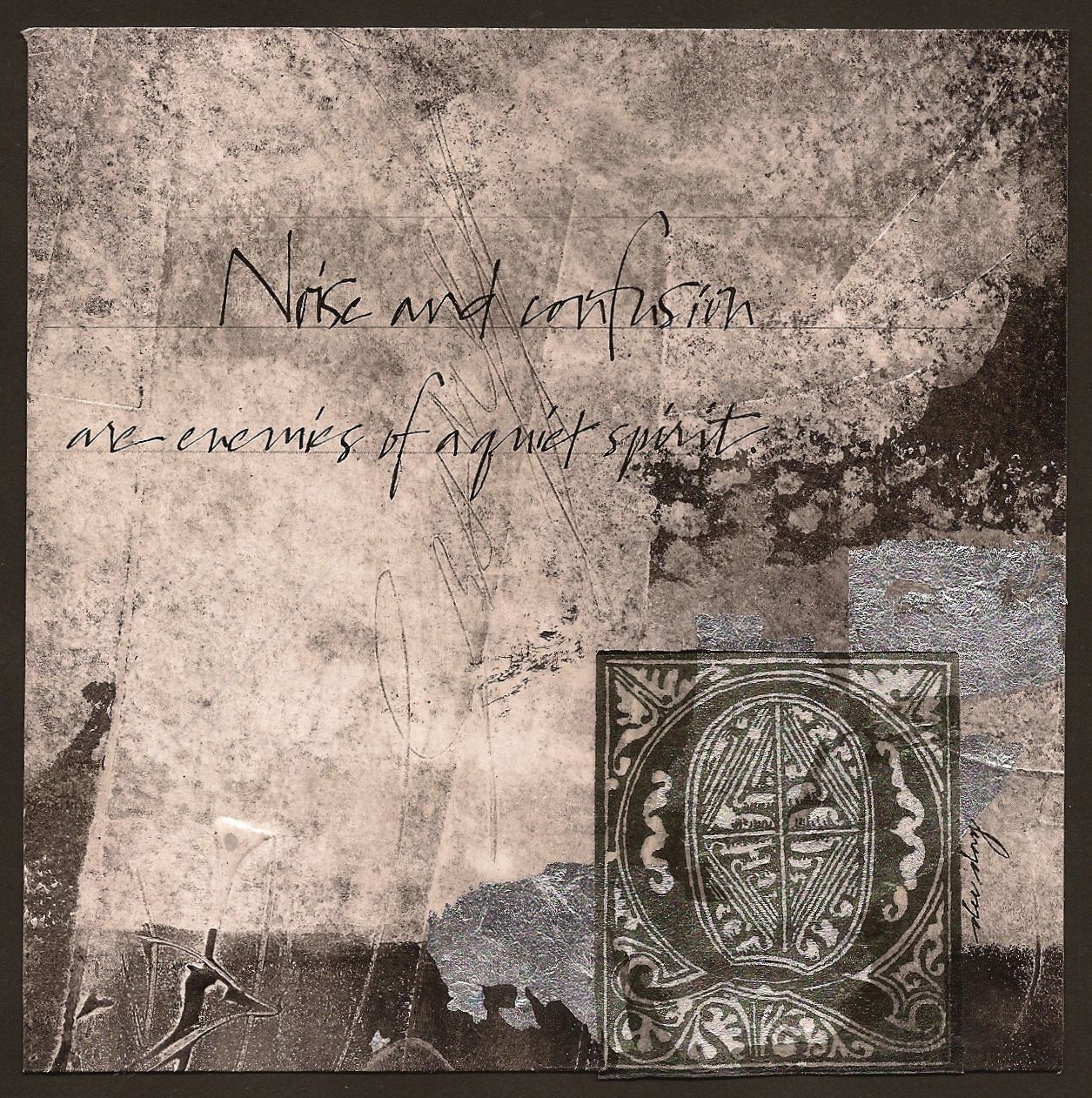
This is a very, very, experimental piece of artwork. I took it to the brink of destruction several times and then decided it was done when nothing else came to mind for me to do.

It began as a mono print on rice paper that was cropped and adhered to a clayboard. It is necessary to attach it to a hard support in order to work since rice paper is thin. Silver leaf, an extra piece of rice paper mono printed, the flourished Amen, and finally some fragments of metallic leaf were adhered in that order.

The method of deconstruction was used to add interest and make the darker purple piece more integrated into the support. After I adhered everything, the darker purple piece was still damp from the gel matte medium so I lifted up an edge an tore it off as far as it would go. I did that in several other places, revealing the mono print underneath. It truly is another spontaneous technique that yields good results in situations like this.

The quote took a back seat and is barely noticeable in the upper left hand corner. Writing it in pencil also helped to keep it subtle. I can't decide whether I like the end result completely, but I am pleased at the very strong shapes that were established. The ornate lettering is an old style which contrasts well with a very contemporary look. And there you have it...just a few more things to think about. So if you're frustrated with anything today, try deconstruction. It's very therapeutic!


Please contact me personally to inquire about this piece.

Friday, June 29, 2012

"The Library" (sold)


(sold)


"Books have the power to take you to far away places and very deep thought." Some of my fondest memories are curling up in a favorite chair and enjoying a good book. There is something very rich about holding the book in your hand....even if you have an iPad or Kindle. My library is my prized possession. How about you?

In some of my larger works, I have completed at least 6-8 pieces over the last few years that I call "library pieces". They all contained collage elements that were very old and generally they all contained small and very old books I have purchased in antique stores across the country. Some of them had a window cut out of a book cover that was filled with an inclusion of fused glass. None of those pieces are in my possession now so I am concluding that library pieces with a very traditional look are still in demand.

This piece reminds me of some of those works for the same reasons. This piece has an old book page, a piece of very old music from a hymnal, some of my own lettering printed on silk tissue paper and a stock photo of a butterfly. An excursion into a library will often have a wall piece containing specimens of butterflies or drawings of plants, etc.

Without intending to, after the pieces were assembled and shapes were formed, I looked at the piece from across the room and the orange shape from top to bottom reminded me of a book mark. The "bling" is the silver leaf. The upper right hand segment was dulled a bit by rubbing on some walnut ink and then blotting.

Another technique with Speedball Printing Ink is in the bottom right hand corner. If you brayer on the printing ink and let it dry, you can dip your pen into water and write into the ink and reveal the color underneath. Likewise, you can drop water or make a fingerprint into the ink and create some texture. I encourage you to try some of these things and see how your library pieces turn out.  And there you have it...just a few more things to think about.

Thursday, June 28, 2012

"Antiquities"


(unavailable)


"Articles of antiquity anchor us to the ebb and flow of history." There are a lot of us out here who like to rummage through old things with interesting patinas and shapes. After thinking about it for a long time, I have concluded that the ongoing interest in antiques anchors us into history and securely places us in the timeline. It makes us feel secure...that all is well.

A few days ago I talked about creating a series. This piece is the third in a series created from the same parent sheet of paper. Alas, this is the last for it is all gone.

The background colors are very conducive to all environments, but this one could be categorized as a library piece. It has a look of history and much of that is because of the colors. This robin egg's blue (Cobalt Turquoise + Raw Umber+ White) is a favorite to use with umbers and other earth colors such as raw sienna. If you like this palette, I strongly encourage you to give it a try and experiment with the percentage of space that each color occupies...vary that...and do a series. It's quite instructive and yields a great study in neutrals.

The collage elements, of course, are the focal point with a contrast of translucent, transparent, and opaque pieces. The dark collage piece at the bottom right was positioned over three different surfaces to create different values and shapes from the one image. The same is true for the ornate letter with all of the flourishes. And that's the charm of transparency and the depth that can be achieved.

It is not necessary to include collage over the whole piece, but rather to keep it in one area and going from edge to edge is a good idea. Also make sure to include contrasts between straight and erratic edges as well as transparent and opaque sections. Both types of contrasts are needed to achieve this kind of look. And there you have it...just a few more things to think about.

Please contact me personally to inquire about this piece.

Wednesday, June 27, 2012

"Play On" (sold)


(sold)


"Play your life with passion for it is the food of life." Energetic and gestural marks are all the rage because of the quick and passionate movement as they're being made. A lackadaisical approach has no energy. So it is in life. A positive and energetic approach is always more attractive.

The foundation of this piece began with acrylic paint and a palette knife. The shapes here are very free form. Basically, all it takes to create shapes is a value and color change. Inscribing into the wet paint with the corner of a credit card created the gestural writing as well as stamped lines to echo the bit of music collage.

I am working on a larger piece with these same colors so I knew the lettering would need to be white. (The Quinacridone Magenta did not show up well in the hairlines of the lettering) For that reason, I chose to include some white of the paper when cropping from a larger piece to tie in with the letters.

This piece is a reminder that it takes a spontaneous technique to create a spontaneous result. And in this day and age the use of spontaneous techniques is essential to set yourself apart in the art world....or at the minimum, using energetic brush strokes or including a bit of diagonal movement, etc. All of these things, plus an ever growing sense of design, is what will help an artist grow. Painting and creating what thousands of others are doing will not do it anymore because we are inundated with visuals every day. And there you have it. Just a few more things to think about.

Tuesday, June 26, 2012

"Seize the Moment"


($40.00....6" x 6".....mounted on 1/8" depth clayboard panel)


"Seize the moment before it flies away." I'm sure we can all think back on a moment of opportunity that slipped through our fingers. Sometimes there is a second chance to revisit something, but most often, it is gone forever unless we suspend what we're doing and seize the moment.  Seize a moment today before it flies away.

You may notice that the colors in this piece are the same as yesterday's posting. That's because they were cut from the same parent sheet of paper. There is the same emphasis on diagonals, but the shapes are quite different in this piece.

If you ever want to work in a series...one of the best ways to accomplish a seamless transition from one piece to the other is to work on a much larger sheet of paper and then crop two or more pieces from that larger sheet. A series can also be created by using the same materials and colors with each piece having a different composition.

Working in a series and presenting them all together is an excellent way of keeping the viewer engaged. The eye is always looking for connections, so by having several pieces that connect visually, the viewer will have much to consider.

One more interesting way to create a series is to use the same palette, but not necessarily use the same colors. Rather, a series can be united thematically. This could also be an open door for collaborative work with each person taking a part of the theme and then all of the pieces presented together. We did this one time on the art team at Open Doors Gallery by assigning 12 persons to take an element of the Last Supper and create a 4" x 4". The pieces were then presented together in the same piece.

Just thinking about a series can offer up many hours of creative study and fun for yourself and others. So think about that and perhaps you will be inspired to get started today.

Please contact me personally to inquire about this piece.

Monday, June 25, 2012

"Unfolding Dreams" (sold)


(sold))


"The reward of the diligent is the unfolding of dreams." The steady and focused attention on a particular skill is the essence of diligence. Steady means "on a regular basis"...like everyday. It is a steady observation and self critique as you work on your work. Go for it!

The foundation of this piece is acrylic paint. There is no gesso. I did add molding paste to the raw umber and retarder to all of the acrylic mixtures to extend the working time. My desire was to experiment with gestural strokes with a broad sweep across a larger sheet of paper.

The texture was mostly created with shaper tools and credit cards. I also used a brayer and alcohol to remove and soften the lines in several places. It's another exciting approach to mixed media and surface texture. The butterfly was printed on silk tissue paper and as you can see the raised texture shows up right through the paper to create a total integration with the surface.

I enjoyed writing the quote with a Mitchell #6 and Walnut Ink. It is the movement created by the diagonal sweep of color that gives this piece drama as well as the butterfly positioned so that it looks like it's in flight. And there you have it. Just a few more things to think about.

Sunday, June 24, 2012

"Sitting On The Patio"


($200.00......18" x 24".....painted on a 2" depth gessobord)


There is no quote today, but I did inscribe the title of the piece into the wet oil paint. "Sitting on the Patio" is a painting of one of my favorite pots and plants on my patio. The patio is what I call the new "front porch". Not everyone has a front porch anymore, but most people do have a deck or patio where they can share conversation with family and friends. Many happy conversations have happened on my patio as well as many quiet moments of thought and reflection. This piece is larger and was created for an upcoming exhibit at Hill Country Bible Church NW called "Come Together".  Indeed, patios are a great place to come together.

I don't post many oil paintings, but I can assure you that I have been dabbling with oils for some time now and my most successful endeavors seem to be created with the palette knife. This entire piece was done alla prima with a variety of sizes and shapes of palette knives.

The same gestural textures can be seen in the background that I also create in kiln formed glass and mixed media. I used a double palette of warm and cool colors. One of the most useful things I've done is to mix all of my primary and secondary colors with the complement (one by one) and adding white and then more white to achieve a range of grays. Those paint chips have been placed on shipping tags....labeled...and hung on a ring binder to give me a ready reference until I become totally experienced with mixing the range of grays that are in the landscape or any painting really.

My inspiration has come from artists like Sandra Pratt and Rocky Hawkins. They both use a lot of palette knife techniques. You might be inspired by taking a peak at their websites. All of these same techniques can be used with acrylics. It is best to use a retarder with the acrylics to give you a longer window of working time. Open acrylics are another option for painting outdoors with this medium. The advantage, of course, in working with acrylics is that the surface can then be prepared for lettering. Other water media cannot be placed on top of oils. And there you have it. Just a few more things to think about.

Please contact me personally to inquire about this piece.

Saturday, June 23, 2012

"The Right Door"


($40.00....6" x 6"....mounted on a 1/8" depth clayboard panel)


"Choosing the right door produces the best opportunity." We cannot always know what's behind every door, but some doors are so dilapidated that it becomes obvious not to go through that one. Choices are everything...literally! It is best to choose the right door.

This is an odd piece in the way it came together. There are actually two backgrounds, one adhered to the other. The top piece was torn, creating an erratic edge and then painted magenta. In person, it is very bright because of the silver and gold leaf, but the brilliance cannot be seen on a computer screen.

The door was painted with gouache and a palette knife and I felt like writing a very erratic line of lettering. Sometimes, I just get tired of everything being regimented and feel the need to break out into a "scrawl".

You can also see a clear division of space with the magenta producing a nice edge and several other shapes. This piece is all about texture which fits my mood today. It's different and it's funky and fits in perfectly with a relaxed Saturday.  So there you have it. Just a few more things to think about.

Please contact me personally to inquire about this piece.

Friday, June 22, 2012

"Swept Away"


(unavailable)


"Love has swept away the emptiness and filled it with the fullness of my one true love beside me." Today's posting is dedicated to my niece, Kelley, on this beautiful day of her wedding. We share in your joy and will see you wed to your beloved this evening. God's blessing on you both.

This is a pouring medium piece with transparent silk tissue collage. The background, of course, is very contemporary, but the format of the lettering is a "take off" on a traditional format popular in the 1800's. The overlays of silk tissue were taken from the Universal Penman which is rich in the Copperplate style of lettering from that era. Most of the pages begin with an ornate title, followed by simple script lettering and ending with a flourish. This is a Dover publication and the images are copyright free up to 10 images in one work.

I know that some of you are working with silk tissue. One thing I have discovered is that the transparency is much more effective on a light colored background rather than dark. So you might want to keep that in mind. This technique also works better if the image has a lot of open or white areas where the background can show through. Hopefully, that gives a little more direction for your special works of art. And there you have it. Just a few more things to think about.

Thursday, June 21, 2012

"Circle of Quiet"


(unavailable)


"When my world becomes chaotic...I go to my circle of quiet." A circle of quiet can be different things to different people. But whether it's taking a walk, riding a bike, or sitting on the patio, and perhaps praying, we all need these "recharge zones". Find your circle of quiet and lower the stress levels in your life.

This is another piece beginning with a mono print on rice paper. And because rice paper can be fragile when wet, it is best to apply the gel matte medium to the support rather than the paper.  Black, white, and red is a powerful color combination that works every time it's tried. So if you're every in a quandary about color choices, this is one you can do and be relatively sure it will come together for you.

When I was contemplating what to do this morning, I found myself identifying with the gestural and chaotic marks in this print. So it continues to amaze me how my daily posting generally reflects what I am personally experiencing. And right now there is a lot of chaos around me, but I have found my circle of quiet and all is well.

The circle was created by sitting a bottle of ink into a puddle of FW Ink that I poured on my glass surface. It made the unexpected erratic circle I was looking for. So if you ever need a circle print, just look around at the bottles in your studio. You are sure to find one that will work. When working with ink, however, you must spray with acrylic coating at least (3x) and dry thoroughly in between. Most inks contain shellac so it does take a longer time to dry. You can then be reassured that the bottle print will not smudge when you prepare your surface for lettering, stamping, etc. So there you have it. Just a few more things to think about.

Wednesday, June 20, 2012

"Good Thoughts" (sold)


(sold))


"Good thoughts flowing through my mind create a rich patina in my soul." Testing has already revealed that angry, hateful, unforgiving thoughts can have a very detrimental effect on our health. It is far better to lay all of that aside and wrap your mind around good, positive, life giving thoughts.

This is a piece that began with a mono print on rice paper. This paper is great for creating a mono print and is quite easy to do. Begin by mixing up your choice of color (preferably on a piece of glass or smooth ceramic tile) and then roll it out over the surface with a brayer. Then pick up an old credit card, stylus, or shaper tool and create gestural marks or remove sections of the paint. Lay a dry section of rice paper over the paint and rub with pressure over the entire surface. Pick up the paper and lay aside to dry.

The other collage pieces were also printed on rice paper and all the pieces were adhered to a clay board panel. I sprayed the entire surface with spray acrylic coating and then dried with a hair dryer. The surface was then prepared for lettering by brushing on (2) parts water to one part gel matte medium.

Mono printing is a spontaneous technique that will yield unexpected results. If you choose to use this type of image as a transparent collage, simply print it out on silk tissue paper for a completely different result. Just a few more things to think about.

Tuesday, June 19, 2012

"Marching Time"


($40.00......6 " x 6".....mounted on a 1/8" depth clayboard panel)


"Time marches on and stands still for no one." Some might think that silver and gold are the most expensive things in the market place. In my estimation, time is the most expensive commodity. No one can manufacture more of it and everyone has the same amount. It's a wise person who thinks about how their time is being used.

Most people think that neutrals consist of black, white, and brown. But anytime your palette is moving towards less intense and more "grayed down" color, you are moving into the realm of neutrals.

This is a neutral piece with a predominance of black and white. All the papers are transparent except for one. Using neutrals and transparency together is a winning and timeless combination. In a world that is hectic and often chaotic, most people will gravitate to neutrals because of their calming effect. This is something to contemplate when creating your artwork. Even bright colors are best showcased when surrounded by neutrals. Too many bright colors everywhere is disconcerting.

Again, you can see here how many interesting shapes can be created with collage elements. Most of the edges in this piece are straight with a few erratic lines in the gesso and torn edges on two of the collage pieces. It is very important to have the contrast between straight and erratic edges. So don't be afraid to have straight edges. And there you have it. Just a few more things to think about.

Please contact me personally ti inquire about this piece.

Monday, June 18, 2012

"Receptacle of Love"


(unavailable)


"Collect your tears in a receptacle of love and the sun will soon shine again." Today's posting is lovingly dedicated to some friends of ours who lost a grand child over the weekend in an accidental drowning. We are crying with them. We pray for the receptacle of love (Jesus Christ) to wrap them completely up in His empowering grace.

The background in this piece was cropped from a larger sheet I created as a background behind a kiln formed piece of glass. It began with textured gesso on Rives BFK paper. It was then painted black with Speedball Printing Ink and a brayer. After that layer dried and received a coating of Acrylic Spray, I applied gel matte medium (one small section at a time) and laid down the gold leaf. It might be necessary to wait a bit and let it become attached to the gel before removing the backing from the gold leaf. Some of the leaf naturally pulled up creating the exposed black areas.

The look of gold covering an entire surface was a bit bright so I applied (2) parts water to (1) part gel matte medium with my right hand and held a hair dryer right where I was brushing to cause the gel to attach to the leaf. This is a very important step because my intention was to brush on charcoal powder to dull the surface and it will not attach to a slick surface. It is also necessary to spray again with Acrylic Coating to fix the charcoal powder in place. You can then prepare the surface for lettering and painting the bowl with a palette knife.

The last bits of gold were applied before lettering and create a contrast between the two values of gold. To paint with acrylics and a palette knife, it is necessary to add a retarder to the paint to give yourself a larger window of working time. So there you have it. Just a few more things to think about.

Sunday, June 17, 2012

"Worship"


($300.00.....10" x 10"....kiln formed galss...can be presented on a pedestal or hung with glass hardward)


The posting today is a piece created for an upcoming exhibit at Hill Country Bible Church NW. It is a three layer kiln formed glass piece. The text is from Psalm 118: 19 (NLT). Happy Father's Day to all the dads.

This piece is all about color blocks of texture and contrast of opacity and transparency. The size of the blocks in this piece is what makes it so unique. It can be displayed on a pedestal or hung on a wall with glass hardware.  (It was photographed laying on a white background)

The same erratic edges that are created with a palette kinfe and acrylic or oil paint were created in this piece with a palette knife and glassline paint. This is a paint that can be fired at a full fuse and looks like actual paint would look. So it's very exciting to be able to do some of the same things in glass that can be done in mixed media.

The same rules of design apply. The one important thing to take away is that color is what unites different textures and shapes. So if you're working on a piece with disparate parts and it doesn't seem to be coming together, take note of your colors and values. Nine changes out of ten, you will then be able to correct the problem. Just a few more things to think about.

Please contact me personally to inquire about this piece.

Saturday, June 16, 2012

"I Owe You"


($40.00.....6" x 6"....mounted on a 1/8" depth clayboard panel)


"Every success can be attributed, in part, on the influence and help from others." Whether knowingly or unknowingly, we all affect or have been affected by the influence of others. Every conversation and action has the power to impact someone else negatively or positively. Let's go for the positive!

This piece is essentially an experiment in learning more about how to create complex textures by breaking up the surface plane and focusing on extreme contrasts.

It began with gesso that was texturized and left to dry overnight. This morning I applied black Speedball printing ink with a brayer...dried it with a hair dryer...and then brushed over it with a sponge brush dipped in water. That action was followed by blotting with a kleenex. The operative word here is blot. Wiping would kill the printed look that you can get with this ink. After being satisfied with the texture, I sprayed with acrylic spray coating. Silver leaf was applied to areas that had been brushed with gel matte medium. To break up the surface of the silver leaf, I removed parts of it, especially around the edges to create the erratic texture seen under the letters "i...o...u..". White Speedball printing ink was applied and also dried, rewet, and blotted to break up that surface.

Learning how to break up a surface and allow the previous layer to show through is a key component of integration. Remember also, to have distinctive shapes, contrast of solid and broken edges, and something different in the corners. And there you have it. Just a few more things to think about.

Please contact me personally to inquire about this piece.

Friday, June 15, 2012

"Enjoy"


($40.00....6" x 6"....mounted on a 1/8" depth clayboard panel)


"Linger awhile and enjoy the process." It is often difficult to "linger" over anything because of the schedules we all keep. To really make progress in any area, it is essential to make time and space to linger over the process. My definition of "linger" is to stay in the process as though time were standing still. Enjoy!

The piece today is texture to the extreme. I began with molding paste and texturizing with gestural marks and glass beads dropped into the paste. This was left to dry overnight. This morning, I applied black Speedball printing ink with a brayer. After drying it with a hair dryer, I rewet it and blotted it in areas to create some grays.

The silver leaf was applied over a base of gel matte medium. As I pressed it into the paste, I began to remove small areas with my fingers to break up the surface. After applying the ornate capital, I realized I wanted some color. I used Venetian Red gouache which is brighter than burnt sienna, but not quite a red. It was applied with my finger and water applied to soften the edges and also to break up the surface a bit. Breaking up the surface is important to keep it integrated with the rest of the piece. Also, by placing the color in four corners, it gives the illusion that there is another piece of paper underneath the black.  (Gouache is not permanent when dry and is also opaque, so it is the perfect choice for this type of application.)

This may be too much texture for you, but it is always good to experiment. I learned that the glass beads really do best when painted a dark color and then applying another color skimmed over the top of them such as the upper left hand corner. And there you have it....just a few more things to think about.

Contact me personally to inquire about this piece.

Thursday, June 14, 2012

"A Travel Diary"


($40.00....6" x 6"....mounted on a 1/8" depth clayboard panel)


"A travel diary records the personal details of your favorite places." Even if you don't call it a diary, most of us do record the details of places we visit with photos, sketches, writing, painting, etc. It's fun and that's the nature of a trip to your favorite place!

This piece is another venture into playing around with opacity and transparency. The key elements are gesso, acrylic paint, collage on rice paper, and collage on silk tissue paper. It is extremely helpful to keep your scraps of lettering practice, stamped designs, and then have a great collection from your iPhoto album.

All of these pieces can be used in this type of piece. I've posted several in the last week so you can look back and see other possibilities using the same materials. The process then moves to design. It is imperative to establish some shapes either in the background paint or placement of the collage elements or both. Using transparent layers over opaque pieces of collage will help give depth and tie everything together...especially if there is some of the dominant color in that transparent layer. You can see it in this piece with the gestural marks carved out of blue paint and then printed on the silk tissue paper. It overlays the yellow right above the train.

In fact, some of your mark makings on other papers might not work in their present state, but might be the perfect thing if printed on transparent tissue. In the spiritual realm, it's called "line upon line" and "precept upon precept". In the art world, we call it the layering process. Just a few more things to think about.

Please contact me personally to inquire about this piece.

Wednesday, June 13, 2012

"Power Through"


($150.00.....8" x 12"......kiln formed glass.....presented on an iron easel or glass hardward on a wall)

"Power through relational roadblocks on your knees." There is not one person who has or is experiencing a relational roadblock. Prayer is the answer to your peace and the path to reconciliation.

This piece is kiln formed glass with a definite feel of mixed media. The same things I have been creating with silk tissue paper and its supreme transparency is the same thing that happens with glass quite naturally. It's called a three layer collage in glass. The extreme texture you see is the result of stacking glass that has been textured and fired and then put together again in layers and refired.

Layering always creates depth. The secret to effective layering is keeping your colors and imagery clean and crisp. If the individual images of the layering is "muddied" or unclear, then the layering is not nearly as effective. It is also important to think in terms of contrasting opacity with transparency.

This way of layering, whether it's glass or silk tissue papers, is one of the most effective ways to learn about design. The ability to move things around and see things in different arrangements gives you the freedom to explore without the threat of disaster looming over you like a cloud. You will know when it's right. And since it is impossible to look at cut up glass before it's fused from across the room, just lay it on a sheet of foam core on the floor. That places the piece far enough away from you to actually see if it's working or not. So there you have it. Just a few more things to think about.

Please contact me personally to inquire about this piece.

Tuesday, June 12, 2012

"Framed in Time"


($60.00.....6" x 6".......mounted on a 1.50" depth clayboard)


"There is space, framed in time, for a good friend." A person with no friends is living in poverty of the soul. We all need to make space for our friends.

In this piece I am experimenting, once again, with slight diagonals and transparency. The piece began with a blank sheet of Rives BFK. Using an old credit card, I covered the surface with gesso and spread it around. The gesso naturally "pools" where ever you stop moving the gesso around with the credit card. Some of the underlying lines are raised areas of this gesso.

I then printed out several different scrap pieces from my files of lettering and printing from long ago. Because I wanted some sharp color contrast, I chose to print over the gesso with a hand carved stamp and Blue Speedball Printing Ink first.  Most of it was sprayed with water and blotted to subdue the color. After drying and spraying with Spray Acrylic Coating, I was then ready to arrange and adhere the transparent layers.

The last step was to prepare the surface for lettering, think up a quote, and write. It still amazes me how sitting across the room from the piece almost immediately sparks the idea for the quote. There is no way I could have told you what the quote was going to be before the background was done. It really is the best way to work! Just a few more things to try or think about.

Please contact me personally to inquire about this piece.

Monday, June 11, 2012

"Beauty Heals"


($60.00......6" x 6"......mounted on a 1.50" depth clayboard)


"Beauty heals and helps restore the shattered soul." There are many who dismiss beauty as something frivolous or something you enjoy when everything else is done. This attitude must be rejected so that the wounded souls among us can experience healing through beauty. Make beauty a priority in your life.

This is yet another piece in developing depth and mystery with over lays of collage printed on silk tissue paper. You can create a variety of gestural marks and letters on other papers and then print them on tissue paper. The collage then becomes a richer surface and very integrated by allowing the viewer to see the layers underneath.

The "B" in this piece was originally written with white gouache on terra cotta Canson. When the same "B" is printed on the tissue paper, it is transformed into a beautiful transparent. The yellow in this piece was monoprinted on transparent paper, but not silk tissue paper. I honestly don't remember what it is. The key is to keep your eyes open for any kind of transparent paper (generally they are Japanese or Chinese papers). Check the transparency by laying it over some text.

The main underlying design idea in this piece is an emphasis on diagonals. When applying the black printing ink with a brayer, I made sure I was creating a diagonal, but then I also printed some straight vertical lines as a strong contrast. The diagonals are "echoed" in the gestural marks and some of the imagery on either side of the "B". The only reason I point these things out is to reveal my thought processes which are extremely analytical. It really is a habit worth developing because you will notice things that you might otherwise have dismissed. So there you have it. Just a few more things to think about.

Please contact me personally to inquire about this piece.

Sunday, June 10, 2012

"Remembrance"


($60.00......6" x 6"......mounted on a 1.50" depth clayboard)


"Remembrance leads our thoughts to the eternal." This quote is a veiled reference to communion where believers in Christ stop to remember the death and resurrection of Jesus Christ by partaking of the symbolic unleavened bread and wine. Every day is a good day to stop and remember.

This piece shows the complexity that can be achieved in mixed media. The first layer was erratic ink lines on a black sheet of Rives BFK. Black Speedball Printing Ink was applied over that with a brayer in a very select area going edge to edge. The third layer was white gesso applied with a credit card. That technique formed the veiling effect over portions of the black and the very think lines of texture.

My experience in kiln formed glass guided me through the layering of the collage and the decision to include one opaque section with two pieces that were printed on silk tissue paper. This is the same effect that happens when combining opaque and transparent glass in a three layer collage. (Check out the website of Kari Minnick to see the beautiful effects of contrasting opacity with transparency.)

The piece was then prepared for lettering by spraying with Krylon Spray Acrylic Coating and then (2) parts water and (1) part gel matte medium brushed over the surface.   You might also be interested in how the opaque piece of collage was created. I created a monoprint on Rice Paper and then printed the imagery over the monoprint. The ochre color created the warmth needed to contrast against all of the black. This is an example of the power of combining techniques and lots of contrasts to create a piece with depth and complexity. So there you have it. Just a few more things to try or think about.


Please contact me personally to inquire about this piece.

Saturday, June 9, 2012

"By The Creek"


($100.00.....6" x 6".....painted on a gessobord...presented in a frame)


"A morning by the creek is perfect!" Getting outdoors early in the morning is a special treat. It's even better when painting with friends. This particular scene was painted at Brushy Creek here in Austin.

So often I feel like I sound like a broken record when repeating that it takes a spontaneous technique to get a spontaneous result. Such is the case in this piece. This is an oil painting created with a palette knife. It can be very tempting to pick up a brush, but perseverance will be rewarded if you don't.

The quote is inscribed into the right hand edge going up the side vertically. I used a toothpick to write the quote. The lack of detail and erratic marks are the charming things about this technique.

Once again, attention has to be paid to division of space and values. When painting wet-into-wet it is important not to lay down too much paint in the first layer. It is also important to lay down a stroke and leave it alone. Colors will become muddy and lose their sparkling appearance if you keep "fussing". This type of painting is all about capturing the "essence" of something and then leaving it alone. It did help me to work with a double palette of warm and cool colors. I still have a lot of practice to do with the palette knife, but a girl has to start somewhere! Just playing around with this method of application will give you lots of fun and lots of erratic edges. Just something you might want to try or think about.

Please contact me personally to inquire about this piece.

Friday, June 8, 2012

"A Steady Beat"


($60.00....6" x 6".....mounted on a 1.50" depth clayboard)


"History is a steady beat of new turning into old." Isn't it amazing how items our parents used are now seen in antique stores...and bringing a hefty price? History marches in rhythm to time and even today, we are all making history. Make it a good one.

This piece is a combination of gesso, acrylic paint, silver leaf, collage elements printed on silk tissue paper. Notice that the focal point runs from top to bottom, dividing the space and other elements into interesting shapes. I've been looking at work by other mixed media artists. The very best compositions have color, line, and shapes that extend to at least two sides of the design space.

The very old bits of a book spine from the 1800's is a powerful part of this design. The other bits were in my stash and printed on silk tissue paper. Notice also that there is a contrast between straight edges and erratic edges. So there you have it....a few more things to think about.


Please contact me personally to inquire about this piece.

Thursday, June 7, 2012

"The Source"


($250.00......10" x 10" .......fused glass presented on an easel or glass hardware to mount on the wall)


"Fruit reveals the nature of the source." Just as you would not expect to get oranges from an apple tree, so you would not expect wise words to come out of an unwise person's mouth. Whatever a person says reveals the source of their thoughts.

This is a three layer glass collage fully fused in a kiln. The neat thing about glass is that transparency and opacity can be showcased together as a powerful contrast.

Because I also do so much mixed media, I see many similarities between this type of glass work and mixed media. Design is design regardless of the medium used. In fact, it is a good idea to get out of your comfort zone and work in a different medium. It can spark a new direction of working. This type of glass work has taught me a lot about how a particular color block can change the value of an image painted on top of that block. For instance, the apples were created with the same glass powders and were the same value until yellow glass was placed underneath one of the apples. So the "take away" for mixed media artists is that changing the background color for just a small portion of a piece can create this type of value change and "veiled" effect. It creates mystery and depth in the work.

Also, the texture on the bottom right is black powder on glass with parts of the powder removed. Placing a red piece of glass underneath created the value change and also tied it to the red in the apples.

And so it goes. Every day an experiment and pushing the envelope. Just a few more things to think about.

Please contact me personally to inquire about this piece.

Wednesday, June 6, 2012

"Music and Art"


($40.00.....6" x 6"......mounted on a 1/8" depth clayboard panel)


"Music and art pierce the heart." When words will not comfort and the storms of life rage on, it is music and art that pierce the heart and heal the wound.

As you can see, I have departed from pouring medium and gesso (temporarily) and picked up the palette knife. The beige background was applied with a brayer. It is acrylic so I was able to paint right over it with a palette knife.

Much of my intrigue with this tool is the edge it creates. It also forces me to let go of details and paint the essence of a thing rather than "fussing" over all the details. It is not a total and accurate representation, but the appeal is the texture and the edges. My interest in this look is its erratic characteristics which look so good with expressive writing. So there will probably be more experiments of this nature.

The right hand side was stamped with a commercial stamp using Speedball Printing Ink. It was also helpful to add a retarder to the acrylic paint to make it more pliable and extend the drying time. All in all, I highly recommend giving it a try and stay with it long enough to learn how to manipulate it and actually place the paint in the right place. So there you have it. Just a few more things to try or think about.

Please contact me personally to inquire about this piece.

Tuesday, June 5, 2012

"A Quiet Spirit"


($40.00......6" x 6".....mounted on a 1/8" depth clayboard panel)


"Noise and confusion are enemies of a quiet spirit." Growth in any area of life requires times of quiet and being alone. I can't think of any exceptions.

My experimentations have led me to create more subtle textures and an attempt to completely imbed one layer into another. By toning down my texture in the initial layer of gesso, the erratic lettering in the background underneath the quote becomes a more interesting texture because there is no competing texture in that first layer.

Another decision that makes this a quieter piece is the predominance of the light gray area. Also the fact that the large decorated cap and bits of silver leaf and small black areas take up the least space. So whenever the negative space is dominant, the piece will automatically exhibit a quieter mood. This is a key component in value placement and where the detail is placed.

If the black areas had been dominant with tons of texture, there would have been more tension and more drama. It just depends on the mood of the piece. A wonderful exercise is to look at other paintings and notice whether the positive or negative space is dominant and how that makes you feel while you're viewing the painting. It might give you a new direction on which one of these you want dominating your work. Just a few more things to think about.

Please contact me personally to inquire about this piece.

Monday, June 4, 2012

"Time Share"


($150.00.....8" x 8".....presented on an easel or mounted on wall with glass brackets)


"Share the gift of time with others." This quote is referencing a different kind of "time share". And when you think about it, giving the gift of time is a rather expensive gift considering the busy schedules we all have. That makes it even more special. (This is an 8" x 8" piece consisting of three layers of glass and fully fused in a kiln.)

This type of glass work is very similar to mixed media work. The artist still has to be concerned about division of space, designing the corners, edges, paying attention to values, etc. This is called a glass collage but obviously created differently than a piece created with paper.

In this type of work, the glass is textured separately with glass powders, glassline paint, etc. and then fired in a kiln. The pieces are then cut and rearranged to form the collage and then fired again. The one line of lettering is then written and the glass is fired again at a lower temperature to keep the lettering from spreading.

The big thing to take away from this is that whether it is glass, oils, watercolor, acrylics, or mixed media, the facts remain the same. Paintings are made up of shapes. I know I sound like a broken record, but I've done enough teaching to know that some things must be repeated especially if they're important things. And this is an important thing. Thinking in shapes will keep you from many disasters. Just a few more things to think about.

Please contact me personally to inquire about this piece.

Sunday, June 3, 2012

"Forge Your Process"


($40.00.....6" x 6"......mounted on a 1/8" depth clayboard panel)


"Forge your process on the anvil of experience and prayer." Forge is an interesting word with several meanings. It can mean to move forward gradually or steadily. A forge can also be a furnace for melting or refining metal or fabricating hot metal with a hammer. In either case, a person can accelerate the process by choosing the right experiences for growth and giving up everything to God in prayer.

Almost anyone can produce a decent piece of artwork at least once in their lifetime. But the person who wants to continue creating must eventually come to grips with process and how things are done on a regular basis. It requires analysis, practice, keen observation while working, and a lot of experience coupled with prayer doesn't hurt either.

If you have acrylic paint, a brayer, gesso, and alcohol...you can create the kind of texture you see in the background of this piece. Applying paint with a brush will create one kind of background, but if you want erratic texture, I highly recommend applying the paint with a brush and then going over it with a brayer and alternate by dipping your brayer into alcohol. Alcohol breaks up acrylic paint and will produce lovely texture.

More subtle and raised texture is created by applying gesso first. You can even stamp into the damp gesso and create other texture. Let it thoroughly dry and then apply paint followed by brayering and you will have very pleasing results. Of course, there is no need to stop there. You can keep adding different values of color (followed by brayering) and define your shapes for an interesting painting. It's a fun thing to do on a Sunday afternoon so I encourage you to give it a try or at least think about these things.

Please contact me personally to inquire about this piece.

Saturday, June 2, 2012

"Impressions"


($60.00......6" x 6"......mounted on a 1.50" depth clayboard)


"The impressions of the heart reveal themselves in the process." Whatever is on your mind and in your heart inevitably shows up in your art process. It also shows up in your conversation and  actions. This is why people can spot your artwork in an exhibit full of many other paintings.

This is an experiment with gesso, acrylics, brayering, stamping, and collage on silk tissue paper. In past works, I have laid down quite a bit of gesso with textural marks inscribed while it was still wet which created a heavily textured background. In this piece, I deliberately laid down a much thinner layer and used an erratic line stamp pressed into the gesso to create a much more subtle effect.

After this dried, I brushed on some pale blue color over the entire piece and then smoothed and removed it by brayering over the wet surface and alternating wiping off the brayer with a paper towel. That technique is what gives the erratic "printed" look in the background. I then darken the blue mixture with raw umber and brushed over the surface again but leaving the edge around the window. Then I dipped the brayer into rubbing alcohol and brayered over the background and left a darker edge around the window. And I kept doing this kind of technique until satisfied and left it to dry overnight.

This morning, I finished the piece by printing some bits and pieces of work I had done some time ago and added the white lettering. All in all, this is a very soft version of gesso techniques that gives subtle and beautiful texture. And now you have a few more things to try or think about.


Please contact me personally to inquire about this piece.

Friday, June 1, 2012

"Cactus and Tenacity"


($40.00....6" x 6"...mounted on a 1/8" depth clayboard panel)


"Cactus and tenacity are synonymous." Tenacity is the characteristic of keeping a firm hold of property, principles, life, etc. No matter what kind of weather we have in this state, the cactus plant prevails. Against all odds, it never goes away. It even overtakes a pasture. That's what tenacity does. It stays firm...no matter what!

Today's piece is very graphic. The combination of one color, silver or white, and black will yield a strong graphic look. Acrylic color was applied over a textured gesso base. At this point, it is difficult to imagine the end product because it looks so unfinished.

That unfinished look and sense that you might not know where you're going is the very essence of layering. It is very experimental and requires a knowledge of enough techniques to know how to bring the whole thing together. Always thinking about shapes is the best way to keep yourself on track. So after applying the green colors all over, I then laid down the silver which created my first shape. You cannot go wrong by thinking edge to edge. Now if the image is just floating in your design space, if will be much harder to bring it all together so establish a shape first and then placement of your image will become obvious. The cactus was a lino cut printed on silk tissue paper and applied over the silver leaf. Finally, the other shapes were established by using color that would contrast with the existing values. It all boils down to shapes and values. If you can get those two things established, you will be on a good track.

And there you have it. Just a few more things to think about.


Please contact me personally to inquire about this piece.