Showing posts with label Kiln Formed Glass. Show all posts

Monday, February 13, 2017

Dee Day - a new website, a new beginning!

deedayart.com

Announcing my new art website!
Fast forward a few years to view the poetic essence of my art that has been forged over the past thirty years.  I’ve used the good from my experience in art blogging by focusing completely on the core passion of my artistic voice.
I hope you will visit my new full website at deedayart.com where I’ve organized my best and most current artwork (with original artworks and prints also available for purchase).
Thank you for visiting with me!
Blessings,
dee

Saturday, September 28, 2013

"Rejoice" (final section)

(Final)


"Rejoice always." This portion of a verse from Philippians 4 was the inspiration for all three glass pieces in this collection. What you are seeing today is the smallest piece in its final state.

If you remember the last posting, this is the same piece with some important revisions. The transitions from one value to another are much more subtle and creates a more harmonious piece. It is also great to have quieter areas where not much is going on. It actually enhances the part where you want the viewer to look.  Notice the blue now dominates the piece.

 After changing out a few pieces of glass, this piece was placed in the kiln and fired at a full fuse. The addition of the script lettering was written with tracing black powder and clove oil and the same pointed pen I use for lettering on paper. The nice thing about lettering on glass is that you can wipe it off and start over until you're satisfied with the result.

The image you see today was photographed this morning. It will now go back into the kiln at a medium fuse (no hotter than 1350 degrees) to set the lettering. The other important integration factor was splattering some of the writing medium on and around the lettering and allowing some bits to fall into the solid blue areas.

Another point about the lettering is that my goal was to also have it subliminally in the background. In the white area in the top right hand corner, you can faintly recognize the word rejoice carved out of the glass line paint with a bamboo pen. It is another way to achieve texture and reinforce the focus of the piece.

The repetitive writing of the one word "rejoice" appears in all three pieces of this collection. I actually tried writing bolder and with a ruling pen, but it looked contrived and really did not integrate well at all. Fine lines are the appeal in glass and this is one way to achieve them and have texture at the same time. And there you have it...just a few more things to think about.

Thursday, September 26, 2013

"Rejoice" (Preliminary Textures 3)

(Preliminary Textures 3)


Today's posting is the first cut and reassembled piece and ready to go in the kiln. Since I added amber powder in some of the first textures, I have included amber tint glass to complement the blue. There are (16) separate pieces of cut glass in this 5" x 7" piece.

If you now look back at some of the watercolor pieces...it becomes clear that glass is the inspiration for me. Of course, this is only one way to do it. It is interesting to see the similarities between mediums. There really isn't much to say about today's process except to emphasize how important it is to create several pieces with the same textures in order to have enough at the end. This is especially important when working on a collection. And there you have it...just a few more things to think about.

Wednesday, September 25, 2013

"Rejoice" (Preliminary Textures 2)

(Preliminary Glass Texture for "Rejoice")


Glass is still flying out of the kiln at a fast clip....but no faster than (12) hours. For that reason, every kiln load has to be carefully considered when creating a three layer glass collage. You can see the addition of readable lettering today.

Tomorrow, I will have some that will be even more readable on the top layer of at least one of the three separate sections making up this collaboration. In the final presentation, these pieces will be in a steel wall sculpture with three different sized openings.

Unlike yesterday's posting, the image today is the beginning of cutting and layering glass in such a way as to have texture and lettering in different depths of the collage. And this is the advantage of layering in glass. As hard as I've tried to achieve this in mixed media, it simply cannot compare to the richness of glass.  Having said that, there are also some things that can be done with papers and mixed media techniques that cannot be done in glass. It's all a great journey and ever so much fun to experiment with.

So today...instead of having three pieces of glass laying on top of each other in the same size...I have cut glass and inserted textures from other pieces and also used the white opaque as the bottom piece. Tomorrow, I hope to have some smaller areas that have clear glass on the bottom layer with slight texture on the other two layers to create a contrast between pure transparency and opacity. There will also be some areas that are quite translucent. For this reason it is wise to have a multitude of choices before you.

Since I already have a lot of textured pieces, I am presently firing some pieces with very simple additions of glass line paint mixed with powders and thinned to a translucent mixture. This is then brushed on to the glass, but not over the entire glass. It is very important to keep some areas as clear glass so that the layering effect has the potential of creating more depth.

You can now see why my brain is tired from thinking. Hopefully, this will encourage my glass loving friends to carry on with the knowledge that you are not the only one turning yourself into a pretzel by this type of thought process. And there you have it...just a few more things to think about.

Tuesday, September 24, 2013

"Rejoice" (Preliminary Textures)

(Preliminary Textures)


The image today is three layers of glass. I am working on a collaboration with another artist who works in steel. What you see today may end up as only a portion of the piece with different layers of transparency and opacity. The key word will be "rejoice", which will appear throughout the piece.

Today you can see only a semblance of letters in the background. Even if you are not a glass artist, I am sure you can see the strong similarities between mixed media and three layer glass collage work. The advantage of glass is the transparent and reflective qualities that make it so seductive.

The layer of texture you see on the top of the image was created with glass line paint applied with a palette knife right out of the jar. Parts of it were thick which created the crackle. After drying this with a hair dryer, I flipped the glass over and applied the same paint diluted with water and driftwood powder mixed in. A bamboo pen was used to write into the paint. This piece was then fired at a full fuse.

In the next fuse, I flipped this same piece of glass so that the thicker "crackle" area was on the top and added some opaque white powder followed by crystal clear powder over the whole piece. It was then refired at a full fuse and that is what you see today.

Of course, what makes the lettering show up is the transparent blue tint glass underneath which is laying on the third piece of glass which is opaque white. What this selection of glass will do is allow me to have some places that are totally transparent with perhaps a bit of texture in one of the layers in contrast to completely opaque.

If it sounds confusing, it is. The thought process of thinking in layers is exhausting, but also rewarding. Experimentation is the key. And there you have it...just a few more things to think about.

Friday, September 13, 2013

"Essential Ingredients" (final)


($420.00.....cropped portion of ...18" x 24".......Mixed Media on Canvas with a 2"00 depth)

"Essential ingredients create growth." The key word in this quote is "essential". There are essential steps or ingredients that must be present to have growth. This was a piece created for the 30th Anniversary of Capital City Scribes. This organization has definitely been an essential ingredient for my growth in the lettering arts.

I don't often create a piece with quite this much texture, but this particular design element was my passion for this piece. What you saw in the previous posting was burlap fabric primed with gesso. It's hard to capture the richness of the texture in a photo or the richness of the color. My inspiration was a picture of an interior room with a view of the forest outside. The colors in the piece represent most of the color notes in the photograph.

One of the problems of creating a piece with horizontal (or vertical) bands is the straight and hard edges. For that reason, I took the bands of color that have "splotches" of paint outside and sanded between layers and ended up slinging paint onto these strips and adding water to some of the edges to give some vertical and erratic lines with some diffused edges. The dark green in the burlap carried over into this slinging process also creates an "echo" of that color.

Even though I like vertical and horizontal bands, I am now ready to do a piece where the fabric is placed very randomly and without a precise shape or pattern. By the time I finished this piece, I was feeling a bit confined. Never the less, I am glad I followed my vision because it will definitely inform the next piece I create with fabric collage on canvas.

The last element added was the kiln formed glass elements in the openings of the burlap. It does add a lot of reflective quality to the piece and I am glad I tried it, but today, my inner creative voice is screaming for asymmetrical. And so shall it be.....in the very next piece. And there you have it...just a few more things to think about.

Thursday, June 6, 2013

"He Heard My Cry" (final)


($250.00.......11" x 14".....Mixed Media....Kiln Formed Glass...Presented in a Custom Frame)

"I waited patiently for the Lord; he turned to me and heard my cry." (Psalm 40:1....NIV) After (5) drafts, the piece is now done. Hope you have enjoyed watching the process. I will be doing one more psalm and it will be the largest.

The only thing I added to the piece since yesterday was the white lettering. I alternated between ruling pen and a Speedball C-5 using WN Bleedproof White Gouache. I then touched up with a Leonardt Principal Nib. My goal was to create some expressive lettering with a lot of line variation.

Just to recap some of my thought processes...I did keep everything in the realm of the book arts. All of the materials used would be elements that one might see in a book. Even the glass inclusion has some non verbal lettering. What brings it into the realm of fine art is the design, the materials used (all archival) and the presentation. It will be presented in a very historical looking frame, under glass, with a balsa wood spacer in between the glass and artwork. (This creates a shallow shadow box and is a very elegant way of presenting this type of work.)

My total focus in combining all of the elements was to integrate a wide variety of shapes and values, as well as the three focal points of all of my artwork which is opacity, transparency, and translucency. Integration was achieved by having echoes of all of the elements throughout the piece.

As I said earlier in the process, any artist could have stopped just by laying down the marbled paper....followed by the one text page and handmade paper....ending with the glass element. There is nothing inherently wrong with doing that, but it is infinitely more interesting to have many layers of papers. And by choosing what to reveal and conceal, the shapes are arranged in an interlocking fashion with a lot of variation in value which creates depth.

So if you haven't tried this type of layering, you might want to give it a try. Shapes can also be created with paint...followed by the inclusion of papers in select areas. There are some artists who collect old pieces of paper off of the ground for heaven's sake!

The sky is the limit. Just keep the main thing, the main thing and keep it simple. It will get complicated enough with the selection of just (3 or 4) elements. Remember that all I selected in the first draft was a sheet of marbled paper, a fragment of handmade paper, and a piece of kiln fired glass. And there you have it...just a few more things to think about.

Please contact me personally to inquire about this piece.

Wednesday, June 5, 2013

"He Heard My Cry" (draft 4)

(image 1)


(image 2)


The draft from yesterday bothered me a lot so I have spent one more day adjusting values by removing some of the darker values with a stiff brush and rubbing alcohol in addition to adding more rice paper. Today I am satisfied that I can now deal with the lettering. Notice that the shapes are much more identifiable and you can see the range of values from light to dark.

As I expected, looking at draft (3) on my iphone led to an immediate conclusion that the values were still wrong. At first I thought it would just be a matter of removing some of the darker values with rubbing alcohol, but that was not enough.

So this morning I made the decision to add more rice papers to lighten up several of the shapes that connected to the focal point and went to the edge. I also knew that placing rice paper over a semi medium value would not be light enough so I painted those shapes with (2) coats of white gesso. I dried them and then did some writing in pencil over the gesso. That's what you see in (image 1).

The next step was to place some plain rice paper over each of those areas and cut around them with a break off knife right on the piece.  Those areas were slightly smaller than the previous layer so the edge of the underneath layer would show. After adhering the papers and drying them, I sprayed the piece with acrylic spray coating and brushed on (2) coats of dilute gel matte medium.

I integrated those areas into the piece by brushing over them with a light gray. There was one more area on the left edge where I laid down two more pieces of rice paper...followed by drying and brushing with soft pastels again. All of this was then sprayed again with acrylic coating and the handmade paper set into place. I then placed the piece on the floor...added the frame to check the values one last time. 

The new areas were still a bit too dark so I removed some of the color with a stiff brush and rubbing alcohol. The piece was sprayed again followed by preparing the surface for lettering. I did some pointed brush lettering at the bottom, but didn't care for it, so I washed it off with a brush dipped in water followed by blotting. What you see in image (2) is the end of the background.

The lettering will be the final touch. I hope you see how the shapes are much more defined and you can actually see a range of shapes and values now. And there you have it...just a few more things to think about.

Tuesday, June 4, 2013

"He Heard My Cry" (draft 3)

(draft 3)


Today's image is the third draft of "He Heard My Cry". I have done a considerable amount of adjusting the values with additional rice papers and a lot of pastel work. Today I will be viewing the piece on my iPhone which allows me to see it in a whole new perspective. There is something about viewing your work as a flat image and simply getting away from it physically that will show you what else needs to be done. So if you don't blog, at least take a photo of it and study it during the day.

At this point, everything is adhered to the support except the handmade paper and glass inclusion. Today I will adhere it to the 11" x 14" flat gessobord panel and weight it down to dry. I also will be considering any other adjustments. I have already set the stage for white lettering at the bottom and because I have subdued the background considerably, I will probably opt for gestural writing and white bleedproof white. I am also considering a bit of pencil lettering in that area before the white lettering is written.

Since yesterday, I have cropped the piece to its finished size and then positioned and repositioned the large bible page, handmade paper, and glass inclusion about a million times. I was very careful not to adhere anything until I determined where I needed some more marbled paper and plain rice paper. But even before all of that, I brushed on a lot of soft pastels to create some darker areas and integrate the piece with my frame. The frame has a brownish red and black color with a gold trim around the opening. The gold looks very good with all of the aged yellowish tones in the piece. So when you are creating a piece that will be framed, I strongly encourage you to select your frame before finishing the piece so you can adjust any of the values and colors for a better integration.

My frame also has a historical look to it which lends itself to this type of presentation. (In the past, I have referred to these type of pieces as my library pieces.) And if you think about it, all of the elements give a nod to the book arts and books are found in libraries. As time goes on, books may become obsolete so I definitely want to do my part in preserving the written word.

In this third draft, my entire focus was on shapes, edges, and values. And you do need some kind of focus and a goal as to what you are trying to achieve when creating layers. If you simply place paint or elements wherever you feel like it, you might succeed part of the time, but eventually it is important to have a focus on what you're doing.

One of the most important things I've learned to focus on is the fact that artwork is made up of shapes. All over backgrounds created with sponges and a dab here and there does not create shapes. That is precisely why the "edge to edge " concept is important. The minute you extend a line, shape, or connecting shapes from edge to edge, you have created several shapes by dividing the design space into two or more parts. That's exactly why the cruciform format (vertical and horizontal from edge to edge) is so effective.

In this piece, that thought of extending shapes from edge to edge played a role in deciding where to add my additional marbled papers. The placement of those papers connecting the handmade paper and old bible page to the top and bottom edge keep the focal point from floating in space. It's not that vignettes are wrong....they just cannot compete with the dynamic pieces that have well designed shapes and depth. And there you have it...just a few more things to think about.

Sunday, June 2, 2013

"Untitled" (draft 1)

(draft 1)


A new day and the beginning of a new piece. It really isn't necessary to use all of your techniques in one piece. Visual overload is generally caused by including too much and not having the design elements well integrated. So stay tuned and watch the selection of (3) elements and how they will "morph" and change over the next few days.

All I am showing you today is the selection of three materials that please me, but more importantly, they all have common denominators and yet they contrast with each other texturally. The most common denominator in selecting materials to use in a piece is the design element of color. My first thought as I was considering a new piece was to do one more that included handmade papers, but do it in such as way that artists who might still be struggling with laying down colors and textures would find "user friendly".

So after deciding on a piece of handmade paper, I looked through my "stash" of marbled papers and found this beautiful antique paper which has a lot of white (common denominator with the handmade paper), but also has some beautiful passages of grays and a tint of red/orange.

I also like to keep true to my vision of having transparency in my work so I looked through my "stash" of kiln formed glass pieces and found some with a darker value of the red/orange, plus a bit of black. So I have contained in the glass elements some darker values of the same colors in the marbled paper. And even though I will not use all three pieces of glass...I at least have some size and shape options by pulling out all three.

And so it goes in deciding the elements to combine in creating a mixed media piece. There will be more inclusions of other elements such as some possible old text pages, as well as some plain rice papers and perhaps some pastels.

Today, I will decided whether or not to leave the marbled paper as a whole sheet cropped to fit a particular size gessobord panel or to tear it in strips and alternate between text pages and rice paper. Alternating horizontal bands of papers might give a more integrated look and also introduces the design elements of alternation and repetition which create rhythm in a piece of artwork.

The other option is to leave it in tact and cover up portions of the marbled paper with rice papers which will create different sized shapes, edges, and values which can also be adjusted with soft pastels. In either case, the next step will determine the support upon which the handmade paper will lay upon.

What I hope you can see through this commentary is that I am avoiding the most obvious choice which would be to adhere the marbled paper to the panel...followed by the handmade paper on top of that and then adhering the glass to the handmade paper.

There is nothing inherently wrong with this choice, but the piece can be infinitely more integrated and interesting by considering other choices. Keep reminding yourself that paintings and all types of artwork are make up of shapes. The way the space is divided to create those shapes is an eternal and exciting exploration and is part of the reason we do what we do. And there you have it...just a few more things to think about.

Wednesday, May 29, 2013

"Road Tested" (final)

(final)


($250.00.....11" x 14".....Mixed Media and Kiln Formed Glass on a Gesso Panel....Presented in a 4" Width Frame)

"Every God direction is road tested. Everyone who runs to him makes it." (Psalm 18: 30...from The Message) Eugene Peterson did an excellent job of writing the Bible in contemporary English. The words bring a lot of visuals to mind. This is the final and will be presented in a 4" width historical looking frame.

Since yesterday and after going to find a frame...I fully realized that black and white combinations (as wonderful as they are) can also be very cold in visual temperature. So I purchased a frame with some of my favorite molding which has a lot of brown.

When I got home, I decided to check out my stash of kiln formed glass and found a piece with lots of black, but also some yellow which looked like raw sienna. That selection sent the entire piece into a different direction.

I took a leap of faith and brushed on several colors of soft pastels over the rice papers. Of course, when you do that, the edges become prominent and the places where the gel matte medium "oozed" out also became prominent. I used brown, raw sienna, and burnt sienna pastels with touches of charcoal powder.

After securing all of that with spray acrylic coating, I added a few more plain pieces of rice papers. You can tell which ones they are because they are much lighter. After drying the new papers,  I also brushed on a bit of color over these papers but just enough to integrate them into the piece.

As I went along, I kept checking how the piece looked in the frame and when I was fully satisfied, I sprayed the entire piece (2x) with spray acrylic coating and let it dry overnight.

This morning I prepared the surface for lettering...practiced for at least 1.50 hours and then wrote the verse on the final. I feel completely at home with this look and since the Psalms make us feel comforted, I especially am pleased to have added lots of warmth to the piece.

The kind of depth in layering is also reminiscent of some of my old work so it all feels good to me. The most important thing I took away from working on this piece was not to be afraid to let the piece "morph" in a different direction. I also learned that soft pastels are a very happy companion to rice paper and add a layer of depth and ethereal qualities that are quite compelling. And there you have it...just a few more things to think about.

Sunday, May 26, 2013

"Psalm 100" (final)

(final)


($350.00......18" x 24"......Mixed Media & Kiln Formed Glass on 300 lb. HP....Mounted on a 2" Depth Cradled Board)

This is quite a lengthy psalm to write out completely, but if you click on the image, I am quite sure you can read the entire psalm. You might also notice that I have "weighted" some of the words more heavily and made some of them a bit larger so that the eye falls on those phrases first. It is my experience that not everyone will take the time to stand in front of a piece and read every word so it is prudent to emphasize some words that can be read in a glance.

As a recap, I would like to draw your attention to several things. First of all, the initial underlying bands of color from the first draft are still visible in the piece, except for the areas around the edge where I painted them out with black gesso. What you are seeing is opacity, transparency, and translucency in those bands of color which create an ethereal look. I kept the bright green and parts of the turquoise, and much of the black in its original state.

Some of those areas were diminished a bit by laying down fragments of psalms from old bibles plus some plain rice paper to tone down the very textured monoprinted rice papers that went down in the second and third draft. White and black gesso were also used to tone down and block out certain areas.

Then rubbing alcohol and a stiff brush were used to highlight some of the areas that were covered a bit too much by the dilute white gesso. And in between all of these layers, the paper was sprayed (2x) with spray acrylic coating followed by brushing on 2 parts water to 1 part gel matted medium (3x)....drying in between. It's been over a week since I started and that's the kind of time it takes to create an 18" x 24" piece.

However, the time would have been greatly reduced if I had worked on it all day for several days. The time spent on this piece was (2-3hrs) per day. The piece is finished, but I will spray it once again at the end of today and allow it to dry overnight before I adhere it to a 2" cradled clayboard and leave it to dry under a rock overnight.

I will then install the screw eyes and wire...paint the sides....spray the piece again with spray acrylic coating...dry....and finish with a spray varnish. The last thing will be adhering the piece of glass and then it will be totally done! And there you have it...just a few more things to think about.

Wednesday, May 22, 2013

"Psalm 100" (draft 6)

(draft 6....18" x 24")


Today I realized that I had forgotten just how much longer it takes to do lettering on a large piece. What you see today is my lines ruled with a white charcoal pencil and the roman versals written in skeletal form with a pointed pen. I need several days to finish due to other obligations so the final will be posted on Saturday (I think!)

You can now see where the piece is headed in the final stage. For my lettering art friends, I always write my versals in a skeletal form first just to make sure it reads and flows well before building them up with a Mitchell #6 nib and also a pointed pen on the smaller letters.

When writing free form letters like this, it really does help to draw in some free flowing lines first. It is also a good way to emphasize some of the words by making the space in between the lines larger. I am pleased with the flow, but the real test is after they're finished.

There is a lot going on in this piece, but I hope you can see how the black areas ground the piece and by adjusting some of the other values and toning down the texture, the piece tells the viewer where to look. The focal area is framed in by a band of textured areas with an outer frame of black, but just on three sides. It's a very interesting division of space.

And for my glass friends, a two layer kiln fired piece of glass is a very nice inclusion in a mixed media piece, especially if a part of the glass is transparent. In the case of the glass made for this piece, there is a totally transparent band in the upper center of the glass that magnifies the lettering from an old bible which says "The Book of Psalms". All of the text pages in the piece are also from the psalms. Keeping the main thing, the main thing keeps confusion out of the eye of the viewer.

There are also many "echoes" in this piece as well as a full range of values.  Another thing to notice is that well placed shapes of black and white plus other colors works every time it's tried. And there you have it...just a few more things to think about.

Tuesday, May 21, 2013

"Psalm 100" (draft 5)

(draft 5.....18" x 24")


Psalm 100 is back with a new layer. The focal area has been brought back up in value so the Spanish lettering is now visible, but still understated. I also added some more gestural writing with pencil and brush lettering. The other addition is a two layer collage of kiln formed glass. The versals will be added today.

As you can see from all of the postings of this piece that it has been quite the journey! I began the new layer by scrubbing some of the diluted gesso wash over the focal area with a stiff brush and rubbing alcohol and wiping with a kleenex. This technique is very useful in creating depth and adding to the patina. (Of course, if you scrub for too long, the alcohol will eventually get to the Spanish lettering and remove that as well.)

After bringing back some of the values, I sprayed the piece (2x) with acrylic spray coating....drying thoroughly with a hair dryer. I then prepared the surface to receive another layer by brushing on  (2) parts water + (1) part gel matte medium and applying (3) coats of that to the entire surface.

While I was waiting on my glass to get cool enough to take out of the kiln, I practiced brush lettering for about an hour and then added "the psalms" to the piece with gouache (prussian blue + white + a tiny bit of raw sienna.) Of course it was a bit too hard edged to suit me so I blotted the brush lettering with a damp kleenex until I achieved some softer edges and less intense color.  All of that was dried thoroughly and then the entire piece was sprayed (2x) with spray acrylic coating again....followed by preparing the surface to receive the next layer.

I then retrieved my glass from the kiln and placed it into position on top of my piece and then photographed it several times. What you see today is that photograph. The glass has not been permanently fixed to the support yet.

I have also been practicing this psalm in roman versals and I know it will be freely written and flowing from the last portion of the Spanish lettering and over the brush lettering in black ink. Hopefully, you can now see how involved layering in mixed media can be. Not all pieces are quite this complicated, but I am confident that after it gets mounted on a clayboard with all the lettering done and the glass in place, that it will be most of what I hoped for in the beginning. And there you have it...just a few more things to think about.

Tuesday, May 14, 2013

"Bless the Lord" (final)


($150.00....6" x 12".....Mixed Media and Kiln Formed Glass ......Mounted on a 2" Depth Clayboard)

"Bless the Lord, O my soul, and all that is within me bless His holy name." (Psalm 103:1...NIV) As you can see, I have finished the piece and made significant changes since yesterday. I am satisfied with the outcome and thank you for sharing in my process.

Since yesterday, I made some value adjustments by adding more plain rice papers...covering up some more of the background text which included some of the brush lettering I did yesterday. I also made use of soft pastels to help integrate the values and create a very neutral background that complements the glass inclusion and provides the perfect background for my expressive lettering.

The soft pastels I chose were Sennelier sticks in a brighter turquoise and a "dirty" gray color. You can see how that gray color integrates the old text pages with the plain rice papers to create an overall "aged" look. I was extremely careful not to cover up key areas that were the perfect translucency and to leave some of the original text which was adhered to the support in the first layer.

The rule of thumb is to always have some of the previous layer showing throughout the piece. Slowing down the process and being careful about which areas to conceal and which ones to reveal is crucial to achieving the rich and deeply textured background. It all adds depth and interest and can never be achieved without layering.

And when you think about it, most art requires layering. To think that one layer of anything will achieve the best result is a serious error. As for the lettering, this was freely written with a Leonardt Principal Nib and Moon Palace Ink. Even though I took great liberties with the form and spacing, there is a very strong Spencerian Script influence in the form of the letters and especially the exit stroke. I chose this style of lettering to mesh with the idea of the sentiment of the verse in "freely blessing the Lord".

I hope that by going back and looking at the (4) drafts, you can see the importance of layering and how to achieve an enriched surface. The last steps are to adhere the support to the 2" depth clayboard (minus the glass) with gel matte medium and then weight it down with wax paper, followed by a book, and ending up with a rock. Let it dry overnight. Spray again with spray acrylic coating several times. Let it dry for (24) hours. Place the screw eyes and wire on the piece. Finish off the sides with black gesso followed by (1) coat of black acrylic. Spray with Golden Spray Acrylic Varnish (2x). Let dry for a few hours. Adhere glass to the finished piece with E6000 and do not touch or move for (24) hours. (It will break the seal if you do.) And there you have it...just a few more things to think about.

Please contact me personally to inquire about this piece.

Monday, May 13, 2013

"Psalm 103:1" (draft 4)


I only thought I would be posting the final today. On viewing the piece this morning and also viewing several times during the day yesterday, I realized I would like to push the layering a bit further. The title has also changed slightly to Psalm 103:1...since it is a very long Psalm.

My desire is to improve my skill level in layering letters and incorporating more brush lettering. Brush lettering is very expressive and compelling. This morning I spent 1.50 hours practicing and finally writing a few words on the piece.

One of the best brushes to use for brush lettering is a Pentel Pointed brush that comes with cartridges. I never use the cartridges for fine art pieces since they will fade. After removing the cartridge, I cleaned the brush thoroughly of the cartridge ink and then mixed up some gouache on a paper plate with a palette knife and then dipped the brush in a bit of water and "paletted" the brush in the gouache on the paper plate. The surface of the piece had already been prepared for lettering by brushing on a mixture of (2) parts water to (1) part gel matte medium. I generally apply (3) layers...drying thoroughly in between. This is the same process you would use to apply stamped imagery, graphite, etc. The surface will simply not receive other media because it is too slick from the spray acrylic coating applied to secure the previous layer.

I have already sprayed this surface again with spray acrylic coating. So after I have decided on the finaly lettering placement...I will need to brush on the dilute gel matte medium again to prepare the surface for writing. As of right now, I am strongly considering adding some more plain rice papers and possibly a bit more charcoal pencil sparingly before doing the final lettering. It is all about values and choosing what to conceal and reveal.

When layering lettering or other line work, it is necessary to carefully consider the values of the background letters or line work. The final lettering will be either dark gray or black and will integrate well with the darks of the glass and the slivers of black showing from the base support. For that reason, I did blot my brush lettering with a kleenex dipped in water and squeezed out to push that lettering into the background further.

So you can see that the process really slows down towards the end and more time is needed to process design decisions. And there you have it...just a few more things to think about.

Sunday, May 12, 2013

"Psalm 103" (draft 3)

(image 1)

(image 2...cropped section from image 1)


On this occasion of Mother's Day, you will be blessed by Psalm 103:1. This is the last draft and so I will be posting the final with lettering tomorrow. Enjoy your day!

Since yesterday, I have added more plain rice papers to create some more translucency and transparency. I then sprayed it with spray acrylic coating and decided it needed a touch of color. I chose not to use mono printed rice papers since that would create too much texture and compete with the texture in the glass.

Soft pastels came to my rescue...again. And they really must be soft pastels which contain enough pigment to do something for you. Chalk pastels are cheap and should be thrown in the trash. They are useless. After choosing my color to go with the blue/green in the glass, I used a break off knife to shave some onto a foam disposable plate. Using a hake brush or something akin to a blush brush, I placed the brush in the pastel powder and brushed it onto the rice papers. It was stronger than I wanted so I took a kneaded eraser and removed a lot of it until I had a light tint.

Soft pastels are useful for delivering color to a piece without creating hard lines when you need some color in a particular area. It works with any medium. If your surface is too slick to receive it...sponge on a coat of Liquitex Clear Gesso which creates a textured surface for this very purpose. The last thing I did today was to use a regular .05 mechanical pencil as well as a charcoal pencil to create some erratic line work and a few words. I then smudged the lines with my finger and also used the kneaded eraser to make it a lot more subtle.

And lest you think that you might be copying someone else's style by including these erratic and gestural lines in your work...not to worry. Every mixed media artist on the planet knows how to do this and many make it the hallmark of their work. Katherine Chang Liu....Fred Otnes...Peggy Brown...just to name a few. These lines add energy to the piece and also make connections between the shapes. It's like advanced "scribbling". If you know how to scribble, you can do this. And there you have it...just a few more things to think about.

Saturday, May 11, 2013

"Psalm 103" (draft 2)

(draft 2)


Psalm 103 is still center stage. I am going particularly slow with my steps this time to completely show how to combine elements to create opacity, translucency, and transparency. My love for glass is meshing with my love of mixed media. In just a few weeks, I will have completed 800 postings and what I have learned about my own artistic voice is helping me now to completely focus on the above mentioned elements as the core of all my work.

Yesterday's posting was completely easy to do because very few decisions needed to be made. Today, I have cropped that larger section of 300 lb. HP down to a 6" x 12" size. It has not been adhered to the 2" depth clayboard yet. When there are three dimensional inclusions, it is best not to adhere those to the support until the piece is mounted on the clayboard.

My decisions about where to crop had everything to do with the title of the piece. The glass has areas with no darker powders fused so I was careful to make sure that Psalm 103 could be read through the glass. It was also important to include as many of the tabs which create that half moon shape. (A wonderful thing to look for when purchasing very old bibles for this type of work.) It creates a repetitive shape, which in turn, creates rhythm.

Even though you cannot see it clearly in my posting, I also placed some metallic leaf where the glass will be mounted...being careful not to cover all of the text. I also have a piece of plain rice paper which falls underneath the glass to further heighten the value of some of the letters in the glass. So you can see that the process now slows down a bit and becomes much more deliberate.

There will be more plain rice papers added, but I stopped with the sections of metallic leaf and one layer of rice paper to show you the translucent effect that one single sheet of rice paper creates. (Remember that it will not become translucent until sprayed with Krylon Spray Acrylic Coating.) The metal leaf, of course, is completely opaque and covers up everything.

You will also notice that I overlapped some of the plain rice papers over the metal leaf to create interesting values, shapes, and edges. The choice of placement for the metal leaf was based again on edges. I tend to frame things out with my elements (loosely) unless I choose an all over grid format arrangement. Almost all of the metal leaf is position on an edge of the perimeter.

Even though there were not too many additions today, there were many choices made. As I move forward, I will be choosing what part of the text I want to remain translucent and what part I want to cover up completely. And the choice of transparency has already been made with the glass. One other thing...if you are not into glass fusing, you can also use stained glass. And there you have it...just a few more things to think about.
Friday, May 10, 2013

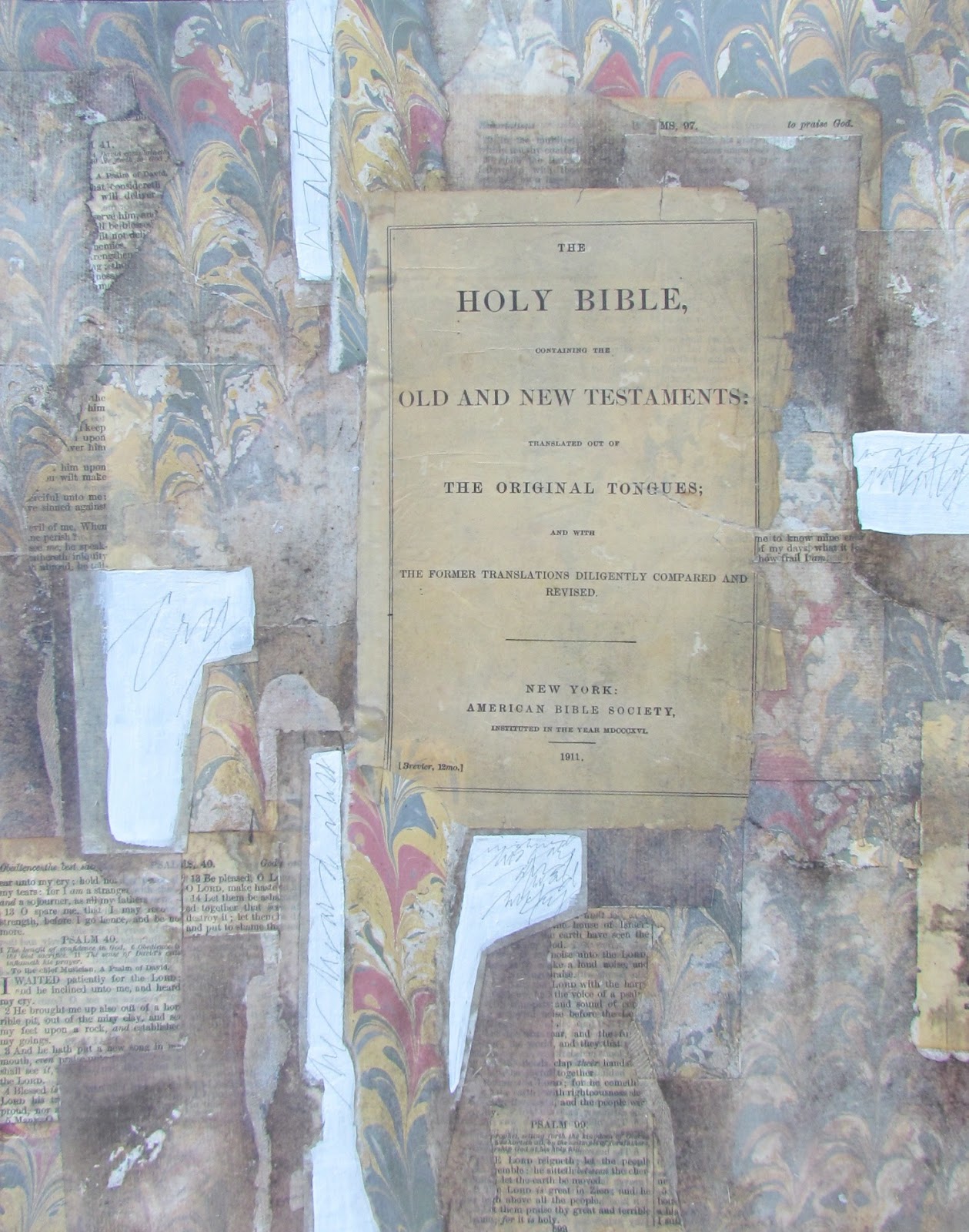
Psalm 103 (draft 1)

(draft 1)


Today's posting is the first draft which is centered around Psalm 103. The first verse is a well known chorus and sung throughout many churches. It reads....."Bless the Lord, O my soul, and all that is within me bless His holy name." I hope you enjoy watching the process of how it comes together.

It still feels very awkward for me to post things that are incomplete, but the response has been enthusiastic and apparently helpful, so I will put aside my feelings and carry on. The truth of the matter is that I cannot create small works for posting and also have the time and energy to do larger pieces as well. Having said that, I have already determined that this piece will be a 6" x 12" with a horizontal orientation. Which means that by tomorrow, you will see a lot of this background cropped. And there will still be some sections left for at least one 6" x 6".

What you see laying on top of the text pages is a 6" length of kiln formed glass with letters fused into the glass. So in this case, the length of the glass determined the size of the piece since I strongly believe that with few exceptions, the glass inclusion needs to go from edge to edge, especially when combined with mixed media. Since the glass has a tremendous amount of detail, my plan is to include plain rice papers and mono printed rice papers that have very little detail or none at all. This will also allow me to layer some lettering in those areas and include some that is free and expressive. It is crucial to keep the areas free of detail when included other elements with tons of detail.

My support for this piece is a section of 300 lb HP Watercolor Paper with (2) coats of black gesso. You can see that I left slivers of the black showing through to create some erratic lines which give rhythm to the piece. The old text pages were then cut or torn and adhered to the support with gel matte medium. By laying the text page on a section of wax paper and applying the medium with a palette knife, you will have less chance of your text adhering to whatever else you might have considered to lay it on. (i.e....Old telephone directories or newspapers have printed matter that could stick to your text page. Wax paper resolves that issue. This is especially important when adhereing rice papers which are much thinner and will stick to other materials.)

So now that the text pages are adhered, I will let it dry thoroughly and at some point during the day, I will add my rice papers. I may even consider added some metallic leaf. My first step, however, will be the decision to crop what you see posted today. Then I will have a better idea of what to do next. And there you have it...just a few more things to think about.

Friday, May 3, 2013

"My Bodyguard"


($80.00.....4" x 6".....Kiln Formed Glass and Mixed Media Mounted on Masonite.... Presented on an Easel)

"Christ is my bodyguard." This quote was inspired by Psalm 18. It was written by King David after God had rescued him from the hands of Saul. It is a Psalm of victory.

This piece was actually created from my "stash". Those who now have their stash of mono printed rice papers and kiln formed glass will appreciate this process. When firing glass, I try to think of sizes, textures, and whatever glass I have on hand to create extra smaller pieces that can be incorporated into mixed media. Such is the case here. It is two layers of glass with spring green powders, glassline paint, and black fine frit used to create the texture and the image of the cross.

However, I was never happy with the piece after firing because the green was too pale. All was resolved, however, when I used a cropped section of yellow green mono printed rice papers to go behind the glass. The first step was to paint a 4" x 6" piece of masonite with white gesso 2x.

I then adhered the mono printed paper onto this support with gel matte medium. I selected a portion of Psalm 18 from an old bible and adhered that on top of the mono printed paper. All of that was dried thoroughly with a hair dryer and sprayed 2x with spray acrylic coating.

I wrote the quote on the glass with a Leonardt Principal nib and tracing black powder plus clove oil. Today I will fire that piece of glass again along with (4) others lined up with the lettering already done....waiting to be fired.

Tomorrow I will adhere this glass on top of the mono printed rice paper with E6000...being careful not to touch or move it for 24 hours. This is just another way rice papers and old book pages can be used. The glass always adds an extra bit of "pizazz" to the piece.

For this type of mixed media...I do think it is best to have a significant amount of transparent glass exposed to reveal the mono print. It all depends out how much you want to reveal. And there you have it...just a few more things to think about.

Contact me personally to inquire about this piece.