 |
| (image 1) |
.jpg) |
| (image 2) |
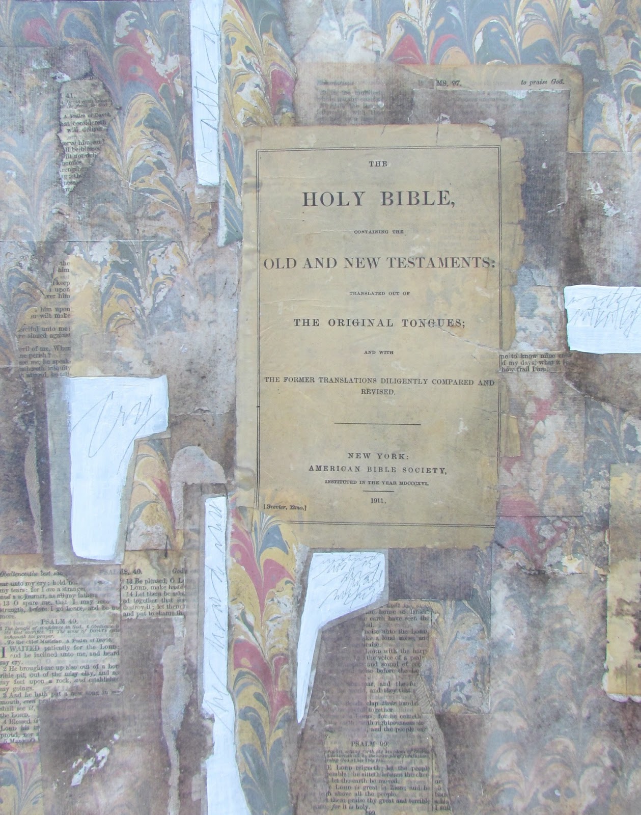
The draft from yesterday bothered me a lot so I have spent one more day adjusting values by removing some of the darker values with a stiff brush and rubbing alcohol in addition to adding more rice paper. Today I am satisfied that I can now deal with the lettering. Notice that the shapes are much more identifiable and you can see the range of values from light to dark.
As I expected, looking at draft (3) on my iphone led to an immediate conclusion that the values were still wrong. At first I thought it would just be a matter of removing some of the darker values with rubbing alcohol, but that was not enough.
So this morning I made the decision to add more rice papers to lighten up several of the shapes that connected to the focal point and went to the edge. I also knew that placing rice paper over a semi medium value would not be light enough so I painted those shapes with (2) coats of white gesso. I dried them and then did some writing in pencil over the gesso. That's what you see in (image 1).
The next step was to place some plain rice paper over each of those areas and cut around them with a break off knife right on the piece. Those areas were slightly smaller than the previous layer so the edge of the underneath layer would show. After adhering the papers and drying them, I sprayed the piece with acrylic spray coating and brushed on (2) coats of dilute gel matte medium.
I integrated those areas into the piece by brushing over them with a light gray. There was one more area on the left edge where I laid down two more pieces of rice paper...followed by drying and brushing with soft pastels again. All of this was then sprayed again with acrylic coating and the handmade paper set into place. I then placed the piece on the floor...added the frame to check the values one last time.
The new areas were still a bit too dark so I removed some of the color with a stiff brush and rubbing alcohol. The piece was sprayed again followed by preparing the surface for lettering. I did some pointed brush lettering at the bottom, but didn't care for it, so I washed it off with a brush dipped in water followed by blotting. What you see in image (2) is the end of the background.
The lettering will be the final touch. I hope you see how the shapes are much more defined and you can actually see a range of shapes and values now. And there you have it...just a few more things to think about.
No comments:
Post a Comment