Wednesday, February 29, 2012

"Stay Calm"


($40.00.....6" x 6"...mounted on a 1/8" clayboard panel)


"Stay calm with quiet simplicity." The operative words here are "quiet simplicity". In some work places, the employees must have all clutter and unfiled things removed from their desk and floor before going home. It sounds harsh, but it really does help everyone be more productive. The same thing is true for any environment. Keep it simple. Keep things quiet. That's the way to stay in a calm state of mind.

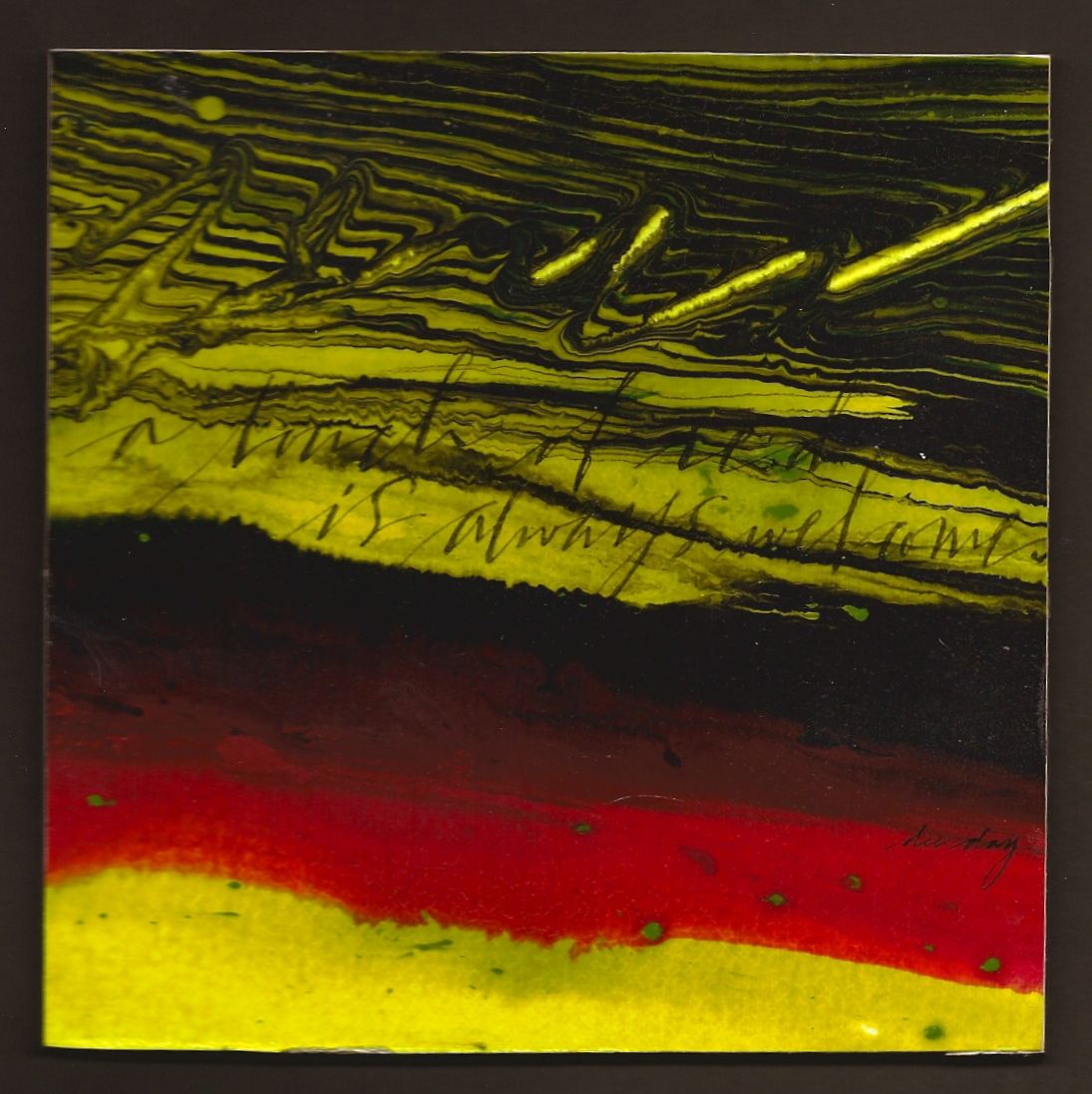
This is such a simple piece, but I decided that it was perfect for this quote. The horizontal bands of color with no hard edges and lots of water in the pouring medium helped to achieve all of that softness. There are a few hard edges in the lower left hand corner springing upward, but they are close in value with variation from hard to soft. It is good to have these kinds of pieces as well as the more dynamic and colorful ones. Once you've gotten through the whirlwind of life, then you can return to more dynamic things. It's like reading the Bible. Everyone likes to read the Psalms during stressful times, then when life calms down, other passages can be explored. I like to call it the rhythm of life and art.

No fussy capitals...no flourishing....just lower case white letters that disappear when viewed from across the room add to the tranquility. Just a few more things to think about.


Please contact me personally to inquire about this piece.

Tuesday, February 28, 2012

"Knowing and Doing"


($40.00....6" x 6"....mounted on a 1/8" depth clayboard)


"To know something is to have done something." This quote is a take off on another quote that I have said repeatedly in script classes...."Doing is the one condition of truly knowing." It is so true, but there is something in all of us that works against that notion. Progress is made only when the doing takes place. Practice....practice...practice.

Since this is one of my favorite quotes, I decided to REALLY sign it with an extravagant signature. D..A..D are my initials. My given name is Delores Ann Richey. However, my husband ask if he could shorten that to Dee and that's what I've been called for (43) years. It is a take off on signature writing which was so prevalent in the early years of our country when Spencerian Script and flourishing became vogue. I'm sure you've probably seen many an envelope with someone's initials or full name with flourished birds circling about. I don't do birds, but I do like signature writing. The idea is to go from one capital to the next without lifting the pen. I didn't quite make it, but a girl has to start somewhere! It was done on another piece of paper more receptive to the free movement of my pen and then I printed it on tissue paper as I explained in my posting yesterday.

Of course, the background is Liquitex Pouring Medium plus Golden Fluid Acrylics. Even though these backgrounds have tons of color, unless there is some detailed marbling going on or the color pools in a particular spot to create a focal point, it is nice to add a bit of collage to create a center of interest...hence the flourished caps. Other types of collage can be used besides the transparent tissue paper images, but it has to be just the right thing to integrate well with this type of background. One way to know is simply the uneasiness that comes over you when something doesn't look quite right. When it is right...you will sense it immediately. That's how you'll know. When in doubt...leave it out. Just a few more things to think about.


Please contact me personally to inquire about this piece.

Monday, February 27, 2012

"Perspective"


($40.00...6" x 6".... mounted on a 1/8" clayboard panel)


"Perspective: the ability to analyze the relationship between two or more things." Perspective is an interesting word. The accurate analysis between two or more things is also very important. In order to get the optimum benefit, it is necessary to not "over reach". For instance, if I compare one year of my experience to someone's ten years of experience and think it is equal, then I'm over reaching.

This is a pouring medium piece created in a class I taught this past Saturday. It also has two collage elements printed on tissue paper. (fine art tissue paper as opposed to tissue paper in the gift wrapping section.) It is often difficult to find. Mine was purchased at Paper Place in Dallas. I have also found it in the end pages of old books in antique stores. It is a very effective way of using collage in a more integrated way. Of course you cannot place tissue paper on the tray of a printer and expect it to go through. You must first print a copy of the image on regular paper, observing how it exits the printer. Then tape a piece of the tissue paper over the image you just printed with removable tape. Place it in the tray of the printer again so that it exits the same way it did the first time. Spray with Acrylic Coating....sponge a bit of Gel Medium on the piece (not the tissue paper) and gently lay it in place.

Collage is very tricky because it can go into visual overload faster than a dog chasing a cat! This technique will help with integration. A general rule of thumb is to not include something if it does not contribute to the main idea. Be a good editor.

The word "perspective" was written on other paper, reduced, and then printed on the tissue paper. There is no way I could have achieved that on this surface. Plus the fact that I wrote it 75 times before the final. Just a few more things to try or think about.


Please contact me personally to inquire about this piece.

Sunday, February 26, 2012

"Glorious Days"


(unavailable....in the permanent collection of dee day)


"Glorious days are the ones filled with prayer and creativity." This quote was born out of all of the glorious days I've spent with artists, especially those who are on the Prayer and Creativity Team at my church. One of those days happened in a "Symphony of Layers" class in my studio yesterday. Since I was aware of several people in the class going through extraordinary circumstances, I was reminded once again that emotional pain needs a lot of healing through the arts. The more pain.....the more art and beauty is needed. To my artists in the PACT Ministry, this fact must never be forgotten! That's why we do what we do.

This piece created with pouring medium has some great colors. The one that was added last as a bit of a surprise is the light lavender. It is a tiny bit of Dioxazine Purple plus a lot of White. Another thing I tried in this one was the last minute addition of several drops of pouring medium with no color added. It creates an ethereal look by slightly mingling with the surrounding colors. You can see it at the top center left.

For those of you who do lettering....especially script, I do not do the press / release technique when writing on this surface. The entire quote is written with no pressure and the shaded strokes are added after the fact.

We discussed edges a lot in yesterday's class so I want to bring that to your attention because this piece and most pouring medium pieces have a wide range of edges. A piece with all hard edges is cold and creates a "so-so" response in the viewer. A wide range of hard edges contrast with diffused edges and color shapes that create extremely soft edges by being next to a color of similar value are all necessary to create a vibrant piece. I am convinced that is one of the appeals of this particular technique. So create away and enjoy the process and share your art with the world. It is badly needed! Just a few more things to think about.

Saturday, February 25, 2012

"A Touch of Red" (unavailable)


(unavailable)


"A touch of red is always welcome." So many of my quotes have been on the deeper side of life lately. Here is one that is light hearted with a powerful color punch. Enjoy!

Horizontal bands are always a "win-win". It could be horizontal bands of different sizes, complementary colors, neutral colors, same color...different texture, stacked lettering in different weights, or lines with slight diagonals with different widths.

This piece has bands of complentary colors plus black, lines with varying widths, same color but different textures, plus a slight diagonal direction. It all sounds very obvious, but until the artist can stop and analyze what is actually making something dynamic....the chances of being able to apply that dynamic to another piece is remote. It's not just about technique, but the ability to dissect the design. Just a few more things to think about.

Friday, February 24, 2012

"Victory or Death" (unavailable)


(unavailable....in the permanent collection of dee day)


"True heroism occurs when a man chooses victory over death." Bear with all of us Texans today as we think back on this day in 1836, when William Barrett Travis wrote that fateful letter from the Alamo requesting reinforcements. Of course, Fannin and his troops had been massacred at Goliad and Sam Houston never got the message. It is a very moving letter and I've included a copy of Travis' signature and the famous closing...."Victory or Death".

If a photograph has a lot of neutrals, it is very easy to transform it into a very historical or vintage looking piece. This photo was taken while I was in San Antonio attending a workshop. It always brings tears to my eyes considering what happened there.

Erratic pencil lines, pouring medium, and charcoal powder plus the bit of collage printed on tissue paper all help to bring about the right mood and atmosphere. Pouring medium does not always need to be strong color. The effects are quite stunning when adding Golden Titan Buff or Raw Umber Fluid Acrylics to the medium. Even white will give an ethereal look. Using any one of these three colors will give an encaustic look to the piece. Just a few more things to think about.

Thursday, February 23, 2012

"Wild Ride"


($60.00.....6" x 6"....mounted on a 1.50" depth clayboard)


"Truth is the reliable saddle for this wild ride called life." Building a life on a wrong premise is disastrous, especially if it's never realized. Having the truth will at least keep the overwhelming odds of life on your side.

Abstract art can give the essence of a thing without giving all of the details. Such is the case with this piece. The colors are the first hint that this could have a western look. The white near the center  and the added brown patterns are reminiscent of a horse and saddle. This type of piece only happens by reacting to a spontaneous process with no preconceived idea of what may appear. I do like realism, but I've almost developed an aversion to anything that looks too contrived. Capturing the essence of anything is probably the most difficult kind of art to create, but it is also the most compelling.

Even when painting a traditional still life or landscape, there is a strong tendency to want to paint in too much detail. I've come to realize that for me, the best road to travel is to practice painting and lettering until it becomes effortless. I remember very well what Yves Leterme said about gestural writing. (paraphrase)...."Practice the strokes or movements until you can lay down a gesture exactly where it needs to go. Hover over the paper and make the movement in the air before laying pen to paper." Now that's a wild ride!....and just something else to think about.


Please contact me personally to inquire about this piece.

Wednesday, February 22, 2012

"Impulse"

($40.00....6" x 6"....mounted on a 1/8" depth clayboard panel)


"Impulse supercharges momentum." I am sure that everyone can recall a time when an impulse to do something was so compelling that it needed to be done immediately. If it was a good impulse, you seized the moment and had a good outcome. However, if it was a negative impulse, the outcome was quite different and only caused a problem. Another quote comes to mind...."Seize the day.....or Carpe Diem!"

There are many impulses in this piece. I am still playing around with the timing of pouring medium. After the pour, it is good to manipulate the colors by running a fork through them in a zigzag fashion. If too much water is present, the marbling effect may disappear, but if you wait for (5) or (10) minutes you can still effect the directional pull of the color with a plastic fork or cut up credit card. (Use tools that can be tossed.) In this piece I did some gestural writing. Much of it still blended too much, but you can see the evidence of some of the strokes in the green portions and in the bottom left hand corner.

Experimentation is the name of the game when exploring new mediums. I am also exploring different papers. This one happens to be 300lb HP watercolor paper. It is a preliminary study for a larger piece. Working on these smaller pieces gives a quick study of many approaches. Just something to try or think about.

Please contact me personally to inquire about this piece.

Tuesday, February 21, 2012

"Order and Stability"


(unavailable)


"Pattern and routine produce order and stability." The first thing my mother taught me when we brought home our first born was to establish a good schedule. Everything turns out better when there's an established order...especially where babies and children are concerned. It works well in every area of life, too.

There are some pieces that leave me scratching my head as to how to bring it all together. The background is extremely chaotic so I decided to bring in a good grounding color like black. The common denominator between image and lettering was the collage element with the black type and letter with the same colors that are in the pouring medium.

Remember that black and white plus one or two or three other colors works every time it's tried. Black charcoal powder also helped tone down the corners and caused the white areas to glow. I can't quite decide if I personally like the piece or not, but it will stay in my possession as a study. Just something else to think about.

Monday, February 20, 2012

"The Right Direction"


($40.00.....6" x 6"....mounted on a 1/8" depth clayboard panel)


"To hit the floor running is good, but only if you're going in the right direction." If you've ever been lost while traveling and gone for miles in the wrong direction, then you can fully understand this quote. The choices we make everyday are like that road trip. Make sure you're going in the right direction.

There was a directional pull in this pouring medium that caused the color to go into two different directions. Not only did it help portray the meaning of the quote, but it divided the space into four quadrants. This type of unequal division is a very good intentional format to follow. Effective cropping caused part of the division, but running a plastic fork through the medium in different directions also helped. There is very little marbling going on because of the extreme wetness of the paper and the dilution of the nickel azo yellow in the first color to be poured.

This technique is not as complicated when working on a small piece like this one, but if larger pieces...like a 12" x 12" on up...are created, a heavier paper will need to be used such as a 140 lb. Hot Press or 300lb. HP. Just a few more things to think about.

Please contact me personally to inquire about this piece.

Sunday, February 19, 2012

"Balance"


($40.00.....6" x 6"....mounted on a 1/8" depth clayboard panel)


"Balance in life is the right distribution of time in key areas." Ouch! This quote hits me square between the eyes. This is just a friendly reminder to all who care about doing life well.

Monoprint, erratic lines, photography, gesso, graphitint pencils, and lettering. That is the sequence of how this piece was done. It creates a mood and that's what I go for in every piece I create. What is the quote and how do I create a mood that fits?

The Graphitint Pencils (Derwent) are fantastic in helping create mood. I'm sure that some of you might be thinking why not use water soluble pencils. Pencils might still leave some of the pencil marks in place even after adding water. These pencils are water soluble graphite. It is soft and dissolves quite nicely into the background. Even watercolors will not be as completely integrated as these.

And just in case you are under the impression that you are looking at an image of a church. it is not. This is actually one of the many spires emerging from The Biltmore Estate. If you're ever in Ashville, N.C., you really must take a day to go. You will not be disappointed. Just something else to try or think about.

Please contact me personally to inquire about this piece.

Saturday, February 18, 2012

"Color and Fragrance"


($40.00....6" x 6"....mounted on a 1/8" clayboard panel)


"Enjoy the unfolding of the flower exploding with color and fragrance." This is the last "hurrah" for Valentine's Day. If you received flowers, they are probably fully opened up by now and spreading their fragrance around the room. If you didn't receive flowers, this posting is especially meant for you. Enjoy!

This is an abstract flower, of course, but the swirling brown and very light greenish-white color do look like the center of a flower...especially from across the room. I keep talking about viewing things from across the room because that's the way I view all of my artwork, especially while it is still in progress. You will see what it needs much quicker than if it's right in front of you.

One of the tricks to having a successful piece with pouring medium is to make sure you choose a light, medium, and dark color. Three colors work nicely, but I've also used (4) so it's just a matter of personal choice.  You definitely need to start with at least two.  If you use colors of the same value, you will probably end up throwing it in the trash because you will not be able to see the definition of the different colors mixing together. Values are one of those things that can sneak up and "bite" you. That's the only reason I mention this. It is also easy to get enamored with favorite colors and forget how they will look when blending together. Just something else to think about.

Please contact me personally to inquire about this piece.

Friday, February 17, 2012

"Pure Gold"


($40.00....6" x 6"...mounted on a 1/8" depth clayboard panel)


"Patience and discipline create growth that yields a crop of pure gold." If I had to say which word was the most difficult, it would be "patience". Most people can go for a substantial period of time doing something that they feel like will yield a hugh return. The problem comes when it takes so much longer than anyone realized. However, when the two skills are combined, the result is pure gold.


There is a significant amount of gold mingling with the raw umber in this piece. It is very difficult to see that on a computer screen. The gold I used was Iridescent Bronze. It is a Golden Acrylic that comes in a tube or Fluid Acrylic. Hands down, it is my favorite gold out of a tube of paint. It also yields a verdigris residue if a lot of water is added. The green in this piece, however, is Golden Green Gold. It has a glowing effect when diluted with a lot of water.

Besides the intense color suspended in the pouring medium, there are some other reasons why this technique is so compelling. If you notice what type of lines are created you will see some that are much more diffused that create a gradated effect. The softness of those lines compared to hard edges created when the pouring medium is more dense is a fabulous contrast. Add to that the direction and energetic movement of the lines in the paint and it is hard to not keep looking. It's organic and seems to be alive. And all of that with one technique. What a deal! Just something else to think about.

Please contact me personally to inquire about this piece.

Thursday, February 16, 2012

"Aspirations" (unavailalbe)


(unavailable)


"To aspire to do great things is infinitely more glorious than living in mediocrity." One of my heroes in life once said that when he died, he wanted the following statement written on his tombstone. "At least I tried." Life is so much richer if we face our fears and do the very thing we aspire to do.

My experimentations with pouring medium rage on. At present I am playing around with the timing of introducing another color into the pour. In this piece, I started with the very light bluish green color and covered most of my design space with just that color. I next introduced the quinacridone magenta + white which ended up a raspberry color. Without hesitation, I added the orange + burnt sienna. Using a plastic fork, I blended those colors a bit by running the fork through them to create a marbelized effect. The last color was raw umber. I also cannot ever resist the urge to write some gestural letters with one prong of the fork. Of course, it dissipates as the colors continue to bleed together, but it gives a different directional pull to the color. (One note about quinacridone pigments...they are a much better choice when using magentas because of their chemical components. They will not fade like regular magenta paint does.)

My desire with these type of pieces is to make sure the piece reads like a powerful abstract from across the room, but the quote can be read when seen up close. By choosing Raw Umber Gouache (Graham) for the lettering, it softens the hot pink in the lower right corner and simply looks like texture from across the room. (This particular brand of Raw Umber is much darker and richer than Winsor Newton in the same color.) Just a few more things to think about.

Wednesday, February 15, 2012

"A Broken Window" (sold)


(SOLD)


"A broken window gives clearer vision." Brokenness in life has a good side if it is viewed from the right perspective. This image of an old window shows how clearly the foliage can be seen with the window broken. It's a visual metaphor of the flip side of brokenness. If you have been hurt badly in relationships or physical suffering, you are the ones who can see life quite clearly.

Windows are one of my favorite visual metaphors, especially if they have several panes. This one is especially charming since it had been sitting outside of an antique store for quite some time. When looking for just the right kind of photograph to include in your art work, don't overlook those things which are not included in the obvious choices. This image not only gave me the perfect metaphor, but it has a wonderful poetic quality with the leaves sitting in the sill and the "fogginess" of the glass. The choice of image left me with very little to do.

However, I did add some pencil lines and created a monoprint with Caran d'Ache Saffron colored ink on the paper before printing the image. After the image was sprayed with Acrylic Coating and adhered to the panel, I added Black Charcoal Powder and black erratic lines with a pointed pen. The piece was then secured with spray acrylic coating again....prepared for lettering with diluted gel matte medium with the final quote and white lines done with pointed pen and Winsor Newton Bleedproof White. And that's how it's done! Just something more to think about in transforming a photographic image into a piece of art.

Tuesday, February 14, 2012

"Love and Commitment" (unavailable)


(unavailable)


"The history between two people is filled with deep emotion where there is love and commitment." After forty-three years of  marriage, this quote comes from the depths of my soul. We've loved, we've laughed, we've fought, we've weathered some deeply tragic events, but in the final analysis, our history has kept us loving and honoring our commitment. Happy Valentine's Day!

The colors for this piece were chosen quite deliberately. It is very true that black, white, and red work every time they're tried. No other color combination says passion quite like this. I did try to manipulate the pouring medium to create the semblance of a heart and to some degree it worked. The depth of the image created by the way the colors mingled together turned out to illustrate the essence of the quote (deep emotion and history) even better than if I had been able to create a perfect heart. Perfectly rendered form is not always the best solution when trying to depict abstract thought and emotion.

Enjoy your day and if time permits create your own personalized valentine. This posting is my valentine for my valentine.

Monday, February 13, 2012

"Buoyancy" (unavailable)


(unavailable)


"My heart is buoyant in the unconditional love of God." To many, the unconditional love of God sounds like an oxymoron when bad things happen. Unfortunately, we also have an enemy of our soul that seeks to kill, steal, and destroy. The love of God is there to catch us and hold us during those times. God is our friend.

There are days when wonderful things happen in the studio. I am sure you can recall a few of those yourself and you wonder why it is such hard work to bring a piece together and on other days it just seems to happen. Such was the case with this piece. And I cannot talk enough about how wonderful it is to work by responding intuitively to a spontaneous process. For instance, this quote would not have happened unless the piece happened first. I would strongly encourage any artist to work this way, even once.

This is precisely why gestural writing and erratic lines and marks are so compelling. They have energy, passion, and seem to have happened with no effort. And that is where the illusion that it all happens effortlessly begins and ends. It is and always will be the day after day going to the studio and practicing these skills over and over again. To quote myself from another posting..."Everything is difficult before it is easy." Repetition really is the name of the game. Just something else to think about.

Sunday, February 12, 2012

"The Gift of Love" (unavailable)


(unavailable)


"Praying for a friend is the very best gift of love." When searching for just the right gift for a friend or family member, the gift of prayer is often overlooked. It is, however, the gift that will yield the largest return and it's totally free. What a deal!

When creating a piece using for spontaneous techniques, it is not always possible to plan the division of space. However, with a bit of collage and placement of the lettering, it can be much more defined. By stair stacking the quote, I caused it to connect with both bits of collage, creating an interesting division of space that goes from edge to edge. Also, by writing the word prayer in a much bolder style, I created an automatic focal point.

Pouring Medium pieces can truly stand on their own with no lettering even when the shapes are a bit nebulous. Artists are always striving to create images in a way that they look like they just happened effortlessly so this technique really does fit that bill. However, if you want something more complex, lettering and collage pair up with this technique beautifully. It truly is worth exploring. Just something to think about.

Saturday, February 11, 2012

"Message in a Bottle"


($40.00....6" x 6"...mounted on a 1/8" depth clayboard panel)


"One declaration of love can change everything." So many things in life change with just one phrase or sentence that expresses the deepest level of commitment. What phrase comes to your mind? Check out the hidden message in the bottle.

Division of space is still a priority of mine, even with the use of photos in my layering. The division of space in this piece is especially appealing with the interlocking shapes of the bottle and pine cones which also touch two sides of the design space. It is absolutely essential to consider how the image is cropped and how it divides the space. If everything is placed in the center with negative space all around, you can lose the viewer with one glance.

And after one year of blogging everyday, I have yet to tire of seeing one line of lettering dividing the space. Of course, it is a bit risky to place it almost in the center, but then, of course, I like to live on the edge. So the best idea is to think about these things when photographing work and see how your image is filling the little rectangular window on the camera. Of course, there's always photoshop. Even the stone wall in the background is creating some erratic horizontal lines. Just a few more things to think about.


Please contact me personally to inquire about this piece.

Friday, February 10, 2012

"Love and Friendship"


($40.00...6" x 6"...mounted on a 1/8" depth clayboard panel)


"Transparency in relationship is a prerequisite to deeper levels of love and friendship." True intimacy requires not holding back. Hopefully, we all have a few relationships where we can "let our hair down", so to speak. These persons are rare. If you have more than one or two in your life, consider yourself blessed.

In this piece, I added another technique to my repertoire. I bought a set of Derwent Graphitint pencils. They are a water soluble graphite that yield neutral color when applied. They were used extensively over this photograph after I sprayed it with spray acrylic coating (3x). By first applying pencil marks where you want more of a color boost, followed by going over those marks with a wet brush, you can get the most subtle effects. The most obvious place where I used one of these pencils is in the neutral red heart on the right hand side. The berries were also given a boost with the same color. The set comes with 12 pencils ranging in various shades of grays...some leaning towards red, green, or blue.

The most obvious blue in the background was created by monoprinting with Caran d'Ache Carribean Sea Ink. Both of these techniques work very well with transparent imagery or any photo that has a lot of subtle color to begin with. Just one more thing to try or think about.


Please contact me personally to inquire about this piece.

Thursday, February 9, 2012

"Write It Down"


($40.00....6" x 6"...mounted on a 1/*' depth clayboard panel)


"Write it down in rich color and say it with love." There is always something special about a handwritten sentiment as opposed to e-mail or other social networking. February is a perfect month to express your love sentiment by writing it down.

This piece has an image of my favorite glass pen. I purchased it at the Venetian in Las Vegas. It has gold dichro glass intertwined with rich brown and purple glass. So using special images like this in your art work makes it more meaningful. And those of you who are in love with Walnut Ink should try the crystals. They are much richer than the bottled Walnut Ink. Just add a bit of water to a small portion and let it sit for awhile and you will be amazed at the difference in the two types of Ink.

These photo was enriched to the max. Before printing it on Arches Text Wove, I created a monoprint with Walnut Ink. After drying, the print was made and sprayed with acrylic coating. From there gesso was applied followed by soft pastels and then collage. When creating these types of pieces sometimes the central focus of your image can become too faded. All you need to do is print out another copy on regular print paper and adhere it over the original.  This will cause that particular image to stand out more than the others and become the real focus.  Just something else to think about.

Please contact me personally to inquire about this piece.

Wednesday, February 8, 2012

"Mood and Feeling"


($40.00....6" x 6" mounted on a 1/8" depth clayboard panel)


"Whatever we think about triggers a particular mood and feeling." Many thoughts fly through our minds everyday. It's the person who knows which ones to discard and which ones to keep who will live a happy and successful life.

This is an unusual piece with line work going every which way. At first, I thought I might discard it, but then I realized that it actually fits the meaning of my quote. Haven't you had days when your thoughts went one way and then another all day long. The "wonky" lettering going with the original line work in the photo and then going against it is a visual metaphor for how I feel on some days.

So I did begin this piece with a photo of some old boards. I added some acrylic paint on the red and blue boards, followed by some pencil lines and lettering. Collage pieces of words and phrases were applied with gel matte medium. After this dried, I added gesso and then removed most of it with a wet sponge brush and blotting with a kleenex. Finally the quote was written along with some erratic lines.

It is all of these steps in different combinations that add visual depth and help in the exploration of new techniques. Going back to my original purpose for blogging. The actual creation of an art piece everyday is what hones skill level and causes you to think about additional things you might want to explore. Painting, lettering, and mixed media, etc....are skills that must be practiced just like piano or any other skill. Fluency and integration do not happen suddenly or by creating art work sporadically. Many pieces will not be as successful, but for those few that really work well, it is glorious! So whether you blog or have some other mechanism to keep you working every day, just do it. It will give you many things to try and think about.

Please contact me personally to inquire about this piece.

Tuesday, February 7, 2012

"Chaos"


($40.00......6" x 6" mounted on a 1/8" depth clayboard panel)


"Trouble and chaos are gone after the light of truth passes through." Reality is a stubborn thing. It really doesn't matter what anyone says or thinks in a given situation if it's not the truth. Facing the reality about ourselves is probably the most difficult, but it is peaceful and life changing when we do.

The division of space and the contrast between the upper and lower sections of the piece were the deciding factors in cropping this piece. It is a perfect illustration of not allowing the intense colors mixed with the pouring medium to cover the entire space. The color on the outside edge of the pour (green) naturally bled a bit since the entire sheet of paper was very wet. You can imagine how scary it would be to have the upper half be present over the entire piece, especially when using direct complements.

When setting up to use pouring medium, cut or tear enough pieces of paper to do several at a time. There are times when you might do 4-6 sheets and only have two that you can really use. Also, don't forget to wear disposable gloves. This medium is very difficult to get off of your hands. I have also bought some aluminum baking pans for the purpose of allowing the excess medium and water drain into when holding the sheet up in the air to manipulate the direction of the pour.

The lettering has varying weights, uneven baseline, and changing directions to help describe the meaning of the quote. Just a few more things to try or think about.

Please contact me personally to inquire about this piece.

Monday, February 6, 2012

"Red" (unavailable)


(unavailable)


"Enjoy the color red for it communicates love better than any other color." Have you noticed how the color red is associated with several of our top holidays? Not only Valentines Day, but Christmas, and the Fourth of July. It is a color that we are already seeing everywhere so enjoy the festive atmosphere and the one you love!

Don't even ask me how I manipulated the pouring medium mixture to spontaneously come up with a heart because I have no idea! What I do know is that all kinds of magical things happen when working with pouring medium. I will probably never tire of it completely but I do expect it to continue evolving as more techniques are tried.

If you have been trying this on your own, I would like to give you another tip. It is very important to leave some of the paper untouched completely or covered with light color. I have actually frightened myself with some of the color combinations and when the entire design space is covered with this moving color, it will give you a sense of being engulfed to the point you cannot work on the piece. Somehow, the untouched areas of paper seem to ground and stabilize the process. It also gives you a place to write. Just a few more things to think about.

Sunday, February 5, 2012

"Push Back"


($60.00....6" x 6"...mounted on a 1.50" depth clayboard) 


"When life pushes back...prayer is the answer." I cannot recall ever knowing anyone who has not had adversity at some point in their life. We have a choice to try to figure out everything in our own strength or to offer up prayer to a God who can help. It's a wise choice to pray.

This piece illustrates just how much Liquitex Pouring Medium and Acrylic Paint can be manipulated. With very wet paper (under the faucet kind of wet...on both sides) pour the mixture of paint and medium on the paper. I have developed a more successful technique by using only one of my color choices first and getting some overall coverage of the medium. It then becomes easier for the other colors to flow into the first and create some interesting patterns. The key is to know when to stop and how much water to spray into the color while working. It will not move well without additional spraying.

I always work at least 2-3 inches beyond my desired size so that I have some choices in cropping. It is a combination of these two things (working larger and then cropping) that leaves you with some design decisions. I was very pleased with the white negative space shapes in this piece because they are all different sizes and very interesting shapes. The addition of two bits of collage printed on transparent paper added to the dynamics. Pairing the quote with the image was my biggest delight. Moving color and understated lettering work every time they're tried. Now you have several more tidbits of information concerning this process. Just something to try or think about.

Please contact me personally to inquire about this piece.

Saturday, February 4, 2012

"The Unexpected Treasure" (unavailable)


(unavailable)

"Collage elements are often the unexpected treasure when taking a walk." If you look down when taking a walk, you might find something you never expected. There are artists who have created entire collections out of found objects. Save those bits and pieces. They make good collage elements!

This piece began with an actual photograph of cracks in concrete. I find them extremely fascinating. They are so erratic and random and give a good basis for a contemporary art piece. The only problem I had with this one was the "blah" color, but soft pastels came to the rescue.

I did not actually use collage elements that I had found, but I did make them look old and worn. When adhering the pieces with gel matte medium, rub a bit over the top of the image and then take a brayer and roll over a portion and the top layer of paper will come right off. Try only an edge until you notice the effect. Dry and then proceed with the soft pastels applied with a soft brush.

After preparing the surface for lettering (2 parts water to 1 part gel matte med.), the very casual versals were written with pointed pen and a mixture of Perylene Violet + Prussian Blue gouache. Spray with Acrylic Coating....dry....follow with varnish and the piece is finished. So I hope this provides you with a few more things to try or think about.

Friday, February 3, 2012

"Junk or Artwork?"


($40.00.....6" x 6" mounted on a 1/8" depth clayboard panel)


"One person's junk is another person's artwork." It seems like there's a renewed interest in anything old, no matter what it is or what it looks like. This pile of faucet heads and connector pipes was just such a thing. It does have a lot of depth and is a bit unusual, but I like it, so here it is.

The layering process on this piece began with a photograph. However, the subsequent pouring medium, soft pastels, lines, and "funky" lettering transformed it completely. It is totally different from the original photo.

Don't be afraid to use line work to create texture, division of space, and more depth in your piece. Erratic lines are used in all kinds of contemporary art work whether it's organized into a pattern, scratched into the surface of acrylic paint or gesso, or used to create a semblance of lettering. Remember that lettering is abstract and any type of erratic line work will create a better environment for your letters. Others may be interested in taking photos of beautiful landscapes, flowers, etc., (and I like those, too), but more often than not, I find myself taking pictures of rusty, old things, cracks in concrete, etc. They make fabulous backgrounds for contemporary work. Just a few more things to try or think about.

Please contact me personally to inquire about this piece.

Thursday, February 2, 2012

"Familiar and Comforting"


($40.00....6" x 6" mounted on a 1/8" depth clayboard panel)


"Familiar and comforting thoughts are found in those things symbolizing truth." This pen and ink drawing of a palm tree in our yard has been a symbol of truth for me. Palm trees symbolize "victory" and that is confirmed in an ordinary dictionary. I am sure that you have symbols in your environment as well. It's a good thing.

I drew this contour drawing of a palm tree in our yard while sitting on the patio having coffee. The odd shapes and angles are interesting to me and even without the shaded color giving it form, the average person can tell what it is. Contour drawing is simply drawing the outline of something with perhaps a few internal shapes. When the color and detail is stripped away, the juxtaposition of angles and shapes can provide a very interesting piece. Try looking at objects or plants in your environment and see what happens when you focus on the outline. Even if it's not totally accurate, it still has a lot of interest.

I drew it the first time with pencil and then, transferred the pencil lines to this piece in the same way you can transfer an image onto an eraser in order to hand cut a stamp. The graphite transfers quite easily on surfaces that have a bit of tack. In this case, it was pouring medium (the black, lime green, and cream color). I then inked over the pencil lines to really give the drawing some definition. It's a great thing to do or something to just think about.


Please contact me personally to inquire about this piece.

Wednesday, February 1, 2012

"The Ripple Effect"


($60.00......6" x 6" mounted on a 1.50" depth clayboard)

"The ripple effect grows wider as we focus on others."  Others are generally receptive and willing to reciprocate if we stop long enough to see that they also have needs and ideas that can contribute to our lives. It then creates a "ripple effect".

Today marks the anniversary of my first posting and the end of my first year. This is the 329th posting (July was a no go with my husband needing immediate surgery). What I've learned about process has been invaluable and I don't know of any other means that would have allowed me to learn this much in one year. Going back and looking at my first posting will give you a comparison.

Today's piece is all about contrast and the unexpected. I included a collage of a 1550 manuscript. It was printed on transparent tissue paper so the background would show through. It is the unexpected element in this piece since everything else has a very contemporary look and feel. The actual lettering of the quote is expressive with the weight of the strokes happening in unexpected places. The pencil lettering is simply an echo of the first three words of the quote and provides subtle texture and division of space.

One of the most unexpected things has begun to happen on a regular basis. I am no longer writing the quote first, but waiting until the image is created, and then responding to what is there. It is exhilarating and has completely changed my attitude about the way I work. Spontaneous techniques have also become a passion....hence the pouring medium mixed with acrylic paint. All in all it has been so worthwhile, that I have decided to carry on until I exhaust the benefits of doing it every day. Thanks for faithfully following and hope you will tell your friends and continue to watch and see where all of this takes me.


Please contact me personally to inquire about this piece.