Showing posts with label White Gesso. Show all posts

Wednesday, July 17, 2013

"illumination" (final)


(unavailable......5" x 10"....experimental gesso work)

"Illumination can be seen or unseen." I love words that have dual meanings and such is the case with the word...."illumination". When something is illuminated in the physical realm, it can easily be seen with the eyes, but there is another kind of illumination such as a moment of deep insight. This inner illumination cannot be seen, but has a tremendous effect on the person who received the illumination.

With just a few more details....this piece is now finished and will stay in my personal archives as an experimental piece. I do like it because it represents the layering process where a part of each layer is left untouched so that a portion of all layers can still be seen in the final.

This kind of layering creates a lot of depth and is a process I love to explore. Additional line work was added, as well as a few soft pastels to create a piece with shapes, contrast of edges, and an ethereal quality.

Every artist benefits by experimenting with process, tools, and mediums in order to create new and innovative pieces. It can be difficult because the percentage of failure is extremely high. However, there comes a time when all of those negatives must be put aside in order to achieve a greater goal.

By notating all of the previous layers, I can now look back and see if I would have been more satisfied by stopping with a previous layer. So my encouragement is to continue to notate your layers with a digital camera so you can gain the optimal experience from each work. Every piece of art created will teach you things you would not otherwise know.

It is good to keep pressing on and create as much as you can and learn new things as often as the opportunity allows. And there you have it...just a few more things to think about.

Tuesday, July 16, 2013

"illumination" (draft 2)

(image 1)

(image 2)


The purpose of draft (2) was to establish shapes and a variety of edges, plus contrasting texture. The one constant in each layer was to make sure that part of the previous layer remained untouched. So you can see that the largest part of the blue shape is the part that remained untouched from yesterday's posting.

If you look at yesterday's posting, there is definitely a look of fluidity and soft edges with the mono printed layering of watercolor. However, there are no clearly defined shapes. To some that is not problematic, but paintings are made up of shapes and to maintain viewer interest, the shapes become very important. They are the foundation of a piece of artwork.

Many artists have created works with little or no shapes and succeeded in the fine art world. In that case the artist was focused purely on color since lines and values create shapes. So what I am showing you today is how I preserved what I loved about watercolor from the first draft and how I then introduced more watercolor glazing to define more shapes. That's what you see in image (1). The purple color is Caput Mortuum Violet (WN brand). I also used more Cerulean Blue.

After drying these new layers (3 layers of the violet), I also created some line work with pen and ink and pencil. Next came the application of diluted white gesso (1:1 ratio) with a credit card. I dried this layer with a hair dryer and then applied another layer. After drying the second layer of gesso...I sprayed alcohol over the shape with the violet underneath followed by brayering. I continuued this until satisfied with the texture and that's what you see in image (2).

I can clearly see that more line work will add to the piece and then I will spray it with spray acrylic coating, prepare the surface for lettering and add the quote. After studying it throughout the day, I may choose to add some other element, but only time will tell. Right now, the focal point is the beautiful watercolor shape from the first layer. And there you have it...just a few more things to think about.

Saturday, July 13, 2013

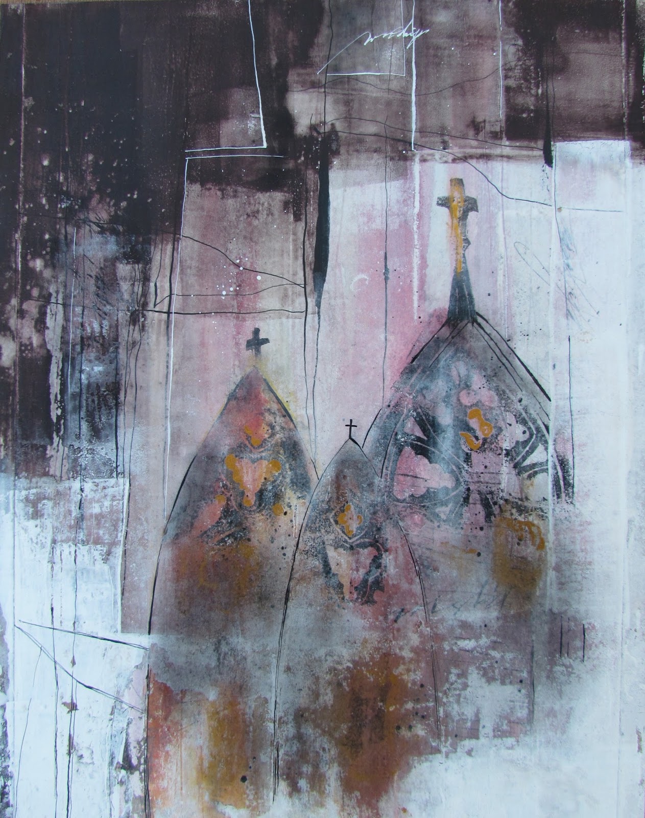
"Cathedrals" (final)


($250.00.....11" x 14".....gesso work on 140 lb. HP....mounted on a 2" depth cradled board)

"Cathedrals in all their grandeur cannot compare to the cathedral of the heart." You can see that the lettering was done in a gothic style called "textura". I deliberately left them in a lighter value. Most of the time, especially on this type of surface, white lettering has to be retouched to deepen the value.

Another intentional decision was to slightly angle the lettering to mimic the line work throughout the piece. It also gives movement and makes it less contrived.

There are several "take aways" from this piece that I would like to share. First of all, when creating erratic lines and shapes with gesso as well as white gouache....the value of these areas can be muted by brushing on a bit of charcoal powder after they're dry.  You can see it quite clearly in the cathedrals where there is a grayish/ whitish texture. It adds an ethereal look and is a very useful technique. If you consistently create mixed media work, black charcoal powder and a soft brush (Hake brush or blush brush) are an absolute necessity.

Line work is your friend when it comes to integration. By creating white lines in the dark areas and black lines in the white areas, I created conversations between the shapes which results in integration. 

Breaking up solid shapes of color with rubbing alcohol and a brayer or laying down color with gouache and brayer and then spraying lightly with water can create very interesting texture. I did this on the left side where you see texture in the dark area.

Using a pointed pen and a press/release technique can help create lines that are thicker and thinner in places which makes them much more interesting. It is also good to have line work created with a variety of different mediums....such as gesso applied with a credit card....pencil lines....pointed pen and ink lines....scratching into damp paint with the corner of a credit card or palette knife...etc

As I mentioned in draft (1), I attempted to write down most of the questions that needed answers as I moved through the steps of creating. There were approximately (50) in all which simply illustrates that it takes many steps to create a piece of artwork. Asking the right questions will give you the right answers. And there you have it...just a few more things to think about.

Please contact me personally to inquire about this piece.

Friday, July 12, 2013

"Cathedrals" (draft 3)


"Cathedrals in all their grandeur cannot compare to the cathedral of the heart." Hearing the sounds of a choir singing upon entering a cathedral is a rare and beautiful moment, but the cathedral of the heart is a place one can visit at any time.

It isn't finished yet, but I am almost there. This piece has now been cropped to an 11" x 14" and all of the edges, lines, and shapes have been adjusted to my satisfaction. It is time to stop this part of the process and move to the lettering. My thought this morning was to bring more of the dark area into the white shapes and vice versa. I did this with line work...removing more paint with alcohol and a brayer...and by adding gold gouache and black charcoal powder.

Holbein manufactures an Acryl Gouache called Gold Orange that has a vintage quality that is perfect for these types of pieces. I applied the gold with a brush in select areas of the cathedrals. It was too even and solid so I used alcohol and a stiff brush to remove and disperse the paint. After drying, I added black charcoal powder right over the gold and other areas of the cathedrals.

You can also compare with the previous posting and tell exactly where I added more line work and a bit more lettering. I am now satisfied that there are definite shapes with a variety of edges and line work that are having a conversation with each other.  Tomorrow, I will add the lettering and post the final.

While this mixed media piece has been in process, I have also been doing some palette knife painting in oils and very pleased to have another creative area to express my voice. It's all very exciting, but if you find it overwhelming to think about too many processes at once, I strongly encourage you to focus on the techniques that can be combined to express your deepest longings in one area.  It's all a win-win and very healing to the soul. And there you have it...just a few more things to think about.

Thursday, July 11, 2013

"Cathedrals" (draft 2)

(image 1)

(image 2)


No quote yet, but by tomorrow, I feel sure I will have one. As you can see, there have been many changes since yesterday. I am going for a very ethereal look.

Last evening, after viewing my piece several times during the day, I had the urge to go over the cathedral imagery again with the same colors plus adding some alizarin crimson to the yellow shape. I also laid a kleenex in a place or two to lift part of the color. It was left to dry overnight.

This morning, one of my first questions was how much detail to add....what tool to use....what color and type of pigment. I began with moon palace ink and a pointed nib, but decided to go with something a bit more graphic and found a hand cut stamp of a cathedral that I cut several years ago. Rather than inking the whole stamp, I chose fragments and stamped those on with Speedball Printing Ink applied with a brayer.

After writing a few words and creating different types of line work, I dried the piece...sprayed (3x) with spray acrylic coating. The reason I sprayed that many times was due to the thickness of some of the ink. After drying the piece again, I used a sponge brush and applied dilute gel matte medium 2x. After drying that layer, I laid in the dark shape which was cobalt blue + brt. sienna gouache. The reason I chose that medium is the ability to lift it if I didn't like the result. Because it is an opaque watercolor, it also has a bit of a translucent effect in places. (You do need to brayer it on and then keep brayering until it becomes smooth.)

White gesso was also added (1:1 ratio with water) and dried. Alcohol and a brayer were used alternately over the gesso to create the texture you see in image (2). I also repeated all of these steps....spraying...brushing on med...adding more gesso...etc. until satisfied.

Today I will be studying this image and seeing if I need to do anymore "tweaking" of values and shapes before deciding on the lettering. So far...I have asked and answered (30) questions about this piece. And there you have it...just a few more things to think about.

Wednesday, July 10, 2013

"Cathedrals" (draft 1)


(image 1)


(image 2)


This is the first in a series with cathedral imagery (if all goes well). I have long been enamored with arches and cathedral imagery. The first decision I needed to make was what kind of cathedral imagery...especially how much detail to include.

At this stage of the game, I chose watercolor in three arch shapes with no detail. There are also some vertical bands covering the page from top to bottom in alternating color. After each application of watercolor, I dried the paper (140 lb. HP...taped to a masonite board). The tape used was gummed taped specifically designed for watercolor paper.  After finishing the watercolor portion, I sprayed the surface with spray acrylic coating since watercolor is obviously water soluble. This is what you see in image (1).

The next step was to apply white gesso. I chose to apply the gesso with an old credit card in (3) vertical bands with the watercolor pigment in between these bands. I then dried the gesso and sprayed with rubbing alcohol followed by removing portions of the gesso by brayering. This was not just one pass with a brayer, but went on with alternate spraying and brayering for about (15) minutes.

When I was satisfied with the amount of pigment peaking through and the texture created, I made erratic lines in the gesso areas and wrote a few words while the paper was still damp. The result is what you see in image (2).

You can see from all of the previous postings just how much of an experimental process mixed media is and how many decisions need to be made along the way. In this piece, I am writing down all of the questions that come to mind as I work. So far, I have answered (10) questions and I've barely started the piece. And there you have it...just a few more things to think about.

Monday, July 8, 2013

"Lavender Blues" (final)


($200.00.....11" x 14".....Gesso Work on 140 lb. HP........Presented on a 2" Depth Cradled Board)


"Improvisational art has a syncopated rhythm." By the erratic placement of color shapes and a close division of space between the positive and the negative...syncopated rhythm occurs.

Drama can be created in a piece by allowing the positive and negative to occupy almost equal amounts of space. it also helps if those two space divisions are odd shapes with some of them appearing in a back and forth fashion. For instance, the light colored windows in the dark area and the dark windows in the light area add to the drama and rhythm of the piece.

In making the final decisions about this piece, I tried to preserve textures that were pleasing and made sure that a portion of all the previous layers remained in tact. Other decisions had to do with the treatment of the edges. I didn't want all of the edges to be solid and severe so I broke up some of those by "inching" my brayer into those shapes a bit and creating a transitional value between the extreme dark and extreme light edges.

I also used a break off knife to scratch into the dark shapes and some of the light shapes to reveal the color underneath. In the dark area, the underneath color was mostly white so I painted on a glaze of Quinacridone Burnt Sienna (fluid acrylic) to tie in with the brighter burnt sienna in the center portion of the piece.

You can also see a tinge of lavendar and burnt sienna in the white gesso areas as a result of spraying alcohol and brayering over the surface. The brayer automatically picks up some of those colors and carries them to the white.

My lettering is a mixture of italic and spencerian script written with a Mitchell #6 nib. Of course, the surface had to be prepared for lettering. It is quite impossible to write with pen and ink over this surface unless it is prepared with (2) parts water + (1) part gel matte medium. And there you have it...just a few more things to think about.

Sunday, July 7, 2013

"Lavender Blues" (draft 2)

(image 1)

(image 2)


One thing that every artist learns over time is that layering creates depth. And so, today there are two more layers and more definition of shapes.

Windows (or rectangular openings) have long been a favorite shape in mixed media work. Artists like Katherine Chang Liu, Peggy Brown, Carole Pickle, etc. have all used windows in their work. They are an effective way of revealing previous layers and perhaps showcasing a particular image.

In the first image today, you can see that I used Dioxazine Purple (slightly dilute Heavy Body Acrylic) to create some rather dramatic dark shapes on either side of the central portion which will become the main focal point.

I began my decision making by using some cropping "L's" and a light charcoal pencil to mark off the rectangles. They are all different sizes and include portions of the original layers. Also, in image one, you can see that I defined the rectangles by using some white gesso. All of these newly painted areas were then texturized by spraying alcohol and removing (or deconstructing) portions of the paint with a brayer. I also allowed the brayer to enter into the rectangles a bit to create a more interesting edge and a transition value.

This particular purple can be very cold looking so I warmed the entire piece up a bit by adding Quinacridone Burnt Sienna (Fluid Acrylic) with a brayer. You can see how it shows up as a highlight in the dark purple areas and creates a lot of drama in the center area. Again, I was careful not to cover up all of the white areas and the purple areas in the rectangles were also left untouched except for the edges.

Today, I will be cropping the piece....adding more white gesso....adding some gestural lines...etc. From my commentary, it may sound like all of this was planned to the smallest detail. But I can assure you that I am only describing what I did after the fact. It was all intuitive while I was working. That's the nature of "jazz painting". And there you have it...just a few more things to think about.

Saturday, July 6, 2013

"Lavender Blues" (draft 1)

(image 1)

(Image 2)


This is the beginning of another piece so I do not have a quote yet. The technique involved consists of heavy body acrylic, white gesso, a brayer, and rubbing alcohol. This could be called "jazz painting" since the piece is being made up as I go along.

 For many years, "jazz writing" was a popular thing to do.....still is. It involves writing in a polyrhythmic fashion by exploring different spacing options and different sizes and weight of the letter thrown into the mix. Including in that type of writing now is a popular term called gestural writing. And it looks easy, but it really cannot be done well without an established foundation in italic or other script hands. So what I have begun in today's posting is my version of "jazz painting".

There are not many rules, but I have established a few just so I have a particular direction to the piece. The first principal of design I am adhering to is to create shapes. In the first image, I actually delivered paint to the surface (140 lb. HP) with a brayer. The color is Dioxazine Purple (Golden). I also sprayed alcohol into it so by the time I got through, there were darker and lighter areas of this color covering most of the quarter sheet of paper.   I also made some gestural marks into the paint with the corner of my credit card while it was still wet.  This dried overnight.

This morning, I added white gesso (full strength) to the areas you see in (image 1). The gesso was delivered to the paper with a credit card and then dried thoroughly with a hair dryer. And this leads me to my second rule which is to leave a portion of the previous layer in tact. Hence, you see a good portion of the original paper still showing.

The next step was to spray the white gesso areas with alcohol to break up the surface and create more texture by lifting the paint erratically with a lot of brayering. More alcohol and more brayering followed until I was satisfied with the texture. And I deliberatedly left a small portion of the white gesso untouched while rolling the brayer over a portion of the original dark purple area.

So in the final analysis, it is all about what to reveal or conceal. And that, to me, is the essence of "jazz painting" and is quite fun to do. And there you have it...just a few more things to think about.

Friday, July 5, 2013

"Color Poetry" (final)


($150.00.....12" x 12"....mixed media on 140 lb. HP....mounted on a 2" cradled gessobord)

"Color is the rhythmical composition that creates poetry in the landscape." It is a more subtle form of color blocking and a completely experimental piece. I was influenced somewhat by a lavender farm and there are vague color forms that could bring the image of that type of scene to mind.

This piece is all about alternating color and texture. White gesso was one of the leading players in this technique so I am pleased about what I learned. Now I am in the mood to do another gesso piece without the color blocking. It is a very captivating technique, but after all is said and done, I do prefer the color blocking pieces to be created with heavy body acrylics and bright colors played against neutrals.

It is always a good idea to play close attention to what you keep coming back to in the way of tools, techniques, and composition. Experimentation is a must for most artists to discover what direction they want to expend their time and energies on. Mine seem to change, but I am noticing that some things keep resurfacing on a regular basis. Even though I continue to gravitate towards the contrast between transparency and opacity, I have very strong feelings about the palette knife and the texture it creates.

So I will probably not be gravitating to oil paintings that have thin applications of paint. Just "show me the paint" and I am much happier! Gestural mark making and lettering is another hugh deal in my art voice. It gives so much energy to a piece and gives voice to my basic love of lettering. Even when I have a palette knife in my hand, I have a tremendous urge to use the corner of the knife to write into the paint. And it's even better even there is an undercoat of a different color that shows through after the mark making.

So I guess the point of all of this is to think about what "floats your boat" in the deepest levels of your being. We all have a unique art voice and it takes time and reflection to sort all of that out, but that is one of my purposes for sharing my own thoughts on the subject. Sometimes it will allude you altogether and you will need to hear it from another artist. Be a willing partner in giving other artists that type of feedback as well as giving it those who ask you for it. Or you can do what I do and give your feedback even when it is unsolicited. If an artist thinks that oils are their "deal" and yet they keep talking about and show passion for three dimensional work then maybe they need to hear that from somebody who is listening to what they're saying. They will be grateful in the end. And there you have it...just a few more things to think about.

Please contact me personally to inquire about this piece.


Wednesday, July 3, 2013

"Color Poetry" (draft 3)

(draft 3)


This piece now has a title which will definitely narrow down the multitude of directions it could have taken. And that is the beauty of decision making. With each decision the lens of the visual artist gets more and more focused.

My most important decision today was choosing a color to go with the red/orange color of the first two postings. After posting yesterday, I did go back in and beef up the color of the red with a few passes of dilute fluid acrylic (burnt sienna). Most of my time this morning was spent creating the purple color. The purple I chose was Dioxazine (Golden) which is very intense. I did mix in a lot of Burnt Sienna to gray it down a bit and create a common denominator with the color from the first sheet.

The technique of creating the second sheet was the same as the first which created another common denominator of texture. It was then just a matter of selecting a cradled board (2") which is a 12" x 12". I began the process of cutting these two sheets into smaller pieces by using two "L's" as a cropping tool. The lower left hand corner piece was selected first. And then I made the decision to have the burnt sienna pieces be the dominating color and you can also see that those pieces touch all four sides of the design space.

My plan today is to paint a small still life on the piece (with a palette knife). This means I will be switching to heavy body acrylics. But before I do that, there is a possibility I might brayer on some more gesso. I will not make that decision until this afternoon. This gives me time to look at my posting today on my iphone which gives me a different perspective than looking at the actual piece in the studio.

All of the pieces are adhered to the board except for the one that will contain the small still life. And then I will need to come up with an original quote. To this day I still cannot believe that for one year I wrote the quote first followed by the visual. It is so much better to create the visual first. This also holds true for concepts and writing an interpretation for your piece. Trust me.....and do the visual first. And there you have it...just a few more things to think about.

Tuesday, July 2, 2013

"Untitled" (draft 2)

(draft 2)


There will be one more draft of this quarter sheet of 140 lb HP and then you will begin seeing sections of it with another sheet done much the same way with different color notes.  I will then begin to reassemble the sections.

What you see today is four additional layers added to the piece posted yesterday. The first layer today was the inclusion of several text pages. (adhered with gel matte medium) After drying these pieces, I added more paint with a brayer.....Quinacridone Burnt Sienaa (Golden Fluid Acrylic) This is a very strong color so I did dilute it with water (50/50) before applying it to the piece with a brayer by rolling brayer into paint and then rolling it over several segments of the dry piece.

After this second layer was dried, I used an old credit card to deliver more gesso (undiluted) to the surface, but not over the entire surface. (It is best to allow some of the previous layers to show through.) After drying the gesso thoroughly, I sprayed it with alcohol and then brayered over the surface....alternating with the alcohol repeatedly until I was satisfied with the texture. This step with the alcohol and brayer is extremely important to break up some of the hard edges created by the paint and gesso and also to lift up the paint in an erratic fashion. (It creates a "mottled" effect.)

While doing the alcohol and brayer technique, I did inadvertently lift up some of the text pages which created a bit of deconstruction. After thoroughly drying all of this, I did brayer on some more paint in very key areas...followed by spraying with alcohol and brayering through that paint. So you can see that it is a very loose and spontaneous process, but the end result is all about creating depth and texture.

By tomorrow, I will have added some more layers and created another sheet of this plus cutting up some of the pieces and reassembling them on a 2" depth cradled board. And there you have it...just a few more things to think about.

Monday, July 1, 2013

"Untitled" (draft 1)

(draft 1)


Today's new beginning was created with fluid acrylic and gesso. This piece and several others will dramatically change and be reassembled to create a very different kind of color block. So the actual title may not be known for a few postings.

As I have shared so many times, it is always easier to create the visual first before coming up with quotes, titles, or both. This is especially true of abstract work because these types of works are often created through an intuitive and evolving process.

One thing I am also noticing with a great number of pieces under my belt is that the innermost thoughts of my being cannot help but show up in my art. Therefore, it becomes a very spiritual process for those of us who are praying for guidance from the Holy Spirit as we work. It doesn't mean that all work is mature if there is little experience, but the spiritual characteristics we embrace will come shining through.

And that's all the more reason to think and feel deeply about what we create. Passion then becomes the primary ingredient in creating work as well as a mastery of technique and materials. Abstraction has the power to be extremely sloppy and trite, but it also has the power to be filled with spiritual attributes that are quite moving and speak to the inner spirit.

Gesso is one way to create veiled effects that possess spiritual qualities when used in various states of dilution. In this beginning piece today, the color was poured onto glass...a brayer rolled into the paint and applied to dry paper. Several passes of the color were made for more saturation and then it was dried. Full strength gesso was applied over the entire piece with a credit card held close to the surface. A broad edged shaper tool or piece of matboard can also be used. After the gesso was applied, I used a brayer to spread it more thinly, followed by spraying with alcohol, and doing this alternately with the brayer in key areas to create the "veiled" effect. Gestural writing was also done with a pencil before paint or gesso was applied.

So, in essence, the technique involves laying down color and gesso and then removing part of it. There will be more layers of the same technique until there is mystery and depth to the surface texture. And there you have it...just a few more things to think about.

Wednesday, June 5, 2013

"He Heard My Cry" (draft 4)

(image 1)


(image 2)


The draft from yesterday bothered me a lot so I have spent one more day adjusting values by removing some of the darker values with a stiff brush and rubbing alcohol in addition to adding more rice paper. Today I am satisfied that I can now deal with the lettering. Notice that the shapes are much more identifiable and you can see the range of values from light to dark.

As I expected, looking at draft (3) on my iphone led to an immediate conclusion that the values were still wrong. At first I thought it would just be a matter of removing some of the darker values with rubbing alcohol, but that was not enough.

So this morning I made the decision to add more rice papers to lighten up several of the shapes that connected to the focal point and went to the edge. I also knew that placing rice paper over a semi medium value would not be light enough so I painted those shapes with (2) coats of white gesso. I dried them and then did some writing in pencil over the gesso. That's what you see in (image 1).

The next step was to place some plain rice paper over each of those areas and cut around them with a break off knife right on the piece.  Those areas were slightly smaller than the previous layer so the edge of the underneath layer would show. After adhering the papers and drying them, I sprayed the piece with acrylic spray coating and brushed on (2) coats of dilute gel matte medium.

I integrated those areas into the piece by brushing over them with a light gray. There was one more area on the left edge where I laid down two more pieces of rice paper...followed by drying and brushing with soft pastels again. All of this was then sprayed again with acrylic coating and the handmade paper set into place. I then placed the piece on the floor...added the frame to check the values one last time. 

The new areas were still a bit too dark so I removed some of the color with a stiff brush and rubbing alcohol. The piece was sprayed again followed by preparing the surface for lettering. I did some pointed brush lettering at the bottom, but didn't care for it, so I washed it off with a brush dipped in water followed by blotting. What you see in image (2) is the end of the background.

The lettering will be the final touch. I hope you see how the shapes are much more defined and you can actually see a range of shapes and values now. And there you have it...just a few more things to think about.

Saturday, June 1, 2013

"En Mi Corazon" (final)


($125.00)....8" x 8"....Mixed Media Mounted on a Gessobord Panel....Presented in a Custom Frame)

"I have hidden your word in my heart that I might not sin against you." (Psalm 119: 11...NIV) So here is the final of this 8" x 8" piece presented under glass in a frame with a balsa wood spacer between glass and art. It is a spectacular way to present this kind of work rather than using a shadow box with a 2" depth.

If you like ethereal and aged looks, you will love this way of layering. In essence, it is alternating layers of white gesso over color which was dried and sprayed with spray acrylic coating and prepared for lettering. Brush lettering was added followed by soft pastels. It was then sprayed again and prepared for the next layer and another layer of white gesso (diluted) was applied with a credit card and then brayered. But the next step will give you some nice texture. You end up by spraying alcohol onto the surface and then brayering in all directions and many times...spraying again with alcohol....brayering....etc. until you're satisfied.

The final lettering was done with a Leonardt Principal nib and Winsor Newton Bleedproof White gouache. The only caution I would give in creating this type of collage / assemblage is to keep the main thing the main thing and don't add anything that is "cutesy craftsy" and don't add too many things. Simplicity is the hallmark of elegance and subtlety.

Hopefully, you have seen another way to create a piece with handmade paper inclusions. One last pointer...papers are a definite part of the book arts. So think of inclusions that go along with that category. You could include a small antique book...part of a book cover...marbled paper...wax seals...an old pen...text pages...etc. Keep it simple and get ideas for dividing your space by observing well done pieces that are elegant. If handmade papers are treated as an elegant inclusion, more than likely, it will be "gallery worthy". And there you have it...just a few more things to think about.

Please contact me personally to inquire about this piece.

Friday, May 31, 2013

"En Mi Corazon" (draft 2)

(image 1)

(image 2)


"I have hidden your word in my heart that I might not sin against you." (Psalm 119: 11) The title of the piece in English is...."In My Heart". Of course I love to write it in Spanish and you can actually see it vaguely written with a pointed brush at the bottom of the piece. You can also see that I have now cropped the piece to an 8" x 8".

It will be presented in a frame with a balsa wood spacer to allow room for the dimensional inclusion of rolled up papers. In fact, all pieces that include handmade papers will look better if there is a spacer in the frame. It is a much better plan than picking out a shadow box that has a 2" depth. This type of presentation is very subtle and allows for a piece that is in between mixed media, collage, and an assemblage.

Since yesterday, I have added in this order....the brush lettering...a thin layer of white gesso...brayering after alcohol was sprayed on the surface....and then an application of dark purple pastel, brown pastel, and black charcoal powder. I also placed the frame around the piece to make sure I had enough brown tones that would also be picked up in the frame.

All of this was then sprayed with spray acrylic coating (2x). I then rolled up some text from the Psalms taken from a very small bible. I then found a piece of interesting yarn in an ecru color and wrapped that around the rolled up text pages. The papers are held in place with a liberal amount of gel matte medium.

The next steps are important so as not to paint yourself into a corner. The handmade paper has not been adhered to the support or the whole piece to a gessobord panel. So today I will be removing the handmade paper and adhering the piece to my panel and weighting it down with wax paper, book, and a rock for the remainder of the day.

I will then prepare the piece to receive lettering and after writing the text, I will spray it again with spray acrylic coating (3x)....drying thoroughly in between. I will finish with one coat of Golden Spray Varnish...dry thoroughly and then attach the handmade paper and allow it to dry overnight.  It will then be ready to go in the frame.  And there you have it...just a few more things to think about.

Thursday, May 30, 2013

"Untitled" (draft 1)

(image 1)

(image 2)


This piece is untitled (for now) because I haven't decided what psalm will fit best. And this was one of the things I learned after one year of blogging. My pieces are much more suited to the quote if I do the image first.

This new piece will be cropped by tomorrow, but only after doing some more layers. The finished size will be an 8" x 8", so I obviously have a lot more surface than I need for the finished size. It does, however, give me lots of options.

The first image is a mono print created on 300 lb HP. (I chose the heavier paper because it will not buckle when wet and there will be no need to tape it to a board.) The mono print was created on a glass printing surface with Golden Fluid Acrylics. I simply squeezed some paint onto the glass...sprayed it with water... and rolled it out a bit with a brayer. It was very "sloshy". I then laid the paper into the paint. It was too dark to suit me so I sprayed the paper with water and let some of the pigment drip off. I then wiped the glass off and laid it on the clean plate to mono print over the first one.

While the paper was wet, I wrote into the wet surface with a stylus which created the gestural marks. And this brings me to the point of gestural marks. I have noticed that some students like to create a bit of writing in the middle of the design space. But it is infinitely better to completely divide the space by going edge to edge. Random marks in the middle of the design appear to be floating around and going nowhere. Ground them by going to the edge.

Another thing that makes gestural marks more interesting is to have a variation in height and interval of the marks. Pretend you are writing a word, but vary the height and size of the letters and then have the line continue with no letters before making any more detailed marks. If your marks are all the same size and interval, it looks less spontaneous and interesting.

In the second image, (after drying the paper), I poured some white gesso out on a foam plate and added water (probably a 3 parts gesso to 1 part water ratio). Using a cut up credit card, I laid down some gesso while preserving a window of my most interesting gesture marks. After drying this first layer of gesso, I sprayed it with rubbing alcohol and brayered over it (many times while alternating with spraying and brayering). This removed some of the gesso and evened out the tone in some areas.

And after doing a few more layers, if I want more gesso removed, I will scrub the surface with a stiff brush dipped into alcohol....followed by blotting. The beauty of this type of layering is that I can add more marks and even more color or mono printed rice papers in between the layers of gesso if I like. And tomorrow you will see what I decided to do. In the meantime, you have a few more things to think about.

Saturday, May 18, 2013

"Psalm 100" (draft 4)

(draft 4....18" x 24")


Psalm 100 is a psalm of praise so my idea from the beginning was to have lots of energy, color, and diagonals. Today you see a very changed piece from yesterday. I am almost finished, but need a couple of days to complete the final lettering, and fire a piece of glass. In light of that, I will not be posting again until Tuesday.

Hopefully, you will then see the final. Before I left the studio yesterday, I sprayed the entire piece with spray acrylic coating so it would be very dry this morning. Today I prepared the surface for lettering and then added some dilute white gesso to the focal area. I used a 1.50" broad shaper tool to apply the gesso...sprayed water and blotted some areas, and scraped off the excess gesso. I dried this thoroughly with a hair dryer and then brushed on some light gray pastel. (soft pastel) Of course, I then needed to spray that area again with spray acrylic coating (1x), dry thoroughly, and then again prepare the surface for lettering.

It took me approximately 2 hours to write Psalm 100 in Spanish with a Leonardt Principal Nib in Spencerian Script. After completing that, I then sprayed that area with spray acrylic coating (2x) and then once again prepared the surface for lettering.

Once again I applied dilute white gesso to the same area....followed by blotting, and removing the excess with the shaper tool. (You could also use a piece of mat board or cut up credit card.) This area was dried thoroughly and then again I applied gray soft pastel with a hake brush.

While I was doing this, I was studying the border and my prominent "L" shape and stopped what I was doing to cover up most of the outside area surrounding the "L" shape with black gesso. It immediately change the piece (for the better) and gave the very area around my focal area a chance to be appreciated. I especially like the way the bottom left hand corner shows off the ethereal quality of layered rice papers.

I ended up today with a bit more charcoal powder in the focal area. (The light gray was not completely doing it for me.) Today and tomorrow I will be studying the piece and removing part of the gessoed areas in the focal area to reveal a bit more of the Spanish lettering and the area where the kiln formed glass will go. So I deliberately waited to spray with spray acrylic coating so I could have this option. I will remove parts of the gesso with a stiff brush and rubbing alcohol. And there you have it...just a few more things to think about.