Showing posts with label Transparent Watercolor. Show all posts

Saturday, September 14, 2013

"Notice" (draft 1)

(draft 1)


"Noticing, naming, and writing things down makes them visible in our heart." This quote is a paraphrase from One Thousand Gifts by Ann Voskamp. This is a book that will create a paradigm shift in your life. It is all about noticing and naming the everyday things in life as an act of gratitude.

This is the second piece created in watercolor and inspired by kiln formed glass. When transparent glass is layered and then fired...a very rich surface is created. It can be all transparent or a combination of transparency and opacity.

Transparent watercolor is another way to achieve a similar look. For all of my glass fusing friends...it is also a way to practice before committing your design to glass. (And a lot cheaper!) This piece began with a monoprint on damp paper. This was allowed to dry naturally so the color could do its thing.

The next step was to lay down some masking fluid. The erratic lines and lettering were created by decanting the masking fluid into a small bottle with a tip. However, the little metal tips that come with those bottles is much too small for the masking fluid to come out of so it is best to just use the bottle without the tip. The quality of the line can be controlled by the speed at which it is applied. After drying the masking fluid with a hair dryer, I applied two glazes...drying in between.

The next part requires more serious thought. I will need to decide how much glazing needs to be done...decide whether to add more words and lines with black ink and a pen...and then decide where to place the actual lettering of the quote. And there you have it...must a few more things to think about.

Saturday, July 13, 2013

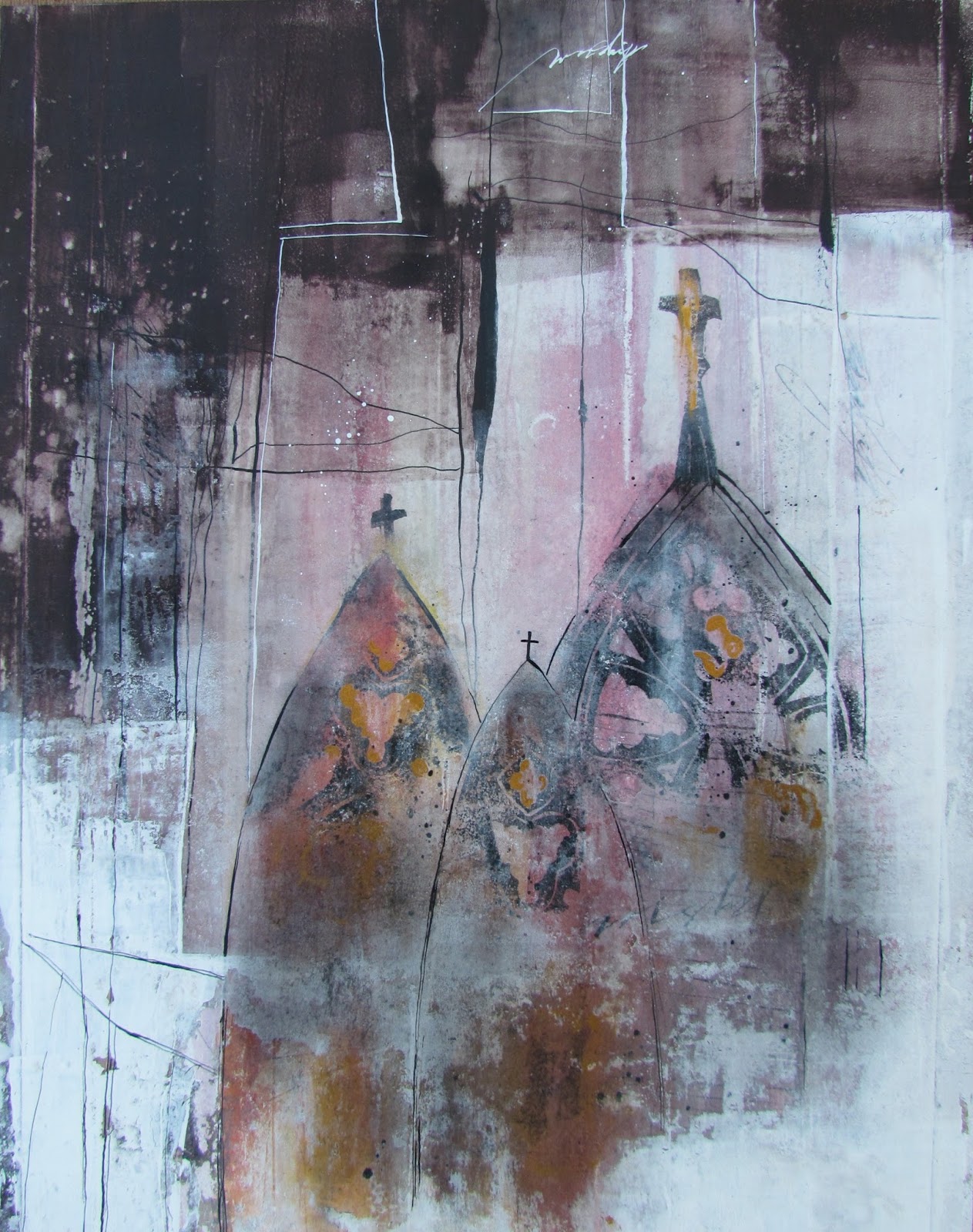
"Cathedrals" (final)


($250.00.....11" x 14".....gesso work on 140 lb. HP....mounted on a 2" depth cradled board)

"Cathedrals in all their grandeur cannot compare to the cathedral of the heart." You can see that the lettering was done in a gothic style called "textura". I deliberately left them in a lighter value. Most of the time, especially on this type of surface, white lettering has to be retouched to deepen the value.

Another intentional decision was to slightly angle the lettering to mimic the line work throughout the piece. It also gives movement and makes it less contrived.

There are several "take aways" from this piece that I would like to share. First of all, when creating erratic lines and shapes with gesso as well as white gouache....the value of these areas can be muted by brushing on a bit of charcoal powder after they're dry.  You can see it quite clearly in the cathedrals where there is a grayish/ whitish texture. It adds an ethereal look and is a very useful technique. If you consistently create mixed media work, black charcoal powder and a soft brush (Hake brush or blush brush) are an absolute necessity.

Line work is your friend when it comes to integration. By creating white lines in the dark areas and black lines in the white areas, I created conversations between the shapes which results in integration. 

Breaking up solid shapes of color with rubbing alcohol and a brayer or laying down color with gouache and brayer and then spraying lightly with water can create very interesting texture. I did this on the left side where you see texture in the dark area.

Using a pointed pen and a press/release technique can help create lines that are thicker and thinner in places which makes them much more interesting. It is also good to have line work created with a variety of different mediums....such as gesso applied with a credit card....pencil lines....pointed pen and ink lines....scratching into damp paint with the corner of a credit card or palette knife...etc

As I mentioned in draft (1), I attempted to write down most of the questions that needed answers as I moved through the steps of creating. There were approximately (50) in all which simply illustrates that it takes many steps to create a piece of artwork. Asking the right questions will give you the right answers. And there you have it...just a few more things to think about.

Please contact me personally to inquire about this piece.

Friday, July 12, 2013

"Cathedrals" (draft 3)


"Cathedrals in all their grandeur cannot compare to the cathedral of the heart." Hearing the sounds of a choir singing upon entering a cathedral is a rare and beautiful moment, but the cathedral of the heart is a place one can visit at any time.

It isn't finished yet, but I am almost there. This piece has now been cropped to an 11" x 14" and all of the edges, lines, and shapes have been adjusted to my satisfaction. It is time to stop this part of the process and move to the lettering. My thought this morning was to bring more of the dark area into the white shapes and vice versa. I did this with line work...removing more paint with alcohol and a brayer...and by adding gold gouache and black charcoal powder.

Holbein manufactures an Acryl Gouache called Gold Orange that has a vintage quality that is perfect for these types of pieces. I applied the gold with a brush in select areas of the cathedrals. It was too even and solid so I used alcohol and a stiff brush to remove and disperse the paint. After drying, I added black charcoal powder right over the gold and other areas of the cathedrals.

You can also compare with the previous posting and tell exactly where I added more line work and a bit more lettering. I am now satisfied that there are definite shapes with a variety of edges and line work that are having a conversation with each other.  Tomorrow, I will add the lettering and post the final.

While this mixed media piece has been in process, I have also been doing some palette knife painting in oils and very pleased to have another creative area to express my voice. It's all very exciting, but if you find it overwhelming to think about too many processes at once, I strongly encourage you to focus on the techniques that can be combined to express your deepest longings in one area.  It's all a win-win and very healing to the soul. And there you have it...just a few more things to think about.
Thursday, July 11, 2013

"Cathedrals" (draft 2)

(image 1)

(image 2)


No quote yet, but by tomorrow, I feel sure I will have one. As you can see, there have been many changes since yesterday. I am going for a very ethereal look.

Last evening, after viewing my piece several times during the day, I had the urge to go over the cathedral imagery again with the same colors plus adding some alizarin crimson to the yellow shape. I also laid a kleenex in a place or two to lift part of the color. It was left to dry overnight.

This morning, one of my first questions was how much detail to add....what tool to use....what color and type of pigment. I began with moon palace ink and a pointed nib, but decided to go with something a bit more graphic and found a hand cut stamp of a cathedral that I cut several years ago. Rather than inking the whole stamp, I chose fragments and stamped those on with Speedball Printing Ink applied with a brayer.

After writing a few words and creating different types of line work, I dried the piece...sprayed (3x) with spray acrylic coating. The reason I sprayed that many times was due to the thickness of some of the ink. After drying the piece again, I used a sponge brush and applied dilute gel matte medium 2x. After drying that layer, I laid in the dark shape which was cobalt blue + brt. sienna gouache. The reason I chose that medium is the ability to lift it if I didn't like the result. Because it is an opaque watercolor, it also has a bit of a translucent effect in places. (You do need to brayer it on and then keep brayering until it becomes smooth.)

White gesso was also added (1:1 ratio with water) and dried. Alcohol and a brayer were used alternately over the gesso to create the texture you see in image (2). I also repeated all of these steps....spraying...brushing on med...adding more gesso...etc. until satisfied.

Today I will be studying this image and seeing if I need to do anymore "tweaking" of values and shapes before deciding on the lettering. So far...I have asked and answered (30) questions about this piece. And there you have it...just a few more things to think about.

Wednesday, July 10, 2013

"Cathedrals" (draft 1)


(image 1)


(image 2)


This is the first in a series with cathedral imagery (if all goes well). I have long been enamored with arches and cathedral imagery. The first decision I needed to make was what kind of cathedral imagery...especially how much detail to include.

At this stage of the game, I chose watercolor in three arch shapes with no detail. There are also some vertical bands covering the page from top to bottom in alternating color. After each application of watercolor, I dried the paper (140 lb. HP...taped to a masonite board). The tape used was gummed taped specifically designed for watercolor paper.  After finishing the watercolor portion, I sprayed the surface with spray acrylic coating since watercolor is obviously water soluble. This is what you see in image (1).

The next step was to apply white gesso. I chose to apply the gesso with an old credit card in (3) vertical bands with the watercolor pigment in between these bands. I then dried the gesso and sprayed with rubbing alcohol followed by removing portions of the gesso by brayering. This was not just one pass with a brayer, but went on with alternate spraying and brayering for about (15) minutes.

When I was satisfied with the amount of pigment peaking through and the texture created, I made erratic lines in the gesso areas and wrote a few words while the paper was still damp. The result is what you see in image (2).

You can see from all of the previous postings just how much of an experimental process mixed media is and how many decisions need to be made along the way. In this piece, I am writing down all of the questions that come to mind as I work. So far, I have answered (10) questions and I've barely started the piece. And there you have it...just a few more things to think about.