Showing posts with label Printing with Brayer. Show all posts

Monday, May 6, 2013

"Mi Camino" (final)


($80.00.......6" x 8".....Mixed Media.....Mounted on a 2" Depth Clayboard)

"Your word is a lamp to my feet and a light for my path." (Psalm 119: 105...NIV) This is a very familiar verse that has been put to song and hidden in a lot of hearts. It's still a favorite and hope you like seeing it in a different way.

The motif of this background was chosen because it implies growth and gives a hint of the pastoral scenes that come to mind with many of the Psalms. And even though I had no idea which verse I was going to do, it became apparent that the black papers with white letters and a hint of the background showing through did visually describe the path being lit.

The layout is fairly traditional, but there are many who still gravitate to this straight forward treatment of the quote. My personal inclination is to be a lot wilder and less readable, but I conceded that point in this piece.

Those of you who are playing around with mono printed rice papers might want to try laying your chosen color(s) out on a table or even the floor and then begin to pair them with some of your black papers or even a darker value of another color. You really will have better success if you have light, medium, and dark values represented.

Your layout can resemble papers laying on top of each other and then cropped or you can work in a more complex way with a horizontal band layout. Parts of old book covers also make a nice inclusion. And I hope you have not forgotten that delivering paint to your surface with a brayer and using one color on top of another is another way to begin your piece. You can then selectively choose some mono printed papers to include in key areas.

The technique of brayering first before adding papers will give you some little windows and areas to showcase a particular image or texture. Perhaps I will do that for tomorrow's posting. Never the less, there are many different ways to design with your papers. And the good news is that everything you're using is archival and well protected with mediums and sprays that contain acrylic emulsions of some sort.

You could also brayer with watercolors if you want more transparency to work with. It's all very exciting so I hope you will be hard at work creating your own pieces. And there you have it...just a few more things to think about.

Please contact me personally to inquire about this piece.

Thursday, May 2, 2013

"Fearfully and Wonderfully Made" (Final)


($150.00......8" x 10"....Mixed Media....Mounted on a 2" Depth Clayboard)

"I praise you because I am fearfully and wonderfully made." (Psalm 139: 14...NIV) So here it is with a few more text pieces, some silver leaf, and the verse. We are indeed fearfully and wonderfully made. I deliberately made this piece extremely complex to visually describe the intricate nature of the human body.

Today is a recap of all that has taken place since Monday. Please know that I did not spend hours each day on this piece. Most days, I spent app. (2) hours studying, placing, deciding, and then adhering.

The initial mono printed papers inspired the selection from psalm 139. I learned long ago that it is much easier to be inspired by the image first rather than trying to create a piece based on preconceived concepts. Of course, this is not always possible, but if you can possibly work by allowing the piece to tell you what to do next...I have discovered that it works better, looks less contrived, and I learn a lot from all of the unexpected surprises.

Since yesterday, I added a few more selected verses from Psalm 139, using text from a smaller bible which adds another contrast. Those additional pieces were adhered yesterday afternoon.

This morning, I decided on the placement and size of the text, prepared the surface for lettering, (2 parts water + one part gel matte medium applied 3x) After the lettering was completed, I decided the piece needed some silver leaf.

The beginning decision to have a cut edge and a torn edge on every piece of mono printed paper and then the silver leaf adds unity and rhythm to the piece. Deconstructing the additional colored mono printed papers was also a unifying factor that also contributed to the rhythm. By making these kind of decisions, I have created a piece that looks like a weaving. It reminds me of fiber art and the truth be known...I was probably influenced by the beautiful art quilts I have seen at the International Quilt Show in Houston.

The one thing I did leave alone (almost completely) was the dynamic gestural marks in the top half of the piece. I added just enough elements that were in the bottom half to create an echo, but not too much. All in all, I am happy with the piece. You can look back at the last (3) days of postings and see for yourself if you would have stopped before arriving at the piece you see today. And that is a good thing about photographing a piece after each layer or two. It helps to inform your decisions about future pieces.

Are there things I would have done differently? You bet, and that too, is part of the process. Every artist I know might have (1) out of a 100 pieces that they would not change at all. And there you have it...just a few more things to think about.

Please contact me personally to inquire about this piece.

Wednesday, May 1, 2013

"Fearfully and Wonderfully Made" (Draft 3)


This, of course, is the third draft of "Fearfully and Wonderfully Made" from Psalm 139: 14. Tomorrow I will be posting the final.

As you can see, I have added another color. To fully integrate this color into the piece, I used the same textural stamp to create some more mono printed papers. The application of these blue printed pieces was deconstructed by adhering them to the support...waiting a few minutes and then deconstructing them by lifting up an edge and pulling the paper off. This is one of my favorite techniques because the "pulled up" edge becomes very thin and drifst off into nothing, revealing part of the previous layer.

The blue prints were made by pouring a small bit of Cobalt Blue (Fluid Acrylic) onto the printing plate and then spraying with water. This creates a puddle of color which is then suitable to lay the rice paper into. It will take a little while to dry and may be too wet to hang up. This type of printing is best done with a hair dryer. I only use acrylics to get a particular color that I like,  but I always use Speedball Printing Inks for fine printing. You can see the beautiful print this ink makes in the black portion in the top half of the piece.

I also adhered some bits of plain rice paper in areas where I felt like the value was getting too muddy. And then more bits of plain paper were added on top of the previous ones. By allowing the edge of the previous papers to show, you can achieve a gradated effect which appears throughout the piece.

Tomorrow, I will probably adhere a few more bits of the printed text in key areas and then letter the quote in the white area just above center. It will be written in very informal versals with Moon Palace Ink and a Mitchell 6 nib. There have been many changes since the first two layers on Monday. I hope this helps those of you who are tip toeing into the world of mixed media.

This is only one way to work so look at work by other artists working in mixed media and soon you will be finding your own voice in this provocative medium. And there you have it...just a few more things to think about.

Sunday, April 28, 2013

"Two Exemplars"

(image 1)

(image 2)


An exemplar is an example, model, or pattern to refer to when doing something. In this case I have an exemplar showing Spencerian Script miniscules (or lower case letters). The other exemplar is showing some different ways of printing on rice paper to create a pattern, texture, or both.

There was no posting yesterday because I was "knee deep" in setting up for a "mono printing on rice paper event" in my studio. I also taught two of my private students in Spencerian Script this week and that piece (image 1) also shows a technique with rice paper.

In the first strip of image two, I placed about a 1/2 tsp. of Speedball Printing Ink (water soluble) on my glass surface and brayered it out in all directions to app. the size of my print. I then created a "chevron" pattern using (3) different sizes of broad edged shaper tools. You can also use credit cards cut to the width you want.

In the second strip of image two, I used a little less ink and two different sizes of cut up credit cards. You can vary the width of these lines by the angle of the credit card. In the first stripe, I changed the angle as I was going down through the ink to create a tapered line.

In the third strip of image two, I brayered out a fair amount of ink (1/4 -1/2 tsp) and made a diagonal stroke with a very old 4" brush....pressing hard as I move through the ink. In the same ink, (before printing), I made some gestural lines with the corner of a metal palette knife which created the very thin white lines. I then made the print, dried it, and printed with white Speedball Printing Ink and a rubber segment of circles I received in a package. After printing the circle, I dabbed the edges and part of the print with a damp tissue to soften some of the edges.

In the fourth strip of image two, I placed app. 1/2 tsp. of printing ink in the middle of my printing surface and brayered evenly in all directions, approximating the size of the paper to be printed, but I went one step further by brayering outside of that thicker ink on one end to create a gradated effect since there was less ink on my brayer at that point.  A commercial texture stamp was then use in a repeat pattern over all of the ink and you can see the gradated effect quite clearly.

In the fifth strip of image two, I again brayered out some ink and used my index finger to make different size circles. (with thin latex gloves on) I also dipped my finger in water to remove more of the paint...on the largest circle. The corner of a metal palette knife was used to create the thin lines inside the circle. (It is important to press hard with your finger.)

In the first exemplar, I used some very watered down gouache or walnut ink....smooshing it around on the glass printing surface and then laid the rice paper into those very dilute puddles. (If the paper falls apart, you have too much water.)  You could also use the printing ink or transparent watercolors. After that dried and was sprayed with acrylic coating, I adhered it to a 4" x 6" piece of masonite. I then stamped the image with the same stamp you see in strip (3). The surface was again sprayed 2x with spray acrylic coating and prepared for lettering. The lettering was written with WN Venetian Red Gouache.

The first point to remember about mono printing on rice paper is that all rice papers are not created equal. In the examples you see today, I used Shanghai....purchased from Jerry's Artarama.

The second key point is that mono printing is all about the amount of ink placed on the printing surface and also how much paint is removed. Removal of painted with some kind of tool is essential if you want to have some translucency when layering with other images or text.

The third key point  is the need to have very substantial brayers. The rubber brayers with metal (not plastic) are the best. Asel's here in Austin has some and they can also be ordered from Daniel Smith. It also helps to have .... 2".....4"....and 6" sizes.

The fourth key point is the actual making of the print. When laying the paper into the ink, use a clean brayer (preferably one with a clear plastic roller) over the print to make sure it makes good contact with the ink. You can also place a sheet of wax paper over the paper and rub over it with your hands or the back of a smooth wooden spoon that is flatter than most wooden spoons.

Last, but not least, lay the print on wax paper to dry or hang on a clothes line with clips from the office supply or regular clothes pins.   They will dry faster on a line than laying flat. You will also need to spray all prints with Krylon Acrylic Spray Coating (not to be confused with Workable Fixative) before adhering to a clayboard, masonite, or other surface.  (Remember, this ink is water soluble.)

To know what to do with your stash of printed papers, refer to other blog postings showing finished work to see some of the possibilities.  You will soon have your own ideas about how to use them.  (Storing them in gallon size baggies....by color....will also make this whole process easier.  And there you have it...just a few more things to think about.

Tuesday, April 23, 2013

"Over and Under" (Mono Printing Demo)


(image one)


(image two)


This is only a demo piece with an interesting title. In many circles, "over and under" is referring to a shotgun! In this case, I am referring to layering techniques with text pages and mono printed rice papers.

The very first thing I created was the black mono print with a simply line drawing of two apples. This is just an extension from yesterday showing another possibility. If I were creating it for a final piece, I might have taken more care and included a bit more detail, but it does show you what you can do while practicing your drawing at the same time.

This type of printing and layering is quite dependent on the amount of paint used and the amount of paint removed before printing. I had on thin latex gloves, so after drawing the apples, I dipped my finger in water and removed more of the paint. (a kleenex was also used) Other lines were created and more paint removed. It was then dried and sprayed with spray acrylic coating.

A piece this size (8" x 10") really illustrates the fine quality of the print compared to the way it would have looked if printed with acrylics. After cropping the print with the apples, I adhered the text and mono printed red papers as seen in image one. This would be the "under" part of "over and under". It is also good to remember that the rice paper does not become translucent until sprayed with acrylic coating.

After the apple print was adhered over the text and red print, I dried it again and sprayed again. I then printed out some text on silk tissue paper and selected three segments of the red printed papers. By echoing the lines and shapes that were already there, I was able to establish some more shapes and have a very interesting division of space. This was the "over" portion of "over and under".

Knowing the next steps to take in this type of layering is informed by what is already happening in the mono print. Hopefully you can see that the red printed papers were placed where they completed and complemented the shapes in the black print with the apples. And there you have it...just a few more things to think about.

Saturday, July 14, 2012

"Empty to Full"


($40.00.....6" x 6".....mounted on a 1/8" depth clayboard panel)


"Thanksgiving transforms empty to full." Thanksgiving is a reverential act that gives all of us the full life we want to experience. Making a mental or actual list of the many things we can be grateful for is a very good start.

When I think of overflowing abundance, my visual memory takes me back to the outdoors and the colors I experience in that environment. This piece is a "nod" to the dominant colors in most landscapes such as trees and grass and leaves. Texture is something I have also been experimenting with and Glass Bead Gel has been my ally along with Speedball Printing Ink.

I have already discussed the layering process of this particular technique in previous postings, but it never hurts to be mindful of shapes, division of space, corners, and edges. What I have noticed is that a straight edge has a very stabilizing effect on a chaotic surface. Just make sure there is a contrast by adding a substantial amount of erratic or uneven edges. I did add a piece of collage made from a cowhide image to give me one of those straight edges. It's hard to tell where it is, but it did achieve the desired outcome. And the goal in most of my collage work using this type of background is to integrate it so well (color wise) that it is barely discernible.

If you like texture, this type of layering is very addictive and compelling and I would encourage you to do your own experiments. The water soluble printing ink is fabulous because it will stick to any kind of surface and writing or imprinting with water following by blotting will reveal the previous layer...which goes to the heart of integration. And there you have it...just a few more things to think about.

Please contact me personally to inquire about this piece.

Wednesday, July 11, 2012

"Neutral"


($40.00....6" x 6".....mounted on a 1/8" depth clayboard panel)


"Put your life in neutral to calm chaos." There is a contrast in this piece between neutral colors and chaotic texture. In life we must all find ways to put our life in neutral in order to stay sane and keep from spinning out of control. Whether it's taking a walk, sitting with a friend, or reading a book, we all need to put our life in neutral for part of the day.

This piece was created much the same way yesterday's posting was created. I simply chose to use neutrals. After the solid acrylic color is placed over the entire surface of textured gesso, it is important to start thinking about creating shapes.

All of the other layers of colors after the dark turquoise were Speedball Printing Inks. They were applied in this order...white...brown + black....orange + brown + lots of white and a bit of turquoise. The very last color was turquoise added to the peach mixture.

what makes this and all other types of layering work is the ability to break up the surface tension in a convincing way. Thinking in shapes will help, but then you must break up the surface in some way to reveal the previous layer. In this piece, I used a pointed pen, a ruling pen, and water, followed by blotting.  The initial raised texture of the gesso and several places where glass bead gel was applied also helped achieve the revealing of a previous color. The shapes give it the structure and without that structure, the human eye does not know where to look.

Other ways of breaking up surface tension could be sanding, gouging, transparent paint or collage elements, blotting, etc. The most obvious way is simply to leave a portion of the previous layer untouched. However, this is not as subtle or convincing and may create too many hard edges and if all your edges are hard, your work will be very difficult for people to view. So there you have it...a few more things to think about.


Please contact me personally to inquire about this piece.

Tuesday, July 10, 2012

"Quit"


($60.00.....6" x 6"......mounted on a 1.50" depth clayboard panel)


"If something doesn't work...quit doing it!" It sounds obvious, but I am still amazed at my own ability to continue doing something for a long time before realizing that it's not working. Maybe today will be the day that all of us quit doing at least one thing that no longer works.

This piece is layering and texture to the max. If the colors are too bright for you, this look can also be achieved with neutrals.

The first layer was gesso applied to Rives BFK with a sponge brush and applied much thicker in some areas. An old credit card was used to make gestural marks that you can still see after several layers. The key is to have the gesso thicker in some places and then to let it dry overnight. (Drying with a hair dryer does not get the inside of the thickest gesso dry and you will find this out when you try to paint over it.) I also added some Glass Bead Gel (Golden) to several areas. You can see it at the top in the persimmon color.

The persimmon color is acrylic and was applied with a sponge brush over the entire surface and then a brayer was used to remove the excess. After the acrylic was thoroughly dry, I switched to Speedball Printing Inks for the remaining layers. The first layer was black and applied with a brayer, not bothering to cover the entire surface. The glass bead gel created enough of a raised surface to leave a larger area of the persimmon untouched. Before sealing the black ink, I took a point pen and wrote into the ink and then blotted it to create some of the texture you see. After sealing the black with Acrylic Spray Coating, I added the turquoise color, being mindful of creating shapes. I wrote into this color with water followed by blotting before sealing it. The last color was the dark yellow, also written into with water and sealed.

The last bit was the collage element in the lower right hand corner which gives the piece more shapes,  form,  and a touch of Mexico. The quote was written after the surface was prepared for lettering. And that's how it's done! Just a few more things to think about.


Please contact me personally to inquire about this piece.

Sunday, July 8, 2012

"Deep Longing"


(unavailable)


"Solitude is a place of deep longing for the only One who can satisfy." Many pursuits can give temporary satisfaction and take up hours of our time, but we were created to have an intimate relationship with God. That is the only thing that can truly fill the deepest longing of our soul.

This piece is another venture into contrasting opacity with transparency. A good rule of thumb is to choose equal pieces of opaque collage elements and transparent elements. By arranging them various ways, you will eventually find the right overlap and placement for each piece. The wonderful thing that happens is that you can see every layer in the piece. It is one of the most effective ways of achieving depth with layering.

The initial background was begun with gesso with some areas having a lot of texture. That, too, will add another dimension to your collage. Cadimium Orange was painted over the entire gesso surface with a solid application. Speedball Printing Ink came next, leaving some of the orange peeking through. At this point, you must spray with acrylic coating because the printing ink is water soluble. Silver leaf was then adhered one section at a time over gel matte medium straight from the jar. If the silver leaf looks too solid and static...simply apply some gel matte medium to your brayer and roll over the surface. The stickiness of the medium will pull more of the silver leaf from the surface.

All in all, this is a wonderful way to create a collage. It also helps to have some silk tissue paper (the most transparent paper I've ever found) and be able to print it on your printer. Simply make a copy of the image on regular paper...watch how it exits the printer...use removable tape to tape the transparent paper over the image...and send it through the printer again in the same way it went through the first time. Spray with acrylic coating and you will be ready to adhere it to your surface. And there you have it...a few more things to think about.

Tuesday, July 3, 2012

"A Complete Picture"


($40.00....6" x 6".....mounted on a 1/8" depth clayboard panel)


"The edges and fragments of our lives come together to form a complete picture." It can be very easy to think about one disappointment or setback and think that everything we've done in life is negated. However, one event does not constitute our entire lives, but it's a series of fragmented parts that come together to make a complete life (or picture).

This piece could be called a study in "green". The piece began with gesso over the entire sheet of Rives BFK and then texturized with gestural marks and drips of gesso. (The raised circle in the upper left hand corner.)  When beginning a piece in this way, it is best to leave the entire thing to dry overnight or at least for several hours.  It takes a long time for think a thick area of gesso to dry completely.

The initial colors were applied with a brayer and acrylic paint. (Lime and Olive Green) I then switched to Speedball Printing Ink and applied several different greens making sure to allow some of the previous layer to show through. It could also be referred to as breaking up the surface tension. Speedball Printing Ink is very easy to modify and will give you the printed look that you will not get with acrylics or gouache.

To add more surface texture, I added some rice paper collage that had been mono printed with a deep green that was almost black. The last bit of collage was the butterfly...printed on silk tissue paper.

One of the key points in creating a layered and textured surface is to allow the previous color to break through the surface in some way. It also gives the illusion of transparency. Failure to do this will result in a look that is contrived and the pieces look like they're just stuck on and totally unintegrated. So it is very instructive to pay attention to the techniques that help break up surface tension. And that's the beauty of mixed media. Just a few more things to think about.

Please contact me personally to inquire about this piece.

Friday, June 29, 2012

"The Library" (sold)


(sold)


"Books have the power to take you to far away places and very deep thought." Some of my fondest memories are curling up in a favorite chair and enjoying a good book. There is something very rich about holding the book in your hand....even if you have an iPad or Kindle. My library is my prized possession. How about you?

In some of my larger works, I have completed at least 6-8 pieces over the last few years that I call "library pieces". They all contained collage elements that were very old and generally they all contained small and very old books I have purchased in antique stores across the country. Some of them had a window cut out of a book cover that was filled with an inclusion of fused glass. None of those pieces are in my possession now so I am concluding that library pieces with a very traditional look are still in demand.

This piece reminds me of some of those works for the same reasons. This piece has an old book page, a piece of very old music from a hymnal, some of my own lettering printed on silk tissue paper and a stock photo of a butterfly. An excursion into a library will often have a wall piece containing specimens of butterflies or drawings of plants, etc.

Without intending to, after the pieces were assembled and shapes were formed, I looked at the piece from across the room and the orange shape from top to bottom reminded me of a book mark. The "bling" is the silver leaf. The upper right hand segment was dulled a bit by rubbing on some walnut ink and then blotting.

Another technique with Speedball Printing Ink is in the bottom right hand corner. If you brayer on the printing ink and let it dry, you can dip your pen into water and write into the ink and reveal the color underneath. Likewise, you can drop water or make a fingerprint into the ink and create some texture. I encourage you to try some of these things and see how your library pieces turn out.  And there you have it...just a few more things to think about.

Thursday, June 28, 2012

"Antiquities"


(unavailable)


"Articles of antiquity anchor us to the ebb and flow of history." There are a lot of us out here who like to rummage through old things with interesting patinas and shapes. After thinking about it for a long time, I have concluded that the ongoing interest in antiques anchors us into history and securely places us in the timeline. It makes us feel secure...that all is well.

A few days ago I talked about creating a series. This piece is the third in a series created from the same parent sheet of paper. Alas, this is the last for it is all gone.

The background colors are very conducive to all environments, but this one could be categorized as a library piece. It has a look of history and much of that is because of the colors. This robin egg's blue (Cobalt Turquoise + Raw Umber+ White) is a favorite to use with umbers and other earth colors such as raw sienna. If you like this palette, I strongly encourage you to give it a try and experiment with the percentage of space that each color occupies...vary that...and do a series. It's quite instructive and yields a great study in neutrals.

The collage elements, of course, are the focal point with a contrast of translucent, transparent, and opaque pieces. The dark collage piece at the bottom right was positioned over three different surfaces to create different values and shapes from the one image. The same is true for the ornate letter with all of the flourishes. And that's the charm of transparency and the depth that can be achieved.

It is not necessary to include collage over the whole piece, but rather to keep it in one area and going from edge to edge is a good idea. Also make sure to include contrasts between straight and erratic edges as well as transparent and opaque sections. Both types of contrasts are needed to achieve this kind of look. And there you have it...just a few more things to think about.

Please contact me personally to inquire about this piece.

Tuesday, June 19, 2012

"Marching Time"


($40.00......6 " x 6".....mounted on a 1/8" depth clayboard panel)


"Time marches on and stands still for no one." Some might think that silver and gold are the most expensive things in the market place. In my estimation, time is the most expensive commodity. No one can manufacture more of it and everyone has the same amount. It's a wise person who thinks about how their time is being used.

Most people think that neutrals consist of black, white, and brown. But anytime your palette is moving towards less intense and more "grayed down" color, you are moving into the realm of neutrals.

This is a neutral piece with a predominance of black and white. All the papers are transparent except for one. Using neutrals and transparency together is a winning and timeless combination. In a world that is hectic and often chaotic, most people will gravitate to neutrals because of their calming effect. This is something to contemplate when creating your artwork. Even bright colors are best showcased when surrounded by neutrals. Too many bright colors everywhere is disconcerting.

Again, you can see here how many interesting shapes can be created with collage elements. Most of the edges in this piece are straight with a few erratic lines in the gesso and torn edges on two of the collage pieces. It is very important to have the contrast between straight and erratic edges. So don't be afraid to have straight edges. And there you have it. Just a few more things to think about.

Please contact me personally ti inquire about this piece.

Monday, June 18, 2012

"Receptacle of Love"


(unavailable)


"Collect your tears in a receptacle of love and the sun will soon shine again." Today's posting is lovingly dedicated to some friends of ours who lost a grand child over the weekend in an accidental drowning. We are crying with them. We pray for the receptacle of love (Jesus Christ) to wrap them completely up in His empowering grace.

The background in this piece was cropped from a larger sheet I created as a background behind a kiln formed piece of glass. It began with textured gesso on Rives BFK paper. It was then painted black with Speedball Printing Ink and a brayer. After that layer dried and received a coating of Acrylic Spray, I applied gel matte medium (one small section at a time) and laid down the gold leaf. It might be necessary to wait a bit and let it become attached to the gel before removing the backing from the gold leaf. Some of the leaf naturally pulled up creating the exposed black areas.

The look of gold covering an entire surface was a bit bright so I applied (2) parts water to (1) part gel matte medium with my right hand and held a hair dryer right where I was brushing to cause the gel to attach to the leaf. This is a very important step because my intention was to brush on charcoal powder to dull the surface and it will not attach to a slick surface. It is also necessary to spray again with Acrylic Coating to fix the charcoal powder in place. You can then prepare the surface for lettering and painting the bowl with a palette knife.

The last bits of gold were applied before lettering and create a contrast between the two values of gold. To paint with acrylics and a palette knife, it is necessary to add a retarder to the paint to give yourself a larger window of working time. So there you have it. Just a few more things to think about.

Saturday, June 16, 2012

"I Owe You"


($40.00.....6" x 6"....mounted on a 1/8" depth clayboard panel)


"Every success can be attributed, in part, on the influence and help from others." Whether knowingly or unknowingly, we all affect or have been affected by the influence of others. Every conversation and action has the power to impact someone else negatively or positively. Let's go for the positive!

This piece is essentially an experiment in learning more about how to create complex textures by breaking up the surface plane and focusing on extreme contrasts.

It began with gesso that was texturized and left to dry overnight. This morning I applied black Speedball printing ink with a brayer...dried it with a hair dryer...and then brushed over it with a sponge brush dipped in water. That action was followed by blotting with a kleenex. The operative word here is blot. Wiping would kill the printed look that you can get with this ink. After being satisfied with the texture, I sprayed with acrylic spray coating. Silver leaf was applied to areas that had been brushed with gel matte medium. To break up the surface of the silver leaf, I removed parts of it, especially around the edges to create the erratic texture seen under the letters "i...o...u..". White Speedball printing ink was applied and also dried, rewet, and blotted to break up that surface.

Learning how to break up a surface and allow the previous layer to show through is a key component of integration. Remember also, to have distinctive shapes, contrast of solid and broken edges, and something different in the corners. And there you have it. Just a few more things to think about.

Please contact me personally to inquire about this piece.

Friday, June 15, 2012

"Enjoy"


($40.00....6" x 6"....mounted on a 1/8" depth clayboard panel)


"Linger awhile and enjoy the process." It is often difficult to "linger" over anything because of the schedules we all keep. To really make progress in any area, it is essential to make time and space to linger over the process. My definition of "linger" is to stay in the process as though time were standing still. Enjoy!

The piece today is texture to the extreme. I began with molding paste and texturizing with gestural marks and glass beads dropped into the paste. This was left to dry overnight. This morning, I applied black Speedball printing ink with a brayer. After drying it with a hair dryer, I rewet it and blotted it in areas to create some grays.

The silver leaf was applied over a base of gel matte medium. As I pressed it into the paste, I began to remove small areas with my fingers to break up the surface. After applying the ornate capital, I realized I wanted some color. I used Venetian Red gouache which is brighter than burnt sienna, but not quite a red. It was applied with my finger and water applied to soften the edges and also to break up the surface a bit. Breaking up the surface is important to keep it integrated with the rest of the piece. Also, by placing the color in four corners, it gives the illusion that there is another piece of paper underneath the black.  (Gouache is not permanent when dry and is also opaque, so it is the perfect choice for this type of application.)

This may be too much texture for you, but it is always good to experiment. I learned that the glass beads really do best when painted a dark color and then applying another color skimmed over the top of them such as the upper left hand corner. And there you have it....just a few more things to think about.

Contact me personally to inquire about this piece.

Thursday, June 14, 2012

"A Travel Diary"


($40.00....6" x 6"....mounted on a 1/8" depth clayboard panel)


"A travel diary records the personal details of your favorite places." Even if you don't call it a diary, most of us do record the details of places we visit with photos, sketches, writing, painting, etc. It's fun and that's the nature of a trip to your favorite place!

This piece is another venture into playing around with opacity and transparency. The key elements are gesso, acrylic paint, collage on rice paper, and collage on silk tissue paper. It is extremely helpful to keep your scraps of lettering practice, stamped designs, and then have a great collection from your iPhoto album.

All of these pieces can be used in this type of piece. I've posted several in the last week so you can look back and see other possibilities using the same materials. The process then moves to design. It is imperative to establish some shapes either in the background paint or placement of the collage elements or both. Using transparent layers over opaque pieces of collage will help give depth and tie everything together...especially if there is some of the dominant color in that transparent layer. You can see it in this piece with the gestural marks carved out of blue paint and then printed on the silk tissue paper. It overlays the yellow right above the train.

In fact, some of your mark makings on other papers might not work in their present state, but might be the perfect thing if printed on transparent tissue. In the spiritual realm, it's called "line upon line" and "precept upon precept". In the art world, we call it the layering process. Just a few more things to think about.

Please contact me personally to inquire about this piece.

Monday, June 11, 2012

"Beauty Heals"


($60.00......6" x 6"......mounted on a 1.50" depth clayboard)


"Beauty heals and helps restore the shattered soul." There are many who dismiss beauty as something frivolous or something you enjoy when everything else is done. This attitude must be rejected so that the wounded souls among us can experience healing through beauty. Make beauty a priority in your life.

This is yet another piece in developing depth and mystery with over lays of collage printed on silk tissue paper. You can create a variety of gestural marks and letters on other papers and then print them on tissue paper. The collage then becomes a richer surface and very integrated by allowing the viewer to see the layers underneath.

The "B" in this piece was originally written with white gouache on terra cotta Canson. When the same "B" is printed on the tissue paper, it is transformed into a beautiful transparent. The yellow in this piece was monoprinted on transparent paper, but not silk tissue paper. I honestly don't remember what it is. The key is to keep your eyes open for any kind of transparent paper (generally they are Japanese or Chinese papers). Check the transparency by laying it over some text.

The main underlying design idea in this piece is an emphasis on diagonals. When applying the black printing ink with a brayer, I made sure I was creating a diagonal, but then I also printed some straight vertical lines as a strong contrast. The diagonals are "echoed" in the gestural marks and some of the imagery on either side of the "B". The only reason I point these things out is to reveal my thought processes which are extremely analytical. It really is a habit worth developing because you will notice things that you might otherwise have dismissed. So there you have it. Just a few more things to think about.

Please contact me personally to inquire about this piece.

Sunday, June 10, 2012

"Remembrance"


($60.00......6" x 6"......mounted on a 1.50" depth clayboard)


"Remembrance leads our thoughts to the eternal." This quote is a veiled reference to communion where believers in Christ stop to remember the death and resurrection of Jesus Christ by partaking of the symbolic unleavened bread and wine. Every day is a good day to stop and remember.

This piece shows the complexity that can be achieved in mixed media. The first layer was erratic ink lines on a black sheet of Rives BFK. Black Speedball Printing Ink was applied over that with a brayer in a very select area going edge to edge. The third layer was white gesso applied with a credit card. That technique formed the veiling effect over portions of the black and the very think lines of texture.

My experience in kiln formed glass guided me through the layering of the collage and the decision to include one opaque section with two pieces that were printed on silk tissue paper. This is the same effect that happens when combining opaque and transparent glass in a three layer collage. (Check out the website of Kari Minnick to see the beautiful effects of contrasting opacity with transparency.)

The piece was then prepared for lettering by spraying with Krylon Spray Acrylic Coating and then (2) parts water and (1) part gel matte medium brushed over the surface.   You might also be interested in how the opaque piece of collage was created. I created a monoprint on Rice Paper and then printed the imagery over the monoprint. The ochre color created the warmth needed to contrast against all of the black. This is an example of the power of combining techniques and lots of contrasts to create a piece with depth and complexity. So there you have it. Just a few more things to try or think about.


Please contact me personally to inquire about this piece.

Tuesday, June 5, 2012

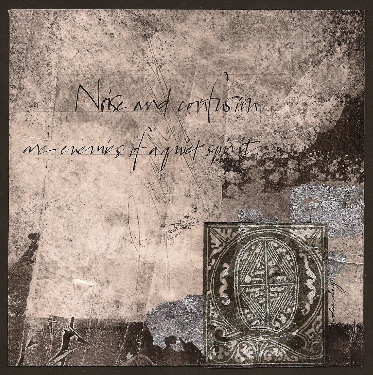
"A Quiet Spirit"


($40.00......6" x 6".....mounted on a 1/8" depth clayboard panel)


"Noise and confusion are enemies of a quiet spirit." Growth in any area of life requires times of quiet and being alone. I can't think of any exceptions.

My experimentations have led me to create more subtle textures and an attempt to completely imbed one layer into another. By toning down my texture in the initial layer of gesso, the erratic lettering in the background underneath the quote becomes a more interesting texture because there is no competing texture in that first layer.

Another decision that makes this a quieter piece is the predominance of the light gray area. Also the fact that the large decorated cap and bits of silver leaf and small black areas take up the least space. So whenever the negative space is dominant, the piece will automatically exhibit a quieter mood. This is a key component in value placement and where the detail is placed.

If the black areas had been dominant with tons of texture, there would have been more tension and more drama. It just depends on the mood of the piece. A wonderful exercise is to look at other paintings and notice whether the positive or negative space is dominant and how that makes you feel while you're viewing the painting. It might give you a new direction on which one of these you want dominating your work. Just a few more things to think about.

Please contact me personally to inquire about this piece.